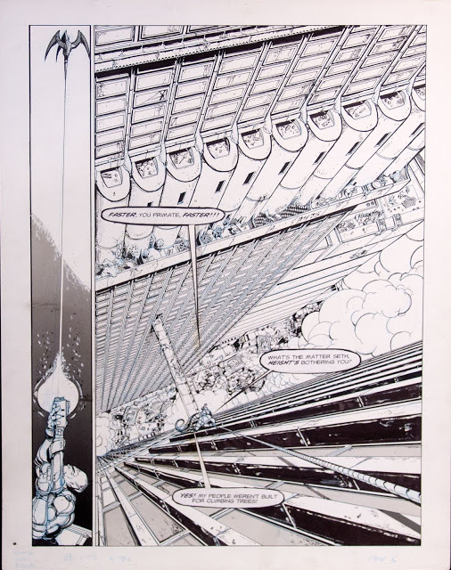
 |
| Omega Corps – Page 6, Donato and Steve Ellis 1991 |
The best way to break a rule is to learn how to carefully, precisely, follow it at first. Through mastery of form and execution, you learn where the dials are that allow you to tweak a rule, modify it, and push its limits until it appears to break. Such has evolved my approach to the use of architectural forms.
In the beginning I adhered tightly to the rules of linear perspective, laying out a grid and forcing my content to fit within that illusionistic guideline. Mostly these rules were exercised within the comics I created while in college and the book cover art of my early professional career. One point, two point and three point perspective worked wonders (and still does!) creating an incredible sense of depth to the imagery while proving a reassuring framework upon which I could safely fall back upon in times of compositional insecurity.
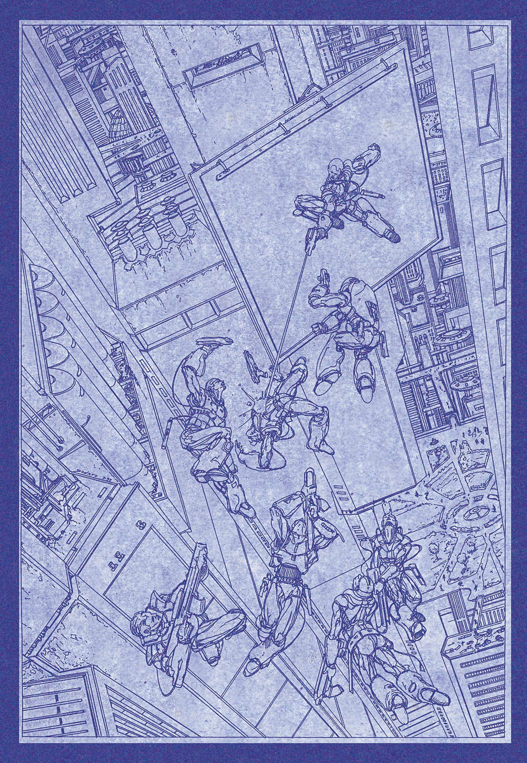 |
| Omega Corps, Donato Giancola, 1994 |
But there are times when the composition and emotional needs of a work trump the formality of a predicable, organized rule of illusion. Let me state that I think there are no right nor wrong ways to approach color, line, design or balance. Nearly anything goes these days.
Each image provides its own internal truths, a map or plan on how the artist and the audience read and absorb the image. Some maps are predicable, some obscure, others familiar, and others at times indecipherable – such is the pluralistic language of the arts! An artist may develop and mature a visual style/language which can be recognized as unique, while another may pursue a path of concealment, masking intent behind walls of aesthetic references and allusions. Viewing art can be a pleasure and frustration to behold and critique as one attempts to glean the intent of the artist.
It is with this in mind that I vary my approach to realistic illusion. I hang much of my viewers expectations on historical assumptions around issues of lighting, color, edge effects, anatomical precision, and numerous other ‘classical’ forms, all while leading them into an area of
distortion and visual and narrative challenges.
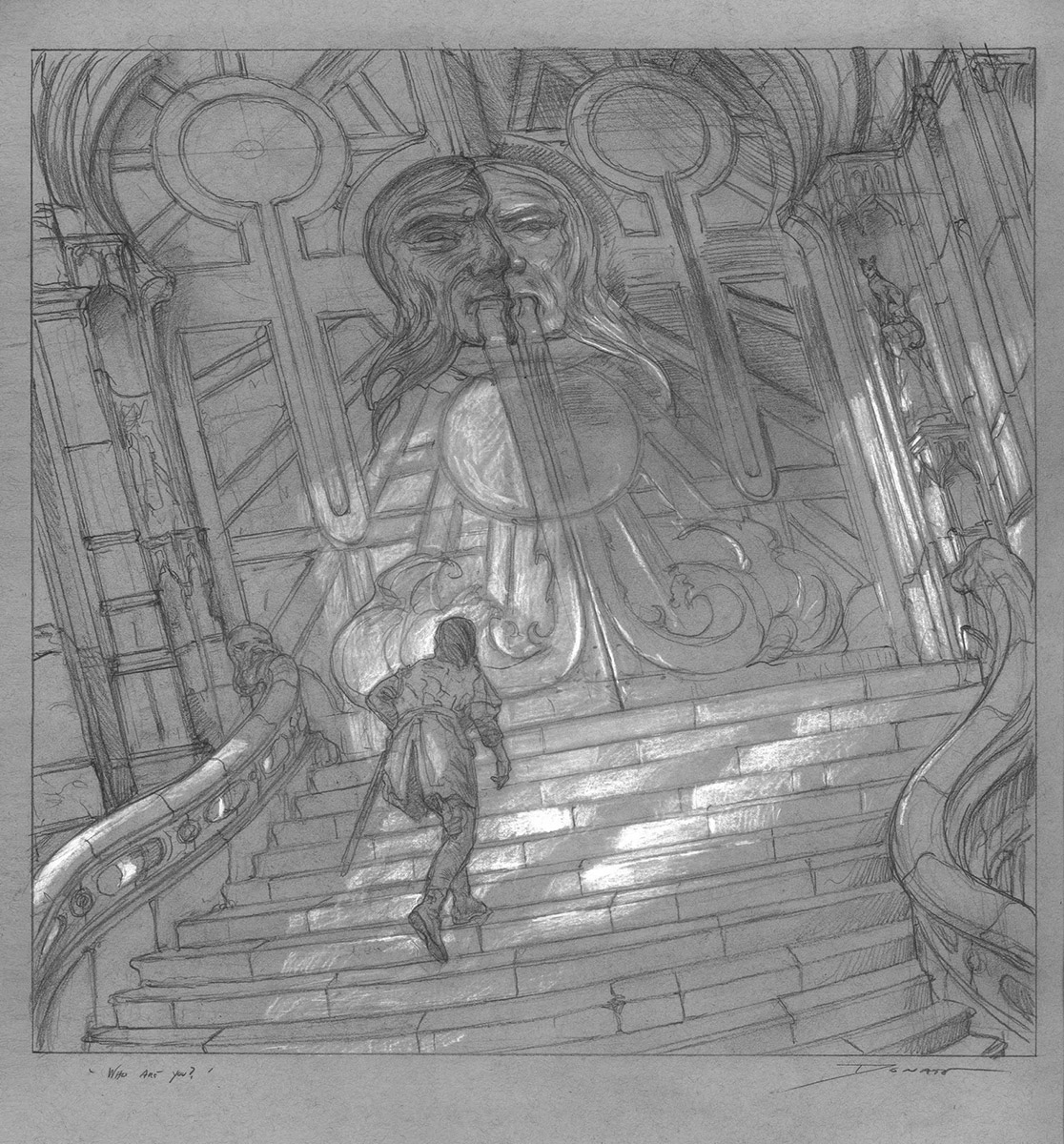
Below are the progress steps for the painting of Arya Stark for the 2015 A Song of Ice and Fire Calendar with George R.R. Martin – The House of Black and White. I began my initial abstract/thumbnail exploration following the rules of linear perspective, but knew something was missing.
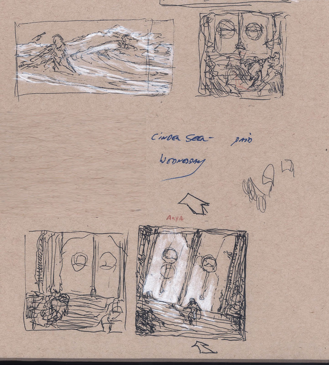 |
| Arya Stark – Roughs 8.5″ x 11″ |
This is a point in the story when Arya’s world is in turmoil. She has no home, no friends, and no where to turn to for a possible bright future. She is adrift in a sea of uncertainty, and in my artistic eye, not a world best represented by rigid perspective. I decided to shake up the conceptual space a bit, tweak the structure and make the ground ‘move’ beneath her feet.
By twisting the camera angle and using an upward and inward left-handed flow to the lower steps, I created a strong contrasting movement with the doors as they tilt backward and upward to the right. Not a dramatic cubist distortion, but enough to make you feel unsure of your relationship to the architectural structure around Arya.
Where is the horizon line? Where is the vanishing point? I am not sure myself, but know it feels right for this moment with Arya.
Some rules are made to be broken…
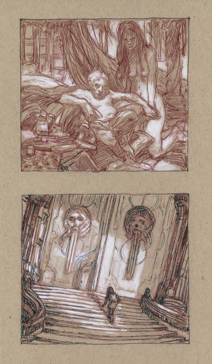 |
| Arya and Tyrion roughs 11″ x 14″ |
 |
|
| The House of Black and White 18″ x 18″ Graphite and Chalk on Toned Paper Collection of George R.R. Martin and Parris McBride |
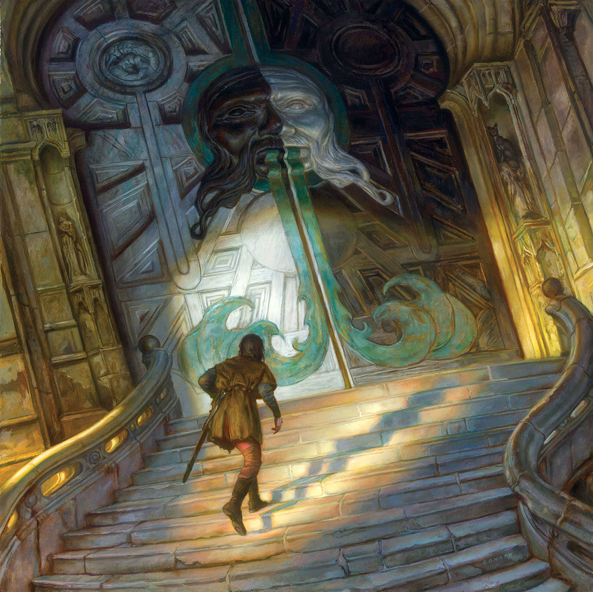 |
| The House of Black and White 30″ x 30″, Oil on Panel Collection of George R.R. Martin and Parris McBride |


Recent Comments