 |
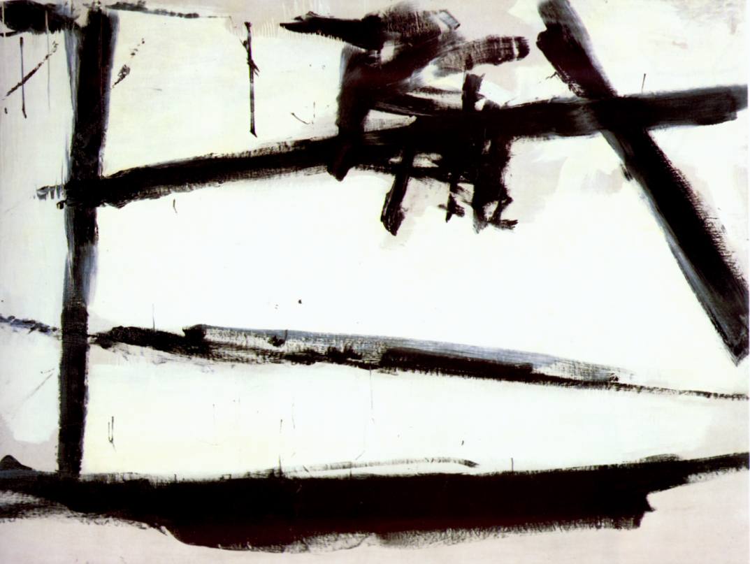
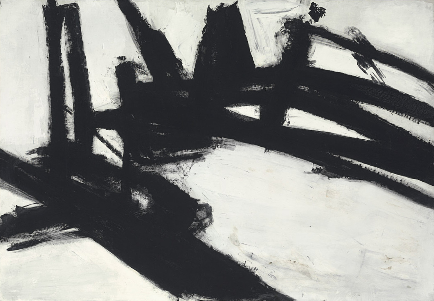
| Painting No.2 1954 MoMA New York |
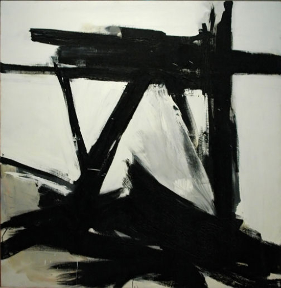
In my continuing Artist of the Month series I routinely try to explore artists outside of the Fantasy genre that have influenced my work or inspire my art tangentially through their unorthodox process. This month I expand upon this idea by including one of my favorite artists Franz Kline (1910-1962).
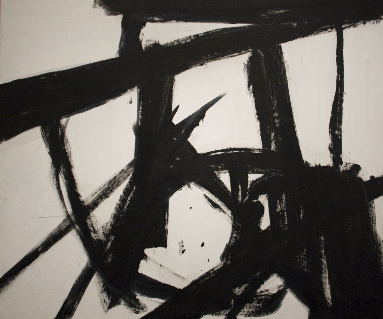
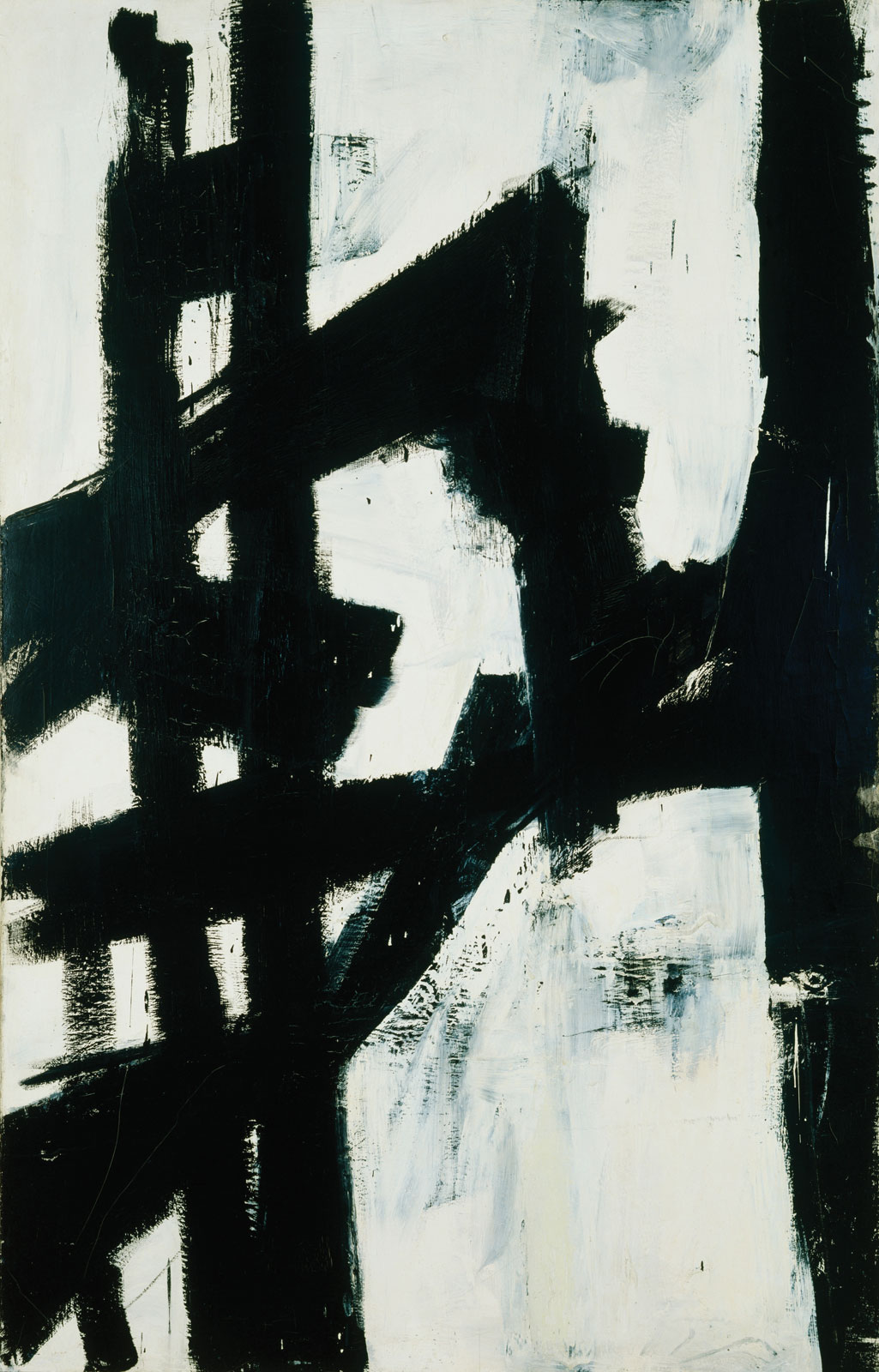
As a fantasy artist it would seem that there is very little connection between the high modern Abstract Expressionist and myself, but he is one of the few painters who’s work I keep hanging on my wall in my studio. Kline is the ultimate composer. When ever I begin a work in the thumbnail stage I, (and every artist) should look to Kline. Eliminating narrative, eliminating color, eliminating space, Kline works in pure abstract composition. Influenced by Asian character brush painting Kline takes the pure form of the thumbnail sketch and elevates it to high art. The essence of the creative process.
One of the fascinating revelations about Kline is that he was a figurative painter until he accidentally stumbled upon his abstract work one day in his studio. Like many of us he did preliminary thumbnail sketches in order to layout his designs before developing his canvas. One day in the late 1940’s he placed one of these thumbnails in an opaque projector to enlarge it onto a canvas when he was faced with his work blown up to wall size, he stopped, and had a revelation, it was perfect the way it was. He painted the thumbnail using black and white house paint and the rest was history.
There is not much to say about his work. It is what it is. Positive and negative design forms. Pure and clean and sublime. There is no context or narrative, simply the essence of painting exploring form and edges. I have always admired his compositions and he is the master of the thumbnail. So the next time you are struggling in your sketchbook over a dozen preliminaries, look to Kline and draw inspiration from the master who spent his life executing paintings dedicated to this simple and limitless exercise.
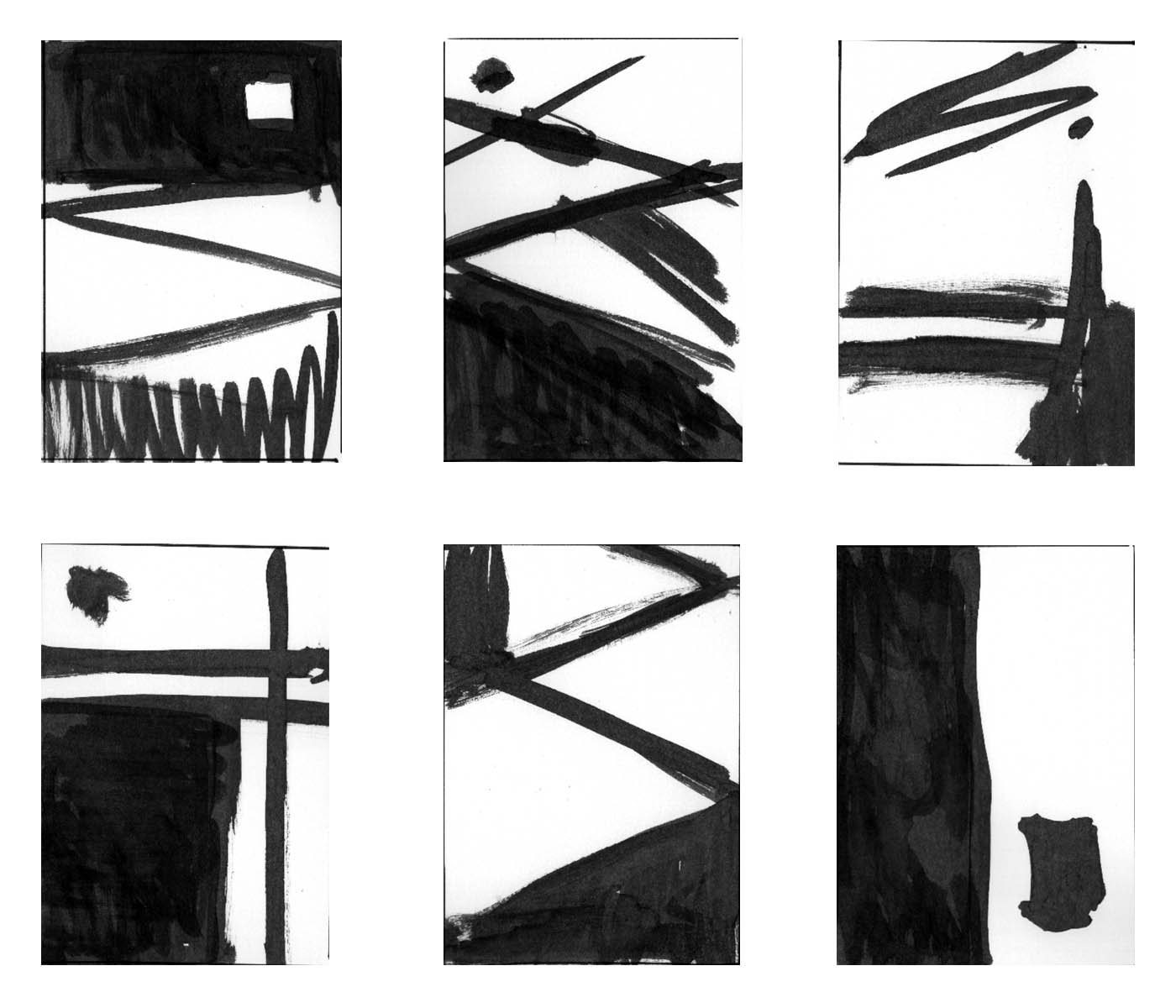 |
| Thumbnails Echoes of EmpireInk on paper |
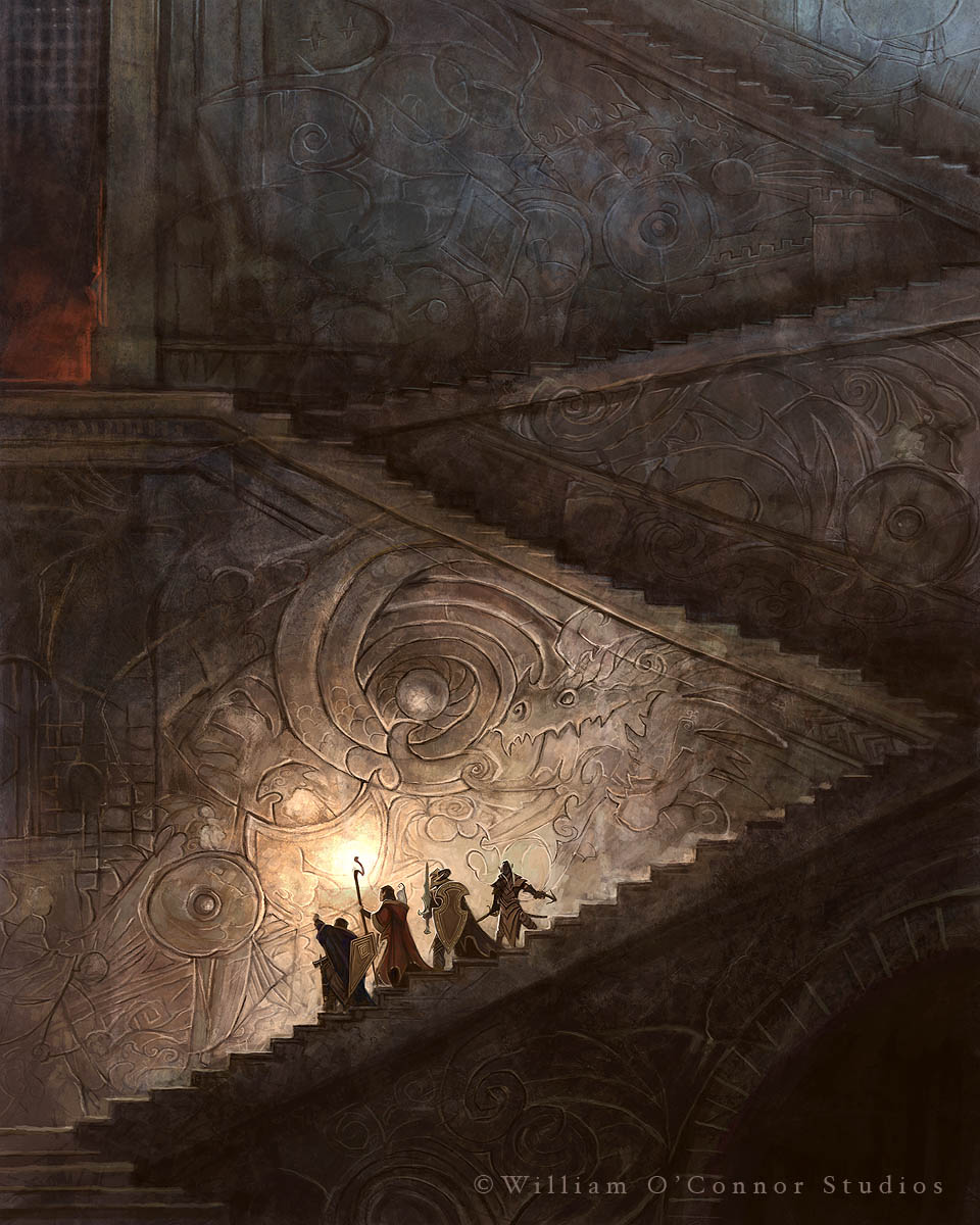 |
| “Echoes of Empire” Wizards of the Coast |
I still use Kline as an inspiration to get back to first principles when I’m designing compositions. Ink and paper are my favorite, no pencil. Black and white, positive and negative, no gray area. Above are a few examples of my Kline-inspired thumbnails that led to the finished painting “Echoes of Empire” for Wizards of the Coast.




Love how you were inspired by the exact composition for your own stunning painting “Echoes of Empire”; such a great compliment to Kline and nice personal touch! V. interesting 🙂
I draw a distinction between art and design. Though there certainly may be composition and a balance between light and dark forms it does not merit the name “art” in a classical sense. In my opinion to do so deconstructs the meaning of the word “art” and brings it dangerously towards the meaninglessness of defining anything and everything as “art”.
No… if this is anything it's design: an arranging of graphic elements into a (subjectively) pleasing aesthetic form.
Don't forget Motherwell! A fun day long ago in the studio and a collaboration as “Ode to Motherwell” a great lesson in follow through design. It's good to be reminded to think about the abstract, the hard part is in carrying through to the realism in the final painting.
I'm not a huge fan of non-objective art. But that said Kline is one of my favorite AbEx painters. I prefer him to Pollock for sure.
Thanks for the introduction to Kline. I love Japanese brushwork, but I don't know if I ever would have thought of building compositions from such a spare foundation. I can't wait to experiment!
A really clever, concise and enlightening post – no jargon, or melodrama; some good facts, some great art, a bit of history and some clear application – top drawer Muddy Colours stuff!
I'll definitely have a fresh look at thumbnails, and Kline and his genre, from now on – thanks!!! 🙂
Thanks for introducing us to Kline! For the Echoes of Empire thumbs did you work purely abstractly and find the image in it or did you know the subject before drawing them?
William and Don – I think your site is being hacked by the Zetaclear/Healthybeats brigade above – there was a reply to Greg's post the other day from them as well, pointing to a sales site…God, even their labels are poorly designed…sigh.
Not hacked, just spammed. We get dozens a day, just like most blogs. I do my best to delete them all before they become a nuisance.
Nice post and I agree that looking at all kinds of art for inspiration is good. It does not matter what genre, style, schoolism etc it comes from, when we distill it down to its most basic we are all the same.
Comics, fine art, concept, illustration, graphics… we are all artists of different disciplines but design is fundamental to all of them. Basic forms and shapes can (later) morph into anything.
I've been experimenting. Began a new 12 x 12″ piece last night and I've tried to let the dynamic design in Kline's black and white pieces influence the composition. It has been so fun. I'm really hoping I can keep the sense of energy as I develop this painting. Thank you again for the idea William!
I’ve always love strong dark shapes but never knew how to use them except in notans. These are inspirational. Thank you for the article