I have been following Chris for quite a long time. He always impress me with spotless mood and colour themes and an atmosphere so thick and touchable that you could cut it with a knife. In my head I dismissed it as something unachievable, that you either had the sense for it or you didn’t – Chris clearly had it and I somehow luckily stumbled into it once in a while…
And then I read Chris’s article. Turned out it is not all a divine given skill that he just tap into, but actually a well thought and planned process, that allows him to handle mood so well. “Sigh”, I should have known. The part where he talks about value sketch is not a new thing, but his emphasise on how important it is resonating within my skull as an angelic truth.
Together with his examples this is one of the most educational painting lessons I have had for a very long time. Enjoy:
– Jesper Ejsing
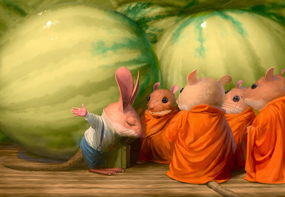
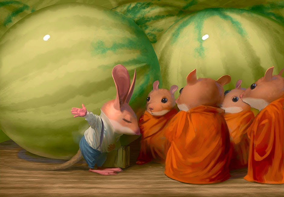
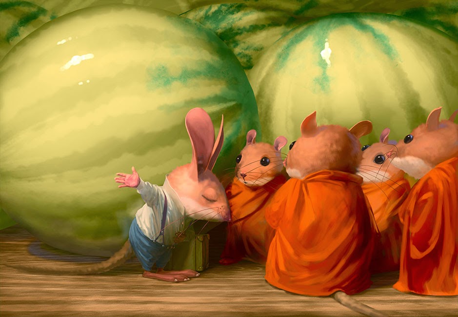
Folks have been asking about my process lately, which in some ways I gather is different from many other painters. This is a pretty simple image I did for Maurice’s Valises: The Muuha of Bang Bua.
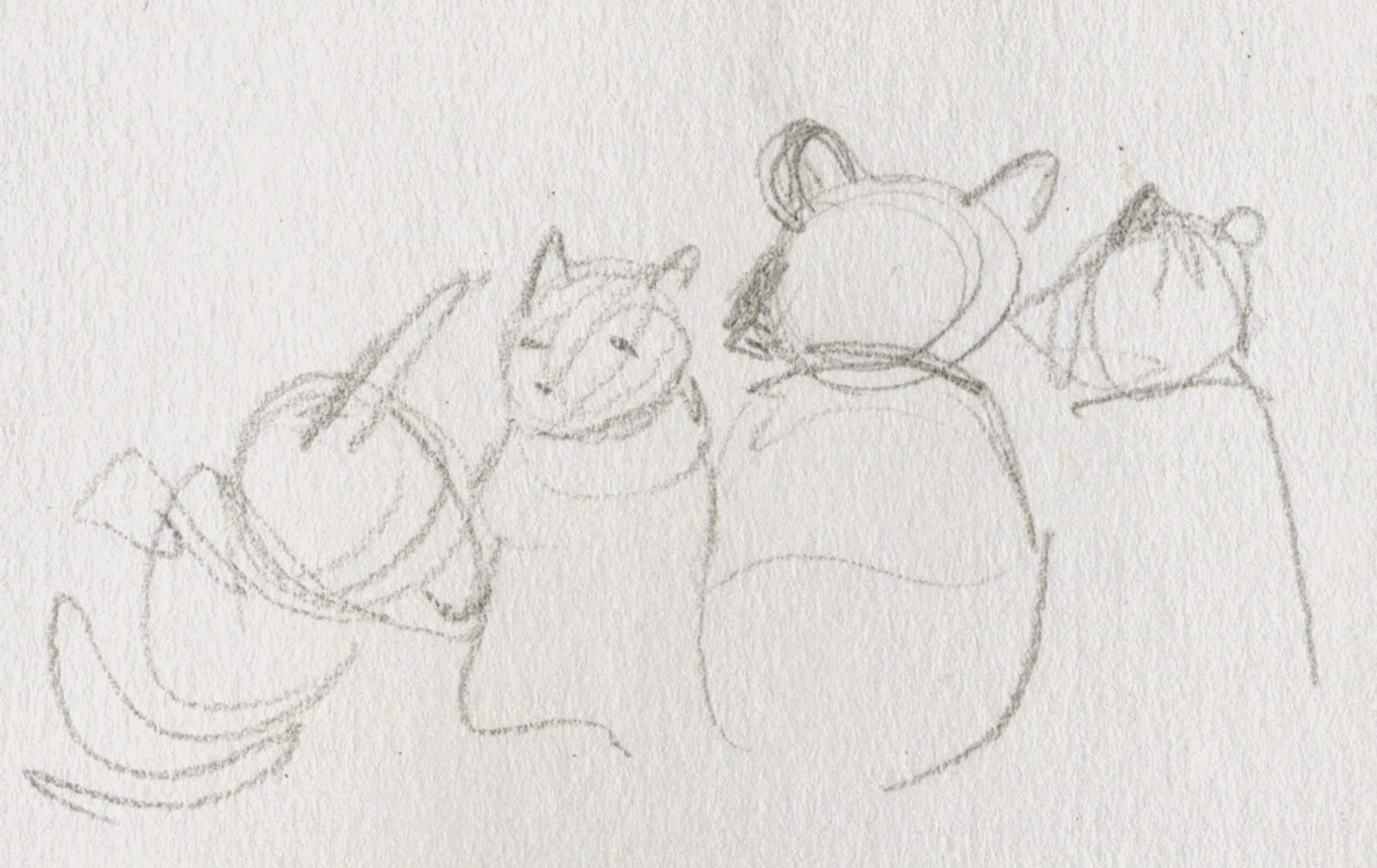
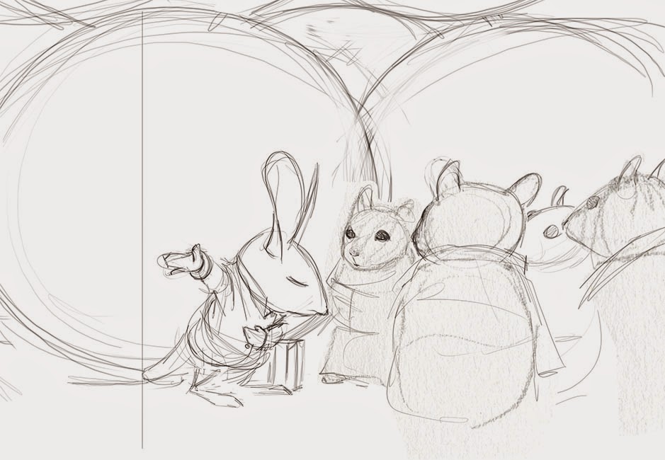
I start with a really simple rough, but only do the bare minimum needed to give me a guide for painting.
The critical parts of an image like this are the value and color plans. I CANNOT STRESS THIS ENOUGH. If this work looks really solid and polished it’s not because I spend a lot of time polishing – it’s because I set up the basic value relationships via careful observation and adjustment.
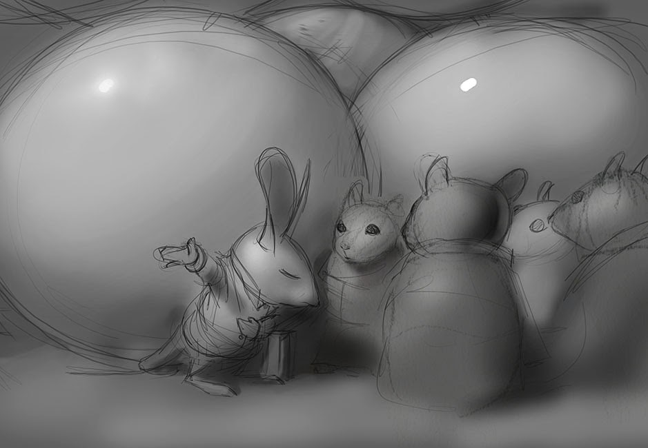
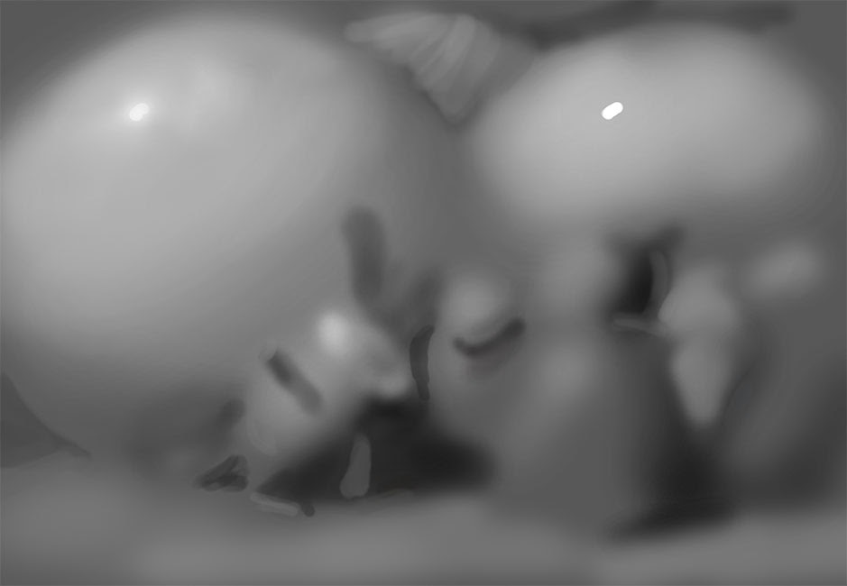
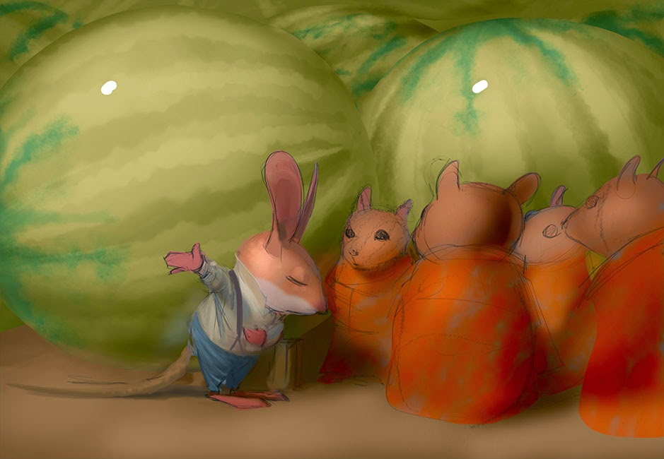
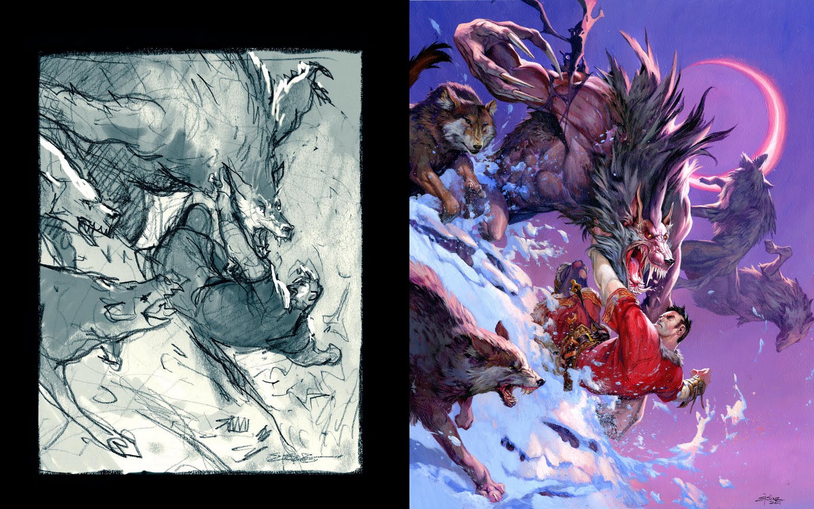
Lately I’ve been setting up my images in value first, then adding color, then painting.
I do all this preliminary value work on a single layer with a big soft brush, because it needs to be very direct and spontaneous.
The second image (without the drawing) is the one I am really looking at. It already has an almost photographic quality, a certain kind of poetry of authenticity and tangibility, despite having no detail whatsoever and certainly not based in any way on a photo or real scene.
Observe how it appears more finished the smaller it gets (this is a combination of the two, with the drawing being preserved for accents in a few spots such as the eyes):
Contrast is typically fundamental for creating focus in a 2d picture, but NOT for creating the illusion of light. I cannot stress that enough either – the illusion of light comes from value relationships in perfect harmony – which is often undermined by extreme contrast.
You don’t need high contrast or even a very wide value range to create the illusion of light (if that were the case it’d be impossible to do this in a picture, since pictures have a very narrow range of value compared to the real world).
If I could only say one thing about color it’d be this: color is relative. We simply cannot judge colors in isolation. The same is true of value.
Color organization systems and other devices (such as color wheels) are necessary for industrial purposes, but for painters these only provide illusory comfort, typically serving merely to mislead and undermine your ability to see – to see what is actually happening right in front of your eyes in that unique one of a kind painting you are working on – which is all that matters.
Working digitally it’s a lot easier to adjust values and colors in context. When oil painting I am constantly painting little swatches of paper and holding them up to the canvas. With digital work I can lay down any color and adjust it, then use that to paint.
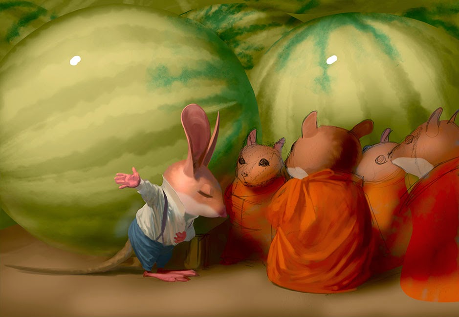
With such a solid foundation nothing can go wrong now! It’s just a matter of continuing to subdivide the image into smaller and smaller value/color shapes.
I flip back and forth between painting detail, working out forms like the drapery, then doing bigger adjustments to realign what I’ve painted with the larger value and color shapes as necessary. This is unique to digital painting (for me at least) because with digital work I can’t paint everything when zoomed out. I need to do some detail work zoomed in, which unfortunately means I can’t see the whole image at the same time (Photoshop’s navigator panel helps, but its interpolation is somewhat coarse).




Nice work firstly, secondly, though I am no digital painting expert by any means, but when I do stuff I set up a new window for the image I am working on ( from the top menu, Window – Arrange – new window for “name of your file' ) and either move it to another monitor or re-size it so that it can fit in the work-space alongside a zoomed in 'working' version. If you turn off the 're-size window to fit' option in the zoom menu you can arrange your windows such that they don't overlap each other when you zoom in and out…
This only works if you use photoshop of course…
Absolutely charming!
Wonderful Chris! I love the way your blurry prelim work implies a very sound grasp of Ambient Occlusion and that linework-less check is definitely something I'll be trying from now on. Did you try alternative crops of your composition before beginning to render, or did you finish the whole piece then select a crop to go with?
I'm impressed. You're quite careful and precise in your planning. I'm that way too when working on an illustration, even though my style is more simple (and more crude, some would say). I make sure to do sketches, color studies and reference checks before proceeding.
hey mate, have you tried enabling the navigator function yet? Pretty much does exactly what you mentioned, without having the hassle of having another window open. When you've openend photoshop, just go “window” and then select “navigator”.
Great advice! Thanks for sharing.
Just had a look…I guess it does..I am sure it never used to be resizable ? I never bothered with it because it always seemed so small…maybe I just never bothered looking into it..I have only been using photoshop for 20 years :P.
Never to late to learn something new…
Fantastic! Learned a lot! Thanks for sharing =)
Distributor Pusat Penjualan VIMAX ASLI CANADA Obat Pembesar Penis Alami Dan Permanen
HARGA VIMAX ASLI CANADA
Pembesar Payudara Alami Dan Permanen
OBAT PEMBESAR PENIS MINYAK LINTAH PAPUA
Obat Pembesar Penis Herbal Alami KLG PILLS USA
TOKO OBAT PERANGSANG WANITA
Parfum Perangsang Wanita PHERO X
OBAT PERANGSANG WANITA OPIUM SPRAY
OBAT PERANGSANG WANITA PALING MANJUR MAX WOMAN
Toko Alat Bantu Sex Pria Wanita
Alat Bantu Sex Pria
Alat Bantu Sex Pria Vagina Senter
Alat Bantu Sex Wanita
PENIS IKAT PINGGANG
IVONI OIL Obat Perontok Bulu Permanen
Obat Peninggi Badan Herbal Alami Super Cepat
SELAPUT DARA BUATAN
Obat Kuat Pria
VIAGRA USA 100MG
Obat Kuat Oles TISU SUPER MAGIC POWER
PROCOMIL SPRAY
Kondom Silikon
Aneka Kondom Silikon Unik Berduri, Berotot, Bergetar
Obat Sipilis Raja Singa Super Cepat
Obat Penghilang Tato Permanen
LIQUID SEX Obat Tidur Bius Cair Ampuh Dan Manjur
I am so glad to read this article, thank you for posting it.
Pasang Iklan Gratis
Maxman obat kuat jogja
Cara Membesarkan Penis
Kado Ulang Tahun Unik
obat enjeksi dini
Obat Kuat Viagra Sleman
obat kuat srigala merah
obat kuat viagra cina 500mg
obat kuat magelang
obat kuat viagra klaten
obat kuat herbal
obat kuat oles
obat kuat maxman
——–
obat peangsang gell
obat peangsang cair
obat peangsang viagra cair
obat peangsang spray opium
obat peangsang serbuk
obat peangsang gell murah
obat peangsang potensol cair
obat peangsang wanita blie wizat
obat peangsang black ant serbuk
obat peangsang gell women erotik
obat peangsang sex drop
——
alat sex pria
vagina senter
vagina bulu getar
alat bantu sex murah vagina getar
alat sex onani vagina tabung
vagina mainan vagina tenga
vagina getar mungil
vagina pinggul