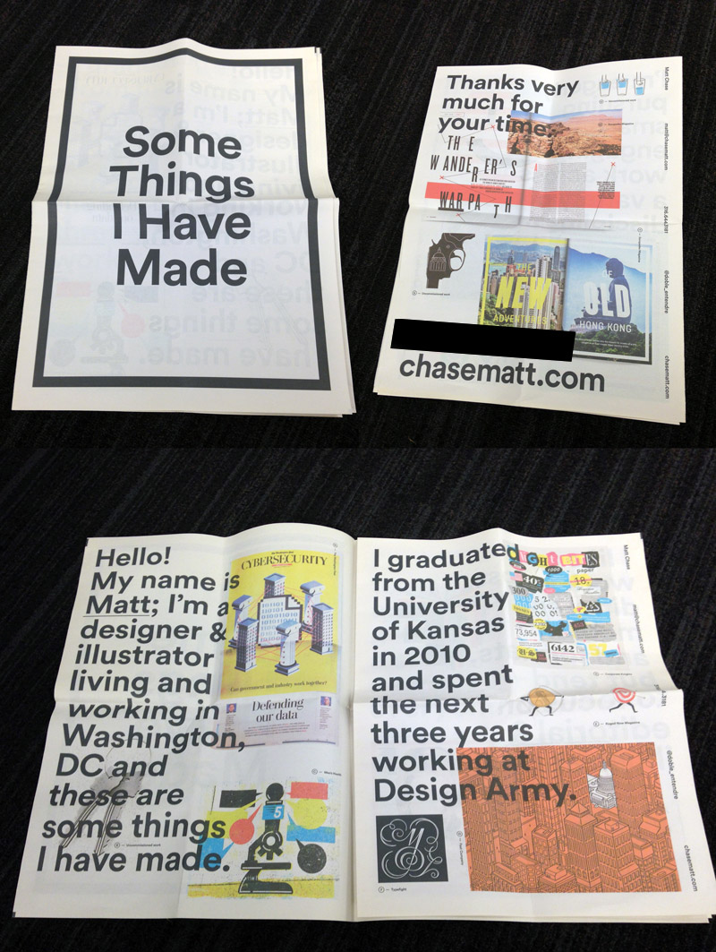
Art Directors get a LOT of promos from artists, and I get asked often to show examples of ones that have really stood out in my memory. So after about a year or so of collecting for this post, here’s a selection of some of the good ones. This maybe represents 5% of the physical promo I get mailed to me and given to me at conventions and events in a given year. Note, this is not comprehensive – if you don’t see your promo here, don’t despair, it doesn’t mean I didn’t like it, I just grabbed a good range to show.
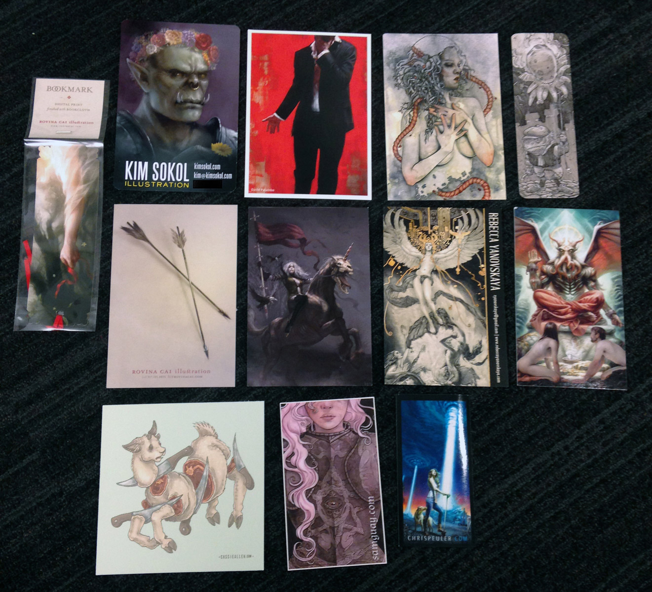
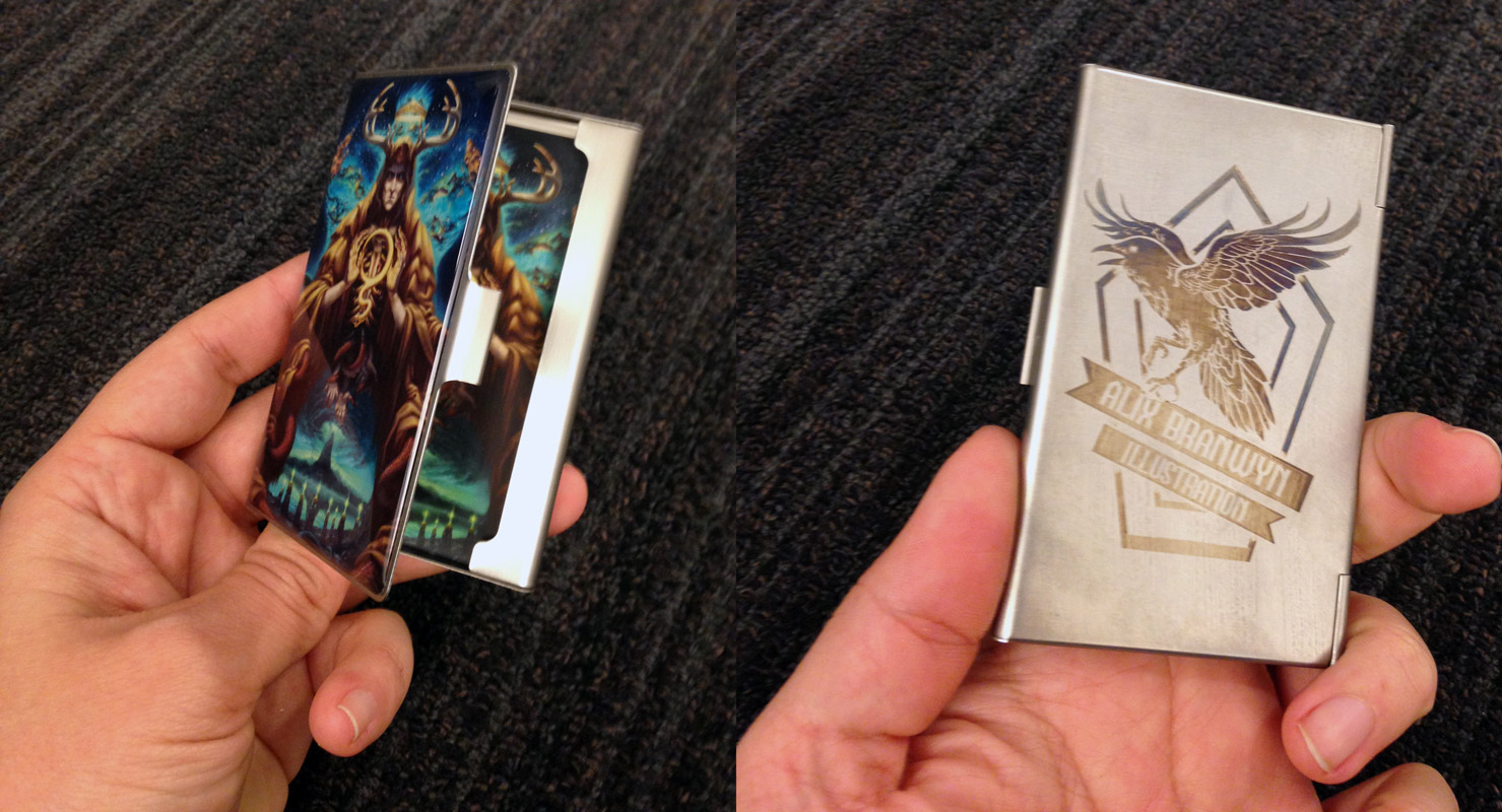
1—Business Cards — probably the most basic piece of promo, and the most critical. You reallllly want a business card that shows you off as an artist, catches the eye, and makes an AD want to keep it around. These stand out to me as a great balance of simplicity, good use of art, legibility, and cool factor.
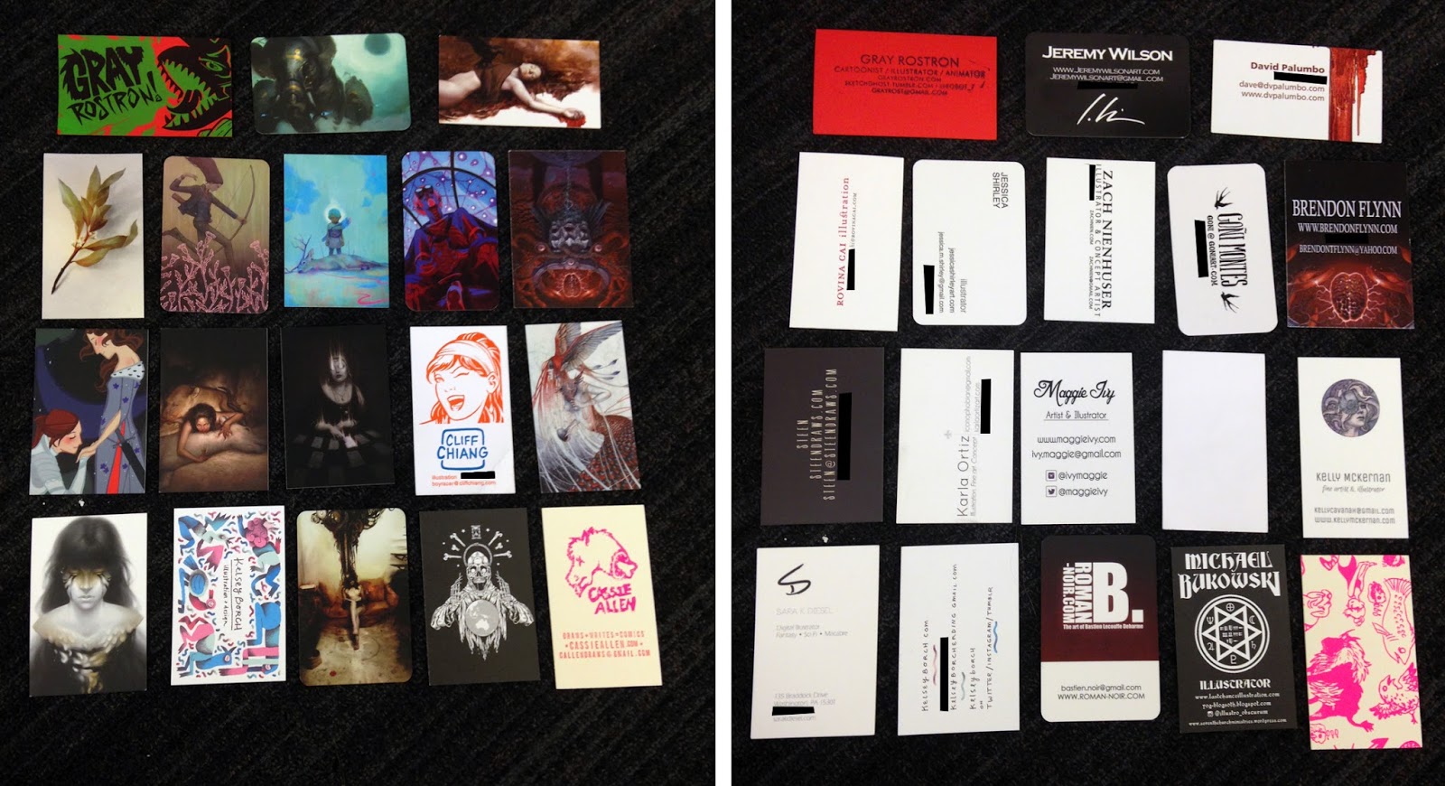 |
| (credits on cards – excuse black boxes, but many artists don’t put their phone number on their websites so I blocked them out here) |
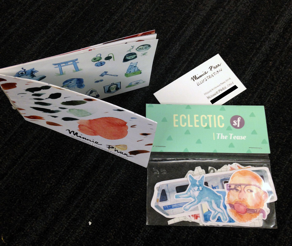
2—Postcards, Bookmarks, Stickers — sometimes given in addition to a business card, sometimes instead of, and the same best practices apply. Cool factor, interesting art but not too busy, legibility, etc.
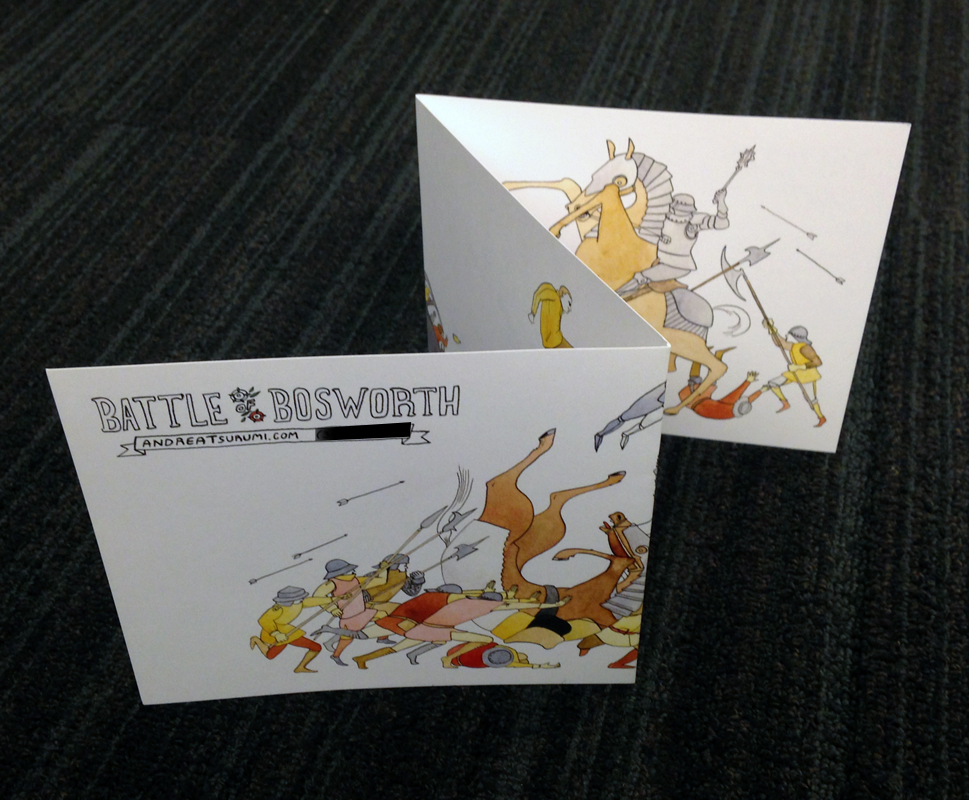
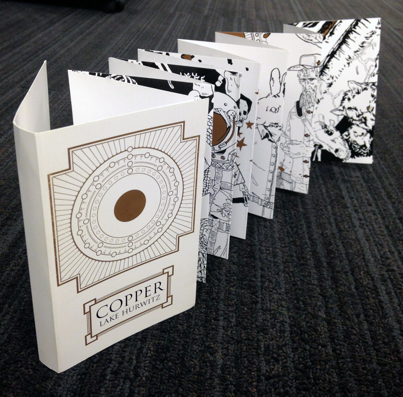
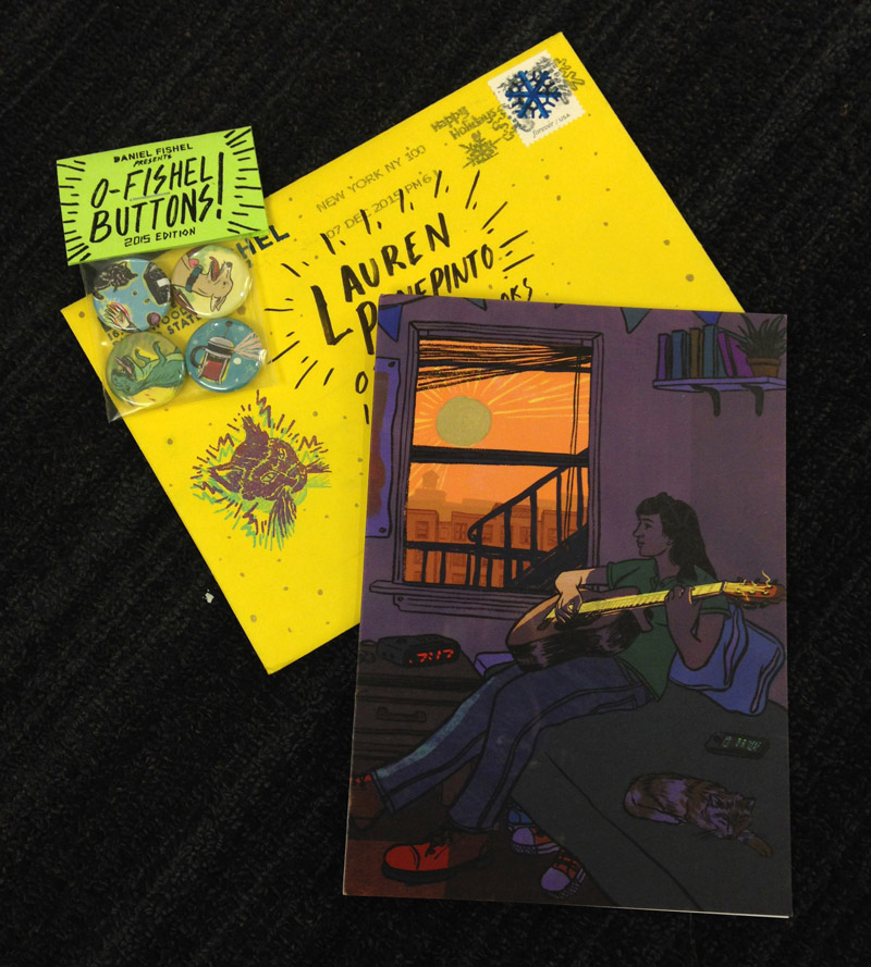
3—Mini Books, Mini Portfolios, Postcard Sets — kind of a mini portfolio, these can be a lot of fun, and a nice thing to produce to sell to fans, but also give away to ADs as promo pieces.
4—Creative Merchandise — fun toys, buttons, desk accessories, folded things…if they’re fun they have 1000% more chance of living on an AD’s desk or shelf than being lost in a pile.
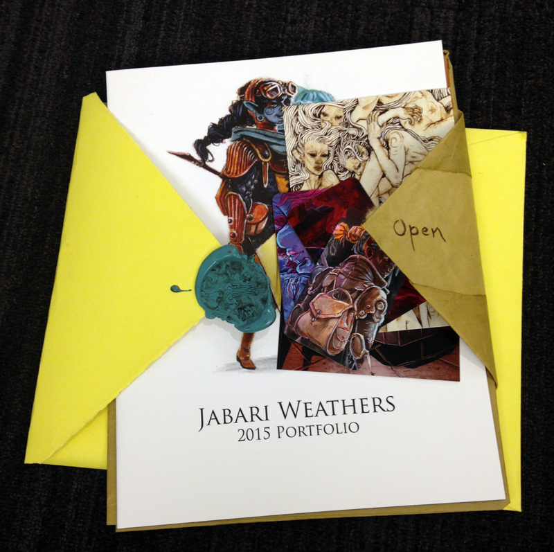
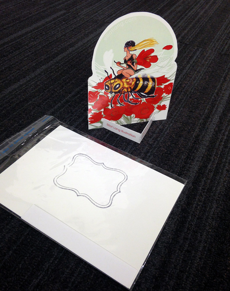
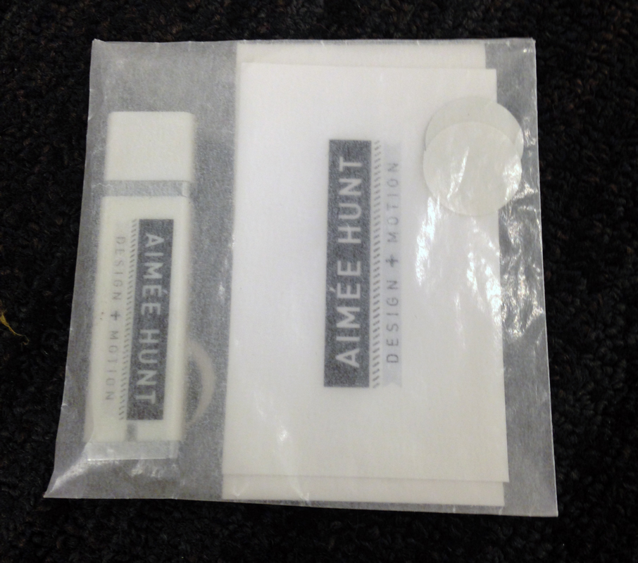
5—Multimedia — a flash drive can be recommended for someone working in video or animation mostly (for just flat images it’s a bit of overkill), but beyond that, the idea of using the cellophane envelopes as a way to put together a little packet is great.
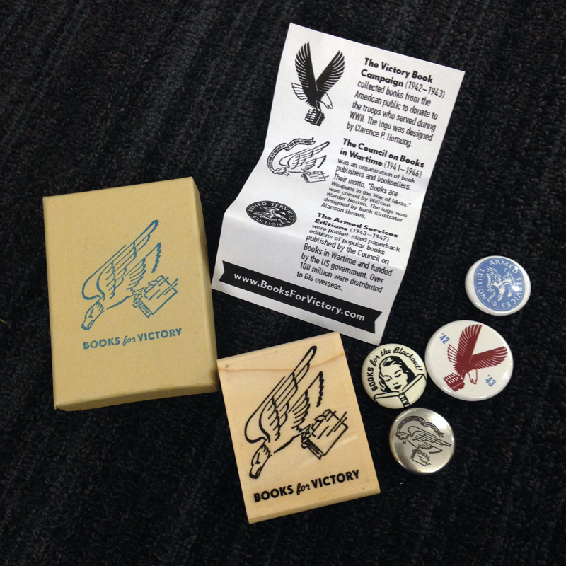
6—Personal Projects — If you have an interest or a personal project, you can send that as a promo. This is a side project of Andrew Brozyna did a ton of research about book donation programs during WWII and turned it into it’s own site and merch…then used it as a great promo piece to send to ADs.
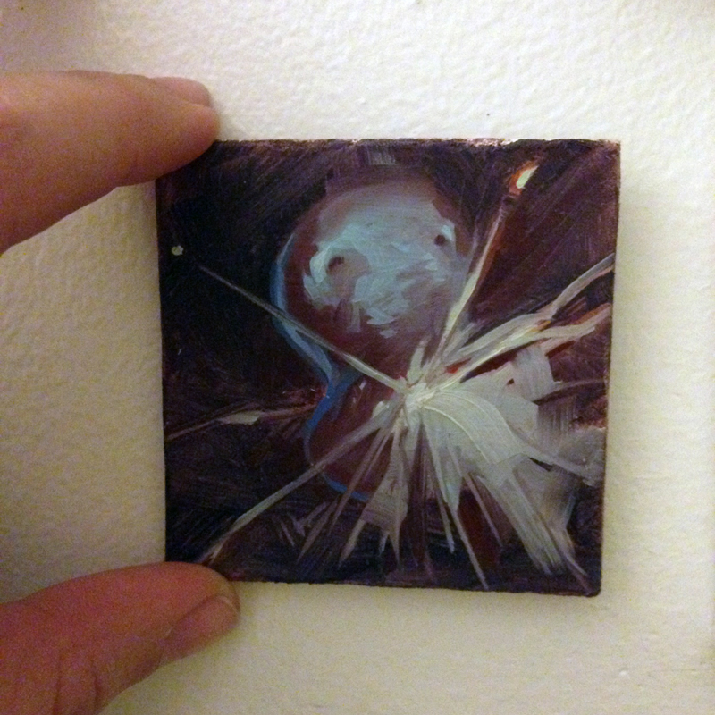
7—Originals — If you’re really trying to impress a few dream clients, then maybe doodle a bit on the envelopes, or leave room on the back of your postcards for sketches. ADs don’t ever want to imply we want gifts, but small doodles or little originals do tend to get a lot of notice and become office decor…where we see it every day, reminding us that you’re waiting for the next commission.
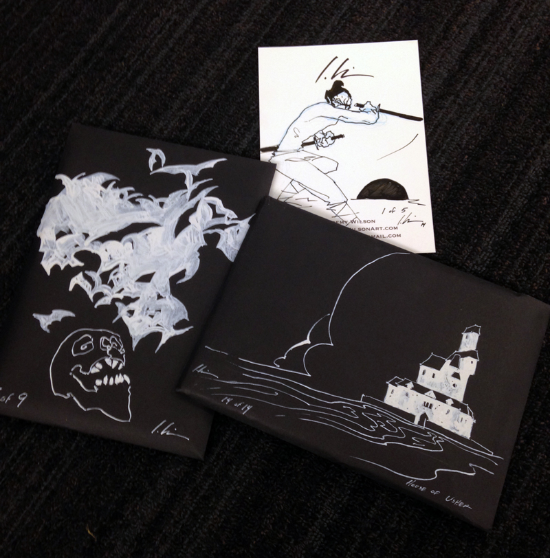 |
| Jeremy Wilson sends the best mail. |
 |
| Jeffrey Alan Love |
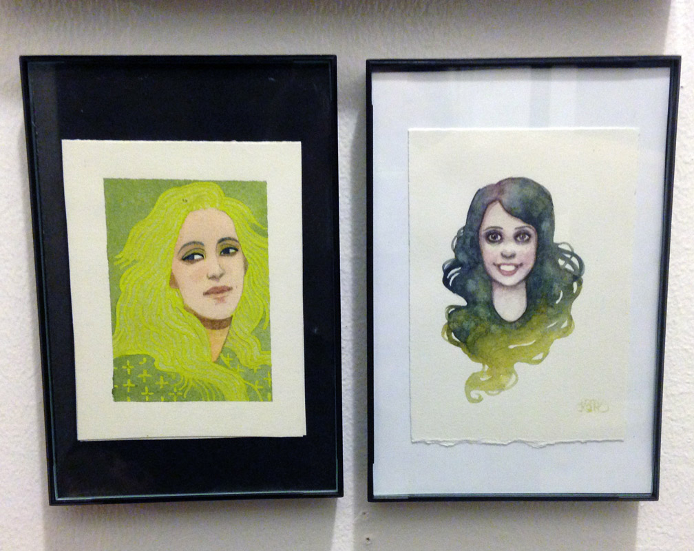 |
| Serena Malyon and Kelly McKernan |
 |
| Jeremy Wilson |
8—Book Design Specific — Have to give a little shout-out to the book designers and illustrators who have gone out of their way to appeal to publishing-specific ADs.
9—(Bonus Round) Thinking on your feet — Caught meeting an AD without your promo pieces? Well, if you’re fast on the draw (literally, groan) you can make a business card out of anything. I was out to lunch with an artist and another artist overheard that I was an AD, came over, and handed me this. I was very impressed with his MacGyvering.
So remember, there’s no hard and fast rule here, but remember to make your promo stand out it has to have great eye-catching art, it has to be legible and easy to understand, and it has to have a cool factor…either from your art or from the packaging. Or both!
Thank you to all the artists who unknowingly contributed their promo pieces to this post <3






Wonderful!
Great to see the diversity in approach. I wonder though how often the cool packaging translates into actual work. I had an animation director tell me once that he referred to a sample book I made often while he was working on projects…but he never called me for a job 😉
Mr MacGyver is awesome! Love that you took the time to compile these! It´s interesting and totally comes at the right time, since I´m making a flyer for myself soon. Great to see so many different approaches to self promo.
Very cool and useful, thanks a lot for the insight !
You have such an interesting blog. Thanks for sharing. I'm a self-help blog author and reading blogs is my hobby and I randomly found your blog. I enjoyed reading your posts. All the best for your future blogging endeavors. Please keep in touch with me in Twitter, @selfhelpnemonik
My thoughts exactly, it's fun to see the length some people go to market themselves (though I fail to see the point to these gimmicks), but without any actual info on who's been hired and how often, this article feels more like just and excuse to post pictures.
I can't imagine anybody on Muddy Colors feeling that they need an excuse to post pictures. Very fun and informative post. Thanks!
WELL! I'm full of ideas now! These are some really creative ways to promote yourself as an artist, but I really like the makeshift business card approach!
stimulation to your skin or any repetition at all and the SSL in the master soaps right into your Neu Serum Pro skin so it's just really great and the this matter the little biunique because it goes right down to your neck a little bit more so actually can use it as a net pack also out so the next one is are low and 11der waterfall and soothing .
http://bleusapphirefacialserum.com/neu-serum-pro/
you're welcome to email the artists and ask them. also, i didn't think i needed “an excuse” to post anything. I write about art biz. promos are art biz. also, do you know what blog you're on? ha, “excuse to post pictures”
Wonderful illustrated information. I thank you about that. No doubt it will be very useful for my future projects. Would like to see some other posts on the same subject!
success