Portfolios can be agonizing to figure out. What do clients want to see? We find ourselves thinking, “if they just knew that I can totally do dragons, they’d put me on their cover!”
No, actually, they won’t. The client is like you—they don’t read minds, and they won’t see your potential beyond what’s right in front of them.
I’ve compiled a list of basic standards for different types of portfolios. They are quite simple examples but they are not suggestions. These are necessary basics for what a specific portfolio should contain for an artist to get work.
A portfolio doesn’t need to be all things to all possible clients. Clients will be looking for all kinds of topics, so don’t worry that you don’t cover every subject they want. That’s fairly impossible.
However, if they see that you can draw horses when they need leopards, you might be able to peak their interest enough to stay in touch and show them future work.
A portfolio should be flexible. In other words, you can move samples from your fantasy book to your mainstream book if the job calls for it. Research your client to find out what they want to see, and what they buy.
Your book is a sample of what you can do. Precisely what you can do. It reflects your basic control of subjects and how you’ll handle an assignment. Obviously, the idea is to show your best work in the book, and certainly, clients assume that what they see represents your highest level of skill. They will not read into it and assume you will do a better job for them. Generally, your book is a deal maker or breaker.
Stay smart: they will not see your super genius just by looking at your coffeeshop doodles. Know that you can only convince a client to use your skills if you show them what they buy. But also stay practical. Your beautiful tabletop still lives will not get you a portrait job. Adjust accordingly.
Again, the list below shows basic themes necessary for a portfolio in each of the different areas. Though this is where I differ from most ideas about a successful portfolio: I’ve always taken the long view. That has provided a steady, working, and successful career. It comes down to this:
Starting out, your interest should focus on getting work instead of getting medals.
Strive for a book that showcases your skills, what you can handle, and show how you can handle that. Clients will be looking for that first and foremost. Let’s be honest. If a client wants award-wining artwork for their project, they’re going to go after award winners first.
But not every client needs that. Careers are built, not born. Yes, we’ve all seen amazing examples. Many of the stories you’ve heard about people “making it” without trying are exaggerated at best. Sure, there are the rare few. So what. Hint: you might not be reading this if it was you. It wasn’t me either. I’ve worked for every break I ever got. You’ll get them, too.
Bottom line: study what a client uses and publishes first, and adjust your work to reflect that. The client is telegraphing what they are all about. Recognize this. Then apply it to your portfolio. Your personal vision for creating work that ‘wows’ them is something you work towards, not something you spring on them. Not at first anyway.
Besides, it makes for a better story. Somebody that makes it because they’re gifted is boring not fascinating. There’s so much more riding on hard, focused work than some miracle of birth. Eventually you’ll learn to focus your portfolio toward the one or two things you do best, and get the kind of work you enjoy. That’s generally how it works…how it’s always worked.
As you read through these, notice what topics are shared by all these portfolio examples. Your work should be versatile enough in the beginning to handle as many as possible:
Figure work
Multiple figures
Room settings
Scenics
Animals
When you’re stuck deciding whether to add another landscape versus character, or another dragon versus a figure, always err on the side of the human figure, unless the request is specific. Clients will be more receptive to your skills at painting convincing people than merely monsters and “cool stuff.”
And my own personal suggestion. If you handle light really, really well…you’ll grab their attention to anything. It’s not just rendering that amazes. It’s the light.
Mainstream portfolio
A mainstream portfolio needs to cover quite a range, but is often editorial based, idea driven and cerebral. But it can easily shift towards specifics for advertising, book, or institutional clients.
- portraits x3
Do at least three portraits of someone instantly recognizable. One portrait is not enough. You might’ve gotten lucky. Two means you might’ve been able to copy the first one. Three pushes the idea that it’s not a fluke.
- multi figs
You’ll need a scene with multiple figures interacting. This easily shows composition capabilities, as well as staging and drama.
- scenic
Multiple figures in a broad landscape works doubly well.
- indoor
Necessary to show staging and architectural skills.
- street scene
Many assignments involve cities and typical scenes within them. It’s nearly unavoidable.
- autos
If you’re showing cities, you’ll need to demonstrate how you handle cars. They don’t have to be precise, but a client can use it.
- horses
Of all the animals besides pets, horses come up the most. For historical aspects, fantasy, sports, and sheer drama, horses have it. If you’re good at them, you’ll get work.
Science Fiction portfolio
A science fiction portfolio may seem restricted to Buck Rodgers-style images, but in fact they should be quite broad in appeal. SF has a wide range of aspects. Focus for: book covers, magazine work, calendars, gaming, conceptual work.
- multiple figures
In situ, in scenes, as above.
- figures in space suits
Figures in motion doing any number of spaceman things: running, floating, working, zooming, fighting, dancing, what have you.
- helmets
If you’re good at helmets, it portends how you handle tech.
- tech
Futuristic technology is a must. How you indicate it, how you design it.
- high tech indoor
Technology, indoor setting, with lighting. Very helpful.
- spaceships x2
You must show how you design, stage in a composition, and handle spacecraft. Period.
- landscape, planet scene
Preferably with figures in it, as above. Barren. Craters are good.
- alien(s)
Don’t get so bizarre that a client can’t tell what the heck it is.
Fantasy portfolio
A fantasy portfolio may seem open ended, where anything is possible. It’s best to hone fantasy images to a manageable range so as not to confuse a client, but to get them to remember. Focus for: book covers, magazine work, calendars, gaming, conceptual work.
- full figures
In costume x3
- fig in armor
Duh.
- multi figs
In a scene, interacting. Maybe on horseback. With armor.
- faces, character designs
Design characters that are unique, but reflect a sense of classic portraiture.
- dragon x2
Make them believable. Don’t give them butterfly wings. Don’t make them so complex a client can’t enjoy their anatomical structure. ‘Wow’ them with good animal form, but be practical.
- energy waves
Every wizard throws ‘em. Might as well get good at it because somewhere along the way, a fantasy story will need to show the magic stuff a character is nearly always going to spray around.
- scenic
Again, with figures, but this time with wonderful light, color, and staging.
- indoor scene
As above. Preferably in a castle, with multiple figures doing stuff. Not just sitting around looking regal. Think Lord of the Rings meets Shakespeare.
- castle
They can be boring or dramatic. Show them how it’s done.
- horses
What? You thought you could get away with no horses? In Fantasy?? See Multiple Figures above.
Horror portfolio
A horror portfolio has very narrow usage possibilities, but see this as opportunity to expand that range. (go read all of Greg Ruth’s posts) Focus for: book covers, magazines, calendars, gaming, conceptual work, comics
- faces x3
Do some horror portraits. Make them unique, but don’t overdo it.
- multi figs
A scene with figures doing creepy things or in a creepy setting, or both.
- indoor scene
As above, but in a creepy indoor setting. Treat this like you are designing a stage play. Include good lighting, good costumes, good makeup. Preferably with a staircase (to show that you can handle repetitious forms without boring a viewer).
- old house
You’re gonna want to have one. Because …cool.
- zombie
They’re still hot.
- ghost
How good are you at painting vaporous apparitions? Do this well and you’ll have their attention.
- cemetery
Always a good call as it can show how well you handle light across multiple shapes, and how spooky you can drive a scene.
- lighting
How you handle your light in creepy scenes, indoors or outdoors, is critical to your success.
Concept Art portfolio
Most of the portfolios above overlap in application and that’s good for an artist. Conceptual work is mostly confined to movies and gaming, but some of that work can be stretched for use in other areas. That’s because so many topics are needed in concept work. Much like a comics portfolio. Focus for: animation, live action, gaming, product design, toy manufacturers
- scenic
Like a location shot for a film.
- architecture
big bldgs and small intimate bldgs - multi figs
as above, but within a scene - character: full fig x3
At least three full figures, with costume design.
- character: facial x3
At least three faces to show emotional expressions.
- costume design
If you work it well, you can combine with the full figures.
- armor
Three figs in armor not to be combined with the characters above.
- street scenes: futuristic street, historical street
Handling historical vs futuristic will show your range.
- animals,
Mythologic animals, and again, horses. Won’t Pegasus be easier if you knew horses? How’s about Medusa if you know snakes? Centaurs, Minotaurs, unicorns, gryphons, etc.
- machines
One tank is not enough. One cool steampunk machine is not enough. Be able to repeat your successes.
Comic portfolio
Don’t restrict yourself to just superheroes, unless you have a burning desire. This field is burgeoning and stretching into many aspects of storytelling. Focus for: comic pages, comic covers, cartoons, gaming, product.
- character full figs x6
Real people, in street clothes. Show your costume design here, and you might include a few where they can see your anatomy at work.
- multiple figures
In a real setting, indoors and in natural, outdoor settings, interacting.
- panel pages
4 to 5 page sequence, show how you can design panels to read and flow.
- city streets, autos
Real cars, real buildings in real cities. You can include a lot of the suggested elements for this portfolio within these pages.
- animals
Horses, mostly…(seriously? you’re still wondering? This is a plus for any portfolio.)
- character faces
A dozen facial expressions, minimum.
note: superheroes are not entirely necessary, unless you really just gotta get into that.





Thank you for this advice! Time to draw horses. Or perhaps there are ways to cut corners here and draw anthropomorphic horse characters in groups, photoshopped into various locations 😉
Great post!
Useful information worthy of thanks ,
http://ixgram.com
That's great, Jeff…..I knew you guys would be coming up with new ways to approach your book. So, maybe add a few horse-people. In a setting. With armor. : )
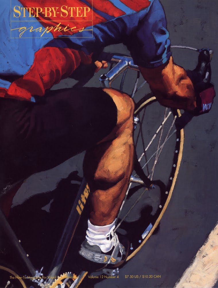
Thanks Greg. By the way great to see a flash from the past, your article in this Step-by-step magazine. I was first introduced to your work in this issue and was totally blown away. Cheers
I see that the Children's Market was not included in your list…rightly so because it is such a complex/diverse market.
I am no expert, but below are some of the trends I have seen expected of artists in the children's market. I organized them with the outline you provided, with one addition category unique to children (in my oppinion). keep in mind I put this together quickly and is probably not comprehensive and as I already mentioned I am no expert:
Figure work –
(various ethnicities , body-types, ages/age-level focus, emotions/facial expressions, postures,…)
Multiple figures
(families, friends, classmates, sports,… )
Room settings
(bedroom, classroom, frontroom, kitchen,… )
Scenics
(neighborhood, school-ground, camping, exploring, sports, downtown,…)
Animals
(domestic, local wild,…)
Imagination
(fears, awards/recognition, over-exaggeration, imaginary friends,…)
Seems like a lot of insane expectations, but I think in the end a lot of these choices boil down to the market you are aiming for…but at least in starting out they would increase your chances of getting started in the children's market.
Thanks a million! I was really out of ideas for what to put in my portfolio. You've saved me!
MIKE! You mastermind. That's perfect! Dang….wish I had thought to include that market, too.
Thanks so much for adding this. I'm sure the artists here will appreciate this.
And also, some images being used for Conceptual, Comics, or really any of the other categories can be pulled from to build a Children's market focused book.
Expertise is not needed here, Mike. Merely experience. That's how I'm basing my choices, too, shooting for basics. There may be a lot of variables in any of the lists.
But then, that's the field! Creatively juggling and producing artwork…
Thanks again!
Greg
Excellent read! Thanks as always for sharing your experience.
Thanks for the much needed list. Things are clearer now.
Thanks for these great lists! Very helpful.
Brilliant post! super helpful and funny! thanks Gregory!
I notice none of your categories have flying narwhal or armored pugs. Discrimination much? This is a great post Greg. Another steal for my students.
Hey Greg, any thoughts on the dimensions of portfolio work? I understand that some are already kind of set for you, like if you're doing a comic portfolio, it should be sized to a comic page, and book covers should be sized to book cover size.
But what about for the mainstream portfolio? Does it count against you to have a square image, or a very elongated one? Should I adhere to the exact bleed size of traditional books, or does a general 11×14 portrait image work just fine? Should I make sure I include a landscape wrap around image for a possible book cover? Or, am I just overthinking this?
Hi Nate, Good questions.
I don't think there are any hard and fast 'rules' here for presentation, but when looking at the market and what's being bought (you know what's being bought and used by seeing it on covers and in the store) the idea is first to mimc that format. Most book covers are vertical, so you'll want to mimic that. Some are wrap-around so including one would not be a problem.
Portraits can be used in almost any format, so whatever size is comfortable for you to paint it would be your guide. A client will look at whether you capture a likeness or give a portrait an interesting 'sense' of the person and will be able to find a way to use it, only if they like it.
The list above is a general outline. Are you overthinking it? Just a tad, but it's a good thing to think about. Trying to be completely 'original' in your approach is excellent, but in the beginning stages this can stall your ability to get work. Of course, some people do something and clients respond immediately and the artist is hailed as 'remarkable', 'amazing', and my personal unfavorite: 'genius.' Sometimes, people get lucky. Sometimes, they just hit the right note for the time.
But I would remind you that different looks and techniques appear based more on a combination of what's come before it, the taste of the time, and specific needs of the media. I love line-and-wash work, but in the 80's and 90's it looked old style. Now we are inundated with the same technique, i.e. line drawings filled with flat color, but this time it's digital and people respond to it.
That will ebb as well. I think you will find it immensely difficult to try to out-guess the market. That's why I suggest, as in the post, that an artist focus first on showing work that mimics the market, and acquire work from that angle. Once an artist is working more and more in the
business, they can get a better view of how they work within it, and also see ways to stretch and push their portfolio as needs arise from the work. This is the long view. This is the practical view.
But if you want to charge ahead with some crazy good style and grab medals right and left and amaze your audience and friends, and clients beg to bare your children, then sure…have at it! Or you might have that portfolio by your side while you have another portfolio that keeps you working and alive.
Lots of flexibility and diversity in portfolios. That's what makes them interesting.
Best,
Greg
Oh, and Nate…you might want to add a flying narwhal or two, and I understand that armored pugs are all the rage now. Or will be. Soon. I swear.
Just ask Bill Carmen.
(Personally, I think it's dancing wombats, but y'know…that's just me.)
Excellent, that is very enlightening. I'll take it all into consideration while I build my portfolio. Thank you, I very much appreciate it!
Funny, I wasn't previously aware that armored pugs were a bad trope haha. Fair enough, I'm off to draw horses instead.
Thanks again!
Hi Greg,
Can these portfolio set-ups also be used when submitting work to get an agent/artists rep to represent you?
Hey Mario,
When speaking to a rep, it's probably best to show them everything you can do, within reason, and start a discussion to find out what you can do together to push the work. They will likely have a different idea of what you should be showing, but it should be a collaboration. They can also help spot strengths you may have missed.
Again, err on the side of figure strength. The agent will know what clients are asking for, and 10 to 1, they need figures. Y'know…homo sapiens. Us.
: )
Amazing information !!!! I have read some articles about creating portfolios but this is the best so far. The specifications are so important for us to learn. Thank you very much
Thanks Greg. By the way great to see a flash from the past, your article in this Step-by-step magazine.
———–
شركة بسمة الرياض وكعادتها معكم تتشرف بتقديم خدمات غسيل المجالس بطريقة علمية ومجربة لضمان الحفاظ على الاقمشة والانسجة فاذا كنت تبحث عن يحافظون على مجلسك فنحن نضمن لك مع شركة غسيل مجالس بالرياض أفضل النتائج الممكنة فنحن نعتمد على عمالة مدربة ومجهزة باحدث الماكينات الحديثة لغسيل المجالس وجميع متعلقاتها حيث اننا نستعمل مجموعة من المنظفات العالية الجودة لضمان الحفاظ على الالياف الداخلية للمجالس فنحن لسنا هواة فى هذا المجال فلدينا باع طويل فى خدمة غسيل المجالس على مستوي المملكة العربية السعودية وبالاخص مدينة الرياض.
وحتى يتم القيام بعملية غسيل مجالس راقية تقدم شركة غسيل مجالس مجموعة من النصائح والارشادات العامة لاتباعها فى المستقبل والتي هي من اسرار مهنتنا وأولها هو الاعتماد على التنظيف بالبخار بشكل دائم لانه يحافظ على الاقمشة بشكل لا يصدق وضرورة استعمال بعض المنظفات المجربة والتي تعطي للمجالس رونق والوان زاهية بالاضافة للاعتماد على السجاد والموكيت والذين يمثلون مجموعة من أهم المفروشات الخاصة بالمجلس ويجب الاعتناء بتنظيفهم وغسيلهم بشكل دوري حتي يظهروا دائمآ بالمظهر الراقي الذي يليق بضيوفك شركة تنظيف كنب بالرياض.
This was one of the more useful explanations for what needs to be in a portfolio. A few good example portfolios would be nice, but overall A+