Prerequisites for this course:
Type 101 for Illustrators: Basic Type Tips
Type 201 for Illustrators: Artist Logos
Type 202 for Illustrators: Watermarks
Alright folks. I’ve given you some universal tips for dealing with typography in Type 101, and given you a lot of good artist logos and watermarks to look at in Type 201 & 202. I’ve seen many of you rethinking and crowd-testing your logos and watermarks (and starting to watermark if you hadn’t been) on social media and it’s looking good. Keep up the good work!
Remember, when in doubt, Less is More, and Keep it Simple.
Now we’re moving up the class levels to 300. Remember this isn’t a series about how to be a designer, it’s a series on how to manage type as an illustrator. If you want to do higher-level design then start studying design. Most of you illustrators are not going to like to hear this but you have to do logos and title treatments in Adobe Illustrator. None of this Photoshop type crap. No really. You need more control than photoshop gives you. You need to work in vector, not raster. It also scales infinitely, which is what you always need logos to do. If you’re going to go down the design rabbit hole, I recommend Lynda.com for program tutorials — especially if the thought of vector type makes you want to cry.
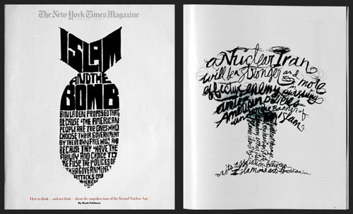
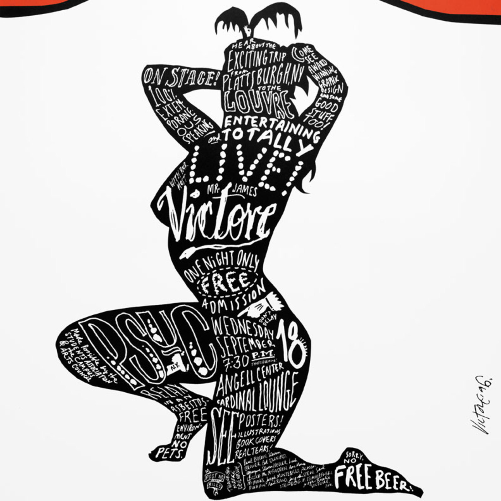
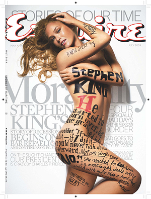
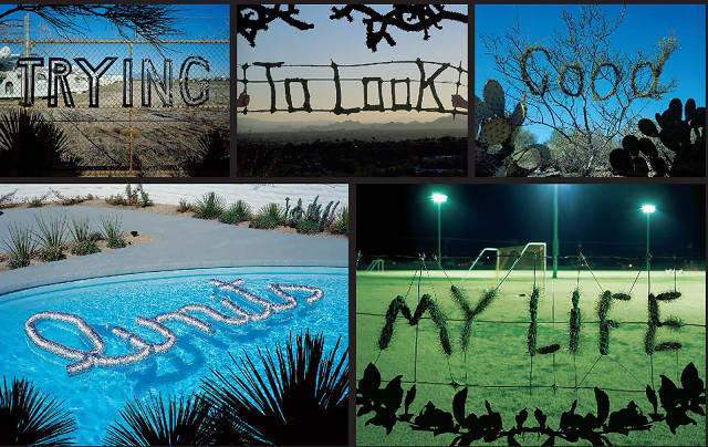
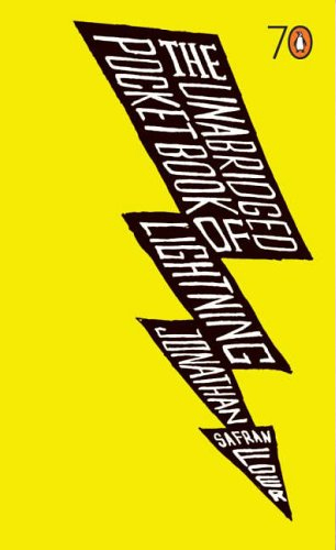
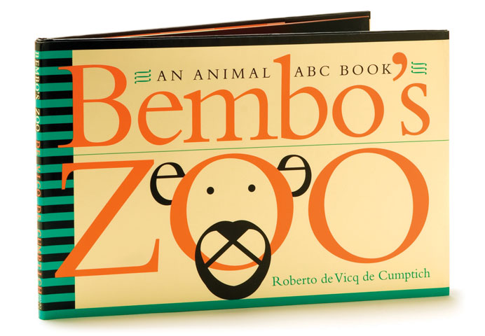
After you’ve got the program knowledge, then there’s type theory. Ina Saltz has some good solid type foundation videos on Lynda, and Skillshare has some great designers on it, James Victore and Genevieve Williams to name two who were my teachers at SVA. James is known for his hand-drawn type and is one of the artists that straddle the design/illustration line.
James Victore
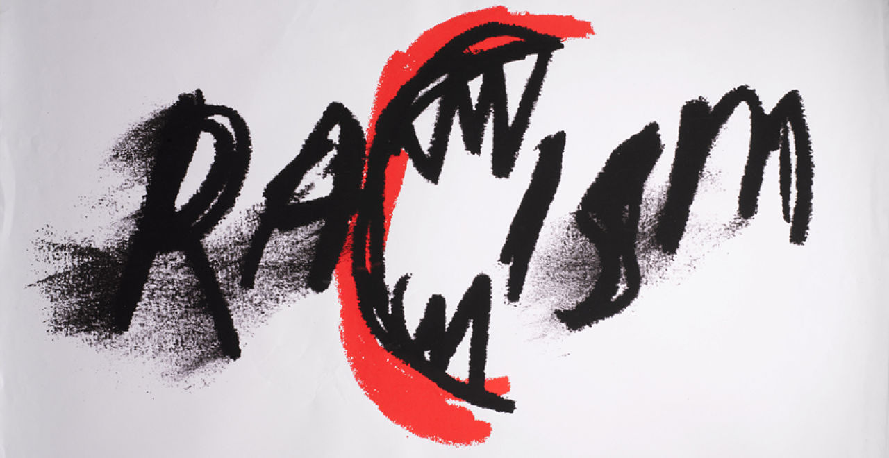
Stefan Sagmeister
 |
| (Yes, he really did carve it into his chest. Or actually, his interns did. And were scarred for life.) |





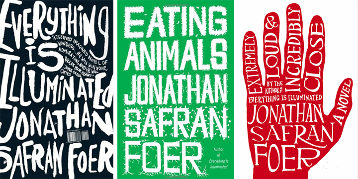
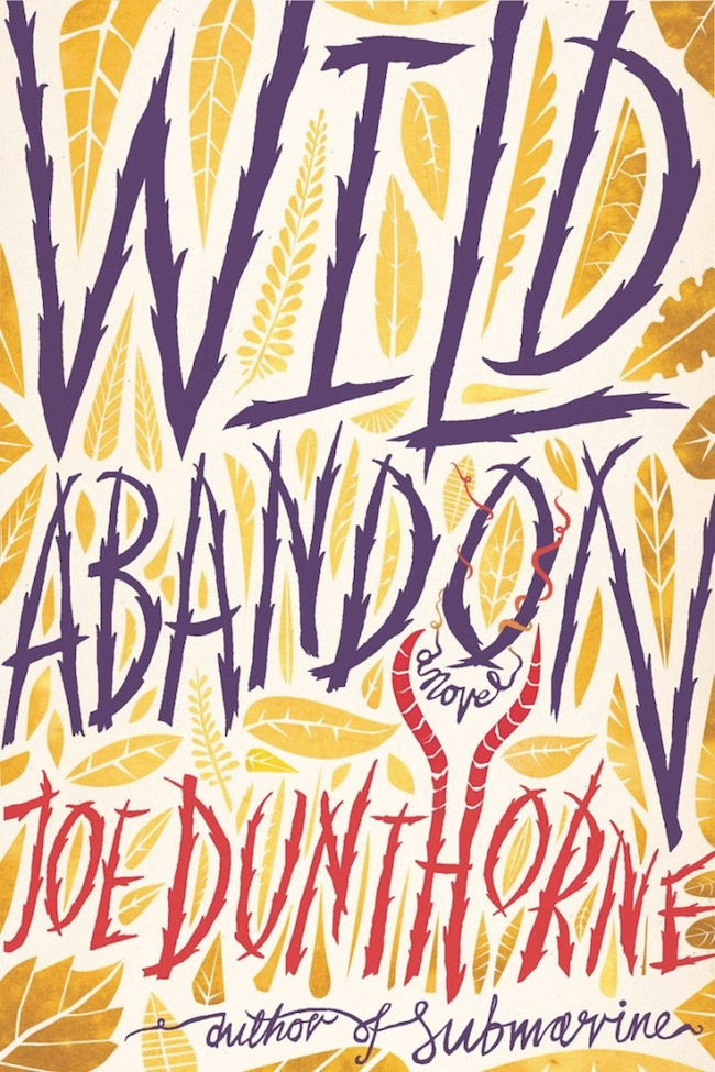

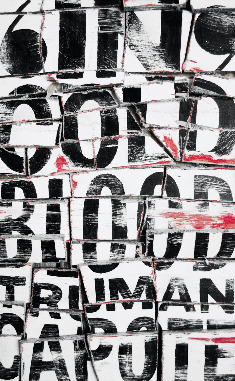
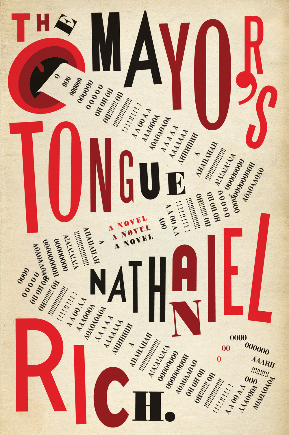






Great post! Thanks for sharing this!
-Chris Chuckry
GOD I LOVE FONT DESIGN
Good post and your advice through out this series, Keep it Simple is IT, otherwise it might be best to hand it off to a designer.
For the artists/illustrators who don't want to delve too deeply into type and design but need to tackle these things on their own your posts are just enough.
This post in particular reminds me a lot of The Daily Heller newsletter by Steven Heller in my inbox. I enjoy those too because they are just short enough that they digest easily for the non-graphic designer.
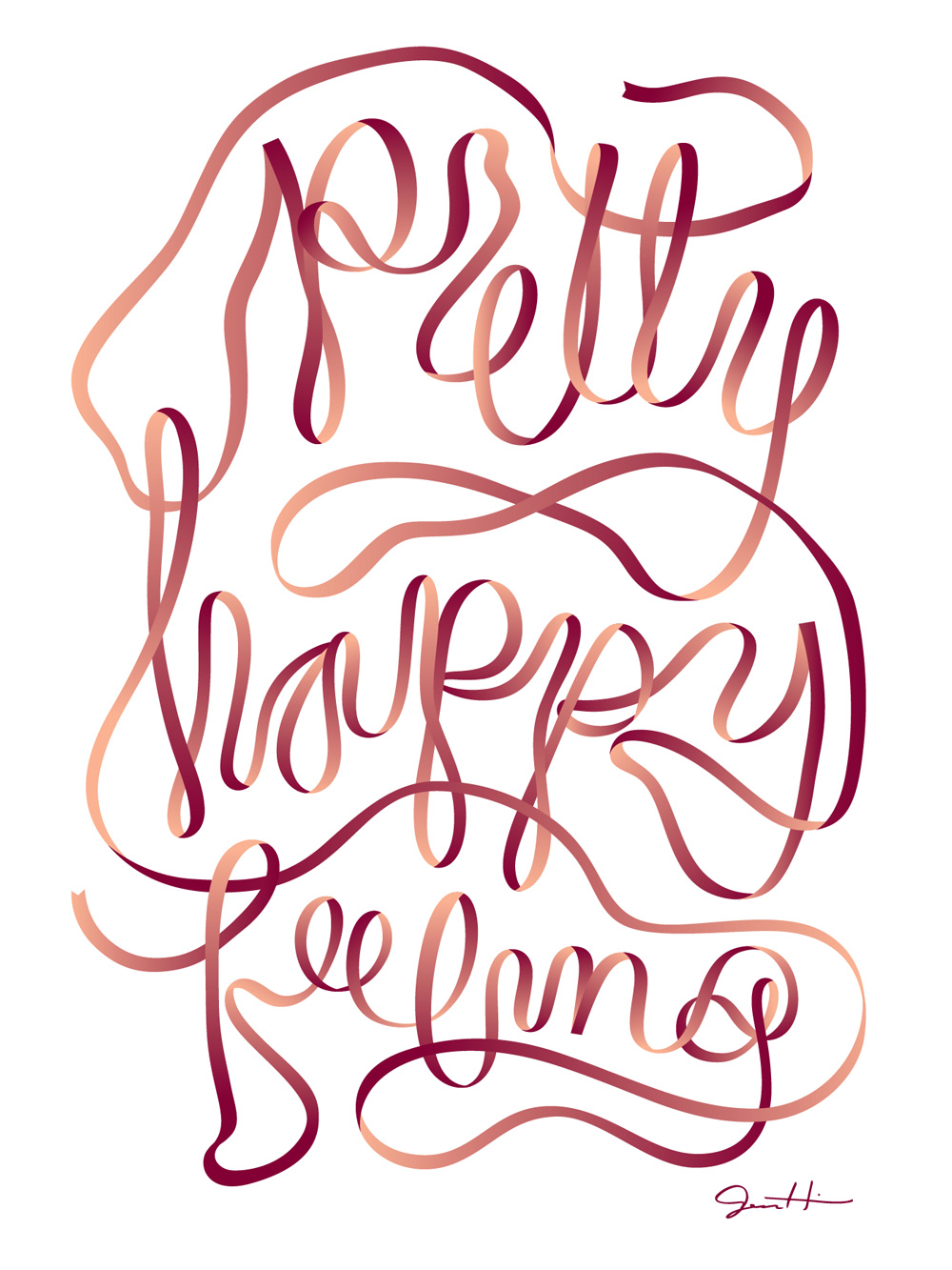
These are all great. The only one I can't make out is the octopus one — maybe it's in a different language? It looks like “Take A on sue”.