I was in Seattle last week, teaching my recent TLC Workshop on the illustrative use of Light and Color. Much of our class time was spent doing small exercises to help with our basic understanding of light, and how it can create form and mood. The last day was spent trying to apply some of that knowledge to an actual piece of art.
We looked through a slide show showing a lot of different artist create use of color to make an illustration more interesting. Artists like David Grove and Kazuhiko Sano came up time and time again. So for my demo I decided to showcase a method very similar to those two artists.
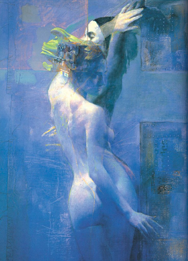 |
| Illustration by Kazuhiko Sano |
The painting started with a simple line drawing based on a photo I took. This particular process actually works a lot better if you trace or transfer your drawing (which both aforementioned artists did regularly). This allows you to draw the shapes of the shadows without actually filling in their value. This is important since the process is all about creating luminosity through the use of transparent layers and unique color choices. I did not have a projector with me, so I just used a graphite rubbing to transfer my drawing to the board.
Once the drawing was finished, I coated the image with a clear coat of Matte Medium. I mixed some Modeling Paste into the Matte Medium and applied it with a stiff bristle brush to create more substantial textures. These textures are hard to see at this phase, but will become more prominent as glazes of color begin to settle into the cracks.
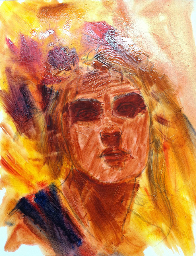
I started the painting with a simple wash of oil paint and turpentine. I applied it quite thickly and with very little fuss. This is where the all the real color selection happens. As the paint starts to stiffen, you can wipe it away with a brush, a rag, or more turpentine. This allows you to work reductively and actually use the white of the board to create the impression of highlights. Wiping out also has the added benefit of making the paint dry very fast when compared to working opaquely.
The first layer is pretty much all transparent. Because this process relies so heavily on the drawing beneath, progress happens very quickly. In fact, the majority of what you see here was achieved in just 2 hours work.
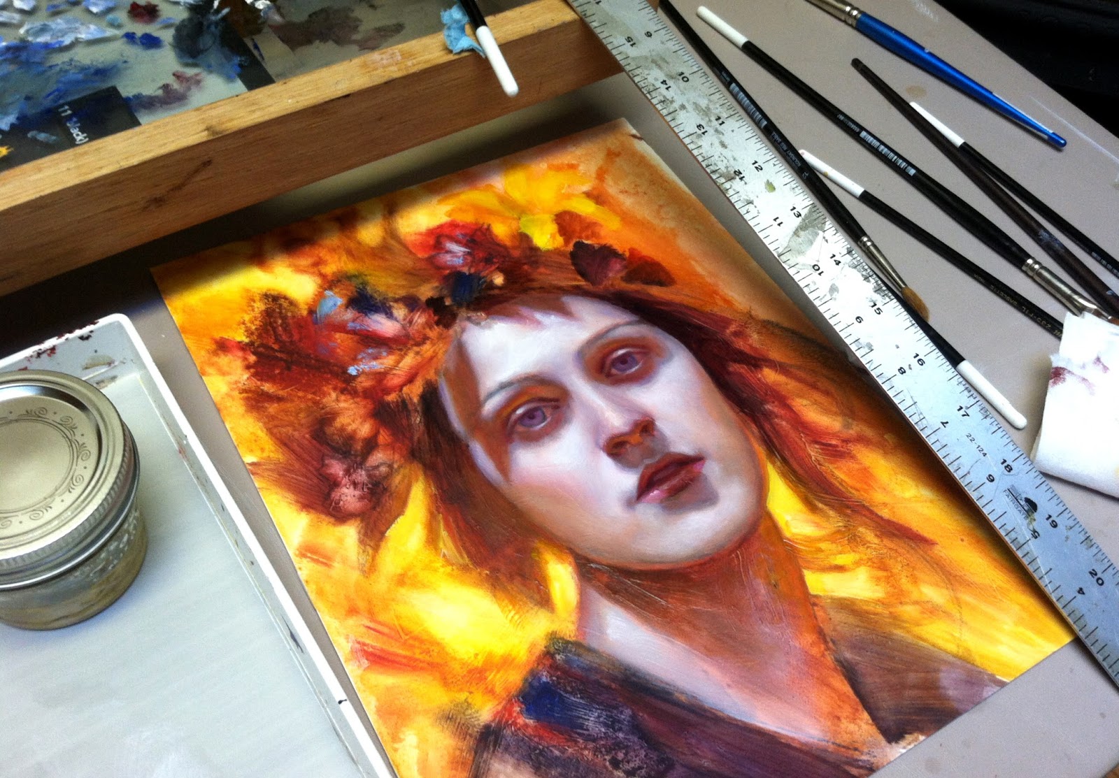
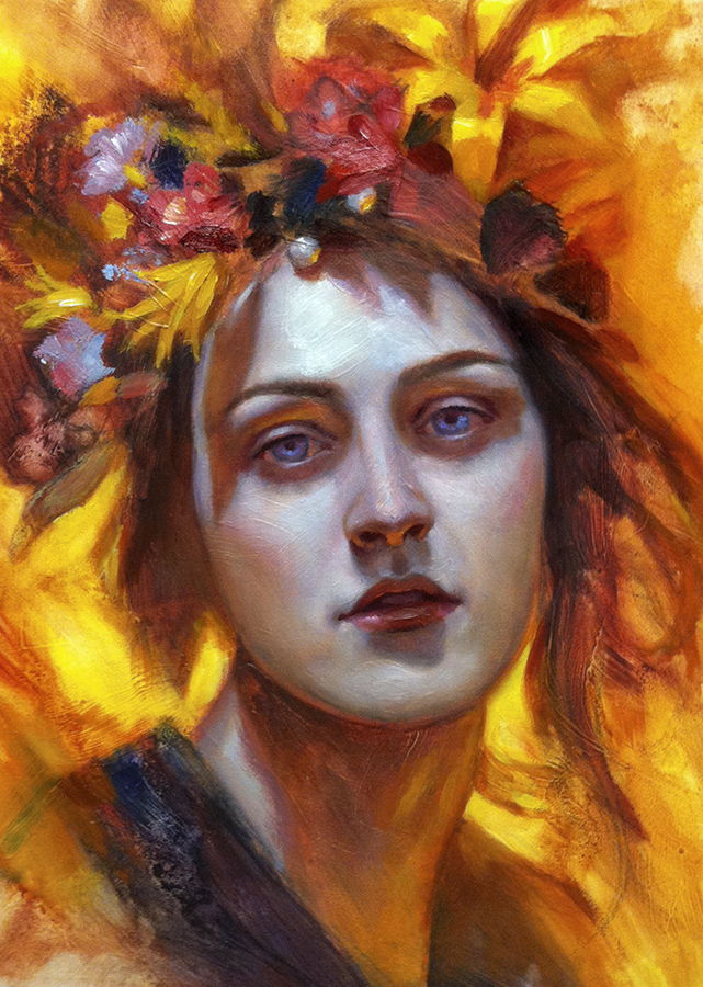
I liked what I had started in class, so I brought the painting back home with me to finish it up. I worked into the face with a little opaque color to create a more modeled and refined effect. Now you can start to see how those preliminary textures really show through and create the illusion of very thick paint, despite it actually being extremely thin.
This painting is still very much in progress (I need to do quite a bit of work to the flowers,), but I am enjoying the process of picking away at in my spare time. Most of my commercial work is much more planned out and refined. So having a small experimental piece that allows me try out some unfamiliar methods is a really fun reprieve. I will be sure to post more pics once the image is complete.
I will have this completed painting, along with several others, on exhibit at this coming Dragon*Con in Atlanta, GA.







Wow, just wow!
wow, love this painting Dan
Actually my first thought of this was it looked alot looser than your usual piece and having the one you posted here as done is already really great and a fresh look . Love it very much dan!
Thanks again for coming out to the workshop, Dan! I loved getting to see the early process as you painted this. And wow, just look how it's continuing to develop!