Over the years, some of my very favorite projects have been working with Henson properties.
In my experience, working with the Jim Henson Co. (along with publisher Archaia / BOOM!) is that their approach to art direction is unique. They are very much interested in the artist’s thumbprint on work that is technically licensing. Put another way, even though you’re working with existing IPs and characters, they are genuinely interested in the artist’s interpretation of the characters, open to artistic license, and not strictly following some kind of style guide. I’ve always felt like I’ve been given room to explore.
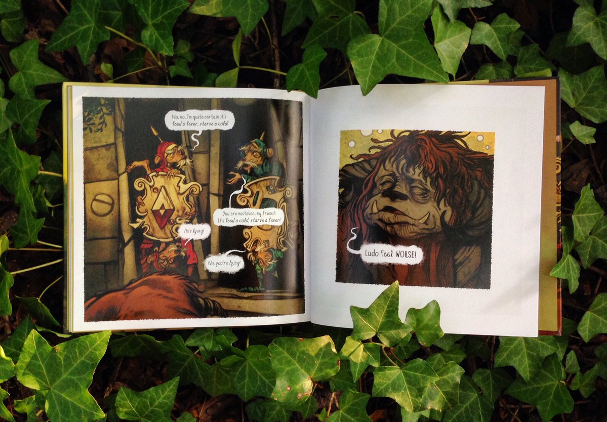
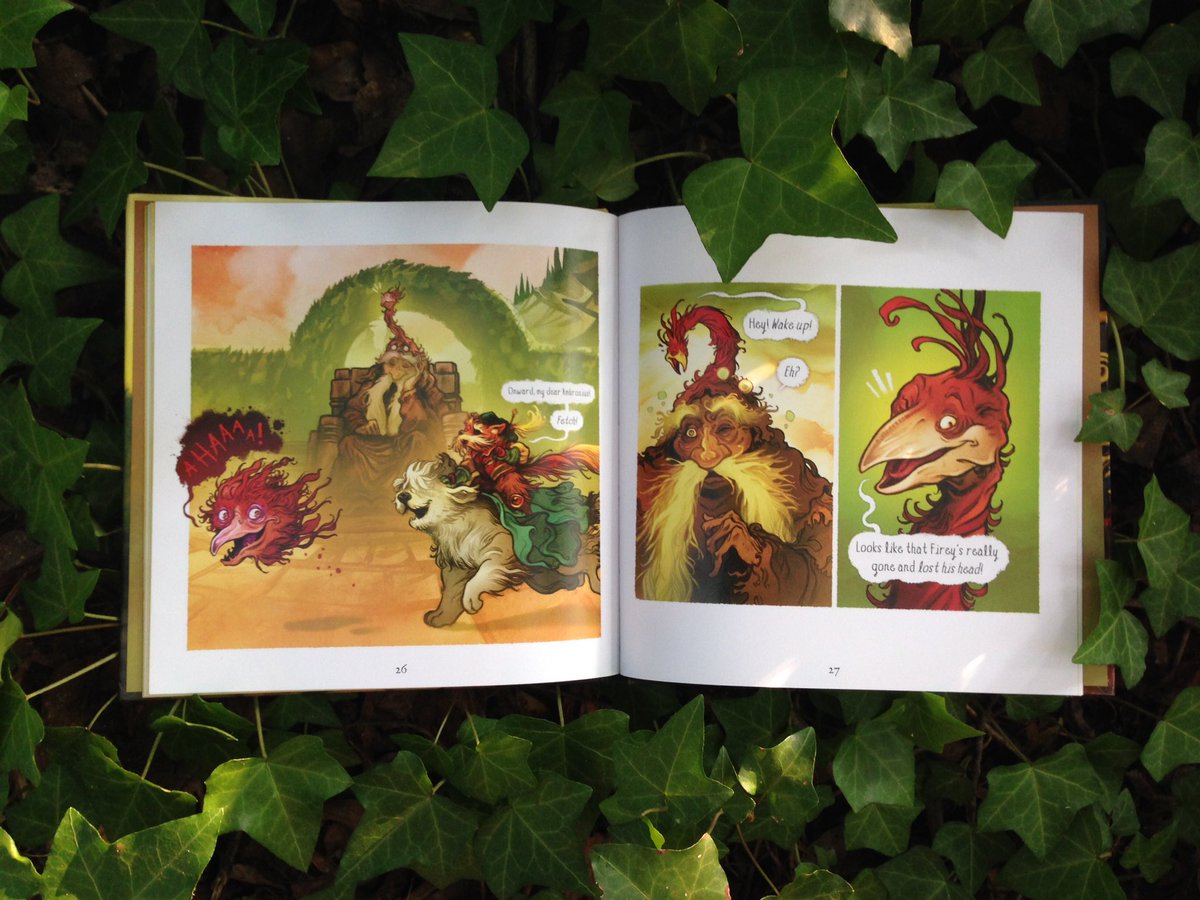
Because this new collection is a redesign of the 2013, 2015, and 2016 comics I wanted to go back through all my old work and dig up files to find the art without text bubbles and borders. In many cases we expanded on the original panels to better fit the page so more of the art is visible. This is a small touch that’ll likely go unnoticed but your eye will appreciate the visual breathing room.
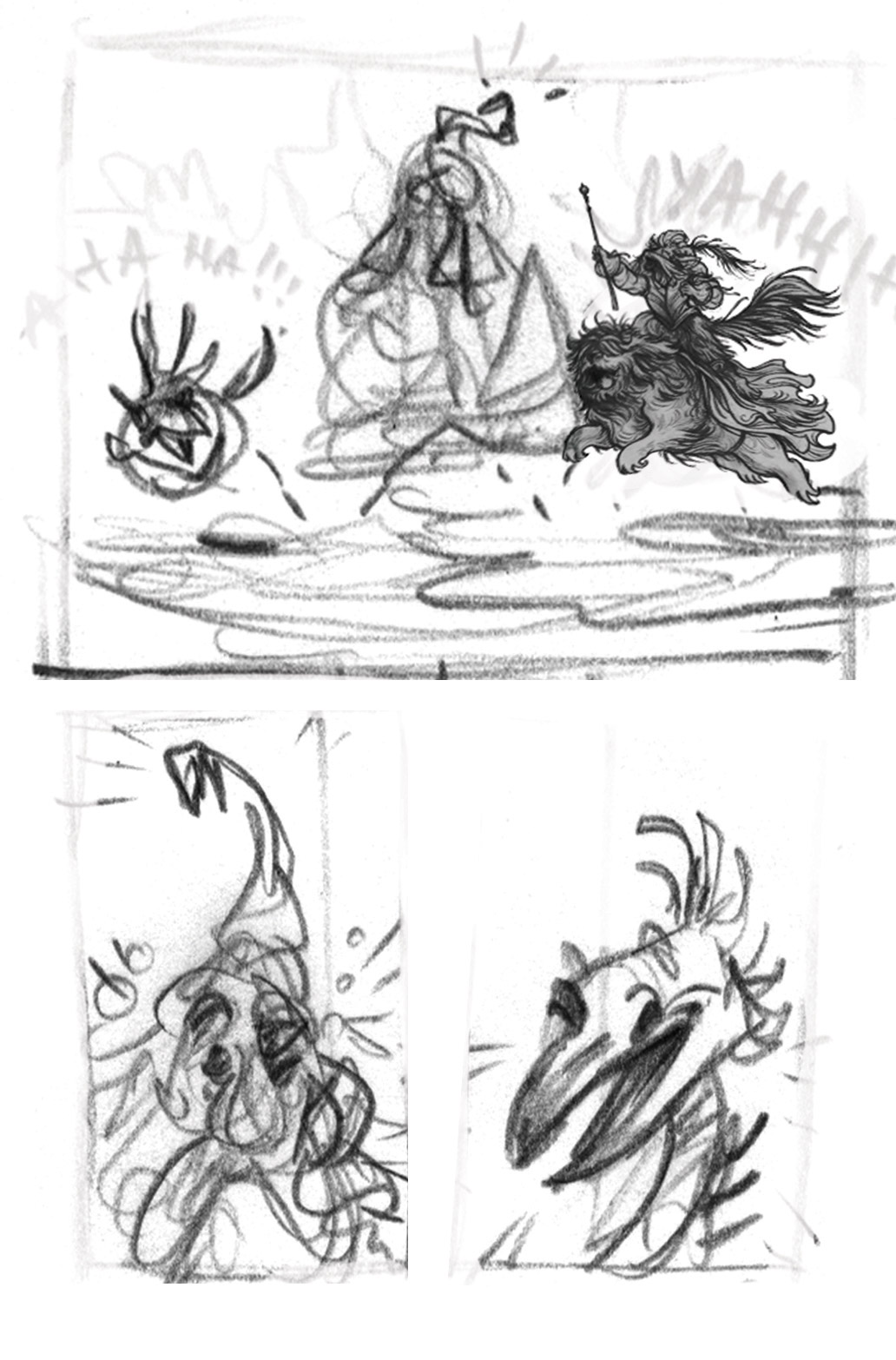
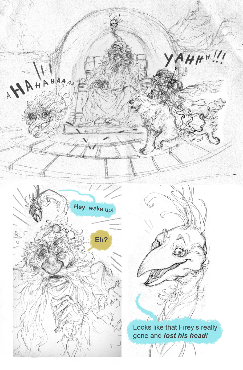
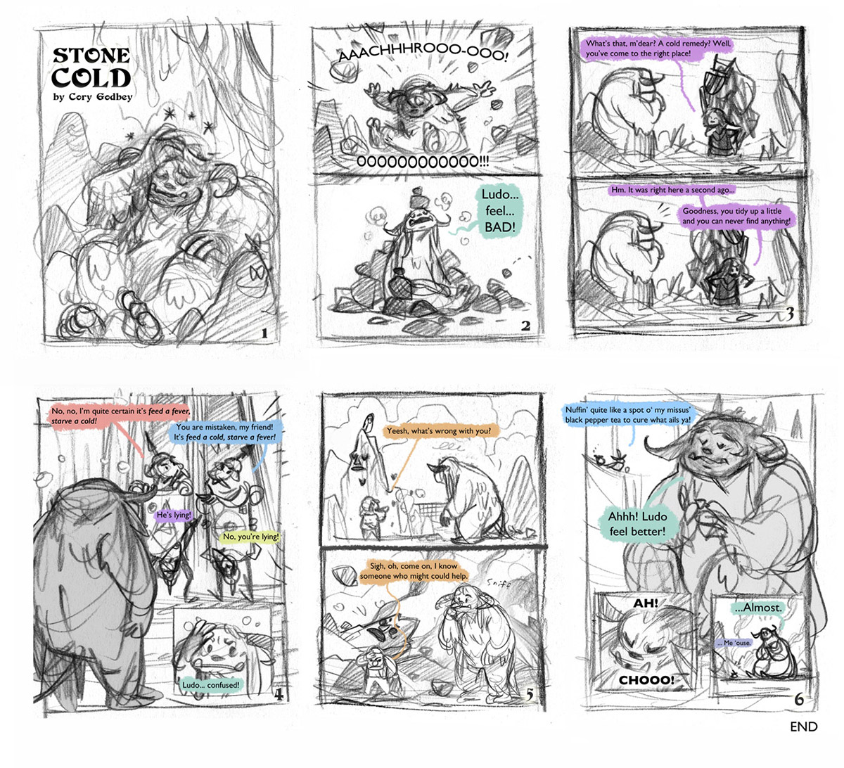
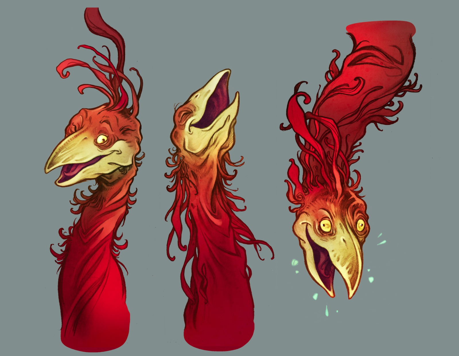
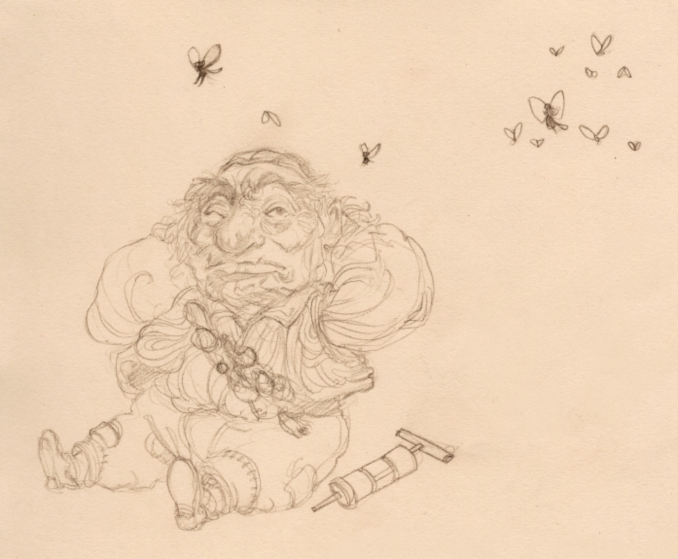
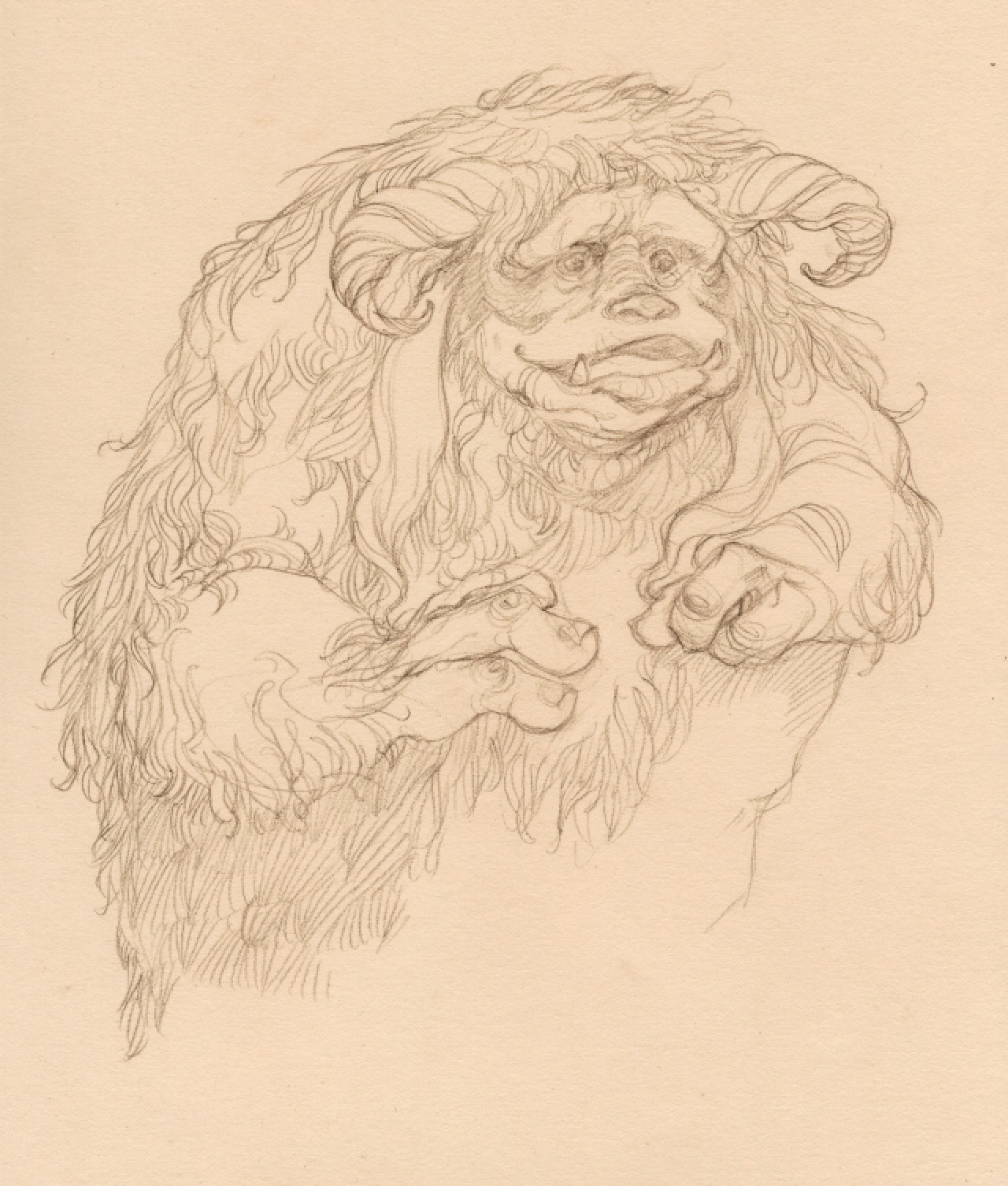
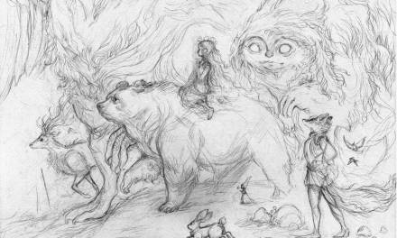
It was fun to troll through all the archives looking at the sketches and prep work that went into each story.
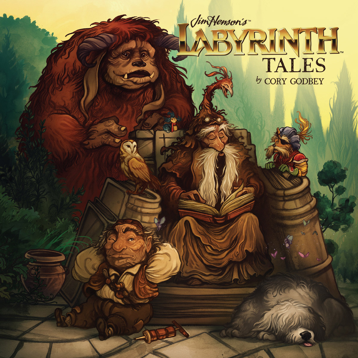
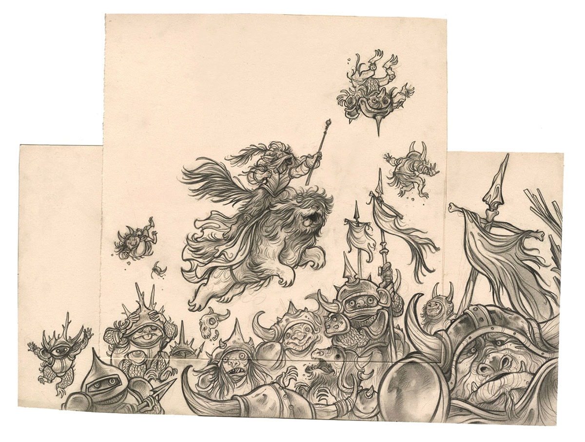
The cover for the book had to come together quickly. Speed and flexibility in my composition were my two main goals so I drew and painted each figure separately.
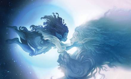
Here’s a look at the full version of the final cover. While I planned the piece around a square composition, the image actually extends a good bit. Bonus, one of those pesky Fierys didn’t make the final cut.
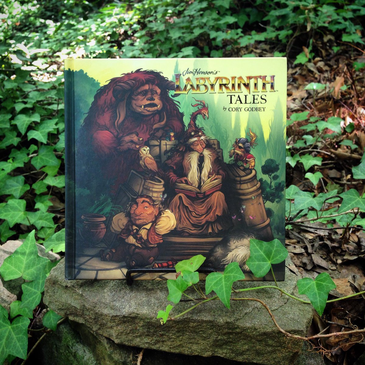
Labyrinth Tales will be released on September 27th. Available at bookstores or you can pre-order your copy here!






Hi there,
Is it possible to have tour labrinth book sent to australia if i pay pre order?
Thanks 🙏
Chelsea