by Howard Lyon
I had a card released as part of Magic: the Gathering’s Conspiracy: Take the Crown release.
The idea behind this card, Emissary’s Ploy, was to present a character casting a spell that for all appearances is good, but it is a deceit.
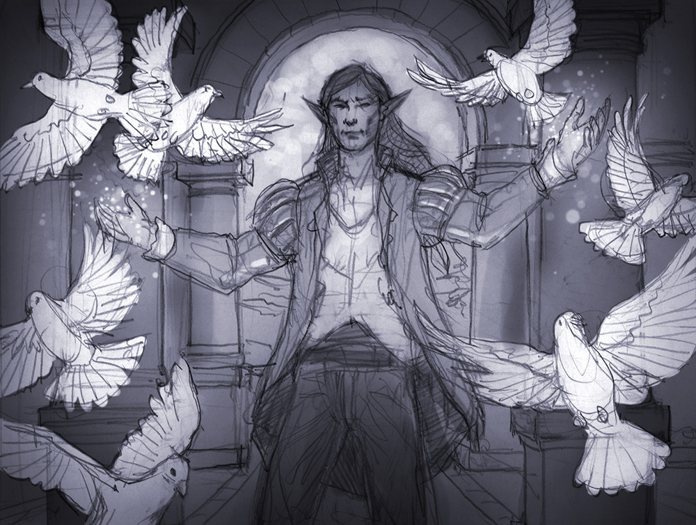
Here is the sketch that was approved.
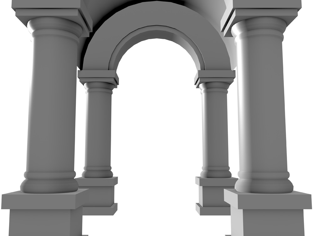
I have really come to like using Blender as a tool for architectural elements. It is powerful and fast for creating something like the archway in the background. Sometimes I will build elements out of wood or foam-core depending on my timeframe, but Blender often fits the bill and it is free.
I designed out the stained glass that will frame the head of the character and the dropped it in place.
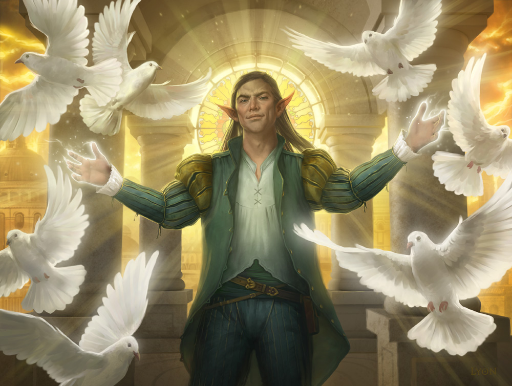
And the final image:
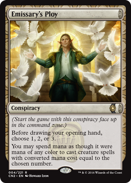
Here is what it looks like in card format. When designing for MtG, it is especially important to keep the final size in mind. The artwork needs to have strong shapes to real well as print size.
An animated GIF of the painting steps. You can see at the last stage the color of the magic change as well as the character’s face and build. This was per the direction of the excellent Cynthia Sheppard at Wizards of the Coast.
Thanks for giving the post a read! If you have any questions, feel free to ask in the comments and I will do my best to answer.
Howard Lyon






Very lovely composition, Howard. I really like the lighting and all those doves! His sneaky smirk is just perfect too.
My question for you would be what were the other sketch choices that were eliminated and why? I'd be curious to see your variations. Thanks for sharing your process!