This elf-illustration is for Magic the Gathering Commander set 2016. I was giving a very simple ar description asking for an elf of my choice in the middle of barrying 2 glowing amber eggs in the forest floor. One egg with a spider, one egg with a snake. The elf should be male.
Two things emidiately came to my mind: I am gonna do a strange elf, since I have free hands and this must be a night scene or I cannot show the eggs glowing well.
With these 2 things to go by I started sketching. The ideas I had and tried in thumb stage was more or less the elf guy digging with a showel like he was digging for worms to go fishing. None of the poses seemed serene and elfy enough for my taste. So I tried some sketches where he was sitting in a crouch position but they also seemed to focused on the actual stuffing the eggs into a hole. Or some looked downright like he was shitting in the forest. Not the immediate read I was going for.
In the end I reached a sketch in an angle I would almost never use and that I always avoid: the profile. I think I have been so much used to do action pictures that the profile just never occur to me as something possible. In this case it solved all my problem. The angle seen from almost directly from the side creates the stillness and mood I was looking for. He is not trying to hide these eggs or hurrying up before some one sees him and steal his treasure. I wanted it to look like a ritual thing, a magical act rather than a physical. This pose did that to me without breaking out of the boundaries of the art description. To be honest the whole digging thing was solved mostly by placing a shovel near him.
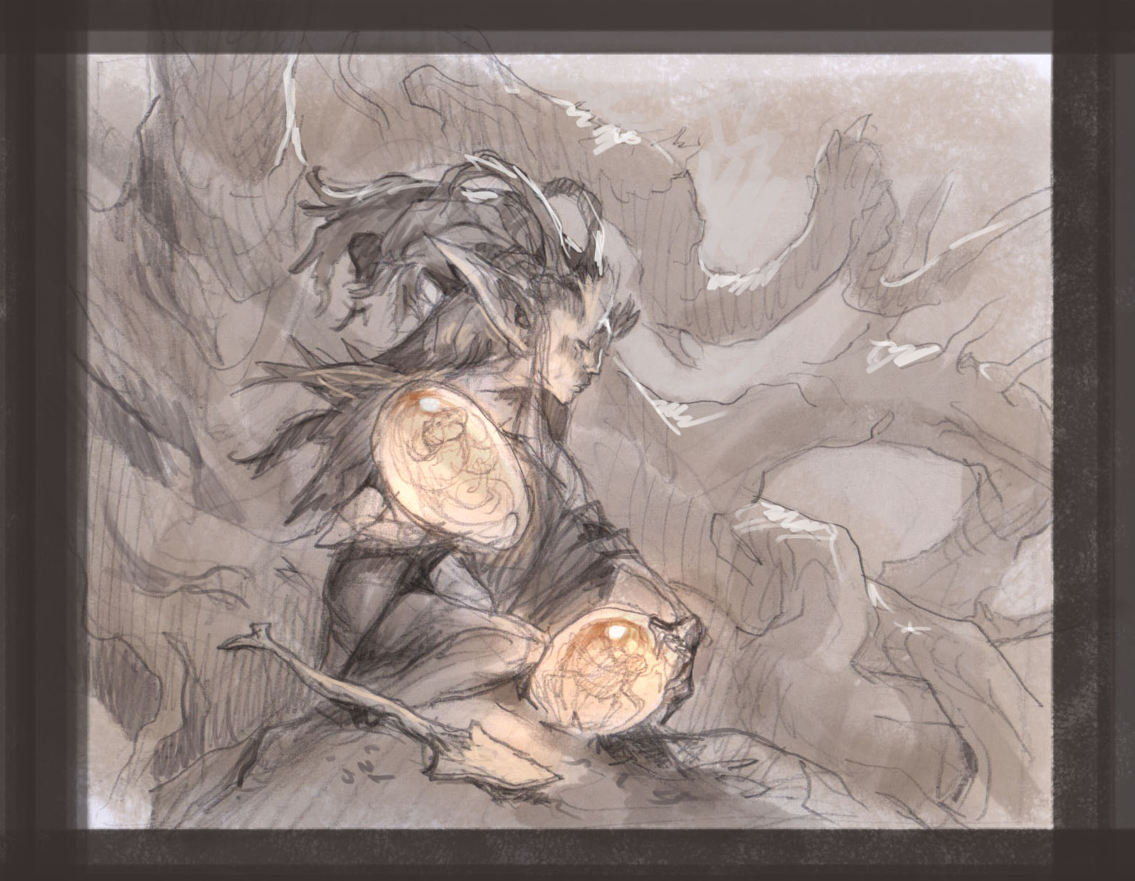 |
| Thumbnail sketch |
So The thumb was sent off and approved and I started sketching the figure. The only change the Art Director asked for was to make sure the he did not have horns.
I ran my head into a wall with this pose. After different tries I found out what was bothering me was that he was seen too much from above. It created more of an establishing shot than a scene where you were being dragged into the piece. There was just no reason to have it seen from above. So I switched the angle to a lower position. I needed inspiration for something that gave this pose a bit more interest and skipped through one of Claire Wendlings sketchbooks and found a sketch to directly steal the legs from. ”Thanks Claire” I remember L.LCool J once said that: ”a good artist only steals from the best”. I always think of that when I am using others for ”Inspiration”.
The angle of the head was now seen from bellow and I used the new position toe emphasize the brows a lot having them point far out of the silhouette of the head. I deliberately wanted him to look feminine to the point of androgyny so I cleaned features in his face up a lot and painted him very smooth and feminine. The gesture, the long hair and the feminine pose of his hands has made a lot of people calling it the elf girl picture.
I think the doe ear, the insane brows and the long hair makes him stand out from the rest of the elves I have done.
 |
| Black and white ink version with black acrylic values |
I wanted the background to look detailed and rich but with out taking up too much attention. I treated it like a tapestry. Lots of shapes going in and out of the picture but with the same shape language and almost the same contrast and value so that they would blur into a whole.
As always I ink the whole image and get ready for painting by planning it all out in a color rough. This time the rough was done digitally.
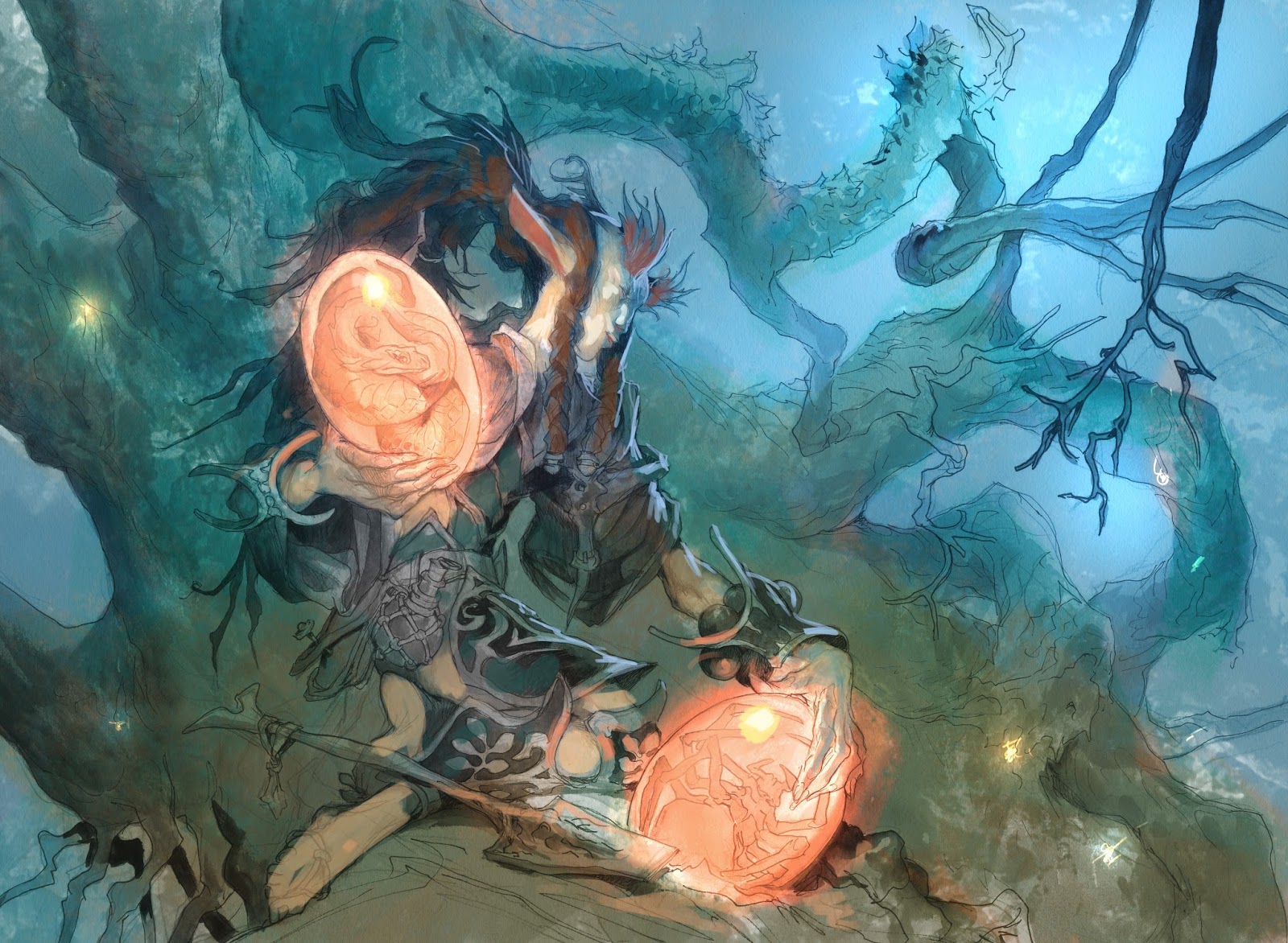 |
| Digital color rough |
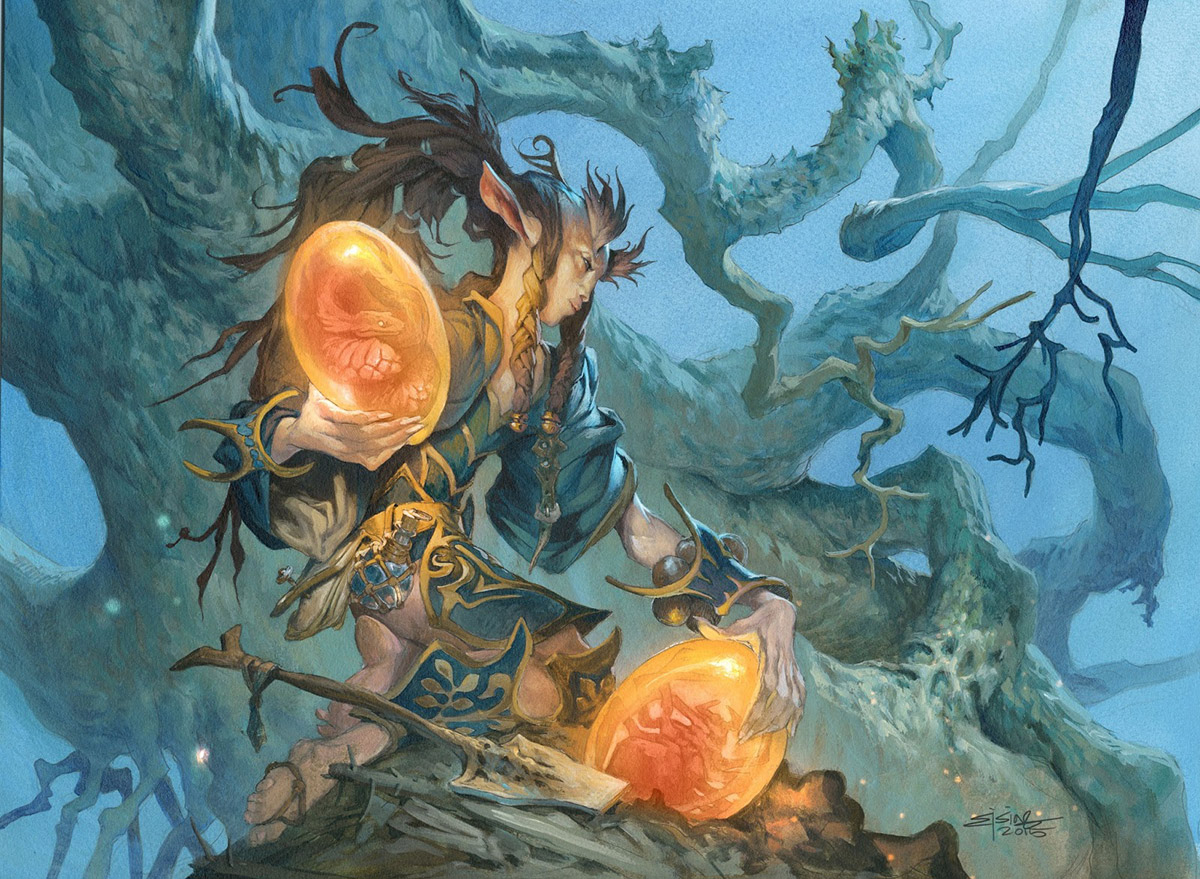
The final painting is more or less a direct translation of the rough. I didn´t masked out the figure but washed the whole background in blue, soaking up the color in the face and the amber part with some tissue paper. Then I finished the background completely and moved on to the figure. I think this is a classic example of how I use cold and warm colors. Everything directly pointing towards the moon light gets cold bluish tones, everything close to the eggs gets warm and orange light. You can see how the green color shifts from warm to cold in his green sleeve as an example.
I have been asked if I started using 3D when this picture came out. I understand why I got the question. But it is a clean example of how 3 dimensional you can get a painting to look if you are simple and clear in the temperatures and use a limited palette.


Wow, one of your most 'magical' paintings! Intense depth with the warm / cools and the styling of the elf is very exotic. Love it!
I learn a lot with your posts Jesper, really thanks!
Very interesting and inspirational!