A painting needs to breathe.
You keep pounding on it like that, expecting the paint to come alive by itself, and you’ll stress the pigment, creating the inevitable muddy color. Ahem.
When working with my students, I’m constantly trying to simplify the concepts of good painting to get them to understand the process without worrying about it. In other words, to achieve good painting like good breathing. An almost effortless approach that feels natural for the mind. I want to de-mystify the process that at times can appear hopeless, as if one can never achieve what they want.
The purpose to explain painting is not to confuse and obfuscate through clever analogies and complicated observations, but to keep it simple enough to understand and thereby reach a sense of comfortable effort. To seek a direction that allows growth and discovery while building experience and later on, strength.
Painting is a complicated process to be sure, but isn’t necessary to understand it all at one time. If someone had told me I needed to slow down and study in my early stages, I wouldn’t have believed them and I would’ve skirted every attempt at learning painting in steps. That seemed like agony to me, and after all, I was in a hurry to learn.
Being forced into a step-by-step series can be irritating, and in the beginning I avoided that, trying my best to blend as many learning aspects into simple, direct moves, so I could leap over all the struggling parts. So I dove in, hoping I was advancing without the trial and error, without the success vs failure endeavor. Actually, we all do. Oddly enough, I found that’s part of the process, too.
I also found that one can’t really leap any of those parts. They will almost certainly demand attention at some point along the way to getting better. It’s a matter of when one is ready for them, and when we are, the learning can be swift and succinct.
The aspects below are in a sequence of priority. As you paint, keep them in mind. When you get into trouble, stop, back up and work from the top down again, correcting for each item as you go. The problem will be in one or more of them. You’ll find it.
Value
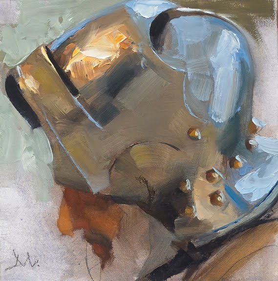
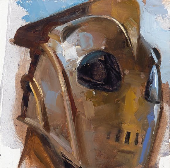
Value first and foremost. Images are recognized first through value. Any problems that occur will likely be solved by value shifts. Train to get accurate at it. All color mixing rides on observing value first.
Shape
Next comes shape. Once the value is accurate, the shape takes over to reveal what you are showing. Line can describe shape, of course, but value and shape can do this work together.
Silhouette
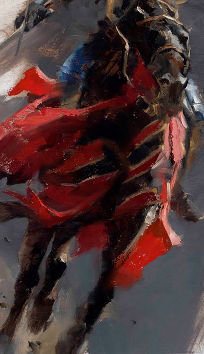
Knowing how each element should be described, or to be specific, to get a horse to look like a horse, you’ll need to examine and show an accurate silhouette that makes visual sense. Does it project ‘horse’ or does it look like a growth on the side of a humpback whale?
Contrast
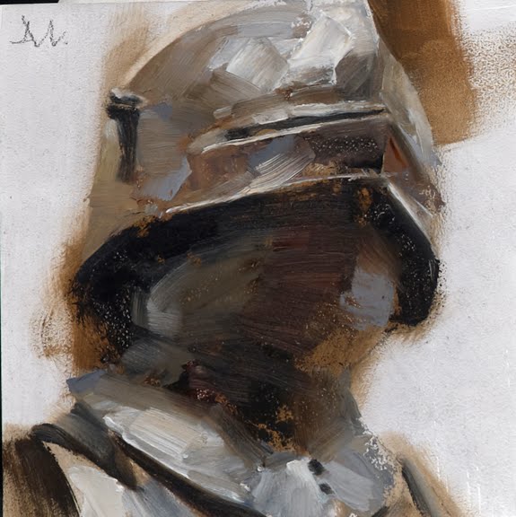
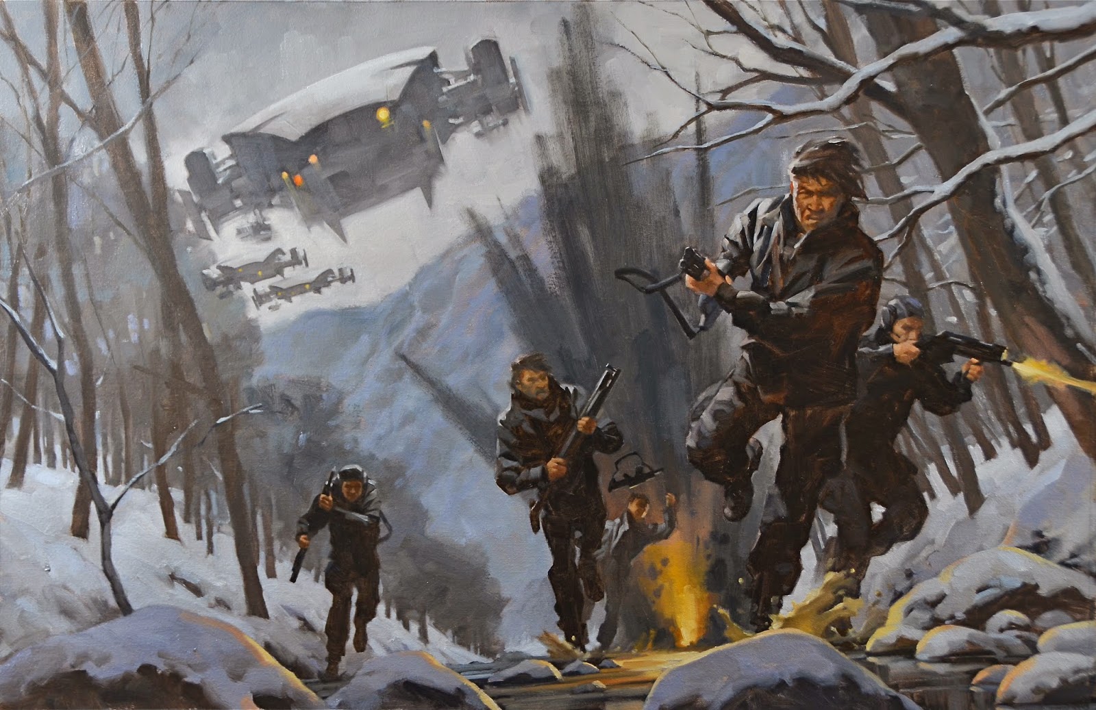
Controlling contrast next can help accent or push back a good silhouette. How much does the element need to be seen? Does it blend with the overall image or stand out too much? Contrast can be used with value, or color, or light, scale, body language, facial expression, etc.
Edges
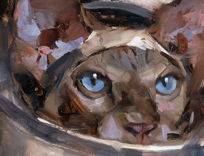
How an edge is controlled can determine whether we are looking at skin, fabric, wood, or even how we perceive depth in a painting. Soft-focus drops back, while sharp-focus comes forward in a composition. Combine them both in an element and it builds interest. And solves a lot of focus problems if controlled well.
Color
Lastly comes color. If all the other items above are considered, it will simplify what the color needs or wants to be. Almost like grisaille, or coloring a photograph, if the values and shapes are in place, the color can be whatever you want it to be. But again, correct for value first. Then color.
When you get to actual painting, keep your mind at ease. If you really need to shorten this list even farther, go with Value, Shape, and Color. Every element in a piece is controlled by these three.
Pigment will do whatever you tell it to do. Stay focused all the way through and learn what to tell it. Concentration is natural. The life it needs will come from your skills.





Thanks again Greg. Time for me to work on my values!
cor that was beautiful, almost poetic thank you
Great pointers. I'm currently working with only burnt umber and white for my portraits. It helps me with values and eventually with color later on.
Thanks! But this is whole. And what about technics?
Thank you so much!