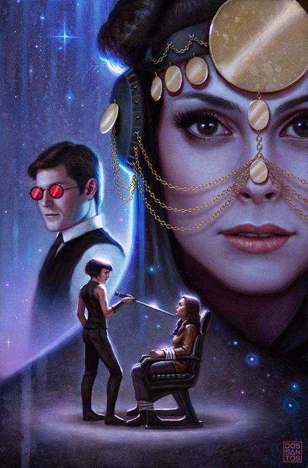
Here’s a cover I did a while back that finally hit the shelves last week. This cover is for issue #3 of the new Serenity series ‘No Power in the Verse’, by Dark Horse comics.
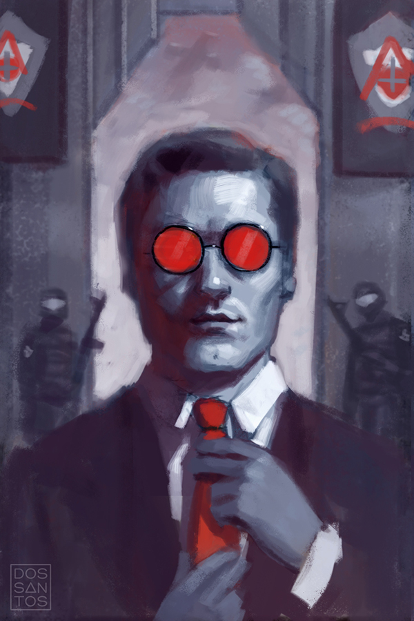
Instead of always giving Captain Mal the limelight on ever cover, we try to mix it up and showcase different characters on each issue. For this particular issue, the Art Director asked that I highlight Simon, but it ended up that Inara sort of stole the show in the end.
In this issue, Simon wears his iconic red glasses (as seen in the first episode of the TV show), as he sneaks his way into an enemy compound through subterfuge. The combination of the red glasses, espionage, and the militaristic setting got me think about old communist propaganda posters for whatever reason.
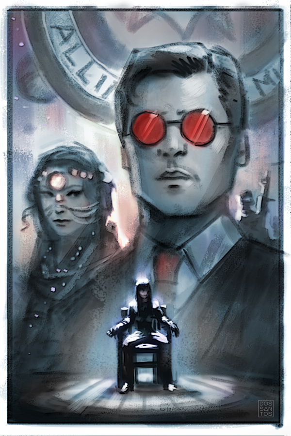
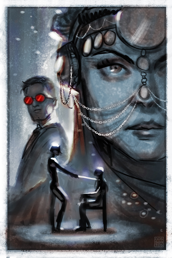
But eventually, more narrative and characters got added, resulting in sketches that told a bit more of the story that unfolds in that issue. The artist who drew the interior art had also included this really exotic headdress on Inara that was much too fun not to include.
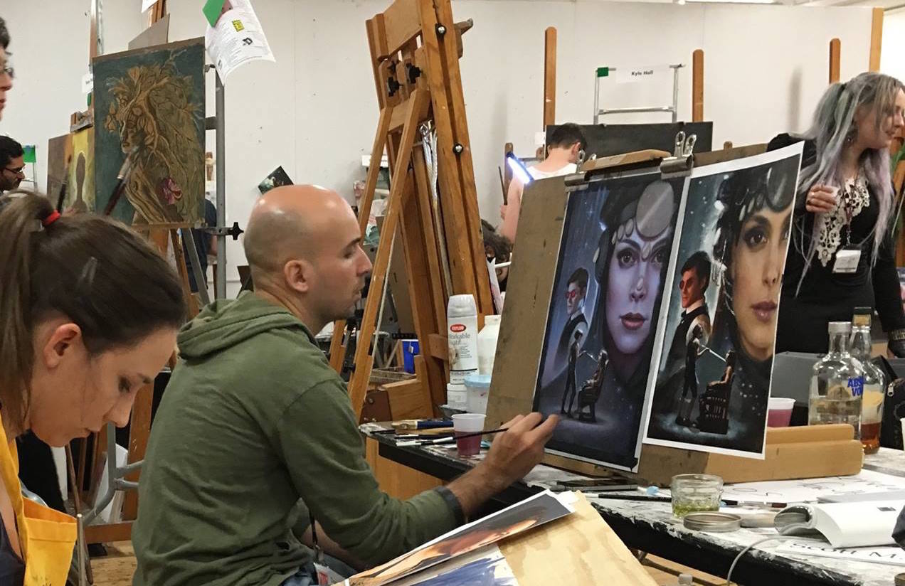
I actually painted this cover as a demo at this past year’s IMC. Not only is it really fun to paint in such an active and inspiring environment, but it meant I had access to a lot of people who were willing to pose for me.
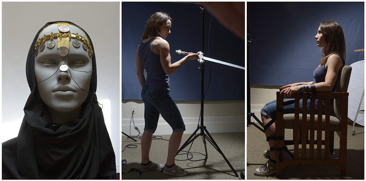
I shot most of my reference there at the workshop, but had also prepared some reference prior to leaving that I knew would be easier to do at home. Below you can see the painting nearing completion, and my reference right alongside it. The reference just is an amalgam of photos pasted directly on top of my preliminary sketch which I then had printed out at actual size.
Regretfully, I forgot to snap shots of picture in progress (there NEVER seems to be enough time at the IMC to get everything done that you want to get done!), but I started the piece with a fairly tight pencil drawing, followed by a sepia-colored underpainting done in acryla-gouache. I then finished the image in oils. Much of the ‘splatter’ pattern you see in the background is actually just a very thin wash of oils over the sepia underpainting.
The woman’s face was still wet when the painting was due, and I didn’t want to risk messing it up by painting the fine link chains into a wet surface, so the chains were added digitally for the cover. I later went back and painted the chains in oils once the face was adequately dry, allowing me to wipe out my mistakes as I went.
Lastly, here is what the final cover looks like in print..






It’s really fun to read the full story on this one! And it’s always intriguing to see the pre-production sketches. Each of those sketches could have also made fantastic covers in their own right, though the one you chose really does justice to the story.
And I had wondered if the addition of the headdress chains were a change made by the art director, but now it makes sense that you needed the rest of her face to dry first.
It was fun being part of the process!
Hooray, a montage! Beautiful work, and thanks for sharing your process.
I love finding these behind-the-scene gems; reminds to to collect, utilize and style my ref and prep work. Would make everything so much easier, dang!