Hello and Happy New Year to you all.
I am going to keep the writing here somewhat brief. I will let the images do most of the speaking for me.
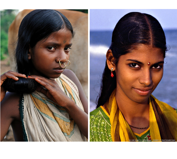
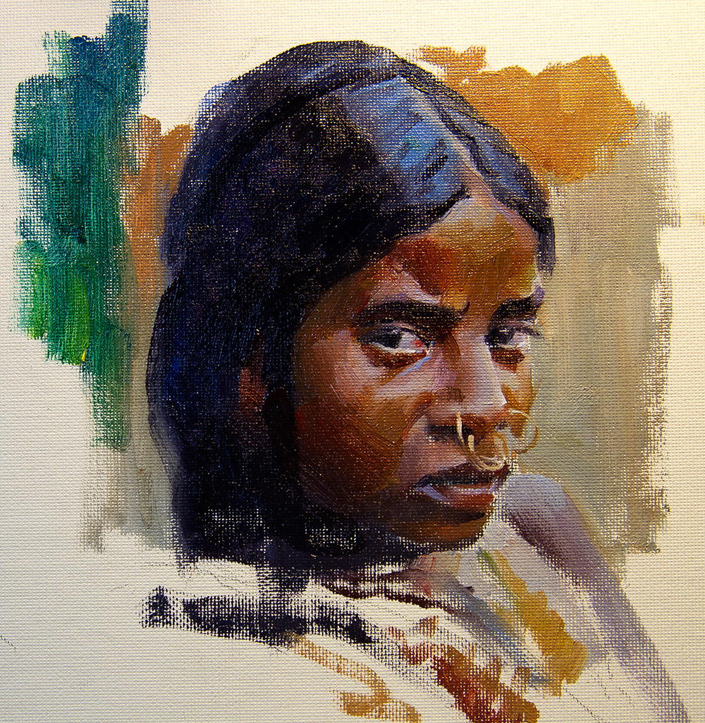
I moved further up in Longitude with regards to the skin tones this month. Here are the reference photos I used.
For the first painting of this series done several weeks ago I focused too much on completing the image and while I feel like I learned something interesting from it, it was too focused on quality of finish and not focusing on the target color system used from the palette. This time I did two very quick sketches, about 35 minutes each while the color mixing of each took about an hour per painting and I think it was much more successful in this exercise.
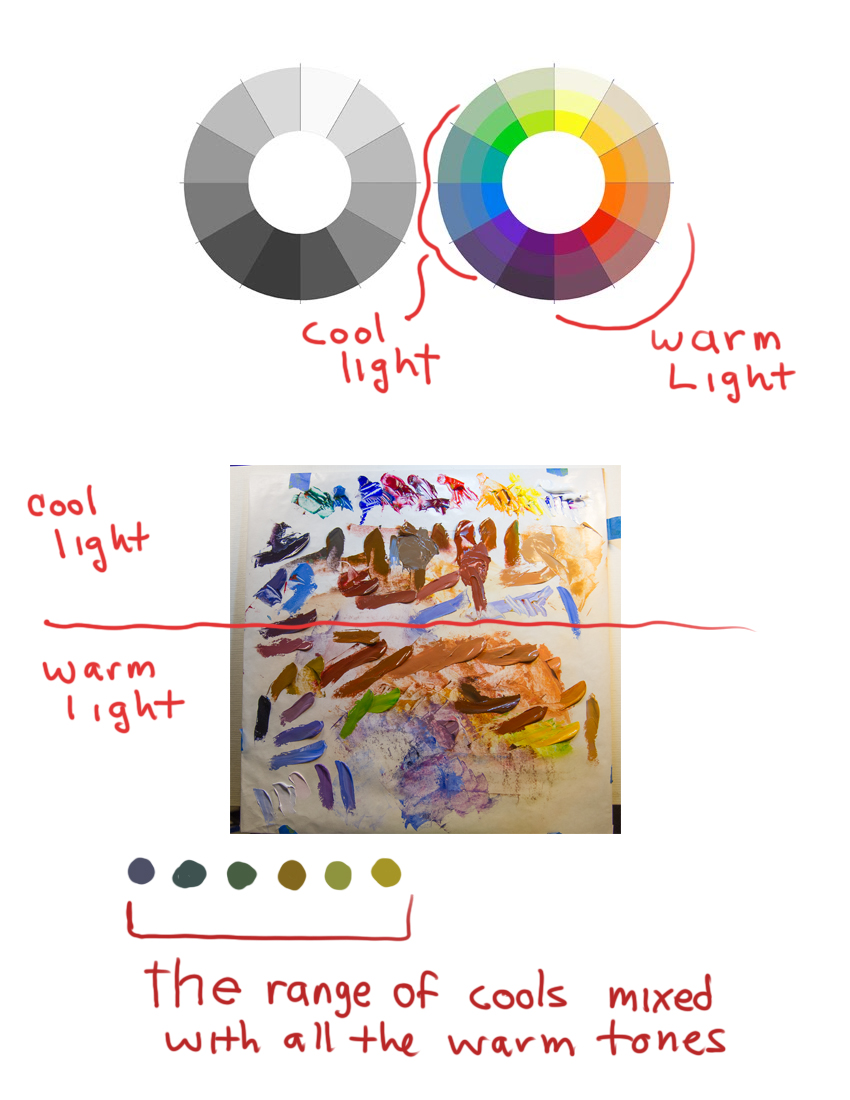
From last months painting, the majority of the hues used were at the very bottom of the color wheel, many were from the purple family, some greens and some blues for reflected lights, and a few deep reds. This time the majority of hues I mixed came from the Green and Blue Green families. The girl indirectly lit had many more blue greens mixed into the reds to cool them down while the girl lit by the sun had many more warm greens mixed into the reds and oranges to subdue them chromatically or drop their chromatic intensity while still keeping them colorful. Here are the colors that were mixed.
Here is a close up of the palette
Both color strings show a series of warm flesh tones but both are cooled off using the range of cools at the bottom of the color wheel image. With just the right percentage mixed into the oranges, orange reds, reds, and red purples, the greens and blue greens do not do anything more than drop the intensity of the hue, but leaves it completely recognizable with its intended hue.
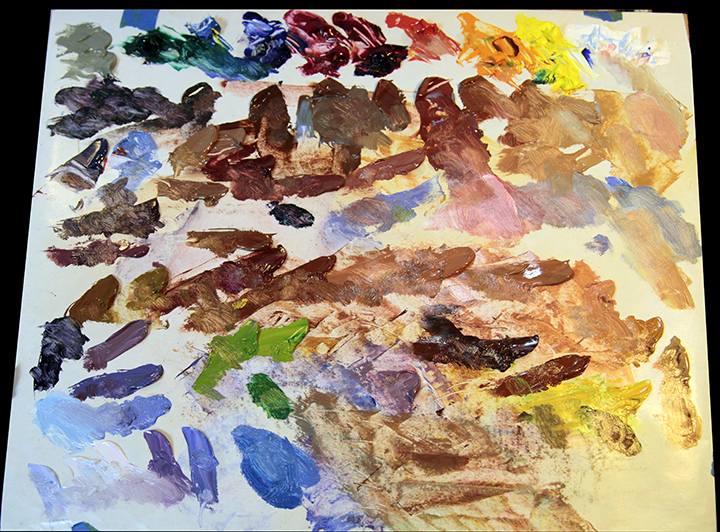
Here is the palette after painting both portraits. Most all of the mixing is done on the canvas, the only additional mixing on the palette was tinting certain hues and or warming or cooling them off further than the original mixture.
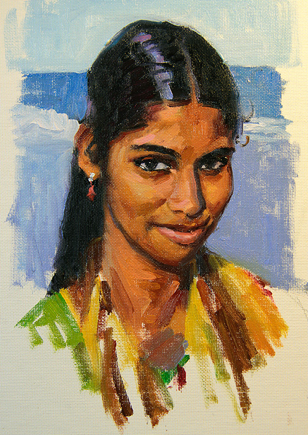
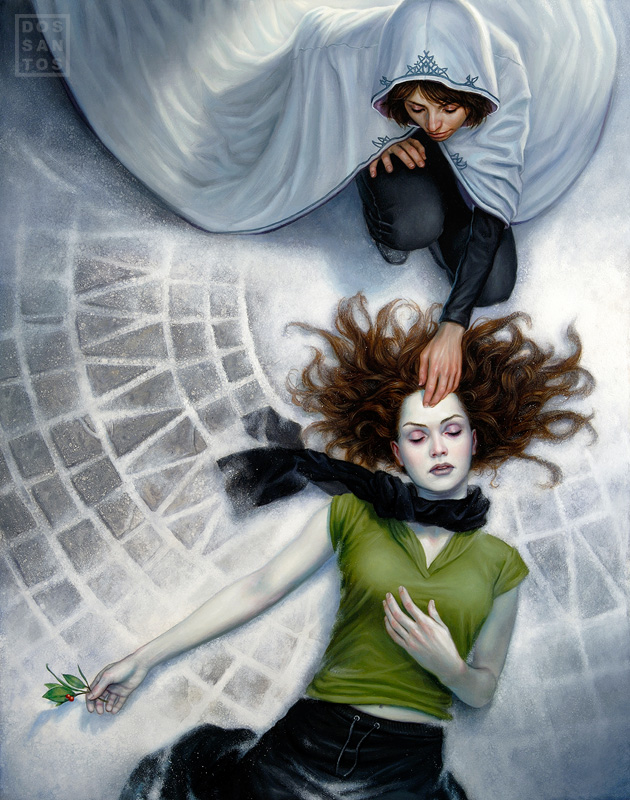
Here are both of the sketches. The lighting is awkward in my studio and I shot these as well as I could but they do not look as accurate as they are live, especially the second painting which feels much bluer and darker than it should but any attempt at brightening it up made it really noisy and hard to read as an image.
The intended goal of these sketches was to show the difference in the skin tones between the indirect lighting and the direct lighting and how the light source is the primary agent causing the skin tones to “feel” the way they do. The cool light (blue and blue green hues) was added to all the local hues within the lit spaces and gives the skin tones a very different feeling or appearance than the girl that is lit by the sun. All of the directly lit hues on the sun lit girl have warm greens or warm hues mixed in with them that resembles the sun light (Oranges, Orange Reds, Reds and Deep Reds or Red Violets mixed with their respective value counterparts).
When I have enough of these faces painted I will give an overall palette assessment and the differences in the hues that are being used for each tonal range and color of skin. There is an interesting development that I am finding with this color theory color palette and mixing skin tones. I do not think it will make much sense now with only a few examples painted. I really need to paint a series of skin tones all the way to the palest of skin for this theory to really make sense.
I am really excited to share this theory along with another amazing property that I discovered with Colorism after painting the first portrait. This is something I have never read and no one ever told me about it before and I think many of you will really find fascinating. I hope you find it fascinating enough to want to try it to see the effect as well.
Back to the easel to get as many of the other different flesh tones finished as I can. Hopefully they will be close to finished by the next post, as long as I can remember to keep them sketches.
If any of you have any questions about this subject please feel free to leave them below. I know this post was semi cryptic but again I think it will make better sense once several more different studies have been completed. Take care and happy arting into this new year.

Great series, Ron. You might consider using a color calibration target when you shoot your palettes and paintings, especially for this series. Pantone has one for $50. Then in Photoshop you just select that and choose one of the auto color balance commands then remove the mask so it corrects the whole image. My MAC is down so I can't look up the exact command but it's easy. And the targets come with RGB etc numbers so you can dial in exact corrections with more effort.
I just saw an instructable where you can make your own target from Pantone color chips glued to a black card, free if you have a color chip book to work with.
I may try that free method as a thin strip. The official targets are rectangular and use up too much image space when I shoot them beside artwork. Uncoated chips may be better as they won't reflect as much peripheral color. Worth an experiment!