So I was up at Illustration Master Class this weekend and as I was portfolio-reviewing, I noticed a trend gaining popularity with artists, and I was happy, because it’s something we talk about over at Drawn + Drafted‘s art business bootcamps a lot. Having a leave-behind that has a choice involved. Usually a choice of business cards that have different pieces of your art on the back.
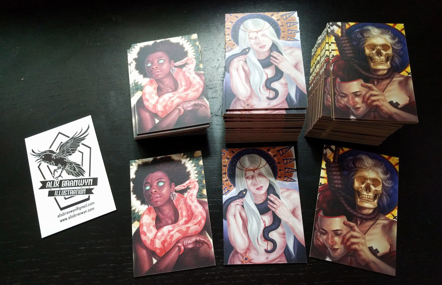 |
| Alix Branwyn The snake is the most popular (also the one I chose) – the visual hierarchy is more more clear in that one, and it really pops at the smaller size |
It seems like such a little thing to do (and the advent of Moo cards offering up to 50 different backs to business cards or postcards made it very easy to pull off), but making someone stop and choose really has a big effect.
 |
| Bruce Brenneise The purple/spaceship card is the favorite, and I’d suspect that’s all about how it has a lot of color, but doesn’t get hard to read at the small size, where #1 is a little confusing to parse what’s going on, and 2 & 4 are more monochrome |
Irene Gallo of Tor Books and Tor.com agrees, when we were talking about it on facebook, she said “being
able to pick my favorite after a review makes huge difference in how
well I remember people. It’s kinda weird how much a difference…I’m suddenly emotionally involved, I’ve made a _choice_. (Also, artists don’t always know what their best work is)”
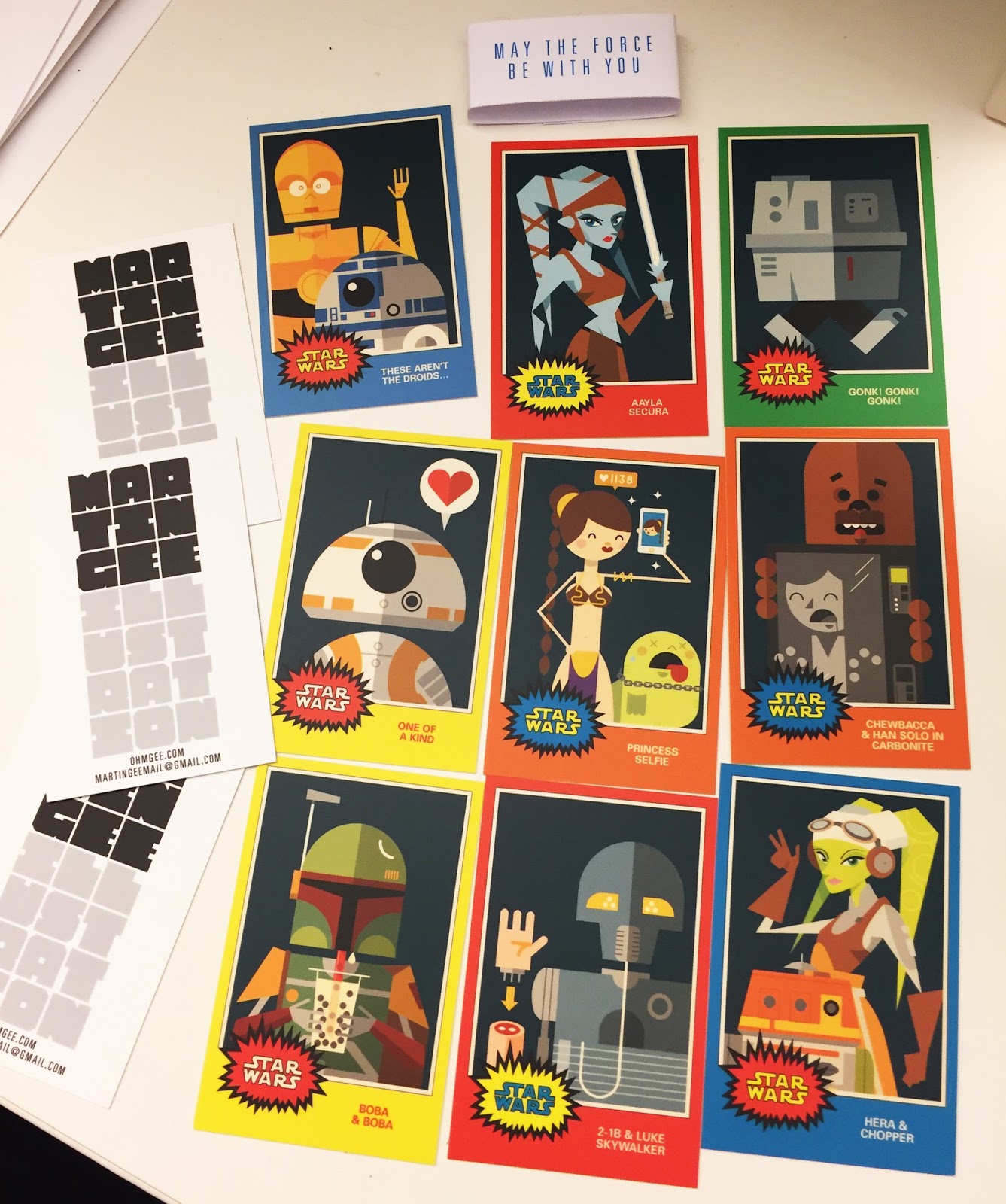 |
| Martin Gee Surprisingly to no one, the Boba Fett, BB8, and C3PO/R2D2 ones are most popular, but Martin uses the whole set (with the belly band shows) as a set to give away to Art Directors and bigger clients. The Boba & Boba one just kills it for fan fave character + adorable clever concept. |
So there’s not one, but 2 bonuses for making cards with multiple backs: first, making someone stop and choose between options does a great deal to cement your work in their memory.
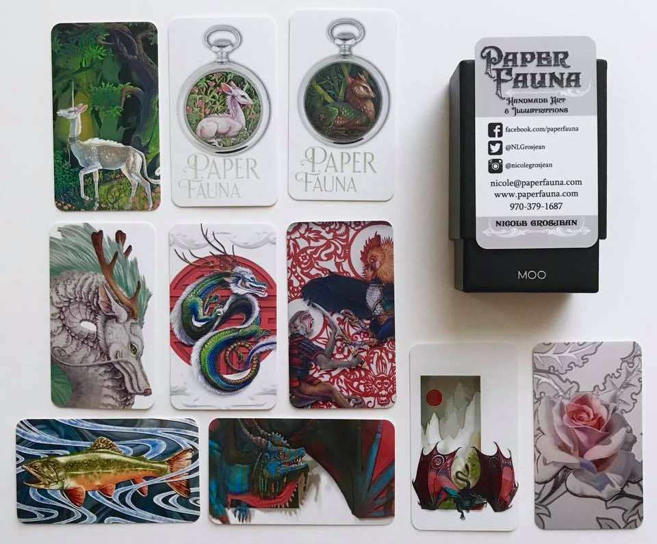 |
| Nicole Grosjean The unicorns are the winners, the full illustration over the watch (though those watches are awesome!) Unicorns are easily a fan favorite, but the illustration reads easily at a small size and the unicorn has a pleasing silhouette, where some of the other cards are a little busier. |
And second — you have a very concrete way to focus test your portfolio pieces. It’s going to quickly become obvious that one image will run out the fastest. Many of the artists I talked to also seemed surprised at which image was the winner. Pay attention, because other artists and art directors may have one favorite, and non-industry fans a different favorite.
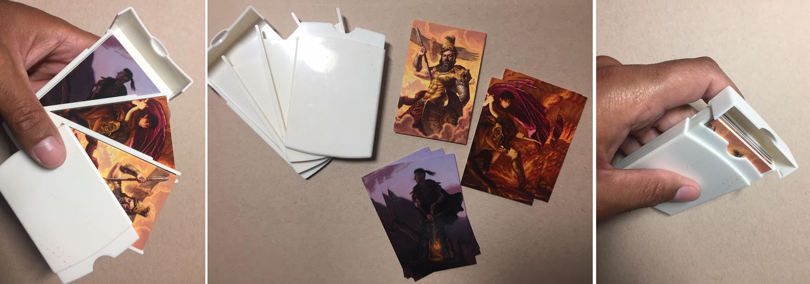 |
| Nicholas Elias Showing off the cool multi-design display case that you can order with your Moo cards. I’m pretty sure I took the top card (Ares) – his silhouette really pops here with the lighter background. |
It’s also a great way to see how your work is shrinking down. Remember it’s especially important for those folks who are interested in doing book covers – your illustrations HAVE to look great in thumbnail. And they have to grab someone’s eye as they scan across a shelf. Seeing which of your pieces catch people’s eyes is invaluable info. Reverse engineer what you did, and apply that to all your other compositions as well.
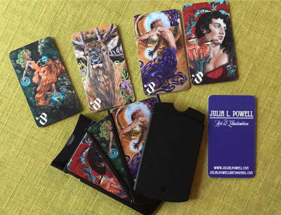 |
| Julia Lynn Powell The portrait card on the right is the most popular, and you can really tell in this picture how well it pops off that card. That one was my choice too, and the piece is gorgeous in person, so this was a great reminder. |
Really what this let’s you do is called A/B Testing…on ADs! So I’m calling it A/D Testing from now on.
You’re welcome.
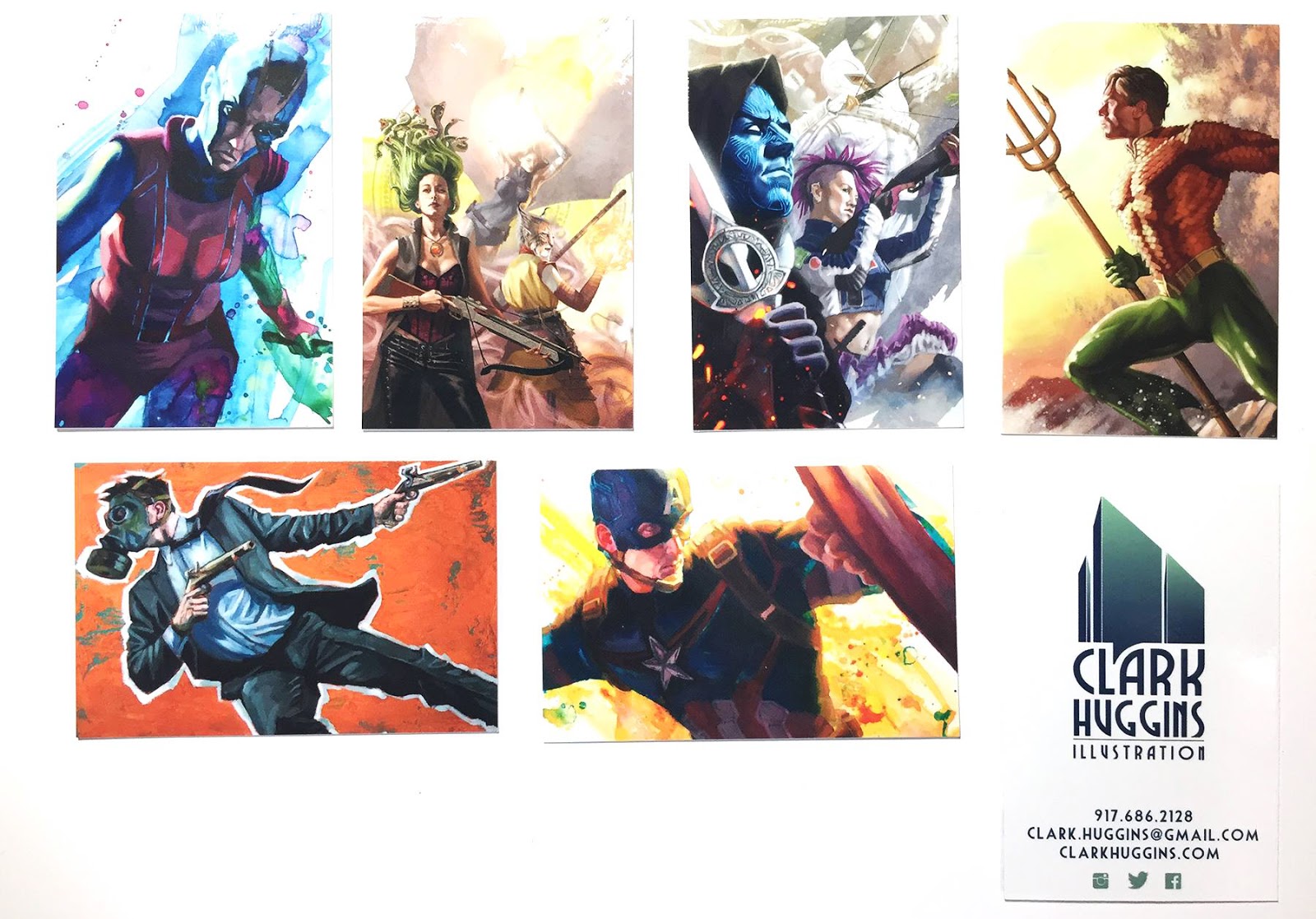 |
| Clark Huggins Clark says he runs out of the Blue Faced guy (the ad for Reckless Deck) and Captain America the most, but I love that Aquaman – such a great book cover composition. |
Thanks to all the artists who posted pics of their card choices! I’m putting notes under each image about which have been most popular, when noted.
 |
| Naomi VanDoren Naomi says she runs out of the two fox dragon ones (top right 2), but i think I picked the bottom right – more book cover like for me to remember. |
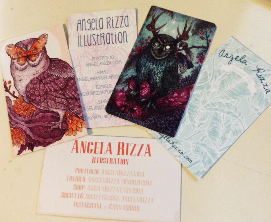 |
| Angela Rizza |
 |
| Anne-Katrin Hermanns Anne-Katrin splits her art between scientific illustration and fantasy work, so it’s helpful that she can keep cards with both options at the same time, without having to cram multiple images on a small card. |
 |
| Brandy Heinrich She says the Koi is the fave |
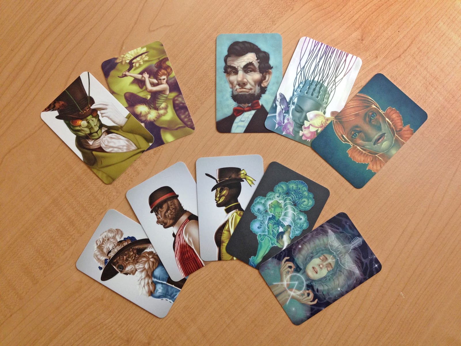 |
| Candice Broersma The top left 2 are the most popular, although I’d have a hard time picking here. So much good book cover feels. |
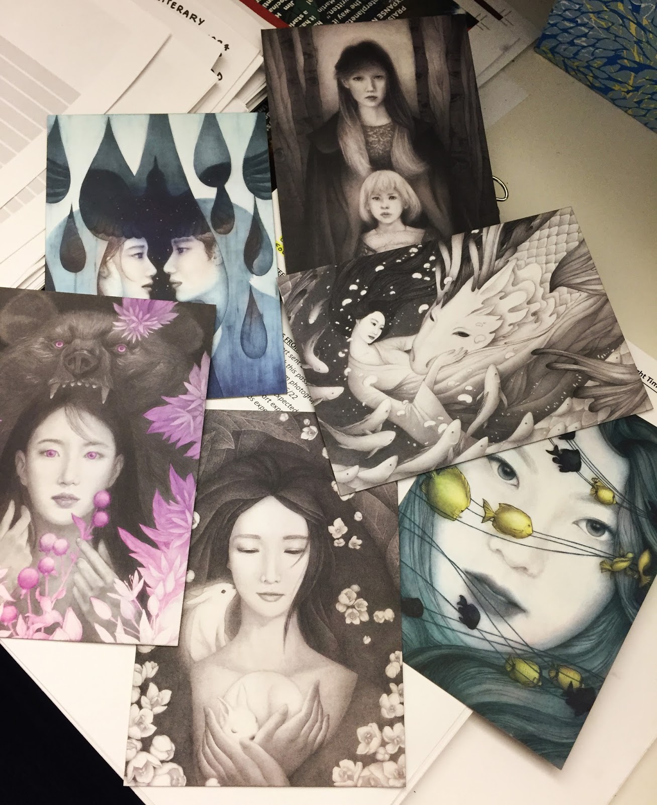 |
| Christine Rhee The bear & the goldfish & face pieces are most popular. I definitely would pick the bear, but I was lucky enough to get a whole set…again, a good strategy for wish list clients |
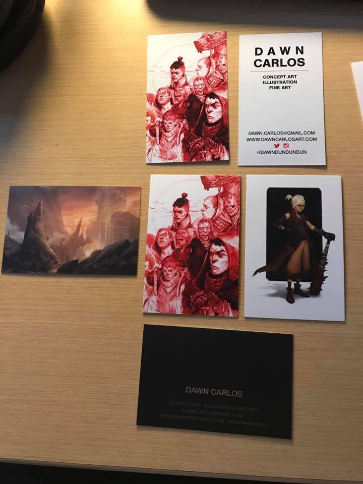 |
| Dawn Carlos Nice strategy – she uses the top card (a cheaper non-Moo print) to pass out at cons with her booth location written or stickered on, then at her booth people can choose between the Moo cards below. |
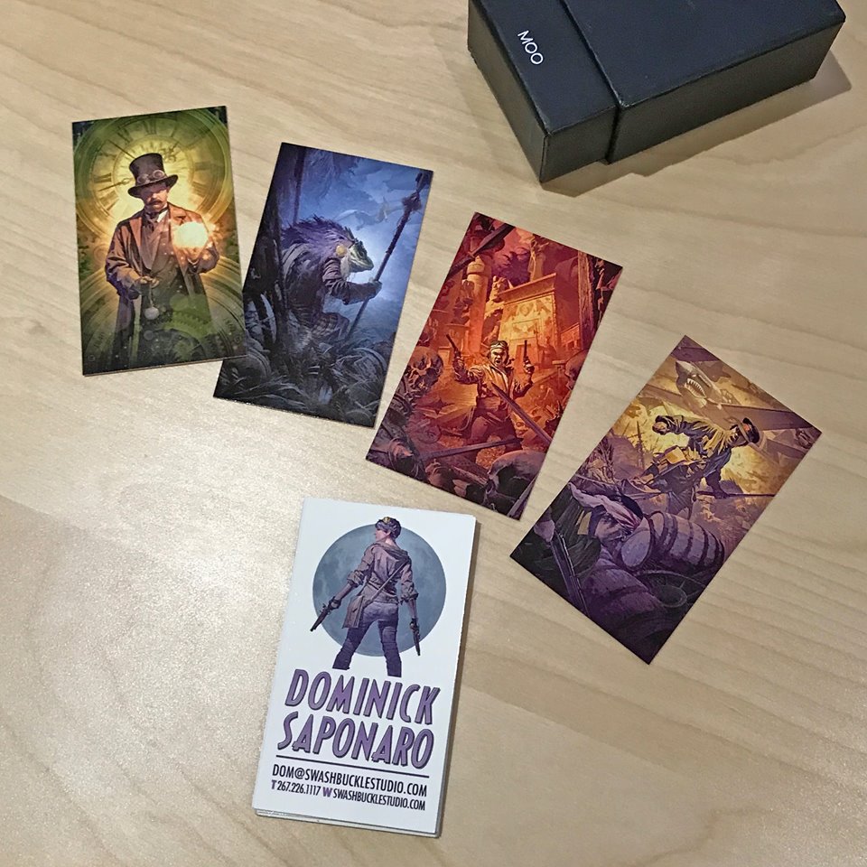 |
| Dominick Saponaro The left two are the most favorite (I picked the blue frog – and I later hired Dom to do covers that related directly to that piece) |
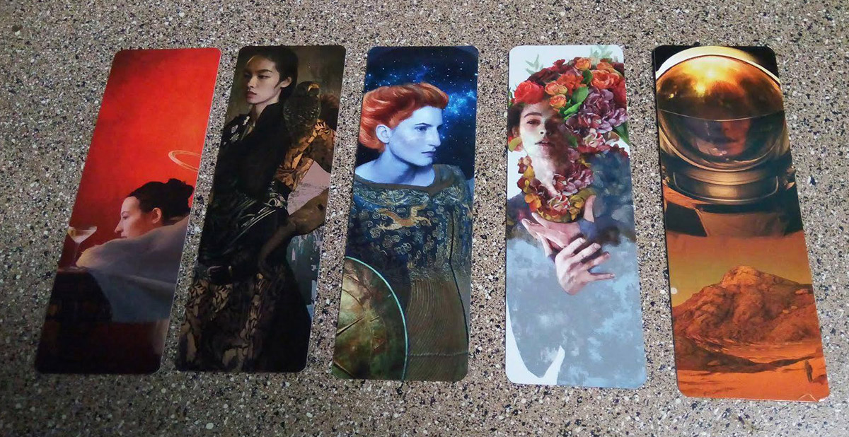 |
| Elizabeth Leggett |
 |
| Gwenevere Singley The middle two go first. My choice was the 2nd from the left. Great conceptual illustration. |
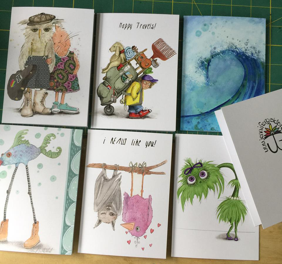 |
| Jennifer Geldard |
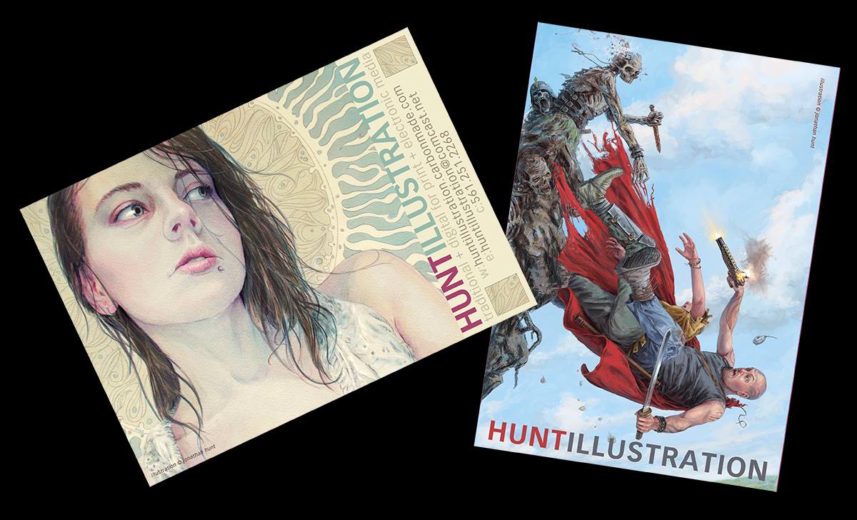 |
| Jon Hunt This is a 2-sided postcard |
 |
| Kate Santee Roller derby wins! |
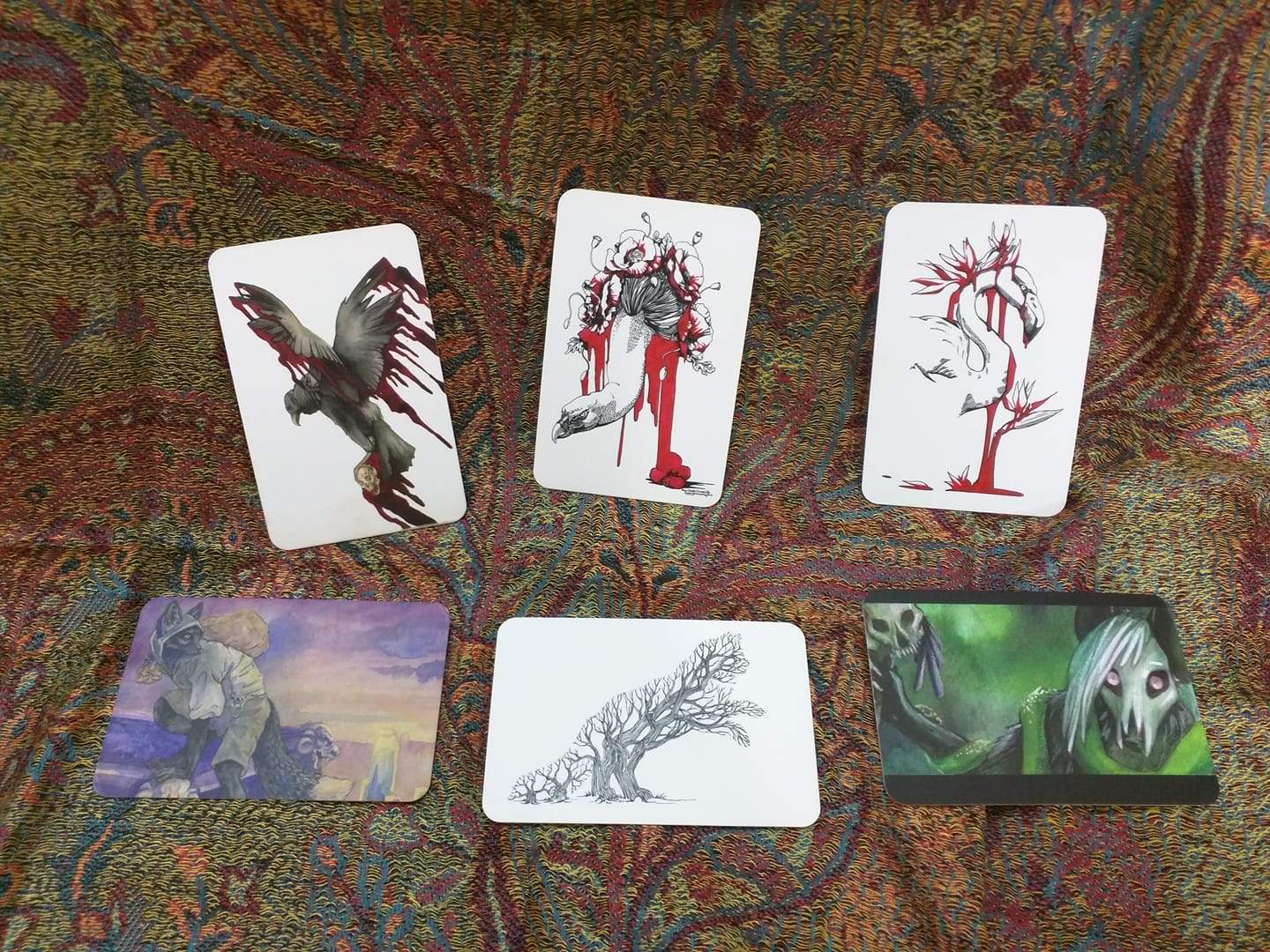 |
| Laura Garabedian The bottom three are the more popular, the tree in the bottom middle a slight winner. I think I picked that one too, cool concept. |
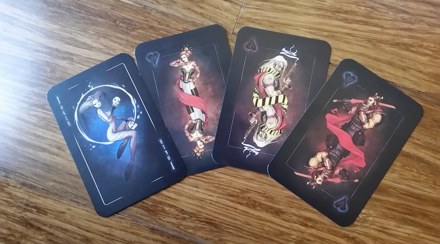 |
| Lily McDonnell Unsurprisingly the Joker is the fave |
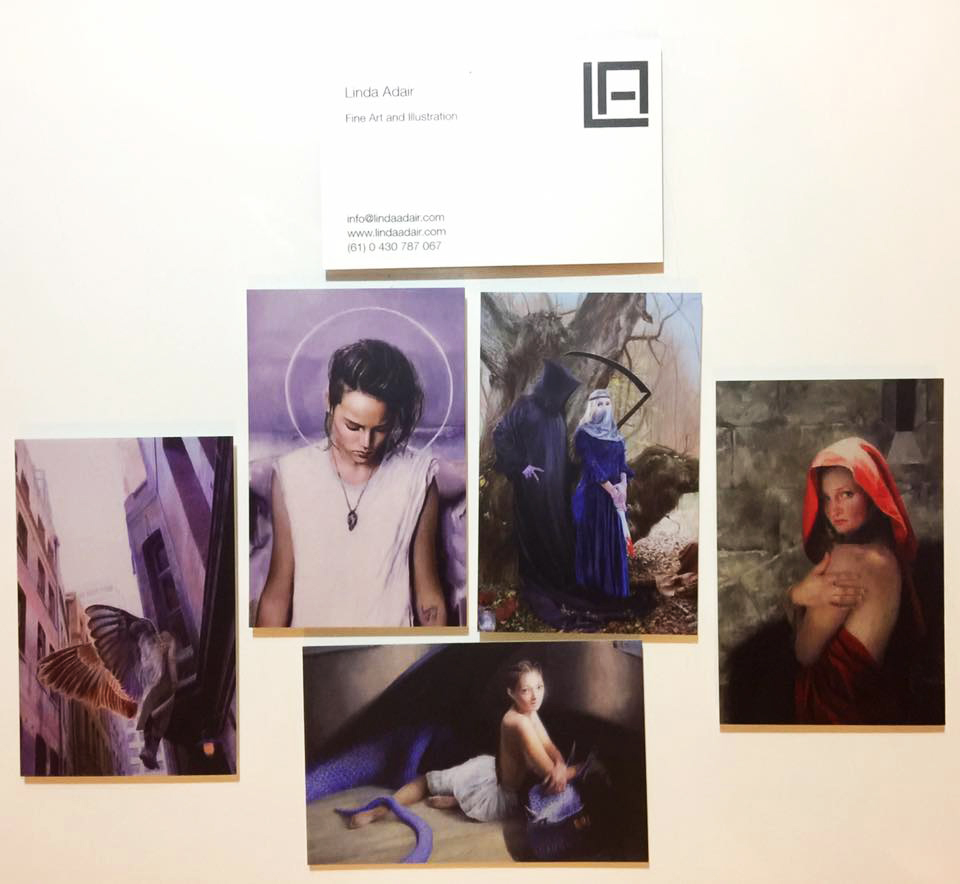 |
| Linda Adair The angels (left 2) are the more popular ones. I love the Halo effect on that one. |
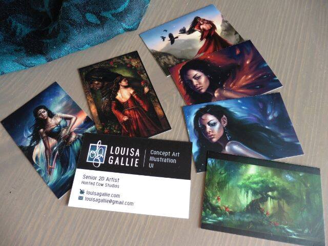 |
| Louisa Gallie The tree is the fave, the girl with the knife the runner-up |
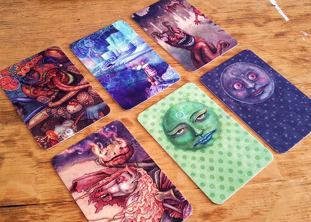 |
| Marcelo Gallegos The two faces on the patterns go first, and I agree with the feeling that they must go bc they are so easy to read at the smaller scale and the orb just pops. |
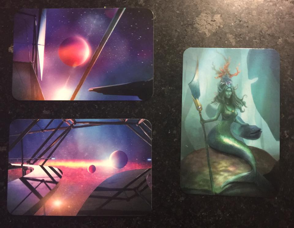 |
| Marisa Erven Bottom left is the fave – which I agree with, definitely draws you in, over the other two |
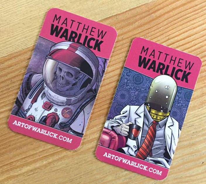 |
| Matthew Warlick He’s actually run into a problem – this is a double-sided card but people generally take two thinking it’s two different cards. |
 |
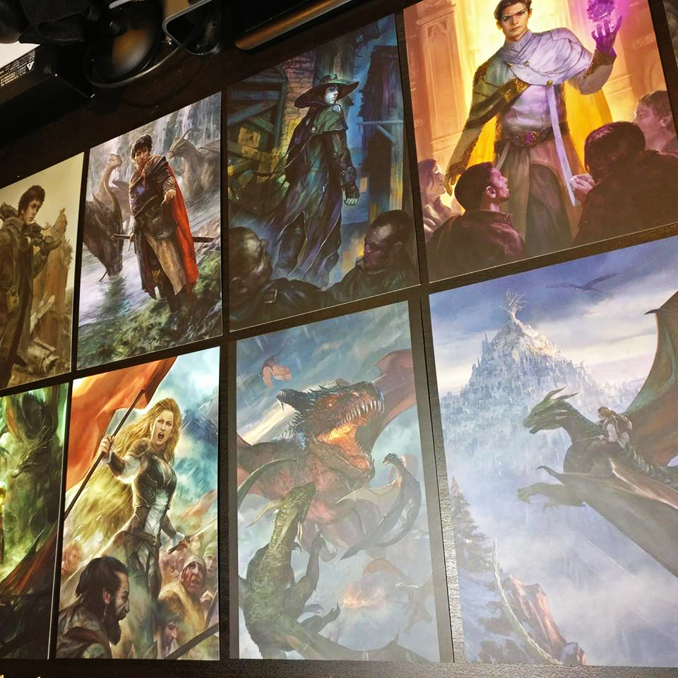
| Preston P. Jackson the center 2 cards ar ethe most popular, depending on whether Preston is at a fantasy event or general art event. Im pretty sure I picked the fantasy one in the middle. |
 |
| Randy Vargas These are new so no crowd testing yet, but my would be the top right bc it’s book covery, and the dragons would probably be fan faves |
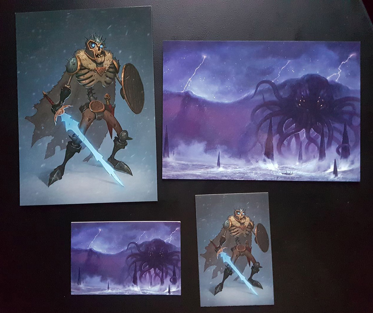 |
| Sam Lamont Cthulhu beats skeletons |
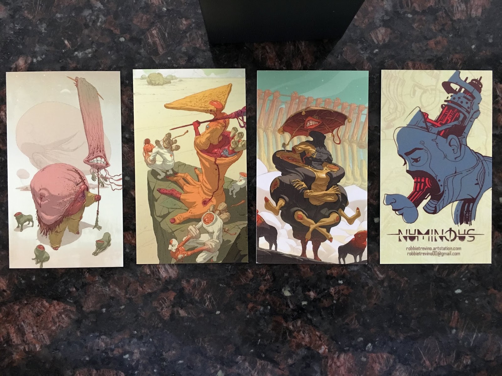 |
| Robbie Trevino The big yellow hand is the fave (and was my pick) |
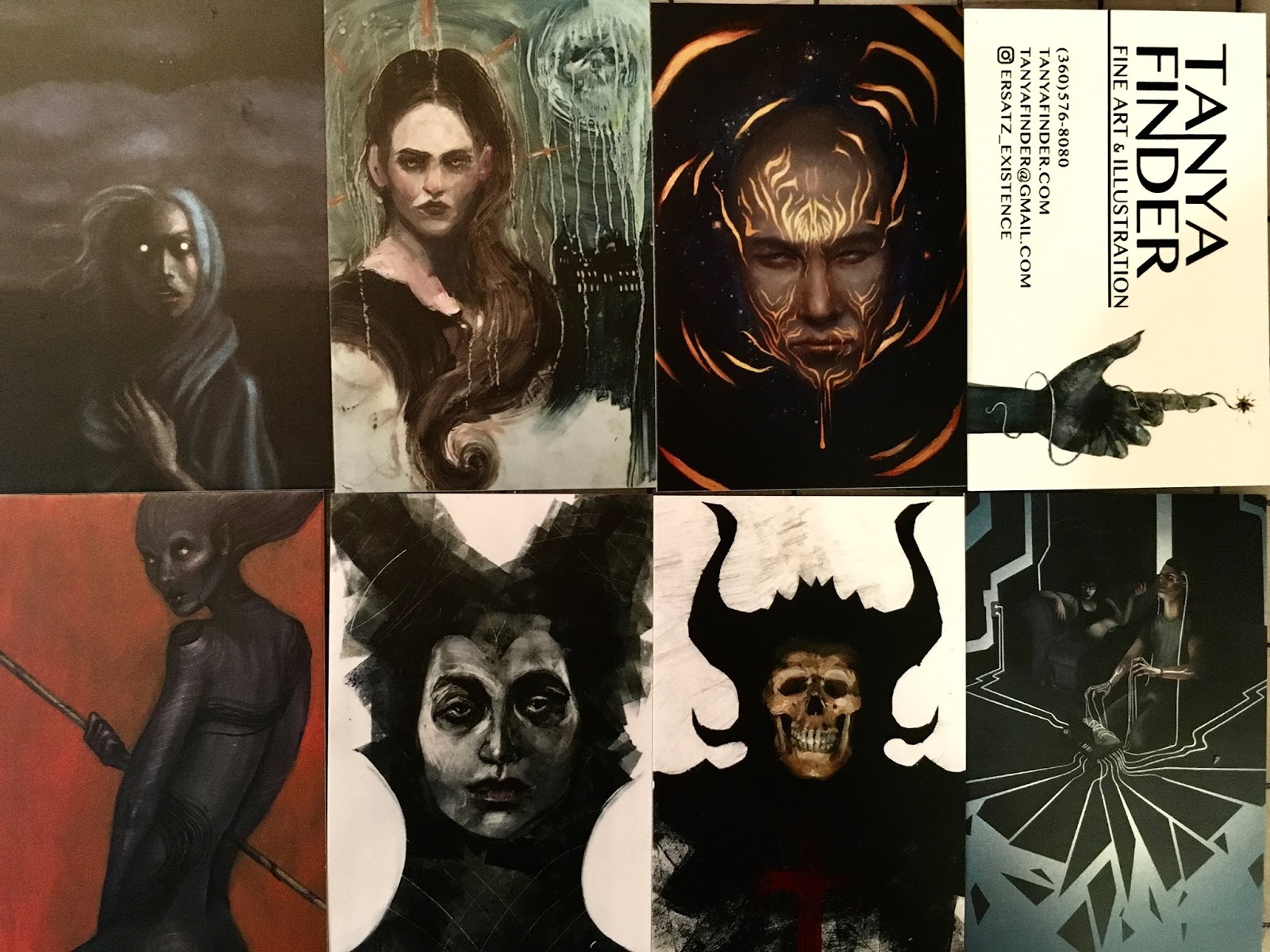 |
| Tanya Finder |


I have a follow up question here: how many choices do you think before it stops being a benefit and becomes a flaw?
My concern with these in the past has been if I'm actually just being indecisive and not making a clear choice about how I want to promote myself. It's interesting to hear your take about offering choice, I just wonder what the sweet spot is between too much and too little?
This is so very helpful. I'll be referring to this article when I redesign my business cards. Thank you for this.
I also wonder about giving so much choice, especially with postcards. I've had people at shows take my postcards (and have me sign them!) which I think detracts from them actually buying something because they get a piece of art for free.
3 or 5 is a good sweet spot. Psychology shows that choosing between even numbered things (especially 2) is harder. More than 5 will take too long.
You're welcome!
I do think free postcards can do that, so most artists I know give biz cards away, but sell postcards to fans (and still use them as giveaways to ADs and professional clients)
This is such a simple and effective idea!
Thank you so much for this post, really enjoyed seeing all the amazing art, I'm drooling over those business cards! Oh, and thank you Lauren for the advice in your comment regarding 3 or 5 different motifs…. last time I ordered business cards from MOO, I went for 25 different ones – just because I could, I suppose. The downside is as well that one runs out of cards quite quickly, because people take more than one, especially doing Cons.
One follow up question I have is, for a leave behind do you prefer biz cards or postcards? I tend to have one biz card but multiple postcards. Would it be better to forgo postcards in person or just have one and just have multiple biz cards? Thanks.