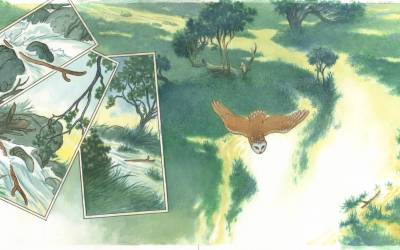
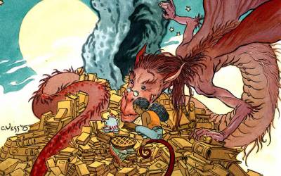
For over 40 years I’ve been making a living from my art and in that time I’ve done my share of cover art:
As well as a seemingly endless amount of interior comic book graphic narratives:
But in the last 10 – 15 years I’ve fallen head over heals in love with the idea of The Book. That is, a complete package for which I’ve not only designed the cover art but a title page with hand lettering:
As well as all the interior art with perhaps even individual chapter headings.
All these individual elements give me my own private book-world, where I’m in complete control of both the horizontal and the vertical. They also give you an object (the entire book) that feels more permanent than the fleeting appearance of a piece of cover art. And that makes me very happy indeed.
I’m glad to say that these days adult illustrated books are making a determined come back. Sam Weber’s ‘Dune’, Jillian Tamaki’s ‘Irish Fairy Tales’ (both for the Folio Society) and Angel Dominquez’s lovely ‘Wind in the Willows’ (published by Books Illustrated LTD out of the UK) are beautiful new editions of old classics. But there are others with original stories to tell, including Todd Lockwood’s ‘The Summer Dragon’ and our own Greg Manchess with his gorgeous new book, ‘Above the Timberline’ (both of these books are written and illustrated by the author-artist). And to this list I’m happy to add my own edition of the collected Earthsea stories that will be published by Saga Press in 2018.
Okay, so now you’re thinking you might like to try your hand at illustrating a book.
Hold on.
First you’ll need to consider the intricacies of a process that can help you make the aesthetically pleasing book that you want to make. Of necessity it is a very collaborative process and sadly many artists want to just be left by themselves to work up what they see in their mind.
But consider this. You’re in a room and it’s filled with your best friends. Everyone is relaxed and maybe some of you have had a drink or two. A random comment kick starts a conversation. Someone follows that vocal outburst with another. More spontaneous comments fly across the room. And round and round the idea bounces, from one person to the next, and suddenly the collective ‘you’ has arrived at a joke or a play on words or a creative idea that you, sitting in that same room but by yourself could never have articulated.
At its best, the collaborative process involved in the creation of a book is much the same.
You will, of course, have to work in collaboration with the text itself and, if they’re still living, with it’s author. Be careful though, the friction of two creative minds rubbing hot and heavy against each other can just as easily produce a torched field, empty of life, as it can burn away any barriers that either creative mind may have tried to erect around their fragile egos. If you’re both lucky though, that fire will leave in its wake a brand new aesthetic persona that will inherit the wisdom of two lives, two experiences rather than simply one.
And we shouldn’t forget that out in the real world of commercial publishing you’ll also have to pay attention to various editorial voices and the needs of your art director with their marketing department as well.
However, with any illustrated book or for that matter cover art or an extended graphic narrative, there is another and perhaps an even more important collaborator involved: the reader of the book: the reader.
Respecting your reader’s imagination is I think one of the most important tasks at hand for any book artist and only when you allow them to become an active participant in the story you are trying to tell will your images have the impact you need.
To that end I try to balance the visual elements that can be clearly seen with those that exist only in my reader’s imagination.
Because it seems to me that any image that is solely consumed by minutely rendered detail from corner to corner has very little to offer its viewer in terms of their actively participating in its story. So, rather than risk the possibility of trapping my reader’s imagination in a multitude of detail I want my image making to set it free.
Picture this then: the shadow of an unseen tree just beyond the picture plane is cast across a field of grass.
Or, there is a figure staring directly past the viewer, at something unseen.
Or, there is a rising mist that obscures a portion of your land or cityscape.
Each of these simple visual tropes can help activate the alert reader’s mind and without their realizing it, make the story flourish in a more complete world than what they actually can see on the page set before them.
Those unseen element exists only in the reader’s imagination, as does the world that lurks softly behind the mist that rolls across the hills in one of my paintings.
But looking at the images above, you might say, “What about all that minute detail. Isn’t Vess doing just what he was warning me against?”
Maybe. But I think that my chosen method of rendering the finish on this or any of my illustrations produces yet another collaboration between the art and the reader’s mind. By using a pen outline, which I’ll later fill in with multiple washes of color (FW colored Inks), a style that is directly inspired by a number of Edwardian book illustrators such as Arthur Rackham and Edmund Dulac…
I offer a look that is decidedly not highly finished or minutely rendered. Faced with my stylistic choice, the viewer must complete for themselves the conceptual space left unfinished between my hard outlines and the color within. In the best of all possible worlds they in effect, render the image into three dimensions for themselves.
This collaborative process, this pact between writer, artist and reader are, I think essential elements that when combined correctly, will produce a book that can be read and enjoyed again and again and again for many years to come.
Note: all of the pencil art used here are selections from the over 60 illustrations that will be in the collected Earthsea stories that Saga Press will be publishing in 2018. All of this work has been conceived and executed in a tough but fair minded collaborative process with its author, Ursula K. Le Guin and it is an experience that I will very much miss once its over.


Mr. Vess, I have studied your line work and pacing for years. So glad to see you on Muddy Colors 🙂
Wonderfully stated Charles. I am looking forward to holding a copy of your illustrated A Wizard of EarthSea in my hands soon! I love how you balance those open, nondescript forms with killer details when you need them…brilliant.
What a marvelous collaboration. I can't wait to see and hold and own and read the finished Earthsea books. Just the greatest news to hear that this is happening. Congratulations and thank you for your lifelong hard work and thoughtfulness.
Mr. Vess, thank you so much for sharing your wonderful and inspiring art with us all these years. Your work is really a motivation for me!
I am now itching to own a copy of the Earthsea work. I've long been a fan of Ursula K Le Guin and Charles Vess. This just thrills me to pieces.
Thank you all for your comments. All I can promise is that I'll do my best to give you whatever helpful 'secrets' I've discovered in my long journey to discover myself.
The sheer amount of love in these drawings is overwhelming.
Wonderful post Charles!