As I am working with my portfolio students at LAAFA, and working as a mentor with my online program helping build out their portfolios, helping them find their voice, I am starting to notice many bad habits get in the way of getting to a quality finish that holds up to the idea in mind, illustrating convincing performances, and finding meaningful archetypes for the characters that are being painted. Developing the preliminary drawing is a confusing stage to them, focusing too closely to the reference photographed or pulled from sources, whether it is exactly drawing what is seen or painting what is in the photo, there is very little understanding of the true meaning of the reference gathered and how to work with it rather than it taking control of the project and possibly sabotaging the results.
I am going to butcher this in the way I present it but believe me when I say this quote from Walt Stanchfield is profound when it comes to observing/copying from a reference whether from life or not. He says about not having a goal other than just pure copying from the reference, “copying the model without this awareness(a goal) is like copying a novel to learn how to write novels.”
I have made a quick checklist of 10 things you might want to remember when using or shooting reference and working from it. Reference is an aid, not the end goal. Clarity of the idea is most important, and the reference helps to assist in filling in the visual cues that are not so easy to remember. Do not let it overwhelm, intimidate, or dazzle you.
 |
|
Harry Anderson’s reference found on James Gurney’s
gurneyjourney.blogspot.com
|
1. You can use anyone as reference for your subject. Remember that you are the actor since you are creating the piece. It is up to you to figure out what is missing from their performance and inject that into your final product.
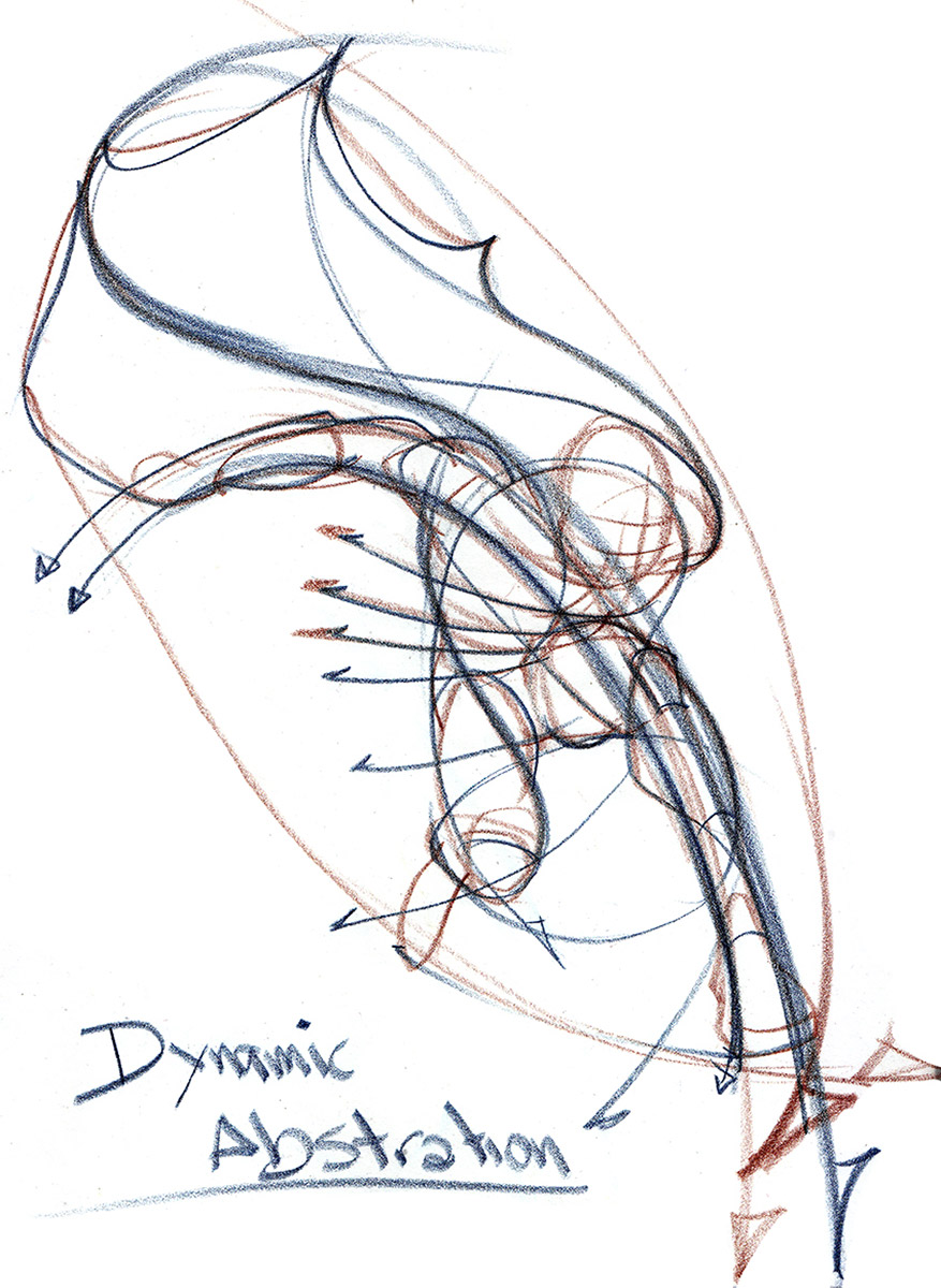 |
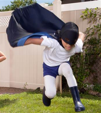
| Here is a dynamic abstraction leaning towards adult like proportions based upon the above reference. |
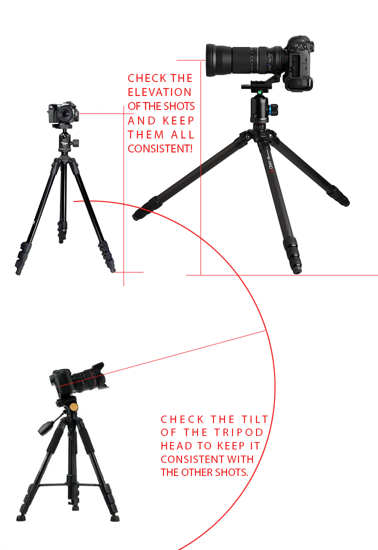
2. Check your eye level. Make sure that if you are shooting several separate pieces that are all supposed to come together as 1 image, make sure to shoot from the same height and same angle with the camera on the tripod. And do shoot with a tripod. It is very easy to be inconsistent and aim the camera awkwardly when holding the camera.
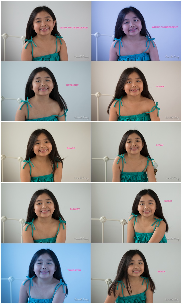
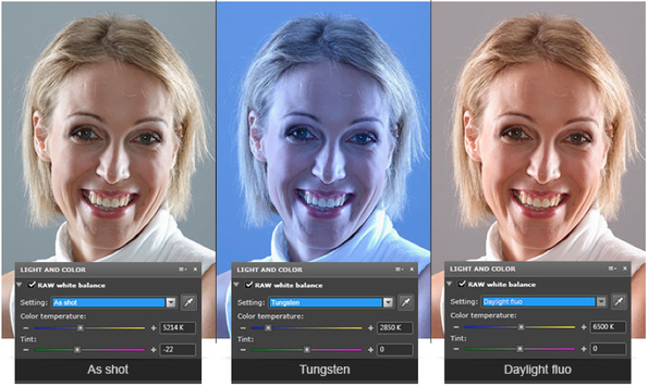
3. Make sure the ambient temperatures of your many reference shots match each. If they do not, then grayscale all the separate pieces to assemble them together as value relationships. It is very easy to think that a camera is all set and is ready to give you amazing images. Sadly, out of the box, everything is set to factory settings, not ideal for what we need. Everything needs to be set to each and every situation. Take the time to learn about the camera, take a class in it and learn what F-Stop means, what film speed does, how to control the temperature and white balance, etc.
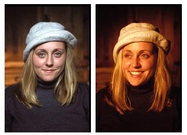 |
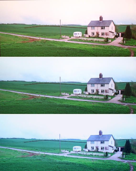
| This image shows the color correction for tungsten lighting. |
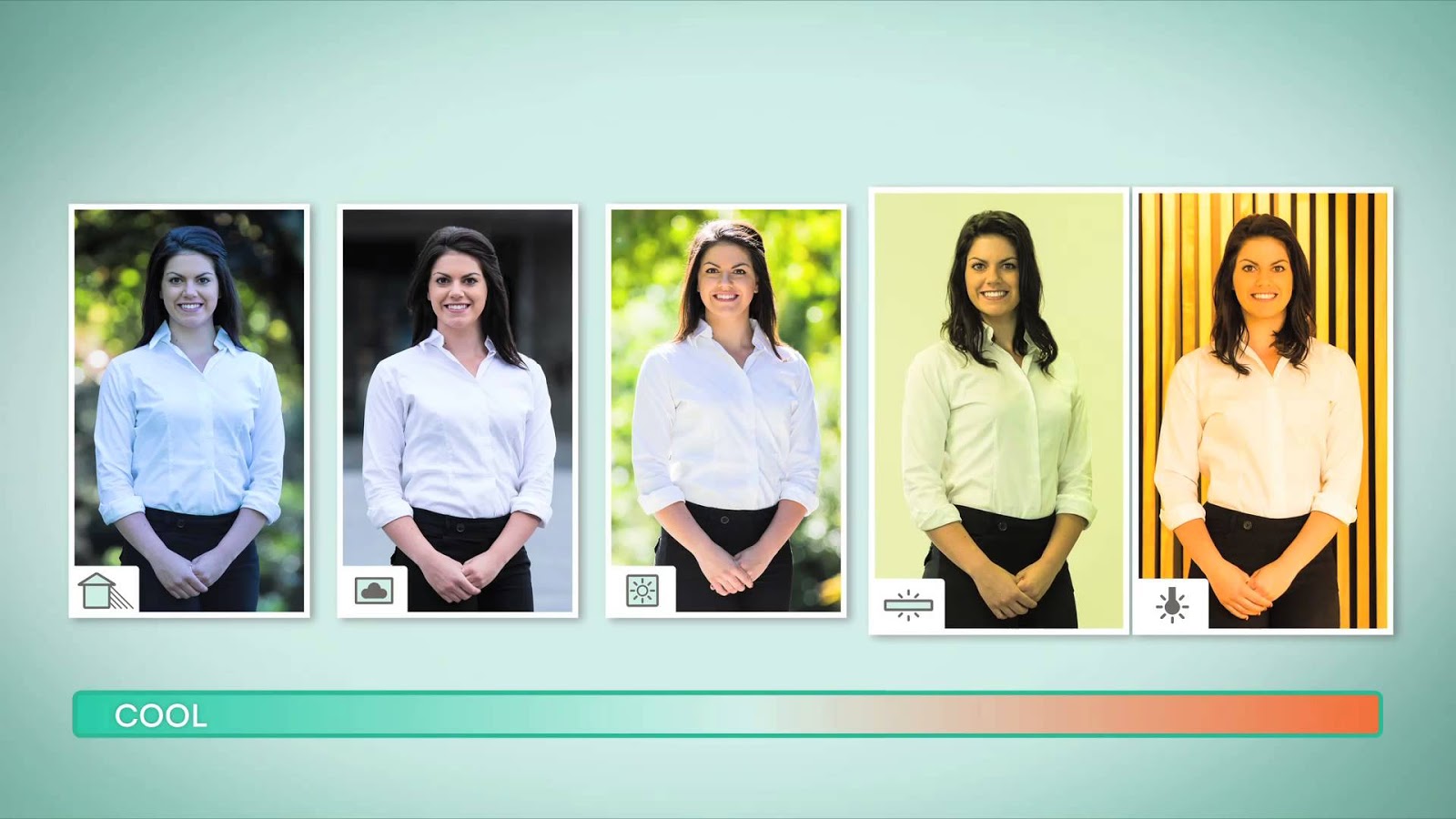 |
| These are all examples that show the difference in lighting conditions and camera settings. Know thy camera. Know it well enough to prepare for any condition. |
4. Work from a well-documented idea. Make thorough thumbnails, line, value, and color to be clear what it is that your final goal should be in the piece and stick to it.
5. If possible, shoot high-resolution video instead of photos. So much of what is shot is action poses, but they are just that, poses. If you really want to capture someone jumping, film it. If you want to capture someone swinging a sword, film it. Do not shoot still shots unless it is a sequence and the actor is in motion. Still shots are posed, and in the end look and feel that way to the viewer. For those epic moments, shoot video.
I also shoot video if I am going to do a commissioned portrait. So many subtleties happen in the face, and as much as we have one idea in mind, every time we try to capture it it is just not there. Video. Record the sitter for several minutes at a time, have them talk, have them answer questions, have them just sit there waiting for instructions, etc. Through time, the face will have gone through so many transitions that the ideal one is just waiting in that mountain of footage.
6. If you are “borrowing” the reference from the internet, try to technically recreate the shot. What time of day? Where? What height is the camera? What is causing all the bounce light on the subject? What is the depth in the image, or what is the distance between things? Deconstructing the reference is like detective work, but will warrant objective results if you spend some time working it out.
Also, if borrowing a reference image and it has blown out highlights or shadows that are too dark, is the image large enough (pixel size) and how close is the image to the first version posted? There might be enough data in the highlighted and shaded spaces to work with the photo in Photoshop, Lightroom, Bridge, etc. to recover lost or compressed data. If there is data, make 3 versions of the image; one too light to see into the shadows, one normal, one too dark to bring back the pixel depth surrounding blown out areas and over exposed highlights.
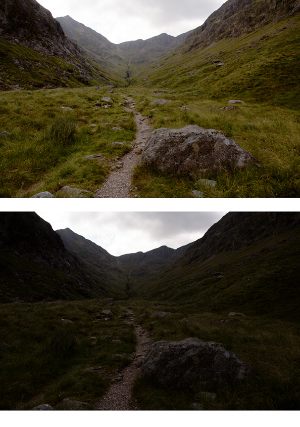 |
| Here this underexposed image was opened up using levels and curves in Photoshop to help bring back the depth and definition that was closer to what the eye saw at the time. |
7. White highlights and black shadows do not exist in nature the way a camera can interpret them. The camera has a limited range of color it can interpret. Our eye separates the red, green, blue spectrum with cones specifically assigned to each wavelength. A typical consumer camera has one ccd chip (charge-coupled device) that stores all 3 wave lengths, and as it stores the data the camera shoots, it averages the data. If the scene is overall blue, the entire shot will have a bluish shift to it. If the camera is shooting trees and bushes in tungsten lighting in the evening while the greens are still visible to the eye, the shot will appear much warmer than our eye sees the moment with a lot of artificial orange and red hues making the foliage appear warmer.
Because of this exaggeration of colors and temperatures, shadows that appear dark tend to be flattened into a blackness, and small highlights and the light planes surrounding them get thrown together in a whiteness that is far whiter than anything that appears in nature. Remember that there is really no such thing as pure white or pure black. If we can see something regardless of its lightness or darkness, it will appear under the influence of the light that is illuminating it. Also, the shadows and hightlights will extend further beyond their actual termination point the further away the subject gets to the camera.
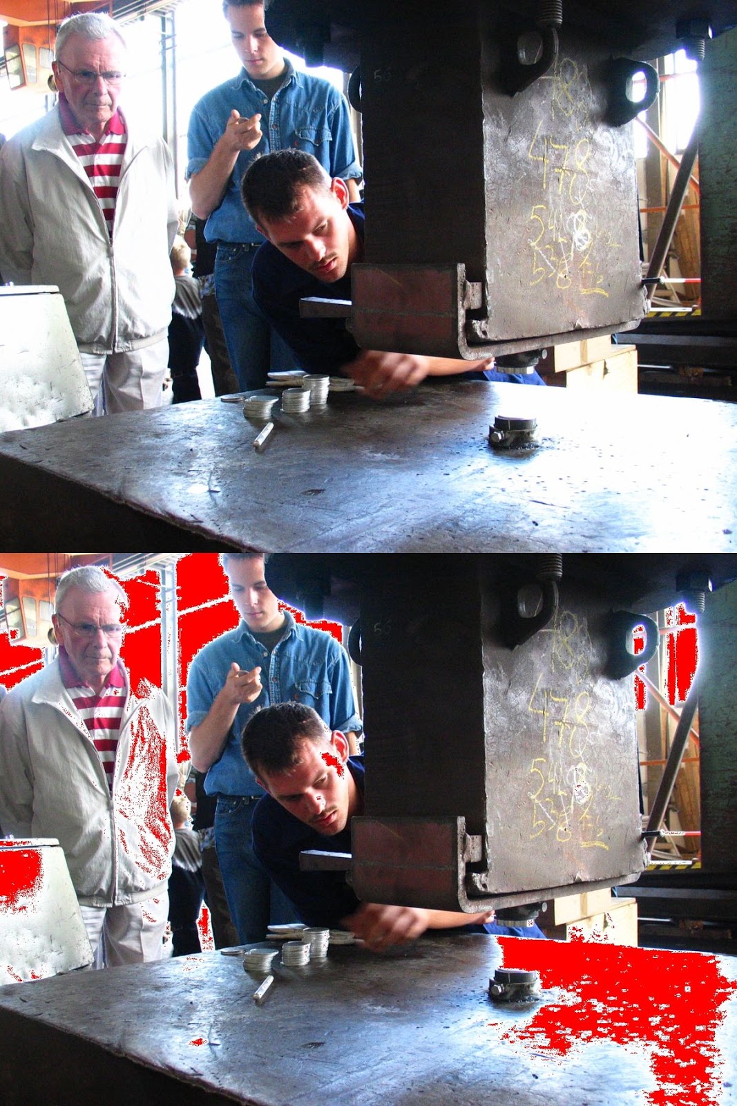 |
| Here the image shows the areas that are overexposed in red. These are the clipping areas, or areas that exceed the minimum and maximum threshold for the shot. |
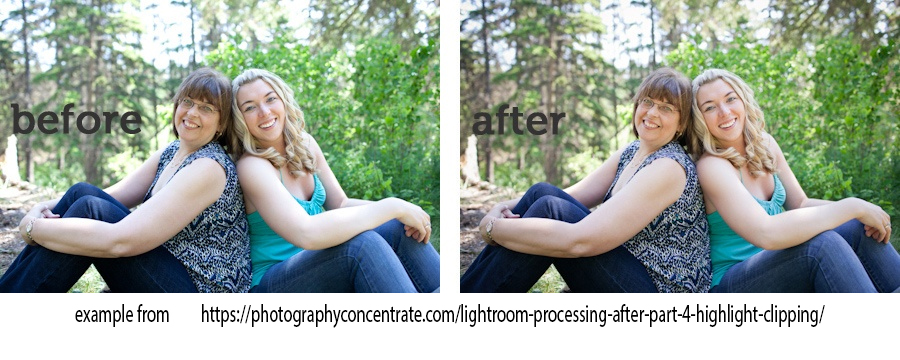 |
| Here is another example that shows the fix in lightroom bringing back the skin tones under the sky light from above. |
8. Make sure to capture the subject at the distance you intend them to be from the picture plane in the final painting. This assures you of the correct amount of detail to focus upon, preventing any over rendering of anything unimportant. If you shoot close up shots, try and be mindful of the angle you are shooting them from so that what you have to work with is the same angle as what you need. You’d be surprised how often this is forgotten leading to some confusing detail work.
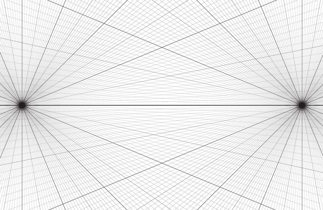
9. Whether collaging together the work in photoshop or collaging the reference together in the preliminary drawing, use a horizon line and ground plane to work with. First, this will help align the references together into the same picture space. Secondly this will help establish an understanding of their distance from each other relative to each other in space. The grid on the ground plane can be broken down into any unit of measure, but just having it helps with the mental conceptualization of the fictitious space you are developing. Here is a link to a few solutions for making perspective grids here.
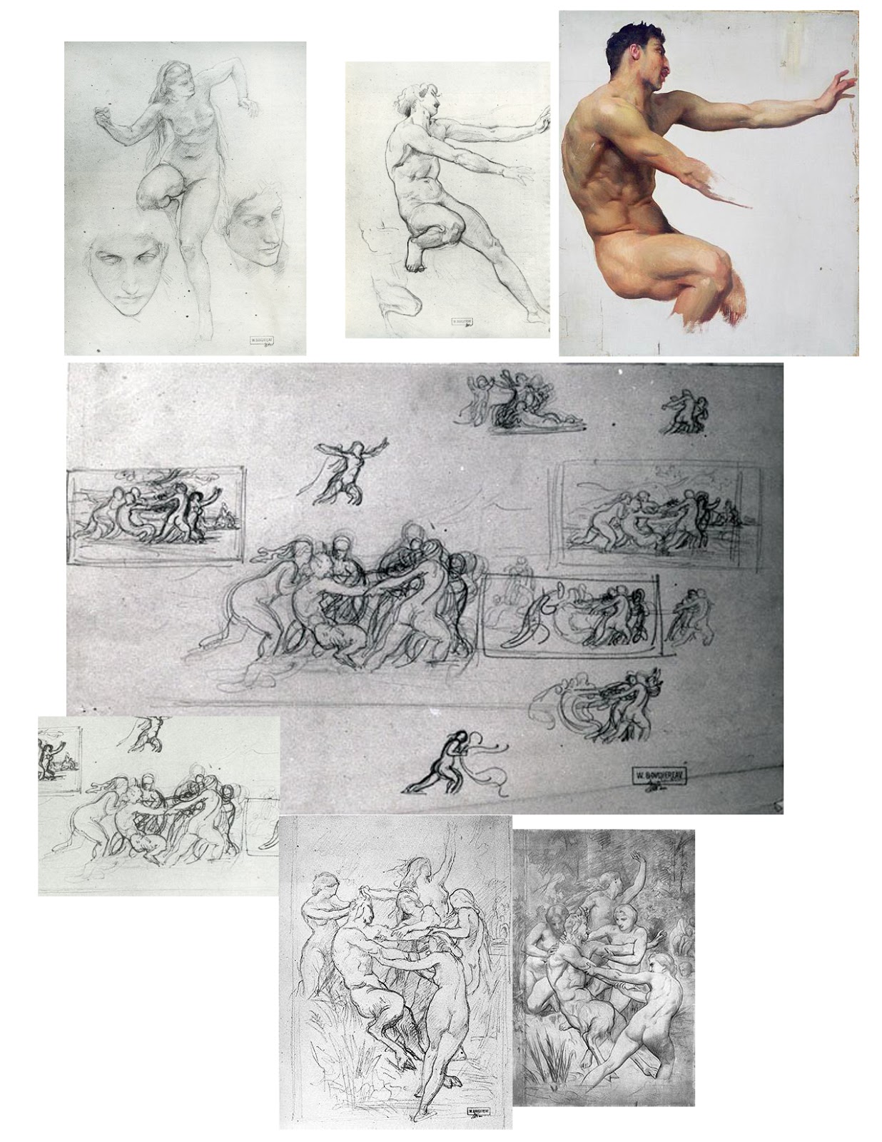
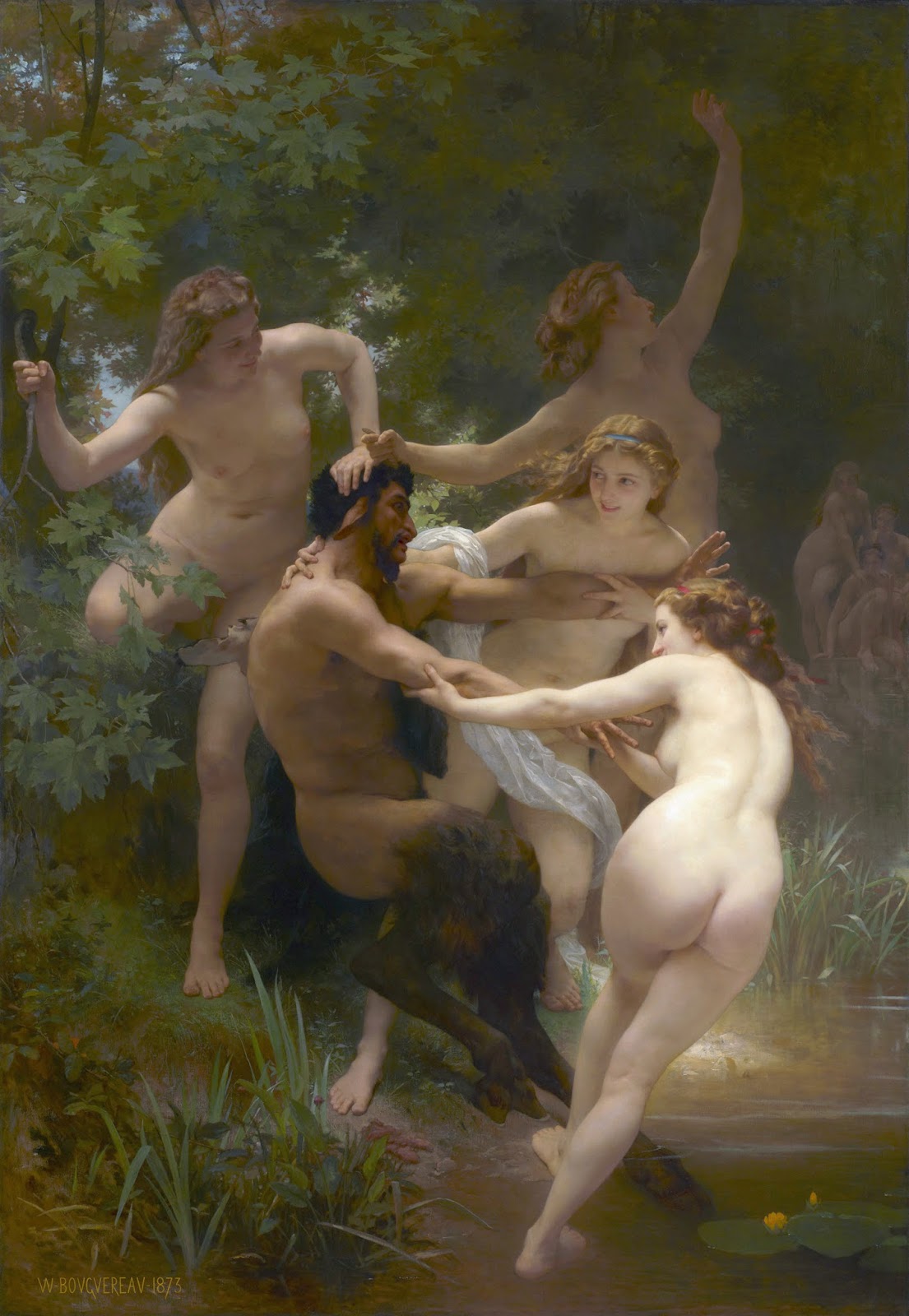
10. Finally, the most and what I find most important to remember: DO NOT BE A SLAVE TO YOUR REFERENCE. Reference is an inspiration to your idea, not the idea itself. Before using the reference for the final performance, study from it. Make preliminary studies of the subject, value studies, color studies, manipulated angles from the studies, redesigning folds and clothing patterns for a stronger composition, etc. The more familiar you are with the reference the less you will need it to tell you what to do with it.
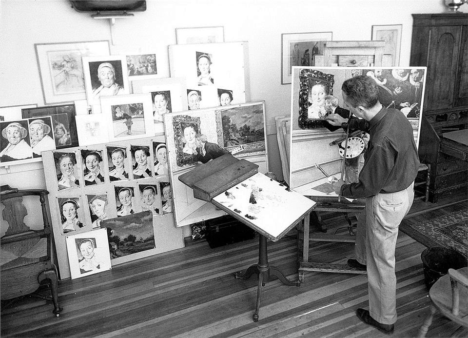 |
| Norman Rockwell with his many studies for his painting titled “The Art Critic” |


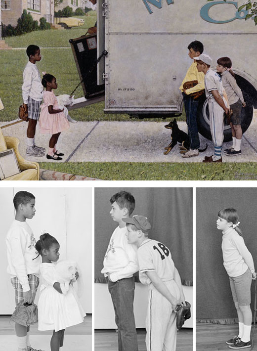

Ron . . . you are spot on in this post. For a dozen years or more, I have been painting, free for parents, portraits of their children who have been killed in the war. I have to work from photos provided by the family, some of which are very poor. I do pretty much everything you mention here in this post, but I call it “making it up.” My point is that over the years I've had to “invent” almost everything you put forth in this post. Wish I had had it a dozen years ago.
Frank Frazetta use to say everything comes out of his head like magic, or something to that affect, however accumulated evidence shows otherwise. At one point, because of that statement of bravado, students/artists use to argue about the validity of photo reference. I can understand why you'd use photo reference, it's a question about at what point does the reference become a tool and the design is really coming from the artist. I mean their are artists that you projectors, even Norman Rockwell used a projector later in his career:
https://www.youtube.com/watch?v=FoYDoh-o48Q
https://www.youtube.com/watch?v=0fEMJp70tGU
For those of you that doubt the ol'days of doubting photo reference as a tool, just watch this Neal Boyle painting video:
https://www.youtube.com/watch?v=yAZDI8G_kG4
Just forward to 2:00 to cut to the chase.
Amazing post.