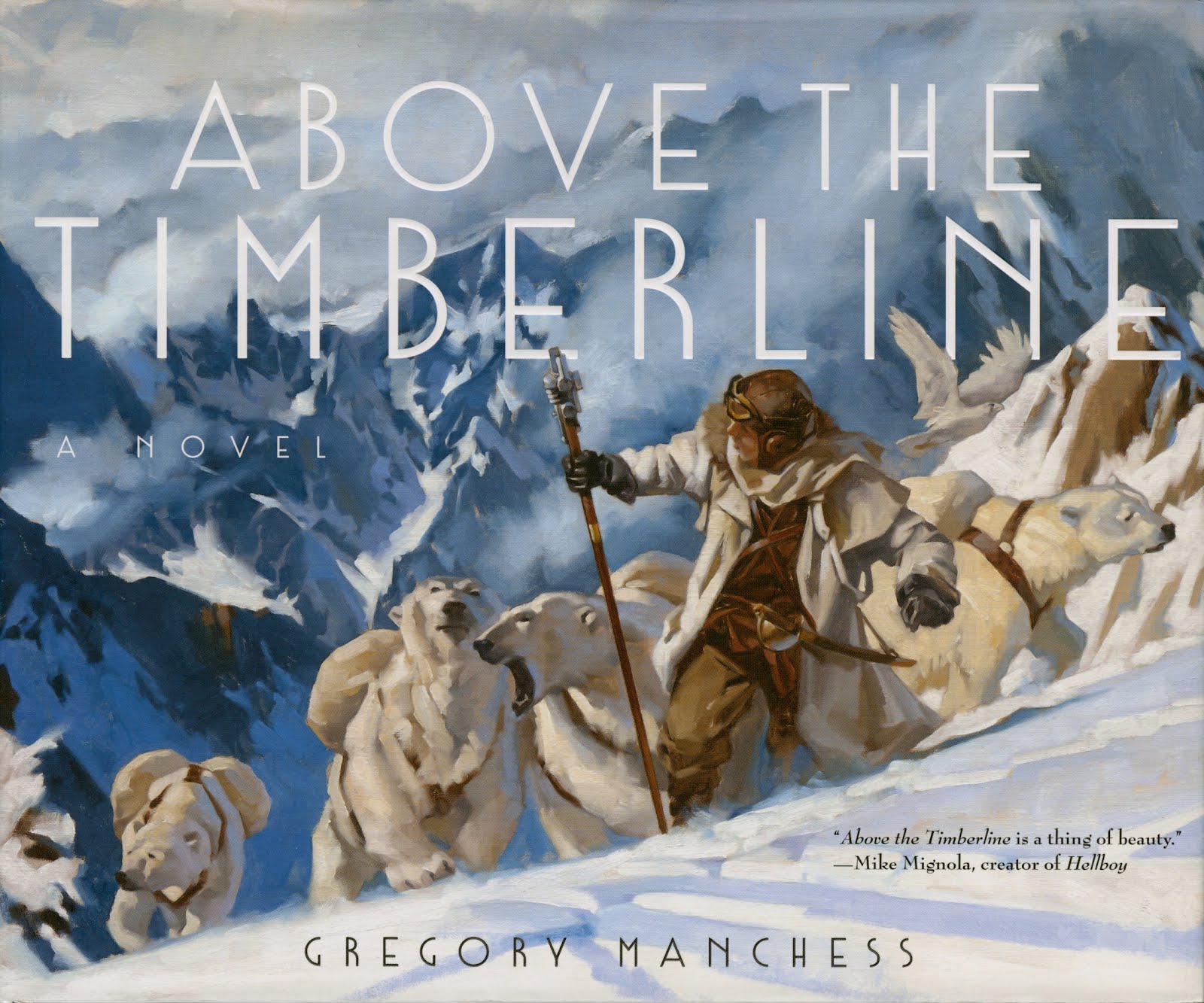
Tomorrow, October 24th, my novel, Above the Timberline, is officially released!
Many of you have followed along while I built this approach to storytelling, from thumbnails to sketches to final art.
Once you read it, or even if you’re just excited about it, please write a review on Amazon. (After 50 reviews, their algorithms recognize the interest generated for a title.) I appreciate all your help and support! But most of all, I hope you enjoy it!
To celebrate a little on Muddy, I’ve prepared a new “10 Things” list below about important aspects for building your own visual stories. I hope we, as creatives, can encourage more publishers to produce works like this.
10 Things About Visual Storytelling
Character first.
Start with a character. Write something about them that you find intriguing. It’s likely a reader will, too. Put the character in a scene and move them through it. Make them speak. What they do and how they talk will give you boatloads of information about who they are. Don’t ‘discover’ them by including too much description in the prose, learn the character and then edit to a succinct description. As viewers we already project character onto people.
Now thumbnail out the sequence. How do they move? What’s their body language? It’s what they do and how they do it. Get that down to a three-thumbnail sequence. If you can, reduce it to a moment in a visual, and rearrange images for sequences. Maximum impact for less.
Do this over and over again. That’s what I did for ATTL.
The Zero Draft.
Before I understood how to write a good First Draft, I learned about the Zero Draft. Put words down on paper as much as you can as intuitively as you can. Get it all out, no matter how sloppy or disjointed, how poorly structured or convoluted, bad grammar or none…get it down on paper before your inner-critic puts the kibosh on it.
Now go back and rework it. All good writing is rewriting. Over and over again until it’s just like you want it. Like a painter putting finishing touches to the canvas.
Keep in mind, if it sounds like writing, cut it.
Temporal shifts.
Sequential stories are becoming less linear. Film uses a linear format because it’s compressing time. But we start and stop all the time: a book, podcast, movie, audio books. A clip of music is enough to remember the whole song. Film audiences have learned to flow with disjointed timing as culturally we change our viewing abilities. Our minds go forward and backward in time everyday, remembering, dreaming, conceiving future events. We can use this in storytelling.
Through-line.
Your characters need something, and the reader needs them to move to get it. A three-act story is a classic approach to storytelling because it’s basically setup, failure, resolve. (Sounds like life doesn’t it?) Or it could be setup and reveal, setup and reveal, setup and resolve. You need a clear line through the story to carry the reader. Best to start with the end in mind.
Format.
Format telegraphs your intent. I got around this by removing panels so that it wouldn’t be assumed to be a graphic novel. Word balloons were the first to go. They instantly project to the viewer that it’s a comic format. Nothing wrong with that, but I didn’t want the preconception; didn’t want the reader to assume what they were in for. It’s a different kind of read and I took the risk to tell it that way.
Visuals.
It’s important not to merely illustrate text. “Say it and see it” is for children’s books. Pull the reader along through curiosity. Curiosity can be built by setting up the reader to expect one thing and revealing or showing them something else they hadn’t expected afterward. That’s the payoff. Say something on one page and pages later reveal it visually with a slight twist, or unexpected point.
Show what you can’t tell; tell what you can’t show.
In most writing it’s better to show than to tell, but this is changing, too. In visual stories like ATTL, I focused on showing story in the visuals–things that took too long to describe in words. And I told story in the prose– things I couldn’t get across visually: emotions, smells, etc.
All good writing is rewriting. Over and over again, until it’s just like you want it, like a painter putting finishing touches to the canvas.
Less is more.
You’re an artist. You’re already thinking visually. Your visual stories are stories. But remember to create curiosity for more. Don’t attempt to explain everything. Nobody cares.
Simple impact.
Less is more is a good guide for most creative work. Keeping things simple is key. Even in complex visuals like a crowd scene or a battlefield, the viewer must be walked through the composition to give impact. To guide the eye through a picture the composition must build a pathway for the viewer to follow characters, figures, or elements.
It’s storytelling. Too much visual information will stall the impression. Too much description in prose is needless. Though, you can use dense information to slow a sequence down on purpose, asking the reader or viewer to see something small, or point to something insignificant yet important. One must learn when to use these effects, but in most cases, it’s best to be direct and honest.
You are asking the audience to come along. They’ll appreciate a sincere approach.
Stay with it.
Remember every writer starts from the same point: word education. NO ONE is born gifted in language. It must be learned. Certainly, some people learn words faster than others. So what. Speed has nothing to do with it. It generally takes decades for a writer to mature and many great writers were much older before they wrote their renowned works.
Forget this pressure. There are loads of great books on how to write or even create great sentences, just like there are books about how to draw well. You can learn to put words and images on paper in a way that stimulates readers.


I received notice this morning that my pre-order of the book is on its way, and I can't wait to finally see it tomorrow!
Thank you for sharing so much about its process.
I cannot imagine what goes into such a project of such titanic proportions. Thank you for sharing your process to help with that.
It is truly inspiring!
It's really inspiring to see this book go out into the world, Greg! As someone who also wants to do a project involving words and art, I've been so excited to see more artists in my periphery journeying into wordcraft. It gives me confidence I can take the same journey and make it through!
Can't wait! And as always thanks for the inspiration!
Looking forward to receiving my copy this week and to just be in awe over every painting!
Thanks, Everyone! You're the Best for watching and coming along.
Angela…you CAN take the journey. It may not be the same, but it will be your journey, and that makes it even more yours. I hope I can return the support. : )
Karanveer…I'll probably do a post soon that shares the process in detail!
Mine already arrived today. I paged through it a few minutes and then had to take a break and genuflect at it a bit 😛
Got my book on Tuesday! I flipped through it, and have had cravings to experience your work. Alas, I haven’t yet had time to sit down and start. I can’t wait, Greg! My wife thumbed through it as well. She was also intrigued. One thing about it, is the sleeve seems very fragile, like many covers, so i’m Babying it!
I appreciate the gesture, DorukArt! LOL!
Kyle…hope it's not too fragile! But look underneath…I did an extra painting of some of Wes' equipment for the actual book case …just a little added oomph. : )
I saw that! It’s beautiful. Nice touch!