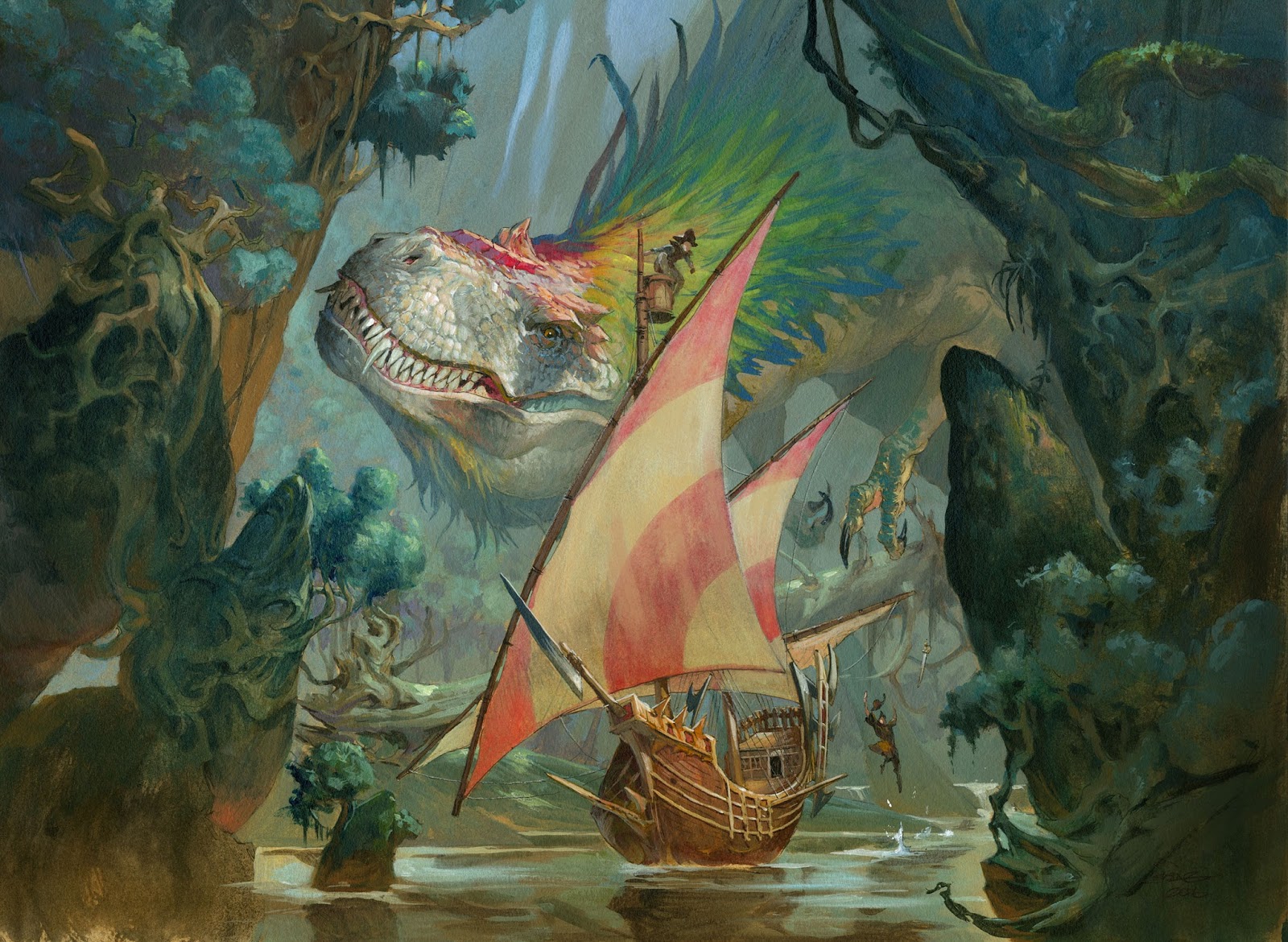
The latest set of Magic the gathering is out and it contains one of my favorite illustrations.
I was asked to do a huge T-Rex looking at a juicy pirate ship sailing on a jungle river. The Set is called Ixalan and is a world of colorful feathered dinosaurs vampires and pirates.
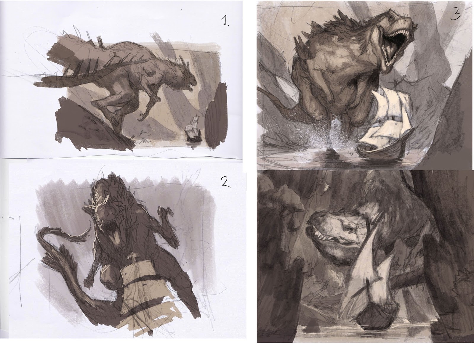
I tried different versions of this illustration and ended up submitting 4 different compositions or thumb sketches if you´d like. They are very different.
1. #1 is an establishing shot. The Dino and the ship have no interaction and everything seems to be taking place off to the right side. I was too carried away with doing a different take on a T-Rex so it ended up not looking like a T-Rex.
2. I kind of like #2. It is a low angle perspective as if seen from the ship. I choose this angle to avoid having to portrait the whole ship and its crew looking up at the Dino because I needed him to be the main character. I really like it a lot because it has a feeling of being a snapshot taken right before the Dino snaps it jaws on the ship. A very impactful angle and a cool action piece. Only thing that bothered me a bit was that the ship only was a pair of sails on a mast and we did not see any water or river or anything and it was hard to se the size of the T-Rex because of the angle and not enough to measure him against.
3. That’s why I tried a third version where the Dino was charging in from the side. I ended up disliking it. The ship seemed like a toy ship in a pond and the high angle made it look like a comic book panel rather than a cool illustration. Everything is too evenly placed around in the image making it boring. Aaaaand the Dino looks fat.
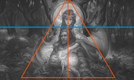
4. The forth version was a different take. I always try to add some personality and character to the monsters I paint, and with this sketch I cleaned the table and started all over. My thoughts went to what went wrong in the last ones. I knew I wanted to center the important elements. I choose a low angle to avoid the feeling of a too well placed establishing shot. Also I needed a shot a bit more from away to be able to have both the river, ship and T-Rex in the lense. What I really like about this composition is the overlapping ship in front of the T-Rex. I added tall sides of jungle cliff sides to frame the action. I like to use this effect to avoid the attention to drift around in the image. Also it makes it possible for me to create a strong triangle composition with the water surface as the bottom part or the triangle. One more thing that really appealed to me about this sketch was that the main figure was a light figure on a dark background. This is something I rarely chose for card illustration because it is harder to read in card size. I usually go for a strong dark silhouette to make sure you can see what is going on.
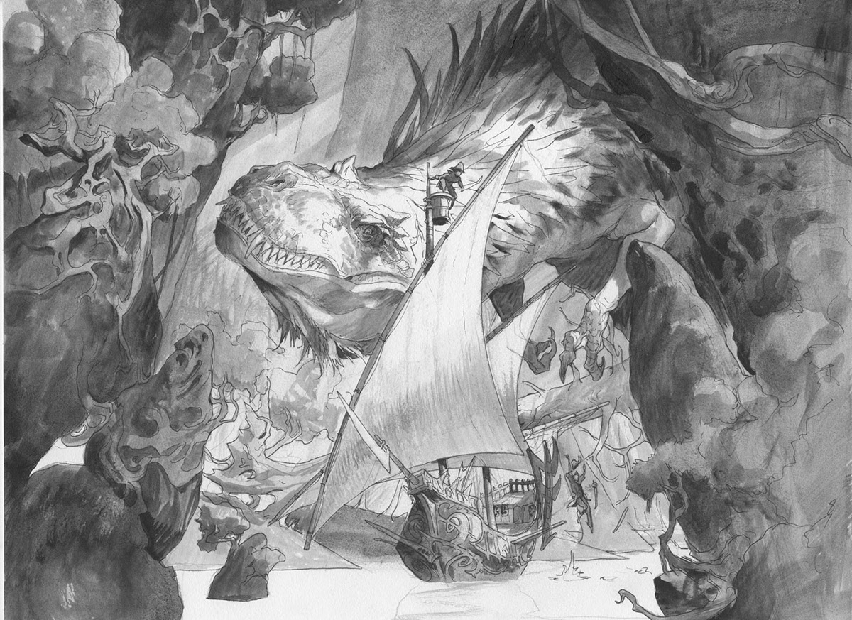
I clearly asked for permission to paint the forth one and my art director agreed. So I went on to next stage and sketched the real drawing up on a watercolor board. When I started sketching I noticed the close interaction from the T-Rex and the ship and thought it would be even better if I added a lookout in the topmasts. It is always better to have a person in danger than an inanimate ship. Someone we as a spectator can read ourselves into. Also to enhance this I tried to make the Dino face more smiling and looking cruel at the same time. The way the head tilts comes from inspiration from birds like parrots. The eyes are placed to the side of the head so the need to turn the head sideways to look at a thing closely. That was the gesture I was going for.
When I started greytoning the picture I slowly strayed away from the light Dino in a dark background. It turned out that I had a lot of different planes in the picture that needed to be clear from each other. I think of them as set pieces in a theater. The framing Cliffside are one plane, next is the ship. Behind the ship is a plane with the T-Rex and then the background. I needed the background to be light so I could use the 2 cliff sides as frames for the central focal point. So I made at least the edges of the T-Rex darker up against the background with a kind of projected light onto his face making him a lighter background fro the ship.
The most difficult part of the painting was doing the face of the Dino. I knew I wanted his skin to be white with the coloring taken directly from an amazon Parrot. The different shifts of color in the maw and the drop shadow from his eyebrow down over his face was really hard to not make too dark. I try all the time to make my shadows lighter and lighter to make the image seems like it is a real lit environment. I struggle a lot with this coming from a comic book background where dark shadows and ink line is king.
I used the strongest colors in the middle of the painting and in the focal area and used a mix of green bluish green and muddy brown everywhere else. Instead of doing a flat white or bluish water surface I went with an almost brown with only ripples and splashes in light. This is to avoid the water surface to be too prominent since I wanted the attention to be higher up with the face and the mast area.
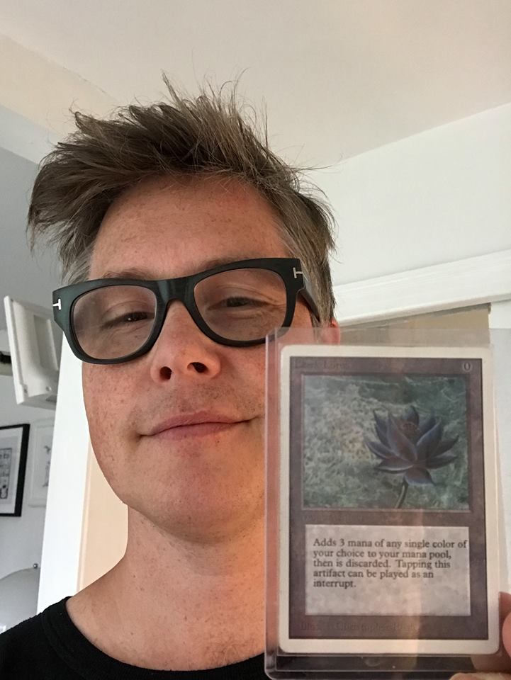
I traded the original painting of the Dreadmaw for a Black Lotus, a very old magic card from back in the days when I started playing Magic. I had one in 1994 but sold it for $200 so I could buy myself a VHS Video Machine



Awesome illustration! Love the sketches.
That 3rd sketch is so killer, You should finish that one as a personal piece. Love the energy in that.
I want to see #2 as an alt-art at some point!