Guest Blogger: Jeffrey Alan Love
The story of how I came to illustrate NORSE MYTHS: TALES OF ODIN, THOR, AND LOKI by Kevin Crossley-Holland actually starts with John Harris.
Growing up, if I saw a book that had a John Harris cover, I would buy it. I loved his artwork. In 2013, after I committed to making art that was personal and meaningful instead of just work that paid the bills, I attended Illuxcon. John was exhibiting, and after working up the nerve I went up to him and told him how much I loved his artwork and how I was trying to become an artist myself. He was incredibly kind and gracious, and we talked about our shared love of mystery, of leaving things indistinct, and how by painting the space around the object you describe the object itself. How you can just give enough information in a painting to allow the viewer to be drawn into it, to bring their own story to it, sparked by what you have suggested. From the outside looking in to the science-fiction & fantasy art industry, it seemed that rendering and realism was king, and to hear one of my heroes talking about composition and storytelling in this way gave me a lot of heart to continue pursuing a personal path for myself.
That night John stopped by my table, where I was exhibiting my new portfolio. We talked some more as he looked over my work, and then we said our goodbyes. I thought that would be that – a wonderful experience with an artist I idolized, a memory I could call upon to give me strength when I felt discouraged by the pitfalls of trying to make my way as an artist.
A few months later I got an email from Alison Eldred, John’s agent, saying that John had shared my work with her and asking if I would be interested in having her show my work around in the U.K. After jumping up and down for a bit I replied yes, please.
I think we knew that this job was a possibility on the horizon for a couple of years before I talked to Ben Norland at Walker Books. I realized that it was going to be something special when he told me he had worked on A Monster Calls by Patrick Ness with the illustrator Jim Kay. If you haven’t checked out that book, do so – Kay’s illustrations are phenomenal, deeply affecting and emotional, a perfect fit for the text. And most importantly, from my point of view, they were in black & white!
Ben sent me a draft of the text, and asked me to put together a wish list of images from it. Reading through the text I was struck by the power of Kevin’s writing, and found it nearly impossible to not just circle every paragraph. I could easily have made this a thousand-page book. “Those mountains over there… they’re made from Ymir’s bones. The sea was made from his skull, and his brains are the clouds.” Every sentence rang with visual possibility.
Those mountains over there… they’re made from Ymir’s bones. The sea was made from his skull, and his brains are the clouds. Every sentence rang with visual possibility.
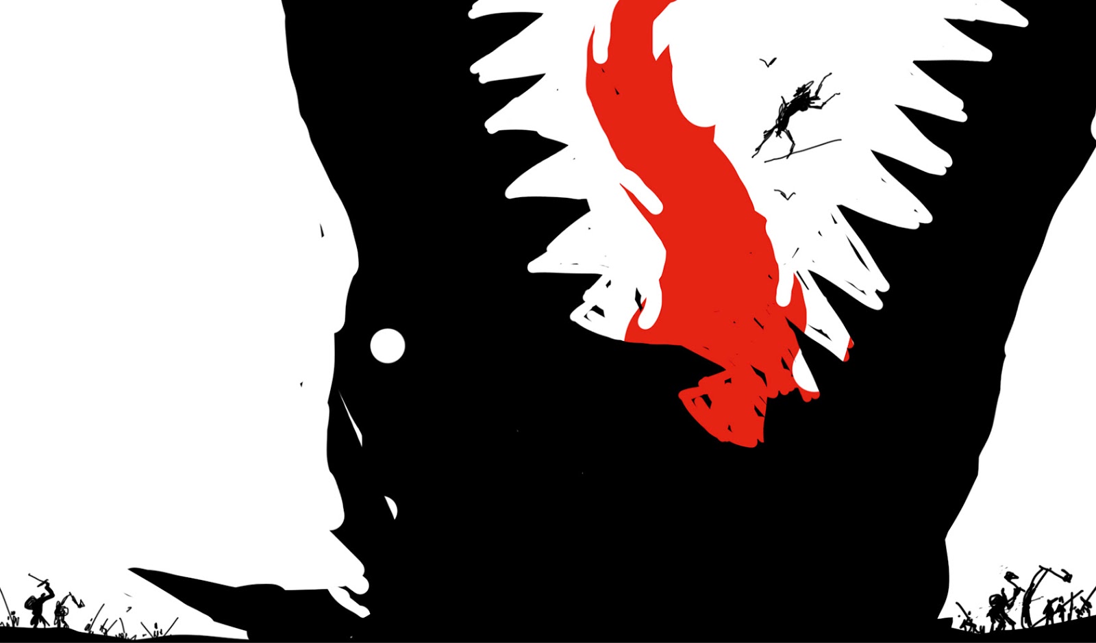
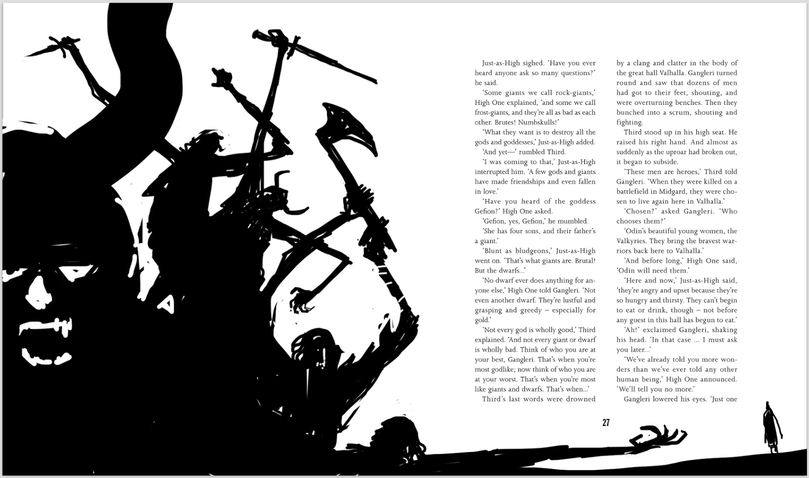
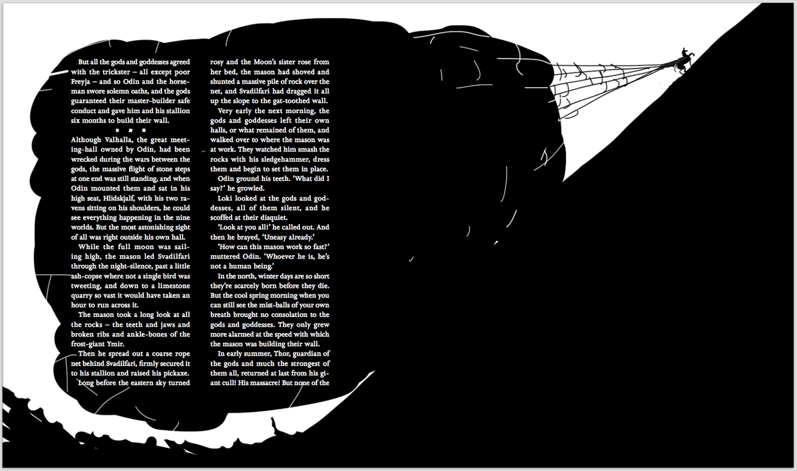
Once Ben had the final draft he laid out the text, leaving areas blank, sometimes full-pages, sometimes columns, sometimes just a thin band across the top of the page, suggesting the placement of the art with the caveat that I could change anything I wanted or suggest something different. In the end I really enjoyed having the text already in place to work with, as it gave me something to work from, it implied a design that allowed my mind to play with the possibilities. Large blocks of text suggested looming figures in pure black in which the type could be reversed to white, narrow columns suggested deep wells or spears thrust into the earth, a strange-faced man juggling razor-sharp daggers.
Another favorite artist of my childhood, Victor Ambrus, had always impressed me with the way his compositions played across the two-page spread, and I tried to bring that to this book, a sense of fun and play with the design, using the full spread instead of confining myself to contained squares.
I work digitally for sketches in photoshop, as for me sketches are not about drawing ability but composition. I’m only interested in value, shape, and edges and whether or not the image is reading and telling the story I want it to tell. In general I use only black and white, and photoshop allows me to copy/paste the sketch over and over, so I can make Thor tiny in one version, and see what happens if I make him GIGANTIC in another without having to redraw him – I just lasso, copy and paste and I can see if it works within seconds. That efficiency with time was always important with previous jobs, but it was invaluable this time around – I was doing thousands of sketches for a 230-page book, with paintings on EVERY SINGLE PAGE. To make things even crazier, my wife and I had our first child in the middle of this project, and when we emerged from our shock I did the math and saw that I needed to finish three paintings a day to hit my personal deadline for the book. Ben and Walker were excellent about giving me as much time as I needed, but I’ve always prided myself on hitting deadlines, and didn’t want that to change now.
The wonderful thing about nailing down the composition in the sketch phase is that I get to just have fun making the final art.
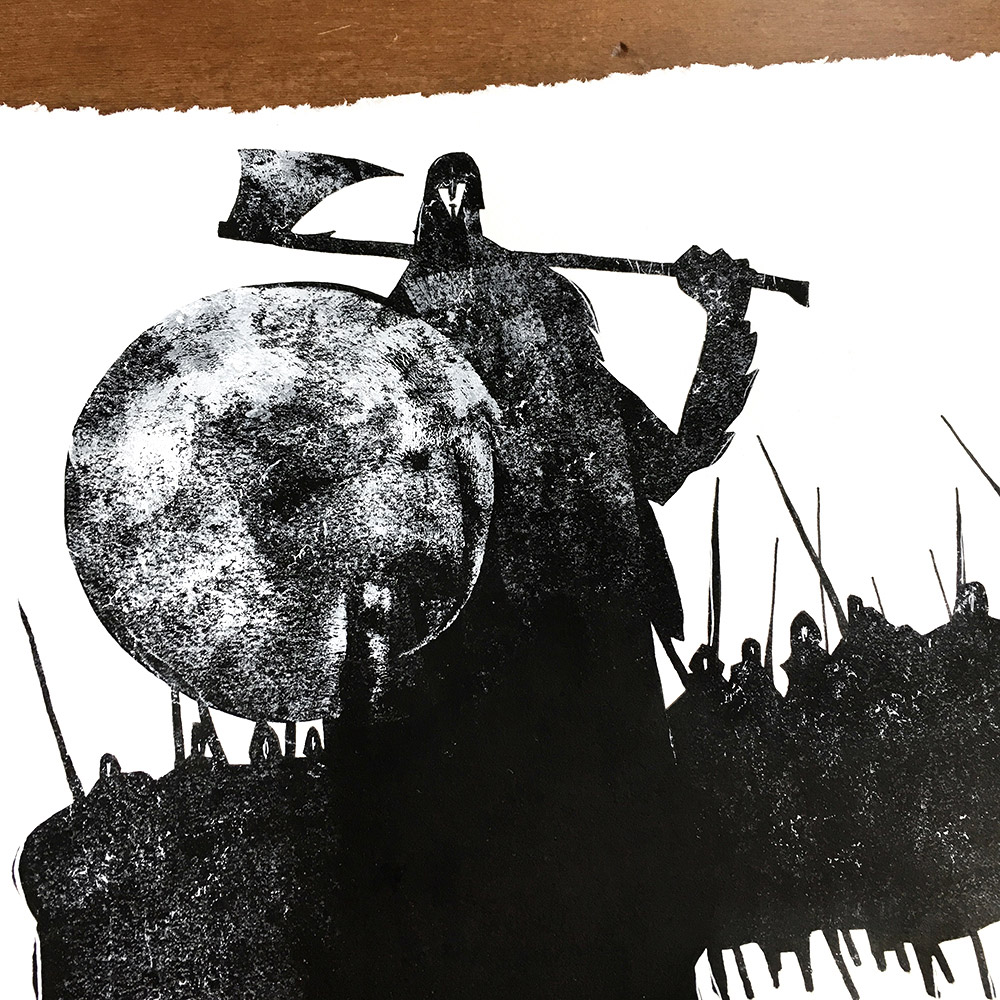
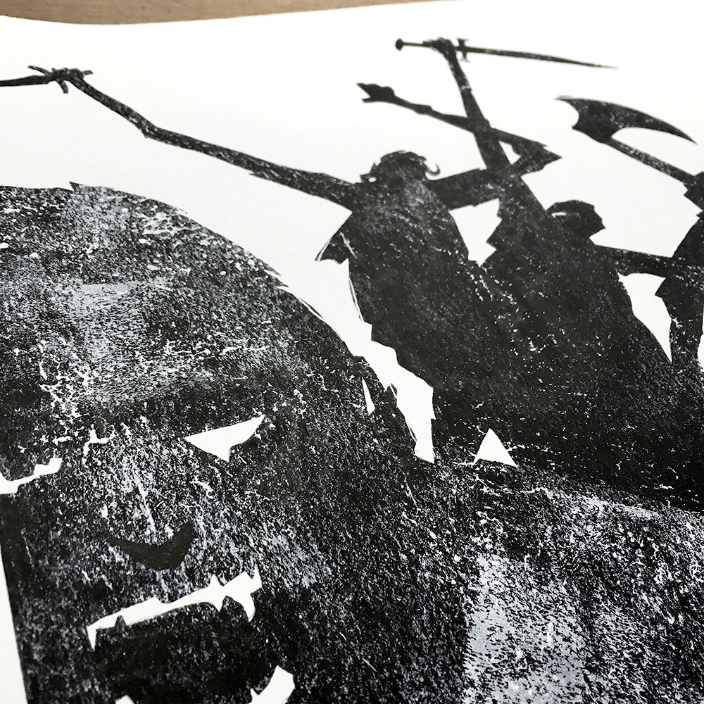
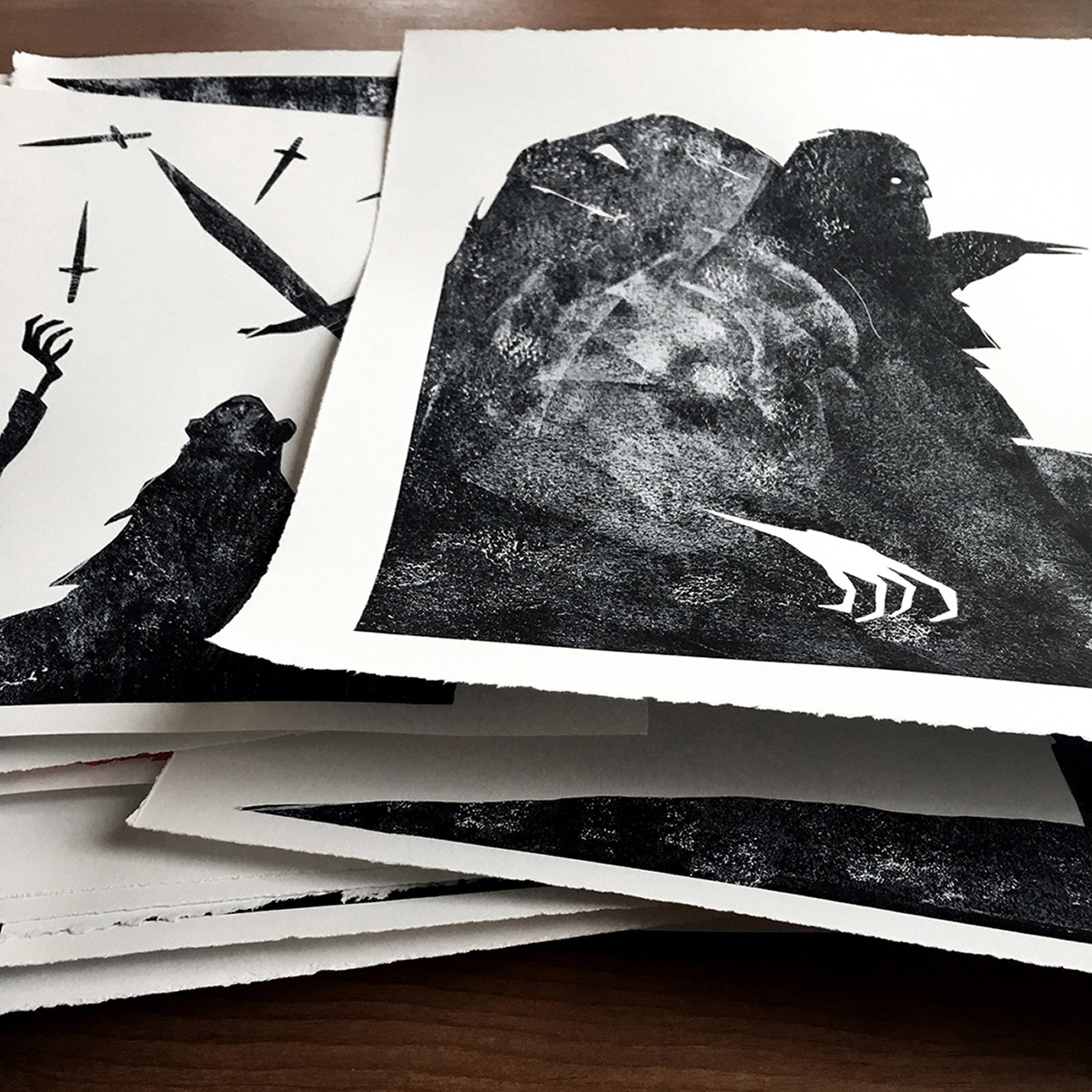
I print out the digital sketch and lightbox it onto Stonehenge paper. I paint the silhouette with black paint or ink, depending upon how much surface texture I want at this stage, and then I coat various brayers, paint rollers, socks, petrified sticks I found on the beach, sponges, brushes, old shoes, my fingers, etc. with paint and start distressing the image. Just about anything can leave an interesting mark, and I try to have fun and leave myself open to happy accidents at this stage.
I intentionally relinquish control of the piece to the materials and let them do what they want. I used to cringe when something happened on a painting that I thought was a mistake or weird – now I love when that happens, when something surprises me in the process. The pieces begin to resemble a Rorschach ink blot, and I start to see things within them. Using white and black ink and paint and colored pencils I go back into them and try to bring out a little further the things I see within the silhouettes so that the viewer will see them too.
Then it’s just the simple matter of painting day after day, piece by piece, until it’s done and you look back and wish it really was a thousand-page book and that it didn’t have to end and you could keep painting it forever, because this truly was a dream job for me.
Thank you to Kevin Crossley-Holland for letting me run wild with his words, to Ben Norland for being such a joy to work with, Alison Eldred for her friendship more than anything, and John Harris for seeing something in my work that was hidden from me, and for sharing it. And thank you to Muddy Colors for sharing it as well.
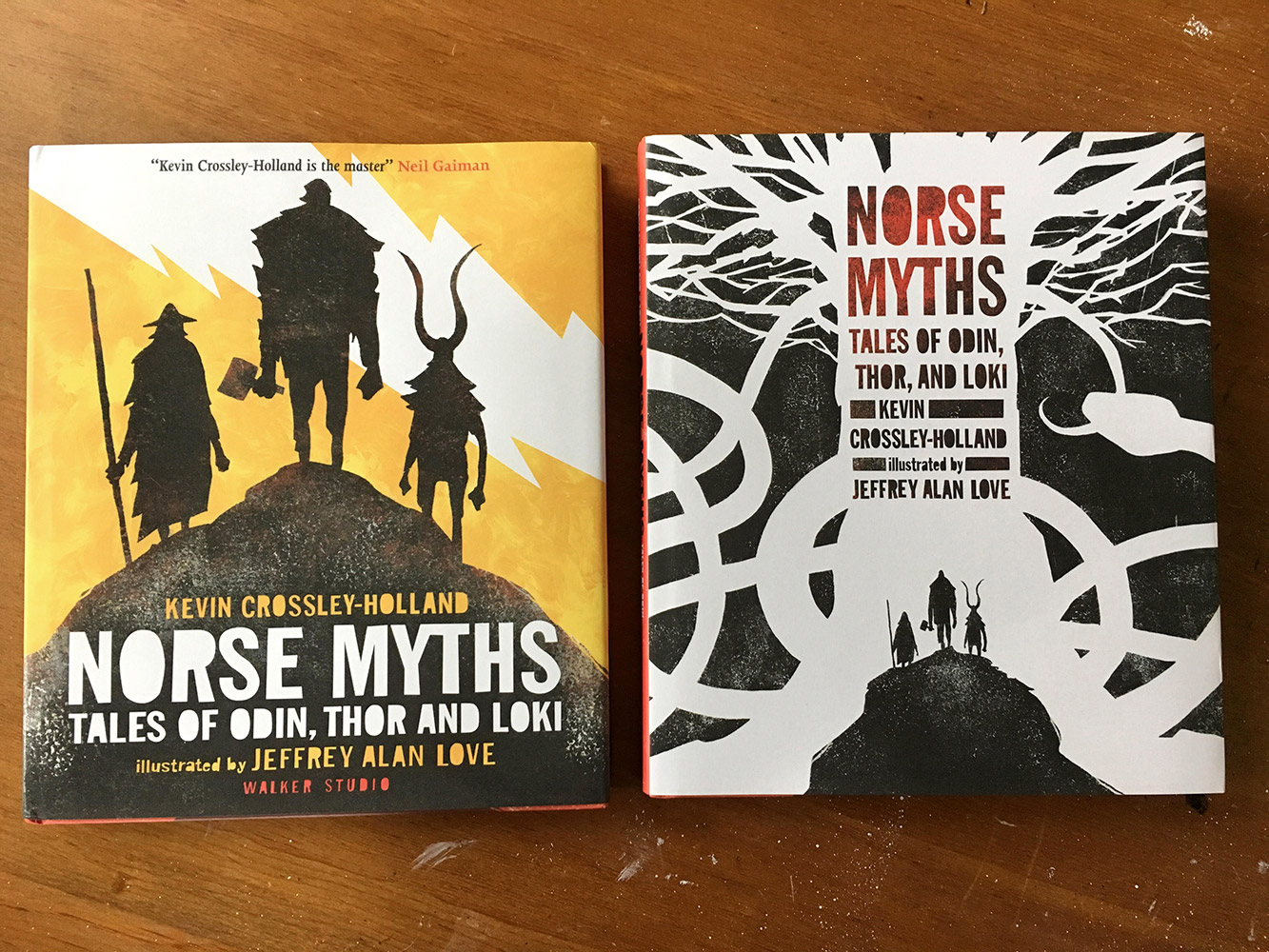
Norse Myths: Tales of Odin, Thor, and Loki by Kevin Crossley-Holland, illustrated by Jeffrey Alan Love, is available from Candlewick Press and Walker Books.





I wonder how he did it, all those crisp edges… masking fluid?
🙂
https://www.youtube.com/watch?v=wmrZIIp0fzs
John's work is always inspiring… but you have become quite the inspiration to the rest of us in your own right. Some beautiful work Jeffrey!
I actually just stumbled on this book in my local Indigo bookstore and fell in love with the stories and images on the spot. I can't wait to go home and continue reading. To find you writing about it just 24 hours later is a coincidence, but all the bits about making the art that means something more to you rings true with what I've felt lately.
Thanks for sharing, Mr. Love!
This may seem dumb, but I went to amazon and see both covers(?), with two different listings. Both are hardback, only difference is price. Are they the same? Is one deluxe? I'm a little confused. I did just briefly scan a chunk of the text. So maybe I missed it.
Awesome