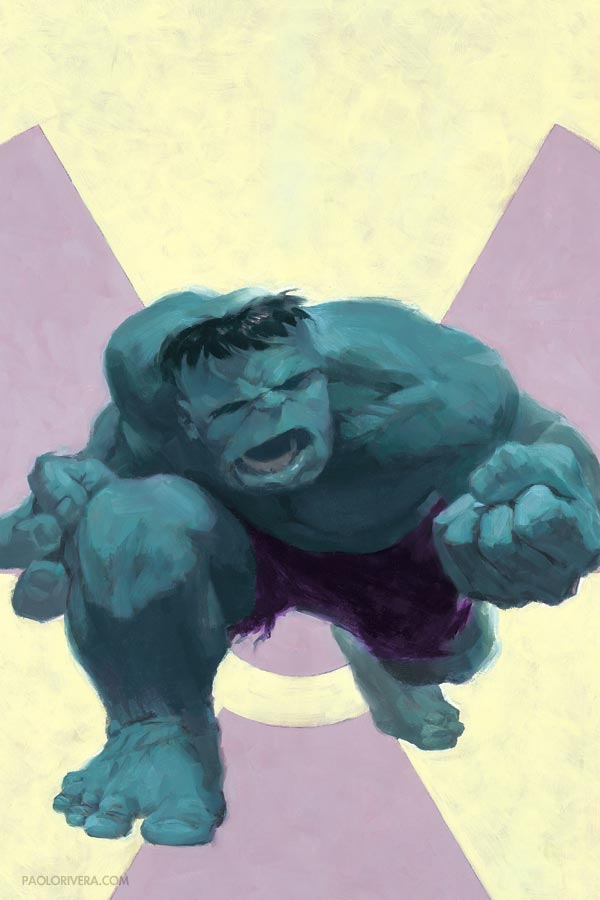
I began much the same way, painting the cover in oil, and taking it one page at a time. At some point while I was glazing the first page — I remember I was listening to David McCoullough’s 1776 — I had had just about enough. Excited as I was to have my dream job, it was simply taking too much time. I knew something had to give.
Joe Quesada, then editor-in-chief of Marvel, had recommended going all-digital as means of speeding up, so I gave it a shot. I scanned my pencils and painted over them in Photoshop using my Wacom tablet (with some experimentation in Painter as well). While the results were passable, I didn’t care for the style. More importantly, I didn’t feel as though I saved any time.
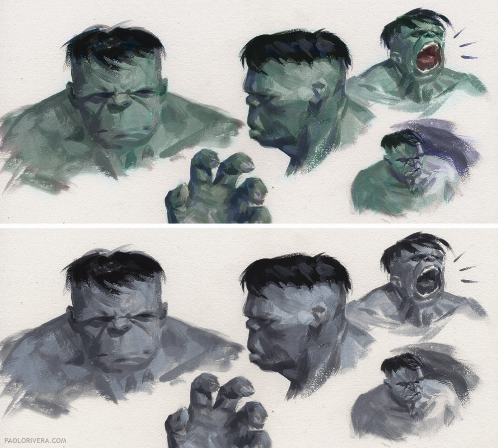 |
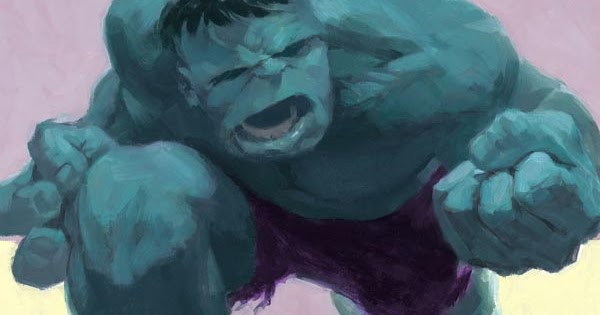
| Mythos: Hulk Studies. 2006. Acryla Gouache on bristol board, 8 × 10″. |
Eventually, I settled on painting in grayscale with Acryla Gouache, an acrylic with a matte finish, and adding color digitally in Photoshop. The results were close enough in style to my oil work, but the added bonus was how easily I could scan the pages which, at 8 × 12″, were small enough to fit on my letter-sized scanner. (I have since upgraded.) That meant no more stitching together scans, and because of the matte finish, no more glare to contend with. Having only 2 colors to choose from — and less surface area to cover — the issue took me less than 6 months, as opposed to the 10 that X-Men required.
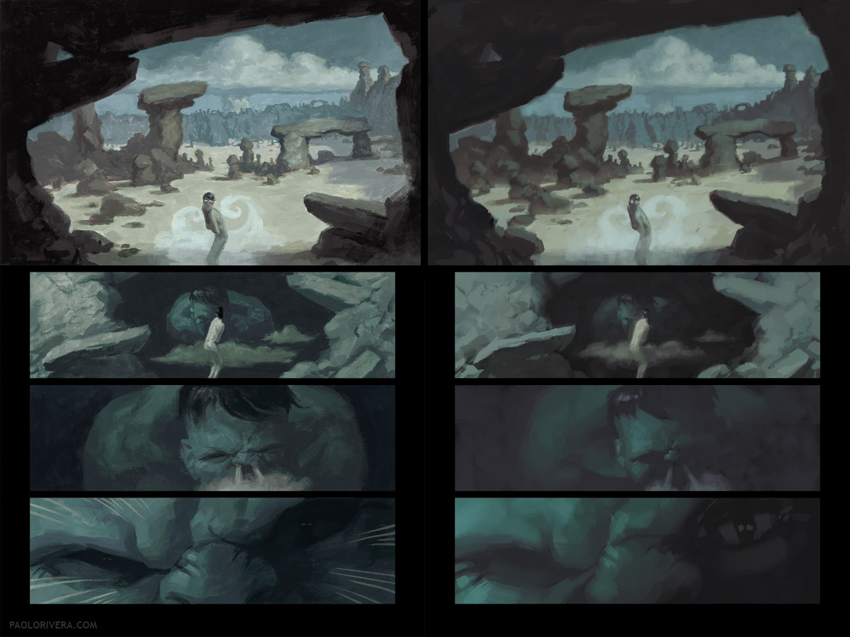 |
| Published page 1 vs. Digitally Painted Experiment |
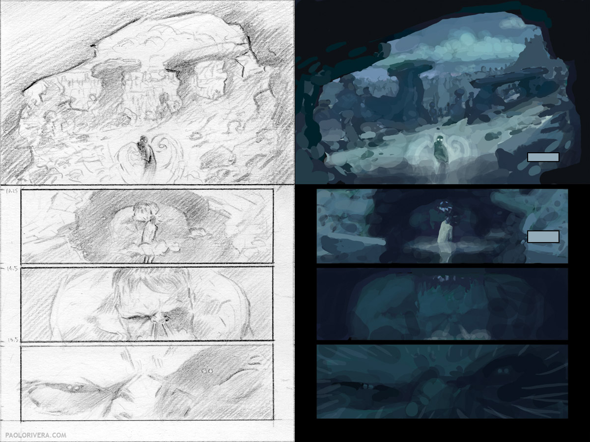
In the end, I painted the first page 3 times in 3 different media: oil, digital, and grayscale acrylic. Aside from those experiments, the basic process was the same for me, starting each page with a pencil layout, followed by a digital color study, and then a more refined pencil drawing. (Later pages included a grayscale study as well.)
 |
|
Pencil on paper, 4 × 6″, and the overlaying digital color study
|
Since I was using acrylic, I could paint directly on the bristol board, eliminating the need to transfer my drawing. I’ve been using the same surface since: Strathmore 500 series, vellum, 3-ply. I purchase large sheets and cut them down, though I’ve since gotten away with the semi-smooth, pre-cut 2-ply for commissions.
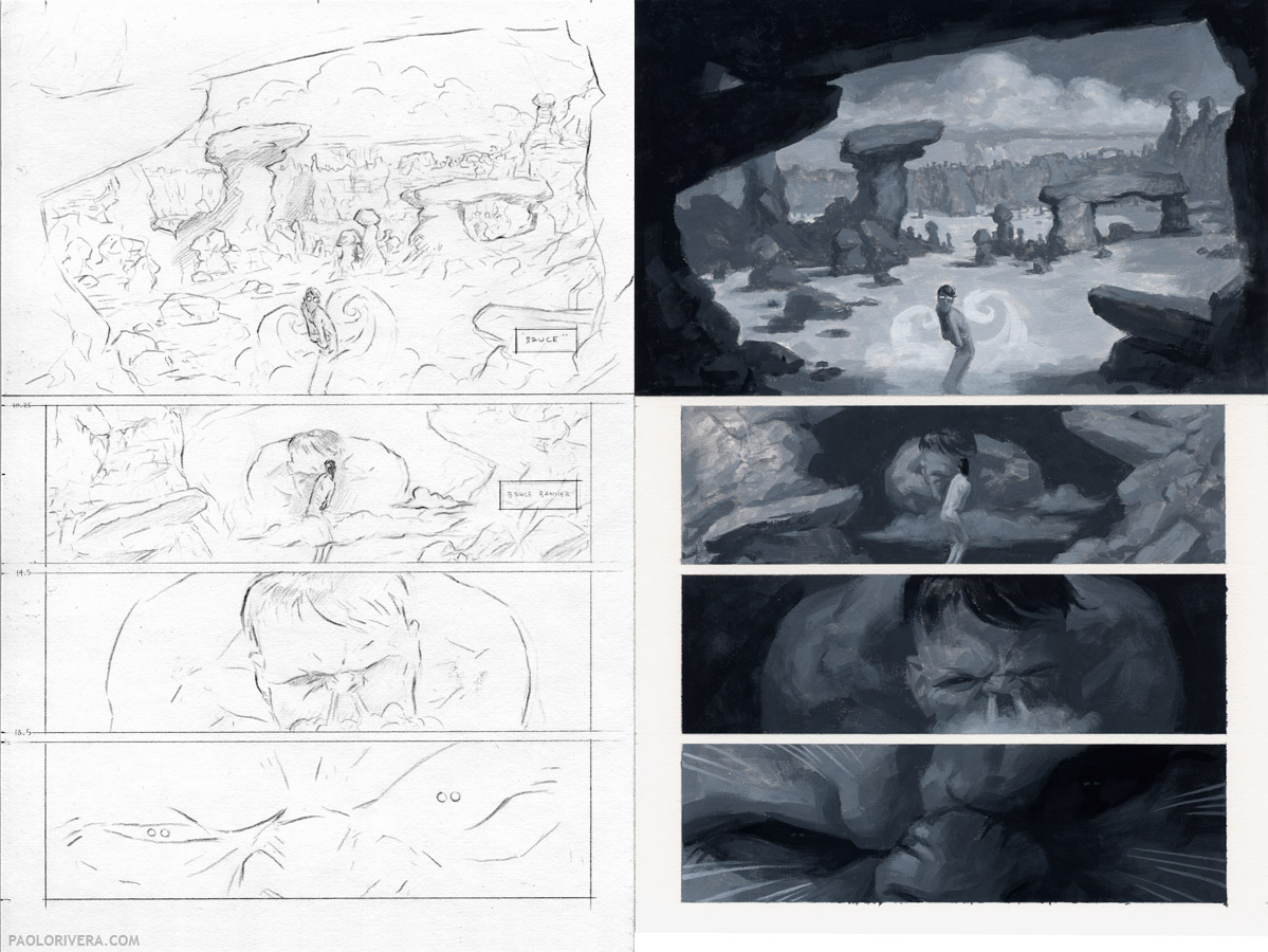 |
| Pencil on bristol board, 8 × 12″, followed by Acryla Gouache |
As for the digital color component, the technique changed from page to page, but the basic approach was to use the grayscale painting as the background, covering it with a layer set to “Color” mode. This meant that any color applied to this layer would adjust the hue and saturation without modifying the underlying value (or brightness, in other words).
Now that process wasn’t always easy. Some colors — red is a good example — can appear much brighter if the saturation is high. That being the case, my grayscale base layer often had to be adjusted in order to achieve the desired result. Each panel required a separate “curves” layer to bring everything together.
 |
| 1. Grayscale Painting 2. Published Panel 3. Isolated Color Layer |
If you look at the color layer above on the right, you’ll see various stray marks across the panel. (Here’s a better look at that panel, along with some sky/cloud reference.) Since the value is determined by the underlying layer, those marks had no influence, so long as the hue and saturation were the same. At first, I colored very loosely, filling in details as I saw fit. As time went on, however, I began to select my actual paint strokes from the background layer, using that as a mask with which to paint. My hope was to create a more natural feel, as if each stroke was individually mixed and applied.
Of course, if I went to that much trouble, why didn’t I just paint in color? Ultimately, that’s exactly what I did, which you’ll see in my next post on Mythos: Ghost Rider. In the meantime, you can see more Hulk work on my blog, including sketches, another step-by-step page, and even some wacky reference. There is also a gallery of pages from the issue at Splash Page Comic Art.
I should be in Zurich for the next week, but I’ll be happy to answer any questions upon my return.
 |
|
Mythos: Hulk Cover. 2005. Oil on masonite, 16 × 24″.
|



Oh Paolo, you're so talented it hurts to even think about it. Really looking forward to the next post.
Awesome work Paolo! I'm trying to get success with the grayscale base then add color way, but sometimes it seems that painting direct in color would be much more effective. Looking foward to see how you paint direct in color.
Amazing Work Paolo. I love the Acryla-Gouache solution. It gives the digital such a nice texture and boldness. Looking forward to the next post!
Thanks, guys! And yes, Denis, painting directly in color is much more effective, but as a learning process, the grayscale experience was very valuable. It gave me a better understanding of what color can and can't do, and just how hue, saturation, and brightness can influence each other.
thanks Paolo, I think the grayscale is a very good way of learning the values too. Your artwork is awesome and i'm learning a lot with your posts.
Thanks for your wonderful sharing.