 |
|
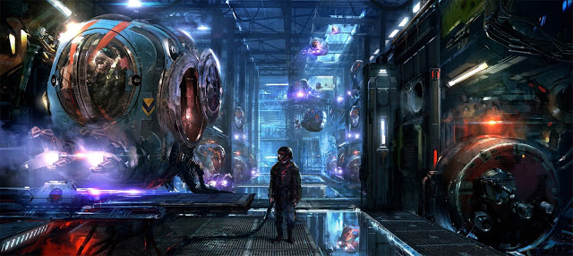
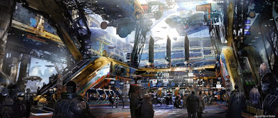
Guardians of the Galaxy art by Atomhawk Design Ltd.
|

Illustration vs. Film Art
Saturday, December 30th, 2017
After recently reviewing a healthy stack of illustration portfolios I noticed an interesting trend developing that I would like to point out and possibly raise a few flags for upcoming illustrators in hopes of preventing more of these portfolio mistakes from occurring. The portfolios I was reviewing were for print, books, covers, etc. and a lot of the work in it was very loose, rough, unfinished, but the idea was there. They were all more or less cinematic ratio or landscape format. The focus was more on the environment, using photos bashed together and painted over to “change” their appearance to suit the illustration’s needs. I have an idea where this influence might be coming from so I asked a few of the artists some questions and my suspicions were confirmed.
If you like science fiction and comic books then you know that we are living in an exciting time with an increasing number of films in these genres made each year, and this next year is providing us with even more comic and sci-fi films and new worlds to explore. The influx of films and animations only means more “art of” books than ever before. Barnes and Noble is loaded up with these “art of” books, almost dominating over the “how to” art books. And these books are a huge influence on many of these artists and how they develop “art” for their illustration portfolios. Because it is printed, it is illustration art.
However, as a “developing” artist or professional keep in mind that these books, as inspirational as they might be are with amazing art are not filled with “Illustrations” in the same sense that Magic cards or card art in general, book covers, interior illustrations, or packaging art is made. “For print” illustration focuses more upon the characters and what they are doing or feeling, controlling their actions, and developing the finer subtleties of a specific emotional state. There is a level of sensitivity and care towards crafting these images that most often will not make its way into any film art.
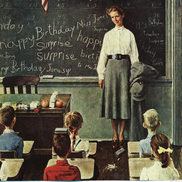
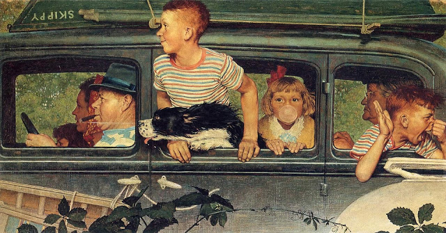
Norman Rockwell was heavily inspired by film and was fantastic at staging and delivering spectacular performances from all of his “actors”.
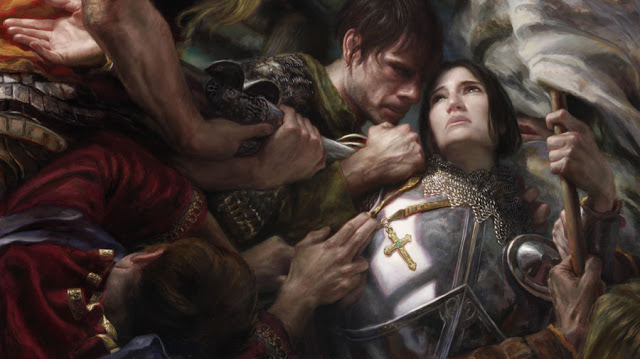
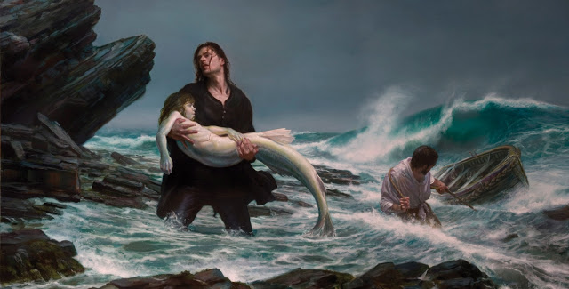
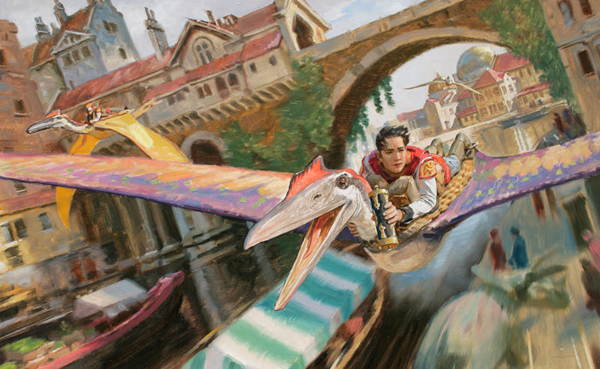
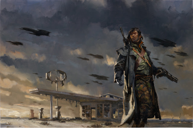
Donato Giancola stages these beautifully like a film director but notice the attention to the characters emotions and the level of detail in these pieces, not found in any film production art to this degree of rendered finish.
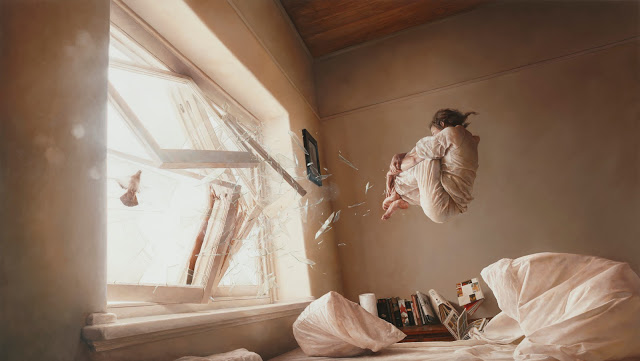
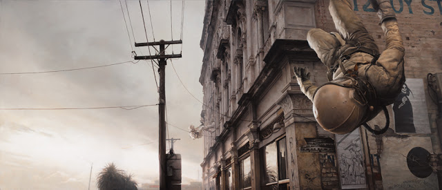
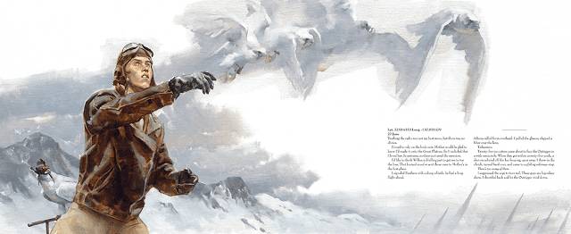
Jeremy Geddes also works cinematically at times, but again the level of detail, focus and finish is not conducive to the fast pace production schedule for film.
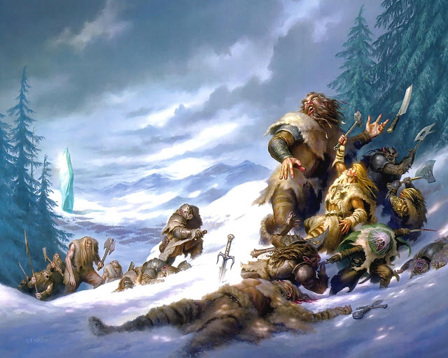
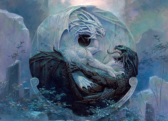
Todd Lockwood renders nuances in his work that requires time and care to finely tune them into his complex and physically charged scenes.
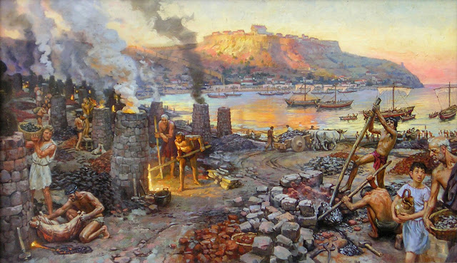
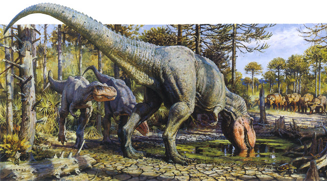
James Gurney’s art is extremely involved and handled care that would otherwise be photobashed for speed and saving production time in a concept piece.
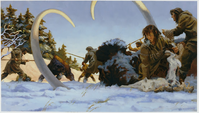
Greg Manchess has a style that looks deceivingly loose and quick, but don’t be fooled by the energy in his brush work. It takes years to build the confidence and control in each of these brush strokes and the amount of planning and care that go into these pieces requires more time to make than any film production art.
Film and Animation art in the “art of” books are production art pieces, descriptive to a team of many different art specialists all building the film, focusing down on a single goal. Most of the “illustrated” work in these books is either pitch art, highly developed and rendered to raise money for production and rendered far beyond anything crafted once production begins, or key frame art, which is the closest thing to a finished illustration the production team is going to generate.
A key frame is an image that is part concept and part storyboard. They are a single frame in a series of frames. They do not focus on the characters expression although it will not be excluded. And key frames do not focus on highly polished, ready for print illustration work.
Key frames:
-describe the lighting
-the blocking of the shot (position of objects and characters within the frame)
-the color palette
-the camera angle
-the quality of action
-pertinent textures
-effects that might contribute to the shot
-depth of field
-direction of the action vs. camera position or movement
Key frames do not focus on the characters specific emotions, that is left to the actors. The characters that are drawn are given emotions but the artists intention is not to describe how the character should behave specifically, but more about what the character is doing in this beat or moment in time.
Key frames fill the “art of” books, they are the “sellable” kinds of art that a non-artist but huge fan could be attracted to. They look finished, because the artists who make them are highly skilled illustrators, but the goal is not the same as a finished polished stand alone illustration.
Some of the above work by George Hull and Peter Popken.
Production plates are similar. They describe setting, scale, lighting, frame position, camera angle, color scheme, texture, and special effects. They do not get heavily involved in character other than contextual to the moment, although with speculative sci-fi, fantasy, and other movies requiring a heavy dose of special effects they are rendered much further to completion than storyboards. However, the production art I am going to show you feels like illustration because it is the first time a non creative is going to preview the possible film.
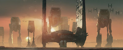
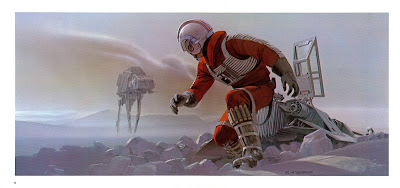
Ralph McQuarrie’s amazing production art for the original Star Wars series.
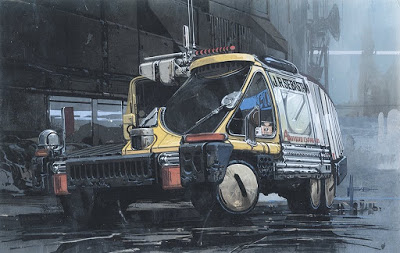
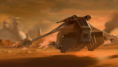
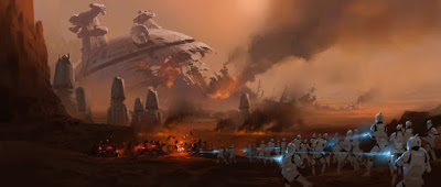
At times it might be difficult to tell one form of art from the other because of the artist. Anyone who has invested focused and goal driven time skill building will put that skill into whatever they do. Syd Mead, Ryan Meindering, Ralph McQuarrie, Stephan Martiniere, Ryan Church, just to name a few, are highly skilled artists working in film and dedicate their full skill set to making their art.
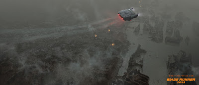
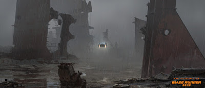
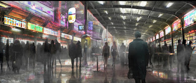
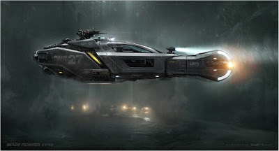
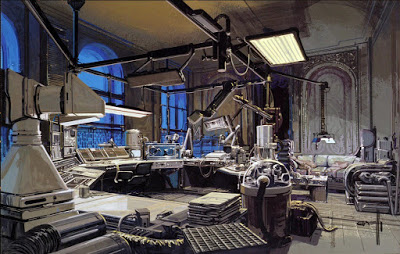
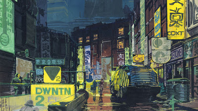
Syd Mead and the amazing pre-production work he did for the original Blade Runner film.
Ryan Church’s concept paintings for the Star Wars prequels.
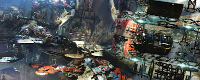
The complex renderings of Stephan Martiniere for Guardians of the Galaxy 2.
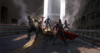
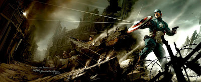
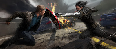
Ryan Meindering’s art for Captain America and the Avengers.
But as polished as that work looks, there is still a considerable difference in the focus of content between their film art and a finished book cover piece. Film art cannot take a long time to generate. Sometimes the artist is given some breathing room to finish the art, but most of the time the art is done extremely fast, and many shortcuts are used that just wouldn’t fly on for a magic card or a D and D book cover.
It’s okay to be inspired by anything that gets you interested in pursuing a career direction in art. Just remember that before you put that book together to pitch, be clear on your goals and what kind of art you want to work towards accomplishing. A portfolio is your best foot forward and as the saying goes, you want to put a million dollar effort into your portfolio for that first one hundred dollar job, showing that you are beyond capable of doing what you are expected and that you do nothing but the best that you can do. Putting “anything” in the book doesn’t work no matter how well it is done. Every industry has its own needs and you want to be clear on what those are so you can build the right kind of portfolio that will get noticed and hopefully open the door to the industry of you choosing and the kind of work you would like to do.









Nice article, Ron. I appreciate the examples and explanations of the differences between these two applications of illustration. One more aspect of for-print illustration that I always enjoy is the opportunity to layer in symbolism, intention, and personal meaning in a work. Due to the commercial nature of illustration, this may not always be possible to include, yet I believe this is where illustration as an art form always has the possibility of positively blurring itself with fine art. Narrative detail can ignite the imagination in either filmic or non-film illustration, but when one can meditatively step back and find deeper meanings and statements in an illustration—things that make one think about what’s important in life or how someone else feels about something—then I feel the illustrator has made something real and more likely lasting.
This was one of your best articles I think. Or maybe it was just so important for me right now. I don’t know but it seriously hit me! I went from a moment of panic in my stomach, forced myself to keep reading, then understanding… you hit the nail on the head with the “art of” books. I actually asked for, and received two for Christmas! Now I’m left here thinking and evaluating my fledgling art career. Don’t actually know which direction I want to go but I already feel better equipped with these awesome examples. Thank you! And I love muddy colors!!!
As a beginner illustrator working on my first portfolio, this article was invaluable.
I now have a much better idea of what the intention behind the artwork is and how it dictates the process.
Thank you also for providing such stunning paintings in this post which are incredibly inspiring!
Great article! As a picture book illustrator thinking of transitioning into film work, I’ve been looking for resources on the needs of that industry, and this is a perfect starting point. I’ve heard that film art requires an incredibly fast turnaround, but I haven’t yet seen any hard numbers on that. Any idea how much time McQuarrie or Meindering had to produce their pieces? Also, do you know any other resources that dig into this deeper? Thanks!
As others have already said, this was an important read. I’m at a cross roads right now, and need to decide if I want to focus on finished “book cover” illustrations or go the movie route.. such a hard choice! my question is can someone do both successfully?
Your Illustration are awesome. I run a slimier blog BeOnTrack. may I use your illustrations with credits? keep up the amazing work. You have earned yourself a regular reader.