I recently had the opportunity to go back to Dungeons and dragons and do some character portraits. I started my whole career as a fantasy artist doing character portrats. In 1986 I started playing roleplaying games and I drew an image of my character for the front of the plastic sleeve containing the sheet. Every time my guy got a new weapon or had a wound or lost an eye or whatever accident happens for a fighter steered by a reckless thrill-seeker, I had to go back and draw a new image. I went on to drawing the rest of the party and thus spawned the idea that I might pursue this as a living. A dream that became real 20 years later.
Usually I think a lot about what is in the belt of the character or what he or she is carrying in the backpack. I try to add or stock up the figur with as much equipment as possible. To some degree I think it is important for the users of the roleplaying books that they can see and recognize details and items that they themselves use and have in their own playing character. But with these new DND portraits I went a little out of my usual filling out details and focused more on the character. Since these had no setting or action to play the ball up against I only had gesture and pose and a bit of details to shape them up around.
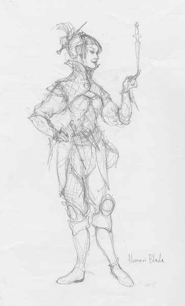
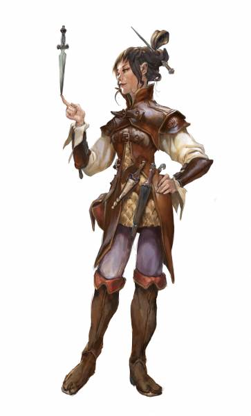
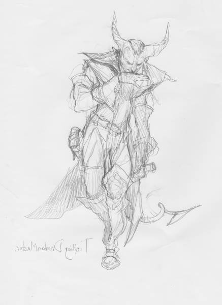
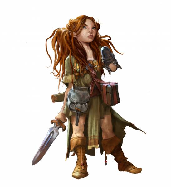
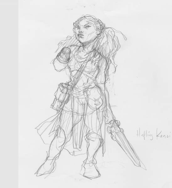
I sketched out poses that would fit with the characters. These are mostly silhouettes to make the gesture and the pose right in my head. And if I like them I start adding in details and expressions. The thief like girl in the middle is my favourite. At this stage I try not to use any references. I kind of think it kills my ability to come up with ideas if I already have something to look at. I do keep a mirror at my desk for hands so I can draw my own fingers and such. The sketched out version of the thief girl lost a lot of the swagger the thumb sketch had, but I continued anyway thinking to fix it in the digital process. For some reason I had decided I wanted to paint these figures in photoshop rather than acrylics like I am used to. I imagined it would save time, but in the end the constant zooming made me spent too much time on details that I would have kept loose and artsy in traditional media.
.
In the final I was able to change the foot position a bit to make the weight better. I found a photo of a cosplayer in leather armour and based a lot of the shine in the leather of the photo.
I think what I liked mostly about this thief girl is that she has a life-like and believable pose rather than a typical heroic pose. In order to “sell” a character I think it needs to feel alive. Gesture and pose will be more than 75% off that. The natural way she balances the knife shows that she is competent.
The facial expression I kept self secure and at ease rather than angry or clenched. I actually wanted her to look like an ordinary “girl next door” type. I think that if you as a fantasy artist can make characters seem alive and believable, you are enhancing the believability in the whole of the fantasy world.
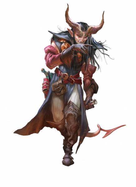
Next character was a Thiefling Drunken Master.
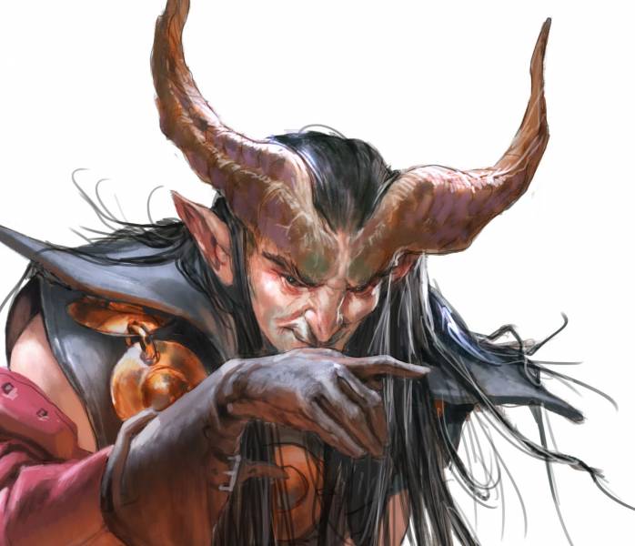
I liked the halfdrunk wager motion that went into the sketch, but after I scanned it and was ready to paint it I adjusted the pose slightly for better weight. I also bent his arm holding the bottle a little to give it more of a Swung. The hand whipping he mouth in the sketch as awful, and I knew I had to make a better one in the final. I used the mirror I have in front of my desk to capture the gesture right. By far the most of the time was spent on the face. I wanted him to look badass and in control, determent and ready despite of the drunken gait. Also I had only full black eyes that are really expressionless so most was in the head tilt, smile and hand gesture.
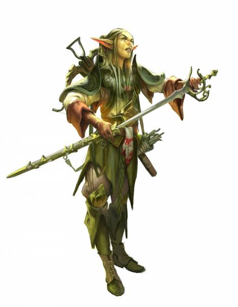
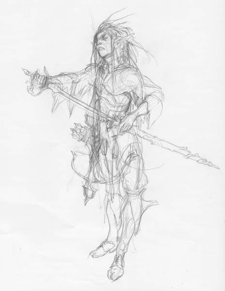
Here are some of the other characters…
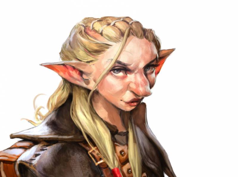
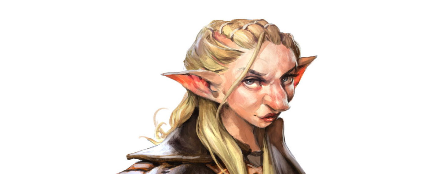
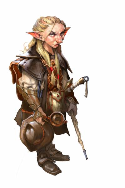
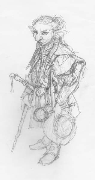
The Gnome Inquisitor is a kind of detective. I focused a lot on creating a face structure that would make her look Non-human but still appealing. also she should look like she had seen a lot in her line of work. Eyes that are serious because when you have seen so much dead and depravation as I imagine she has, you are not smiling with your eyes any more.
Creating these figure portraits have shown me that I do not need to go overboard in action and hero poses all the time. Sometimes less is more. Or, true and believability is way more…
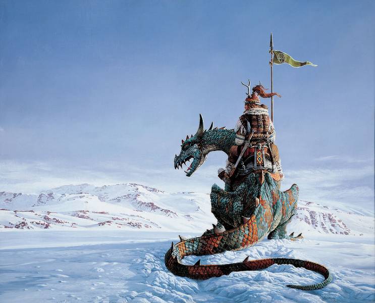
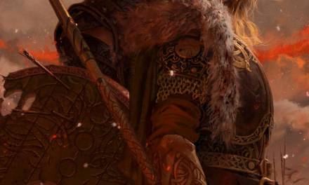
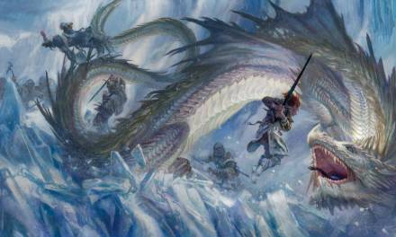
Northwatch by Keith Parkinsson
It ties into the job you are doing as a fantasy illustrator. You are portraying a world that doesn’t exist, but you need to make it exist in the eye and mind of the victims you drag into it. I was once told by Larry Elmore, that him and Keith Parkinsson started to look at old painters that painted indians and landscape paintings rather than looking at Frazetta. They wanted to paint fantastic creatures in a real believable landscape. When I saw the “Northwatch” painting by Parkinsson, I knew what they meant. That painting made a huge impact on me. It looked like a Sami guy on a dragon. The dragon and the landscape was rendered naturalistic, the dragon almost a dinosaur. The Sami-Ranger could be a real Norweigan guy had it not been for the antlers and the sword. This image has everything That I have been trying to reach for almost 20 years now. Still trying, still traveling…





Great article Jesper! You are always an inspiration, thank you!
Always look forward to your articles and art, these characters are great!
Great work! I really like the “just doing their thing” look. How long time do you spend from sketch to final on such characters?
Great article, awesome work. Keith is also an inspiration of mine. I’m also, curious about how much time it takes you to go from sketch to finished painting. I just feel defeated sometimes by how long it takes me. Like I’m missing some critical time saving step. Or maybe I just need to learn to be more patient… a hard thing in the digital age.
that keith parkinson painting is amazing, you can feel the cold air