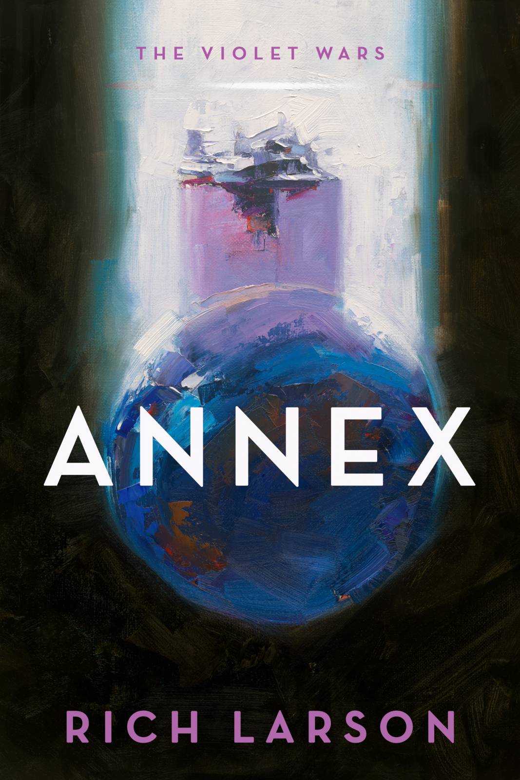
Recently, it was my pleasure to work with Lauren Panepinto of Orbit Books on a cover for the author, Richard Larson, entitled, Annex.
Lauren needed an image depicting alien arrival to Earth, but wanted a more abstract approach with the paint, more of a suggestion, an impression, of what that might look like if we removed enough specifics from the image.
I’d been working for years with a combination of palette knife and brush to force my hand to work with random marks instead of designed brushwork. The knife helps to push the unexpected mark-making in directions I don’t expect. It allows me to then manipulate the errant strokes with deliberate brush marks to gain a combined look of texture that I personally adore working with.
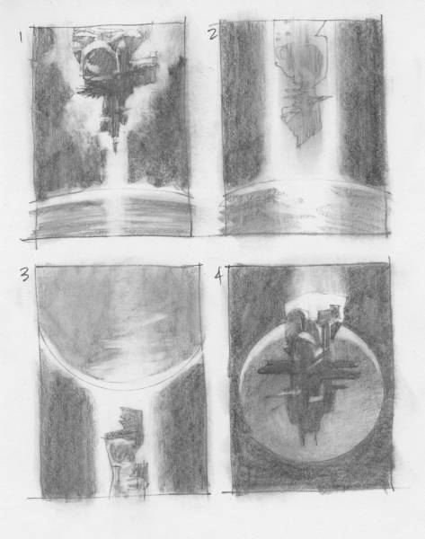
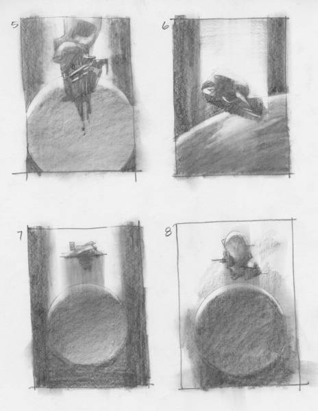
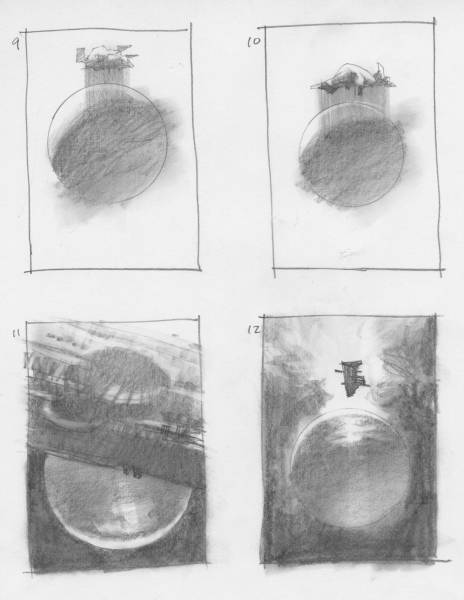
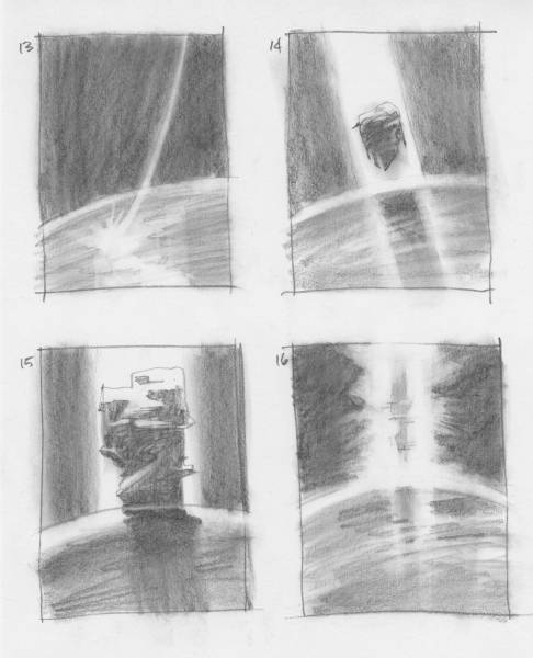
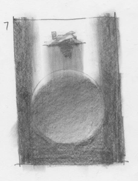
We started with the usual round of thumbnails. My thinking was to keep these a tad ambiguous but shape-driven. A smudge tool helped me stay open to interpretation. I had to read-into the shapes and see if I could feel them coalesce into information.
Lauren chose this thumbnail as representative of the attitude they wanted for the cover. She’d seen some of my looser paintings at shows, on the cover of Communication Arts, and in person during demos at the Illustration Master Class in Amherst, MA.
But this time, she not only wanted to get the work done for the cover, she also wanted a time-lapse of the painting being created. I’m a little nervous at times about things like this. You can imagine—what if things went horribly wrong? What if I forgot how to paint? What if the color sucked great gobs of insecurity? What if I froze? What if…? What if…?
But after Lauren said, “You’ve painted in front of me before, y’know…” I realized I’d forgotten that I was a pro. (Don’t sweat it, you guys—most times this feeling never goes away. And for good reason: we are best when we are constantly challenged to create and also to perform.)
Lauren came by my NY studio and we set up the camera on a tripod to hang over the drawing board from the back so the camera was clear of my hasty, broad movements mixing and applying. I’d adjusted the camera on a gimbaled head so it would read the image correctly from the top of the board, and not from over my shoulder.
About 3 hours later, after many laughs and a wonderfully fun afternoon, Lauren had her video and the finished painting, all at once. I made a few minor adjustments to the background sky to keep the focus on the active strokes in the main subject. I had it professionally scanned by Laumont Photographics in Manhattan.
Even though the technique demands a fresh, quick application of paint, I’d been painting this piece for months in my mind. Mentally, I watched the strokes go down, anticipating some of the blending and deciding which colors might give me different effects. Planning, planning, planning. Visualization. Rehearsal. I planned what size to work so that the strokes wouldn’t look tiny and tight when reduced for the cover.
I usually never make color studies because I paint mentally. This gives me an exciting time painting as I’m delighted by the unexpected results. This time, however, feeling like I should be even more prepared, I made a small color study one hour before Lauren came by. It wasn’t exactly what she’d visualized, so I had to change the color on the fly, with guidance from her.
Oh well- that’s living on the edge of the palette knife.
Here’s the time-lapse:



Great to see a video of you painting! Thanks for sharing 😀
Thanks for sharing. I always love seeing other artists’ process.
This is such a beautiful cover and I loved seeing the process. Thank you so much Greg!
Excellent! Thanks for sharing this, Greg! I’m going to share this with my students so they can see good examples of thumbnails with intent (that you considered the look/feel of the final painting while experimenting). Beautiful painting.