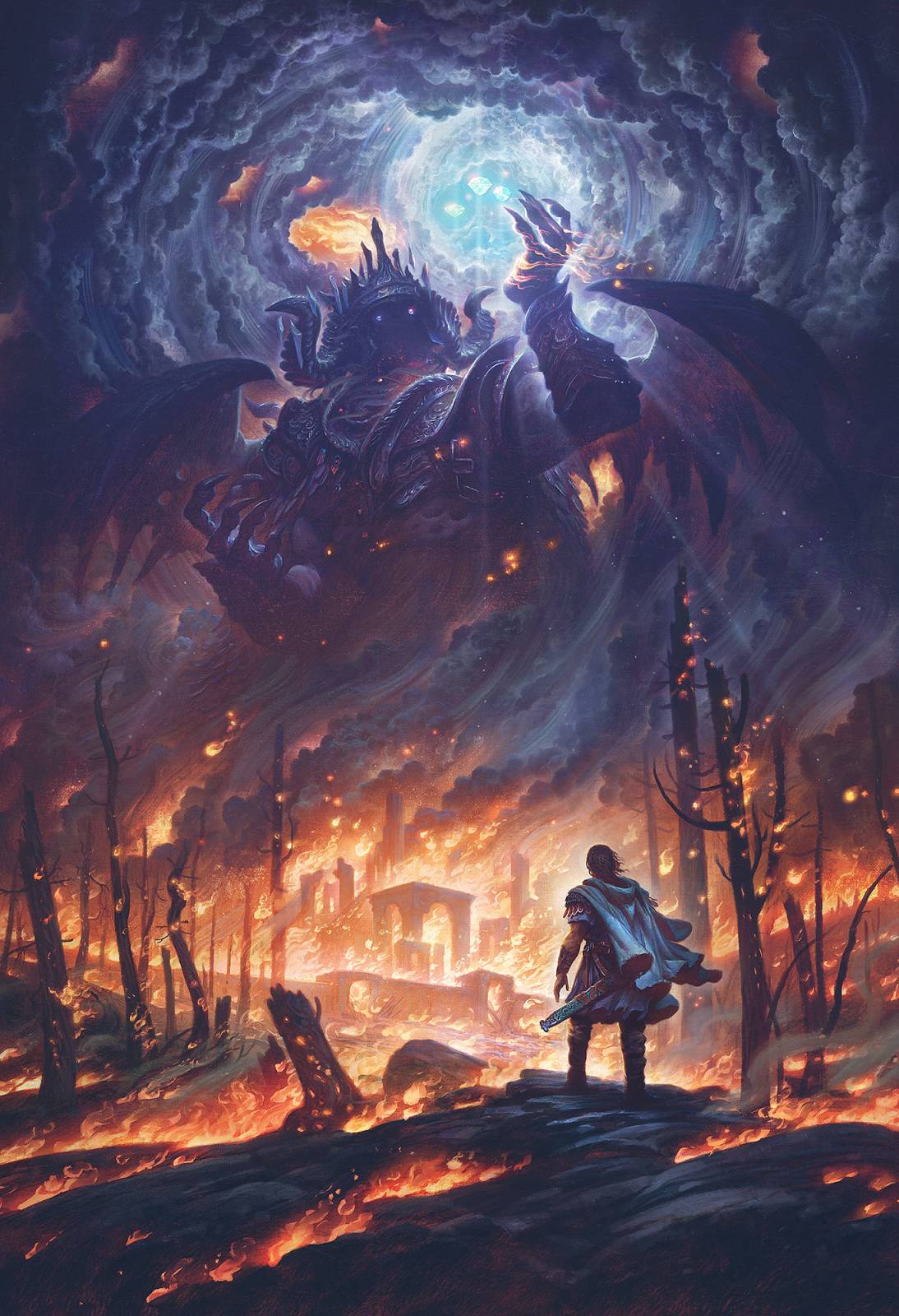
Welcome to Part 2 of Morgoth and the Silmarils!
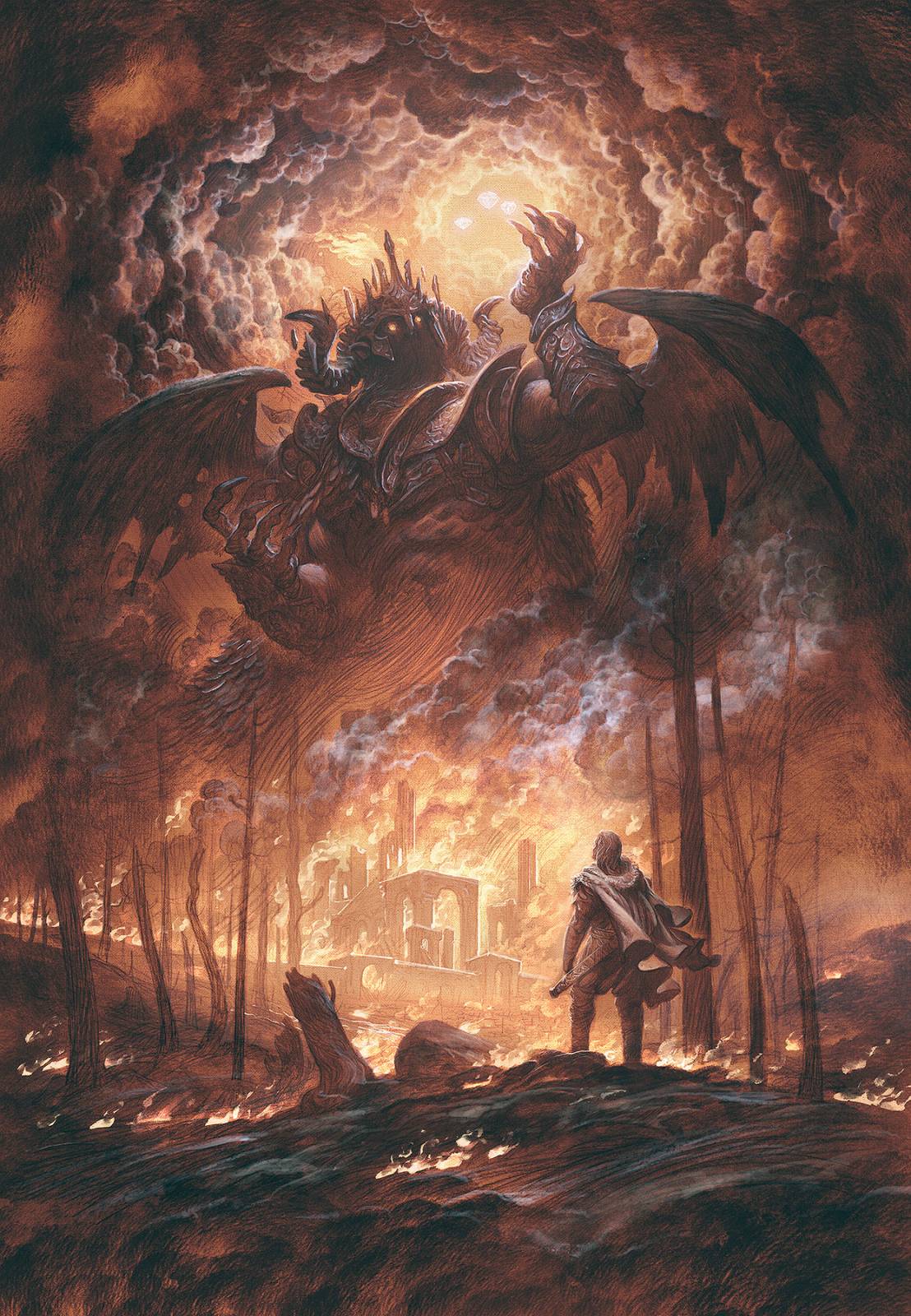
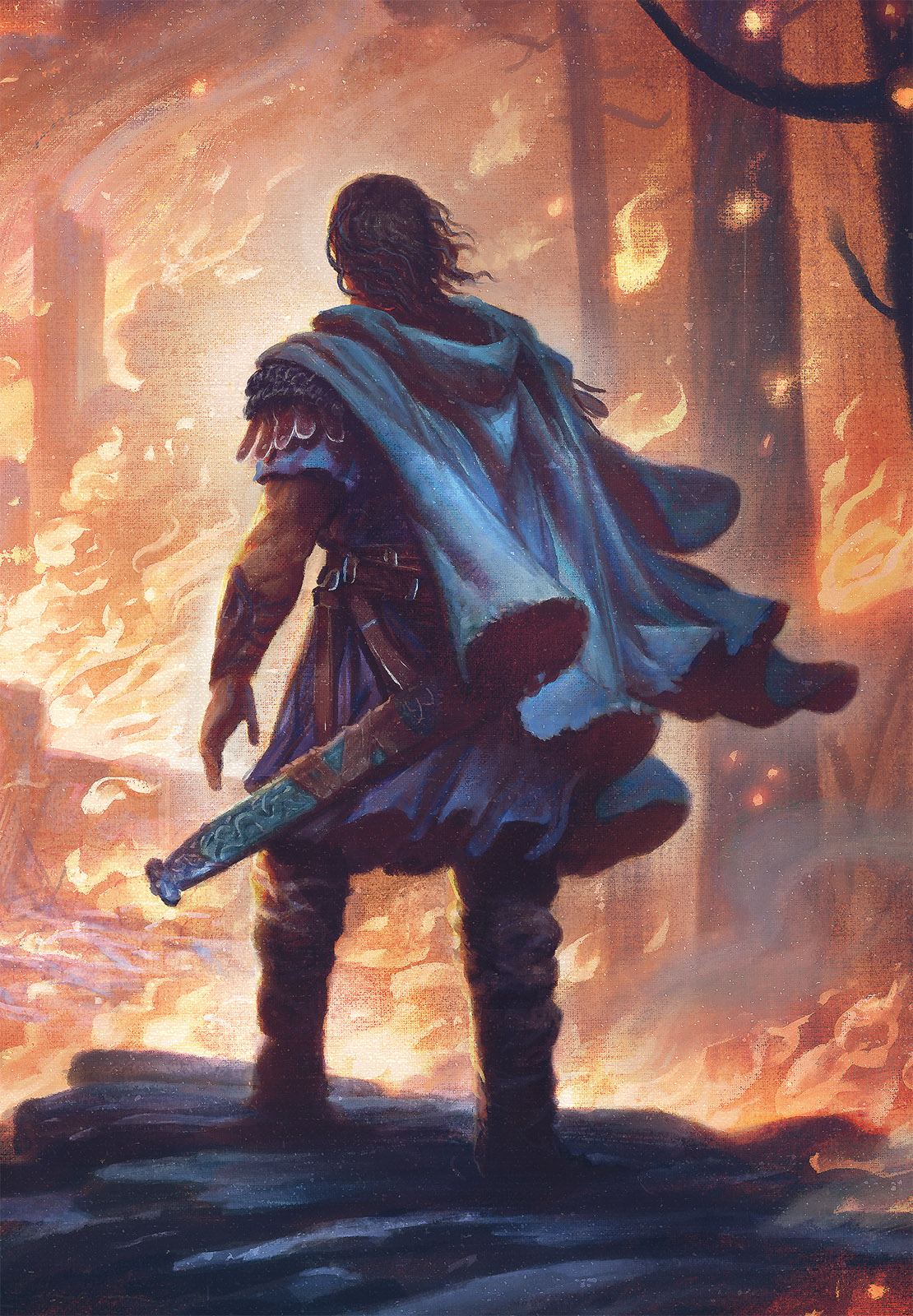
Today we will be colorizing the drawing we finished in the last post. If you haven’t seen Part 1 and want to check out the bones of the image, you can see that here.
When last we left Beren, he was in a bad state. He had lost his home, was about to become an immigrant fleeing a war-torn land, and he lacked color. So news is mostly bad for him, but today he will find the resolve to confront the evil responsible, (or at least become a permanent burning thorn in its side) and he is going to get some overdue color.
To colorize this image I will be working in Photoshop. Usually when I work digitally, I prefer to work in transparent layers over a traditional image. I just love the look of blending digital and traditional. However, today I will forgo my usual tepid approach in exchange for something bold and dangerous: normal layers!
Instead of counting on transparent layer modes like Multiply, Color and Soft Light to preserve my drawing, I am going to be reducing the flow on my brushes so that the paint is built up slowly, and hopefully, most of the underpainting is at least partly preserved.
To ensure this I actually set up an action that creates a layer at 50% opacity and typically work only on this. It sounds crazy but over the years it has probably saved me an entire day of my life. I have one free day that I can do anything with. Maybe I’ll build a trebuchet. Maybe I’ll spend it watching all 400 seasons of Law & Order. Who knows? But actions in Photoshop save tons of time and are worth looking into if you find that you do repetitive procedures over and over again.
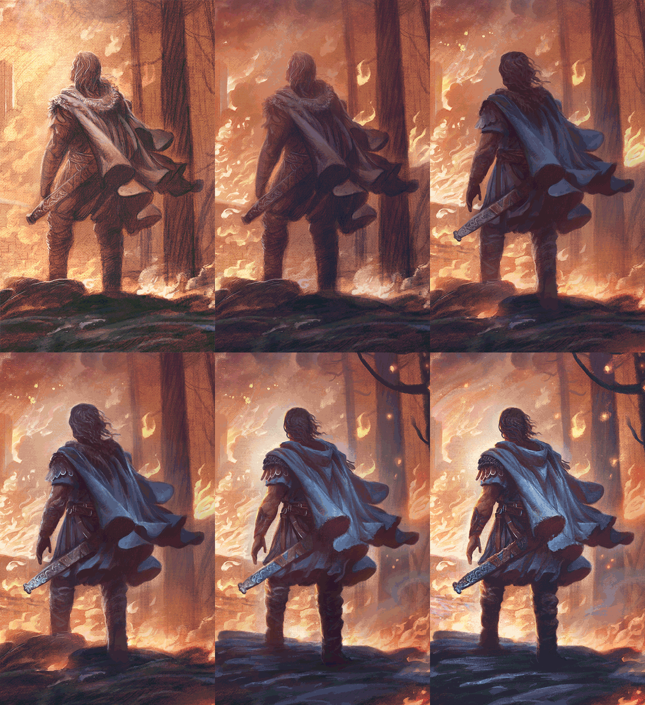
Apart from allowing me to be bolder with my paint application, working on normal layers also allows me something highly important in art: I can murder my darlings at any time! As you can see in the following GIF, I ran into an issue where the main figure’s head felt wrong. Where is he even looking? In the drawing it worked, but now with all the atmosphere he looks nonchalant, like he has just arrived at his favorite fishing hole instead of first seeing the ultimate destruction of his entire homeland. It just lacked gravitas. And no matter how I might try and fake it with rim-lighting tricks, lens flares, hidden yetis, blowing hair, smoky obscurances and the like, the head just had to be changed and repainted if the image were to work. Unless of course, I were willing to re-draw, re-paint, re-scan the broken area from scratch. Which for me is a toss up between that and running barefoot over legos in the dark.
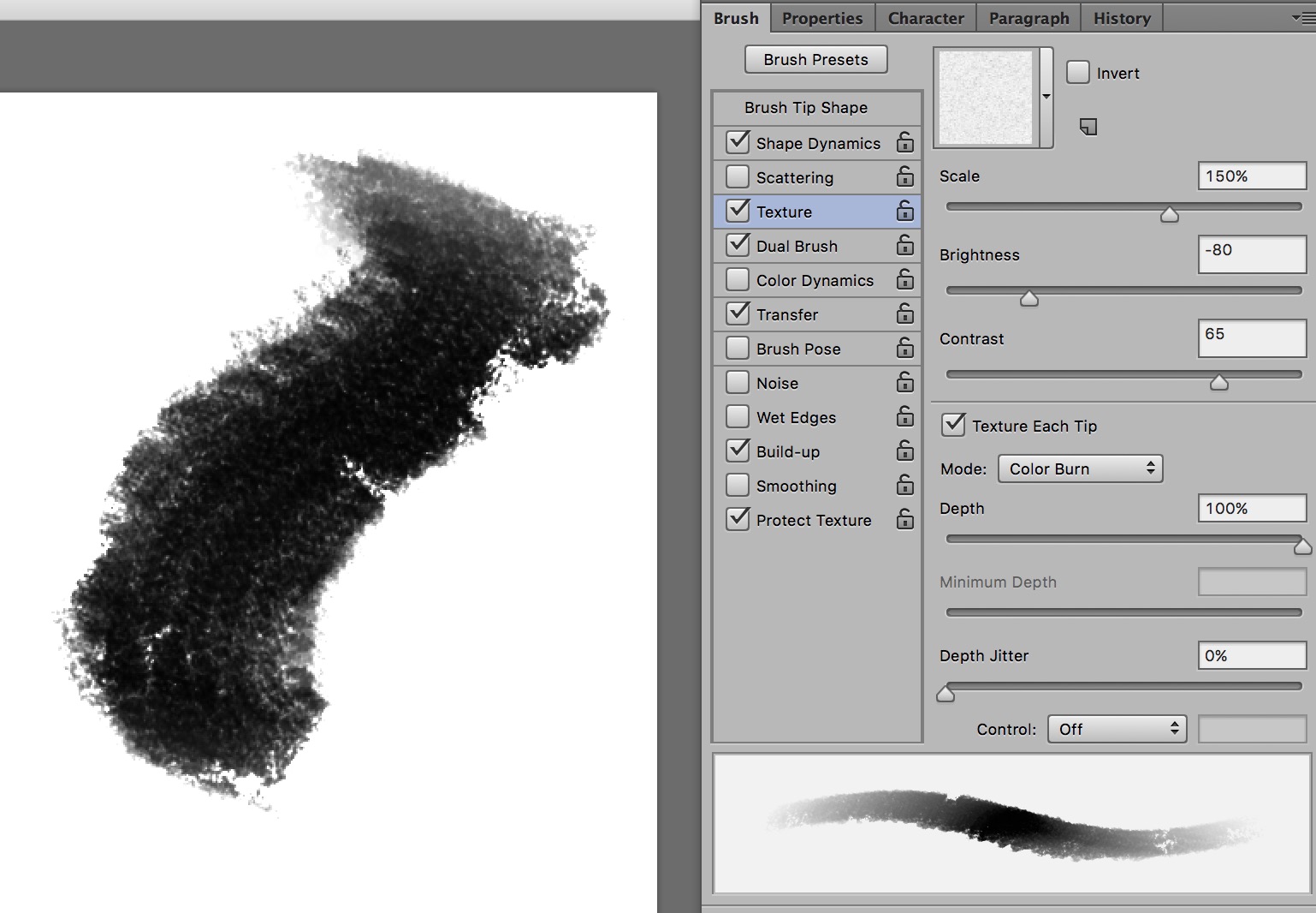
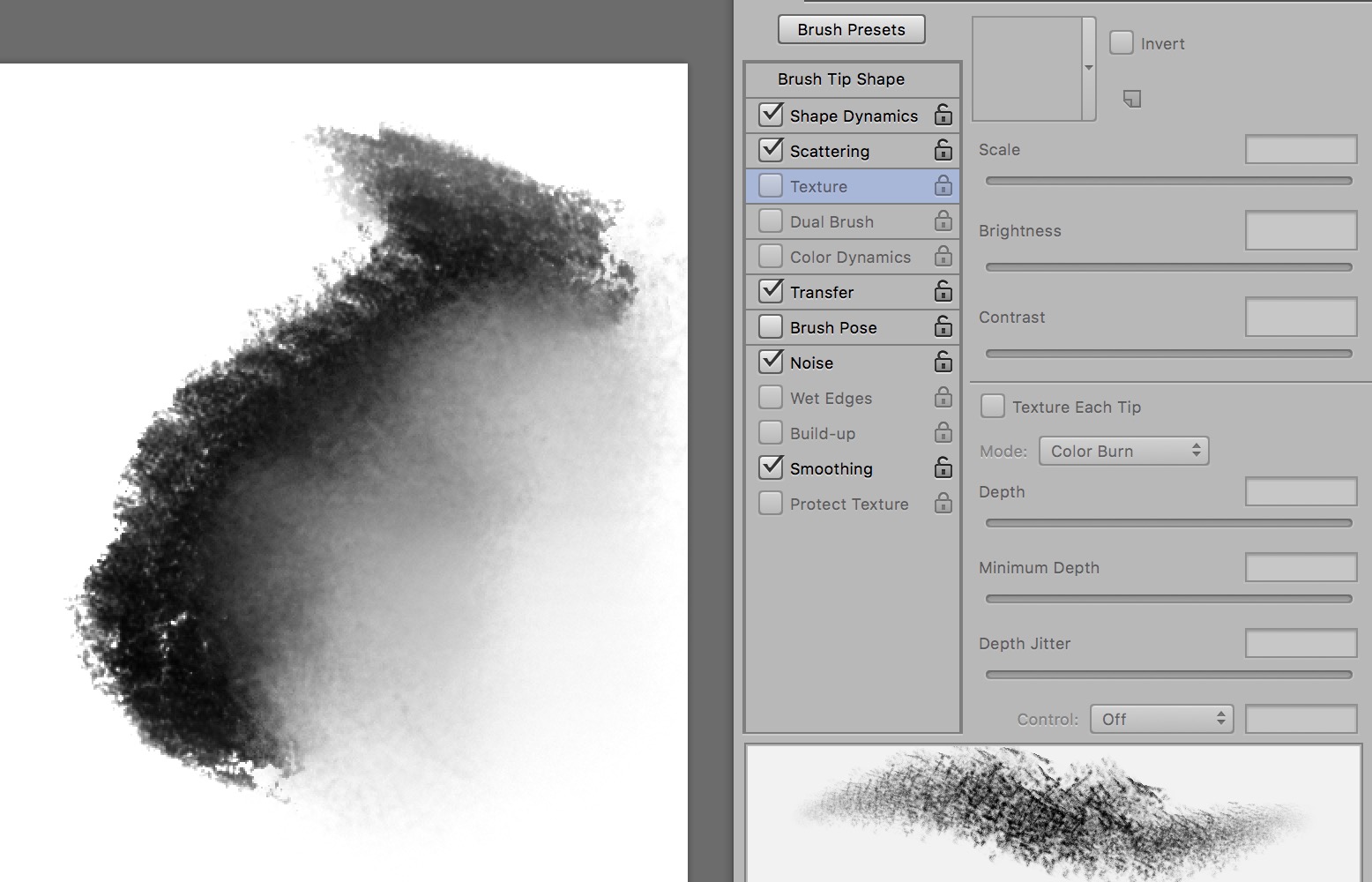
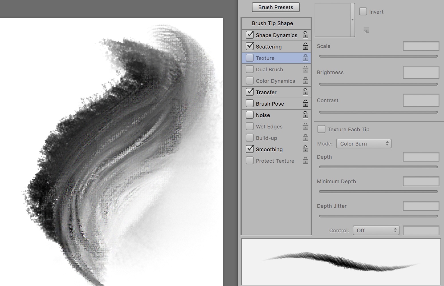
But how do we make a newly painted area look consistent with ones which have all the textures of the underpainting built into? A great trick in Photoshop is to literally add textures to brushes. Not only can you apply a texture, say paper or linen, to a normal brush, you can also apply that exact same texture to a blender brush or an eraser, allowing you to work with a similar “canvas” for each phase of the work. Using this texture I can repaint a section and not worry too much that it won’t match the other transparently painted areas.
VILE TRICKERY
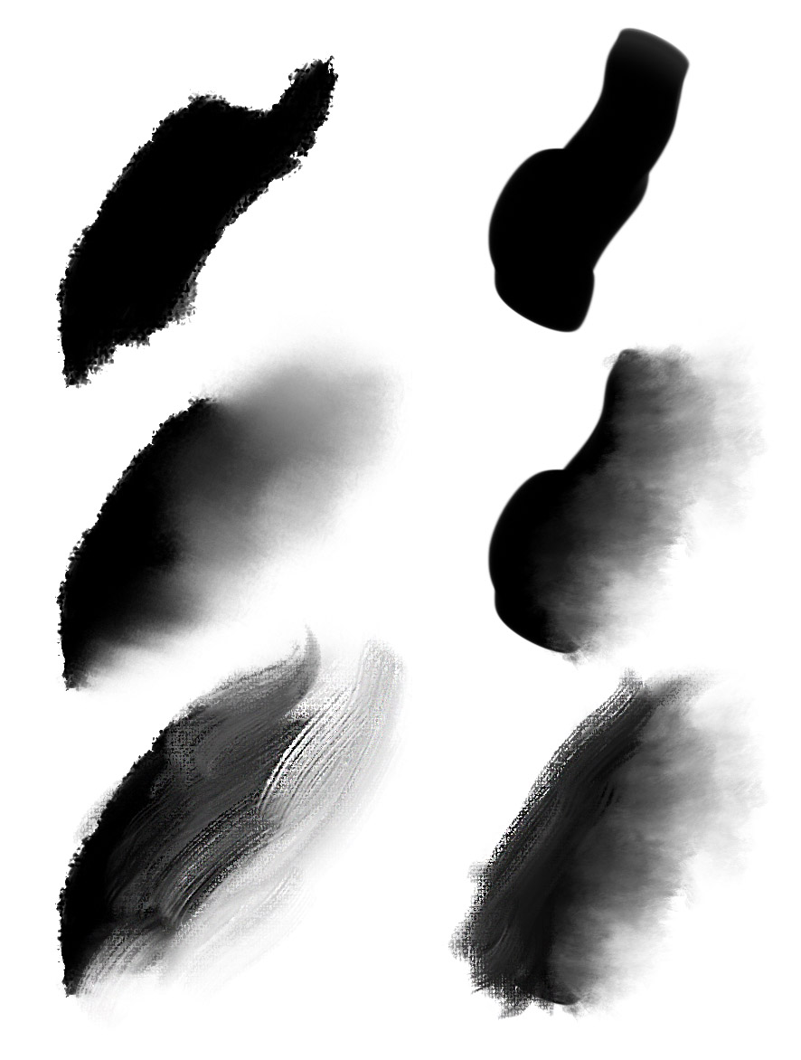
Using these textures I switch between different tools to give more character and texture to a brush stroke to simulate traditional brushwork. You can see in these examples that we apply a stroke, then switch to another tool to feather it out, simulating the same effect when you place a flat stroke in traditional paint, but then feather that stroke (usually as you lift the brush away, but also at times with a dry part of the brush).
Standard Paint Brush
Smudge Brush Applied Over Paint Brush
Blender Brush Applied Over All
To facilitate this and not let this become overly time-consuming I use keyboard shortcuts to quickly switch between brush types to give the paint more variety and texture. I constantly switch between, brush, eraser, blender brush and smudge. Because of this, I rebound all my shortcut keys to ones I can easily reach with only my left hand, which always rests on the keyboard. (Shoutout to Starcraft 2 for tricking me into painting in Photoshop the same way one controls a zerg army)
Another Tip: Turn off “Sample all Layers” in the toolbar if it all gets too messy. This will make it so that you are only affecting the brushstrokes on the layer you are currently working on.
Thanks for stopping by! As always if there is a topic you’d like to see covered please let me know in the comments!




Great stuff. learning a lot from you guys. Thanks a lot for sharing your knowledge.
A masterpiece. Was waiting what felt like ages for part 2 (even though it was pretty quick in coming); I was just excited!
“Vile trickery” and digital pyrotechnics aside – really lovely stuff Justin. Love the light behind the forearm! Now go and build that trebuchet.
Wow! Your paintings are getting more & more epic in scale, subject matter and … execution! That is one grand feast for the eyes!!! Thanks for sharing your methods, and as always … a well-written article with fun & smiles built in.
Awesome!
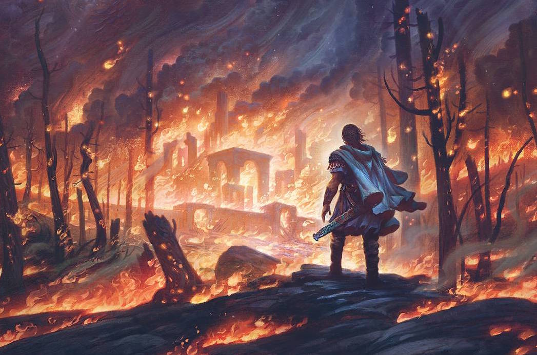
Holy smokes, Justin! I think both versions are amazing. The finished Photoshop image has the epic feel of being in the moment as the hammer falls, while the earlier one has an atmosphere of desolation, the sense that the fire will soon burn out leaving nothing but ashes and that flame-blasted desert landscape. Both of them are very powerful. Well done! Oh, and since I know nothing about the ways of computer art, and given some of the catchy brand names around, I thought Vile Trickery was one of those. As Dave Barry would say, “It would be a pretty good name for a rock band.” Thanks for the look at this and into your process.
As for future topics you might touch on how you came to be a Tolkien fan in the first place; how his work inspired yours. Just a thought.
Thank you Justin, what a great illustration!
Tutorial next month: How to build a trebuchet…. but seriously this turned out amazingly beautiful and beautifully amazing