Guest Post Written by Delilah Dawson
Hi, I’m Delilah, and you’re probably a much better artist than I am. After 31 years of studying art, getting my degree, and working in galleries and as a muralist, I suddenly discovered that I was far more proficient with words than paint or clay. These days, I’ve traded my brushes for my laptop, and I write novels, short stories, and comics. So I’m here to talk about worldbuilding from both sides of the page and how artists and writers can help each other to create images that tell a rich, unique story.
I sold my first book series in 2011, and I dreamed of the day I’d see my first book cover. Although I’d hoped to have some input, most new writers don’t have a say in what’s on their cover. I salivated over Lauren Panepinto’s designs for Gail Carriger’s Parasol Protectorate series and hoped for something similar. So you can imagine my surprise when my first book cover arrived… and wasn’t anything close to what I’d imagined.
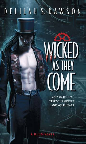
My book had a female lead, but the cover featured a dude.
A half-naked dude.
A half-naked dude who was a lot more tan and ripped than the pale, svelte vampire described in the text.
I mean… there were nipples!
Now, don’t get me wrong. My cover artist is amazing (Hi, Tony! You rock!), and he does magic, and I know his cover sold the heck out of that book. I just wasn’t expecting Beefy McNipples on the cover of my story about a woman on a life-changing journey to another world.
When an author has questions about or concerns with their book cover, the preferred thing to do is to vent to one’s literary agent and, together, come up with a list of reasonable changes. “CAN I PLEASE HAVE A LADY WITH NO NIPPLES SHOWING BECAUSE MY GRANDMOTHER IS GOING TO FREAK OUT” isn’t reasonable, for example. ‟Please give him trousers instead of the original leather bondage pants, as the text states that zippers don’t exist in this steampunk alt-London world”, on the other hand, is considered pretty doable. We were also able to add a small chain hanging from his pocket, which further suggested the steampunk vibe—and the locket at the heart of the book.
As I delicately probed for more information on the cover process, hoping to avoid another authorly panic attack, I came to understand that this gulf of silence between cover artists and writers serves a purpose: It keeps two highly anxious creatives from devolving into a hurricane of possibilities and hurt feelings as their dueling visions battle for ultimate cover sovereignty. Book covers are there, after all, to sell books, not to please authors. But I also came to understand that if I could just have one simple conversation with the cover artist, I could provide a few reasonable bullet points that could help them create a cover that would work for everyone, even the sales team—and prevent costly edits later on.
This gulf of silence between cover artists and writers serves a purpose: It keeps two highly anxious creatives from devolving into a hurricane of possibilities and hurt feelings as their dueling visions battle for ultimate cover sovereignty.
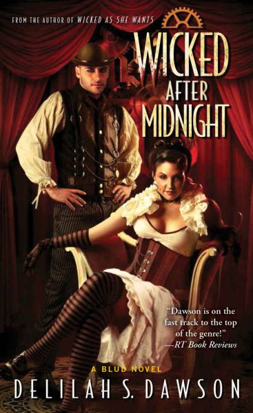
By the time my third cover came around for that series—and I’d proved that I wasn’t a screamy diva—I was able to independently email the cover artist for a brief but fruitful discussion, and that cover is my favorite of the series because it really captures the essence of the book. What were the most important things we discussed?
The book has a vampire Moulin Rouge vibe.
The hero looks like Jesse Williams, not Ryan Reynolds, which is what the brief said. Oops!
A simple back and forth, and we had a cover that made everyone happy.
For my first book cover, I felt like I was actively kept in the dark—and not by the artist. By the traditional publishing process. But for the last cover, I felt like a secret weapon to get to the heart of the book, visually.
After my first book series was complete, I now ask my agent to put cover input into all my contracts. I have proven that I’m not going to make the artist’s life hell, and in exchange, I want to be part of the process. So, if it were up to me, I would create a one-page brief for the author to complete (in 100 words or less, because COME ON) to give to the editor and cover artist. It would include questions like:
- What is the spirit of this book? What ‛vibe’ does it have?
- What is the one thing you wish was on the cover?
- What is the one thing you DON’T want on the cover?
- What are 3 specific details about the main character that would show on the cover?
- What are 3 specific details about the world?
And that’s it. Because let’s be honest—the author can clearly talk about their book for 400+ pages. And that’s not helpful for someone trying to sum up the book in one image that will draw the eye. It’s also important to note that the author is not always the best judge of how to tell a story visually, and we often become obsessed with our ‛darlings’, those little touches to our story that we deeply love. And most of us don’t know which images will pop online or in person, much less what the cover trends will be for the coming year. We toil in darkness and only come out for coffee, but we want so badly to be involved.
If you’re creating an image for a book, the ideal would be to read the book and see which images stick with you as iconic. But we don’t all have that kind of time. The back cover copy should give you some idea of the genre and voice, and even the Look Inside feature of Amazon can give you a few pages to get a feel for the author’s style and the setting. But beyond the brief and the cover copy, how can you narrow that huge story down into one image that will not only serve the story but also the publisher and the writer?
It’s all in the unique details. In the feel of the world. In the iconic objects or moments. In the necklace that kicks off the plot, the dragon that’s awakened, the lighthouse where the final battle is fought. It’s in the stance of that main character, whether she’s cocky or shy or murderous. But you know all that. The question is how to get to the heart of the story without wasting anyone’s time.
The author can clearly talk about their book for 400+ pages. And that’s not helpful for someone trying to sum up the book in one image that will draw the eye.
If you can, I beg you: Reach out to the author. If you can’t send the questions above or don’t want quite that much information, ask a few very pertinent questions. Do not say anything hugely open-ended, like, ‟What would you like to see on the cover?” Narrow it down to questions that can be answered in one sentence: What are 3 current covers similar to what you’ve envisioned? What’s the most iconic object, scene, or place in the book? What is the one thing the hero will fight for? What are 3 distinctive visual cues about the setting or costumes? What was the inspiration for this story?
Because, looking back with lots of distance, that’s why I was so surprised by the cover for Wicked as They Come: The most iconic and important part of the book, to me, wasn’t the hot vampire dude, and especially not his nipples. It was the heroine’s journey. I would’ve shown her set against the steampunk carnival, holding the locket that changed her life. To me, that was the heart of the book, the thing that would’ve made me pick it up in a bookstore, just like I picked up Gail Carriger’s Soulless. And even as I grew to appreciate the marketing value of my vampire dude and his ice cold nipples, I still longed for those specific touches that said it was MY story, and not any generic steampunk vampire Romance: the necklace, or the carnival, or even the vampire’s pet clockwork monkey. Those are the touches that make the cover sing and the author joyous: The personal details of the world that make it different from every other world.
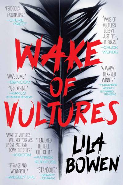
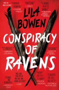
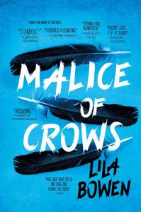
A few years later, my editor asked me what I thought might work for the cover of Wake of Vultures, which I wrote under the pseudonym Lila Bowen. I didn’t even have to open my mouth. I just held out my forearm tattoo of a vulture feather. And you can probably guess what’s on the cover. That was, quite simply, the heart of the story.
There’s this fear, I think, that the author would bog you down for years with ‛his nose isn’t quite right’ or ‛the grass is a different shade of blue’, but I think what authors want the most is a cover that feels like their story, that communicates quickly how their book will uniquely compel the reader. Whether that’s a dreamy Fantasy, a fast-paced military space adventure, or a sexy steampunk vampire carnival, we know that the artist has the command of color, space, and design to make it happen, even if it feels like magic from the authorial side. We trust you. We hope you can trust us, too.
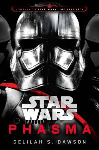
Delilah S. Dawson is the New York Times-bestselling author of Star Wars: Phasma. She also writes the Blud series, the Hit series, Servants of the Storm, and a variety of short stories. Her comics bylines include Ladycastle, Adventure Time, The Jim Henson’s Labyrinth 2017 Special, Star Wars Adventures, Star Wars Forces of Destiny: Rose and Paige, and The X-Files Case Files: Florida Man. She also writes the award-winning Shadow series as Lila Bowen, starting with Wake of Vultures. Her next book, Kill the Farm Boy, was co-written with Kevin Hearne. Delilah lives in Tampa with her family and hasn’t painted anything in over three years.






Great post! But as an illustrator, I would be wary of reaching out to the author personally. As you said, the publisher/art director exists as a very necessary barrier between two creatives. If I contacted the author myself, it would be going around that barrier – in other words, going behind my client’s back and complicating the communication process.
I’ve been illustrating one particular series for several years, and the author and I have a bit of a relationship by now. We’re friends on social media, I send her Christmas cards in the mail, etc. But when I’m working on her books, we don’t communicate directly. All communication goes through the art director. It’s not that I don’t care what the author thinks about the art, it’s that we both respect the publisher’s process.
This is fabulous advice. The only thing I would just stress is that often in traditional publishing, it’s not the artist’s place to reach out to the author directly. As Delilah says, often there is important space kept between art & author, with translators (art director and/or editor) in between to act as translator and also compiler of feedback from multiple sources—author, agent, editor, publisher, sales, marketing, etc—who are all working in collaboration. That said, this is a fabulous checklist of questions to focus on if you are an author, an editor, an art director, or an artist. It’s the soul of the book that matters most, and transmitting that soul visually to the proper target audience. And if you happen to be an artist that works directly with authors, this is a fantastic list to send them to get the ball rolling in your collaboration.
I enjoyed this post as well. I’ve done a handful of cover paintings for authors who reached out to me directly (these were for small niche market publishers who did not have art directors). Anyhow, I had a lovely experience working with the authors – I did not find them nitpicky at all, and I loved their palpable excitement and enthusiasm as the cover paintings took shape!
Off topic: Is there going be a followup to the Phasma novel? I was looking forward to seeing Cardinal and Siv bond over their mutual Phasma obsessions.