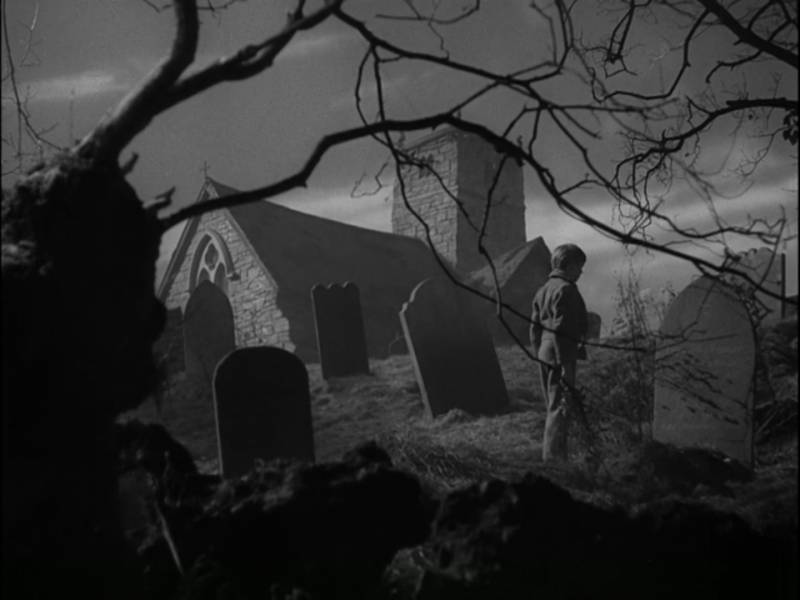
 Composition in visual art is a subject that I’m endlessly interested in. As a painter who appreciates bold design, illustrators of the early to mid 20th century particularly appeal to me, but I’m very happy to take lessons from any visual artform. Paintings and photographs are obviously great sources of inspiration, but I also love looking at cinema. Along these lines, I recently watched the classic 1946 Great Expectations and I am completely in love with it’s visual style.
As photographed by Guy Green (who earned an Academy Award for the picture), the movie has a brilliant visual design from start to finish, creating dynamic and painterly compositions even in relatively mundane scenes. I was so taken with Green’s arrangements that I rewatched it a second time on mute, pulling screen shots to examine things more closely. Of course, as a film it is meant to be seen in motion, I highly recommend giving it a proper watching. Even just as a collection of still though, I think there is a wealth of inspiration and educational value and I wanted to share some of my favorites.
There are three major tools that Green is using particularly well: Lighting, Shape, and Overlap. I’d say for most scenes that stand out to me, he’s doing interesting things with all three. Doing this effectively in a still image is already hard enough, so it’s doubly impressive when you add movement and time as actors and the camera move about the shots.
Lighting:
The lighting is more stylistic than naturalistic, which is what one should expect for the era it was made. Generous use of rim light, quick falloff from light to shadow, and extremely well controlled contrast and value design are used throughout. Old Hollywood often has a stage-like or operatic look that reads well in black and white. But take particular note of how so many scenes can be reduced to simple dark, midtone, and light shapes, and some just two of the three. These tonal shapes always create a dominance hierarchy which, combined with the simplicity of them, practically underlines and circles the focal areas. Though the scenes are often very dense in detail, they are never confusing. In addition, the three tones are often arranged on different layers of depth. For example: a dark foreground, mid tone middle, and light background.
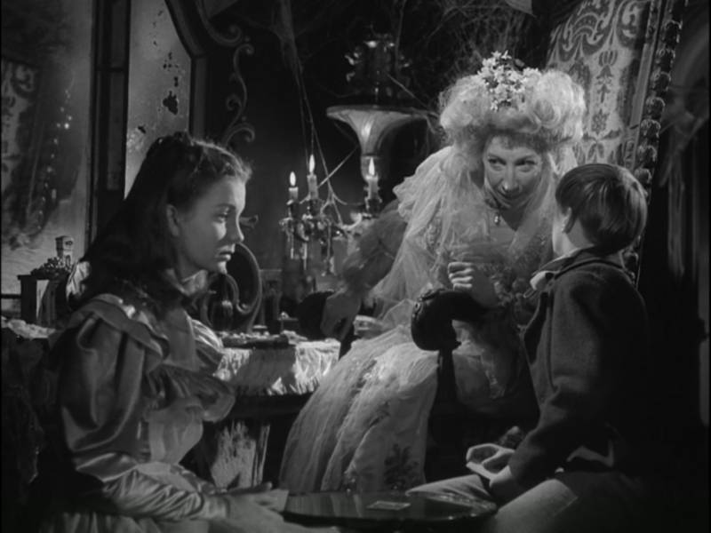
Rim light AND value shapes work together to make an otherwise busy environment orderly, and allow us to quickly register the nuanced emotion of a three figure narrative
Classical theater lighting is not always the best solution for every visual problem, but it certainly is dramatic! When this film was shot, some 70+ years ago, film and optical technology would not allow photography of actual candle-lit rooms as it does today. And in this comparison you can see the difference in stylized vs naturalistic approaches to a very similar scene. Personally I love them both and would use either if it fit my needs.
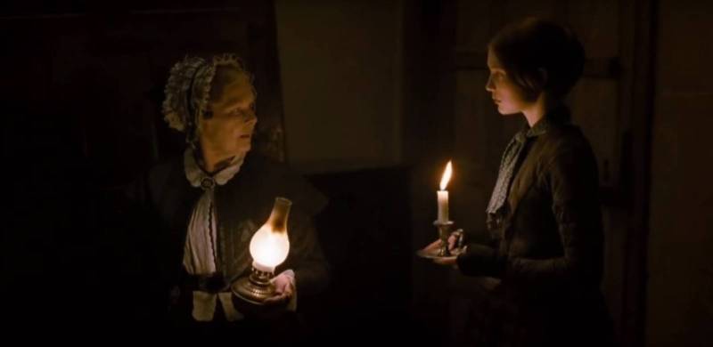
A naturalistic scene lit only by actual candle light. From Jane Eyre (2011), cinematography by Adriano Goldman
Shape:
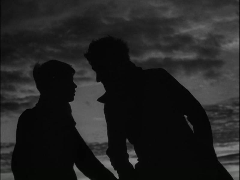
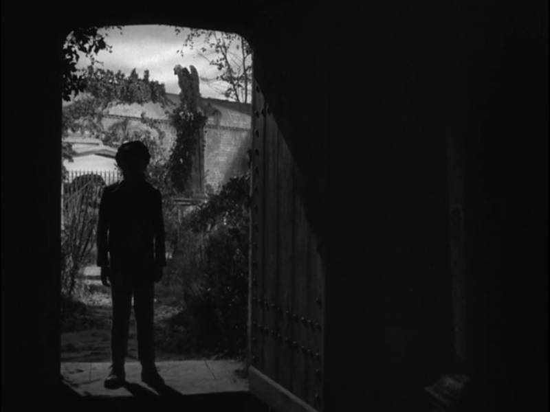
The shapes that are created with tone are stunning. Some scenes play in simple silhouette, again with an operatic flare. I’m very much a fan of minimalism and the ability to convey emotion and story through actual silhouette is deceptively difficult. Beyond this though, the lighting shapes are so well designed they often create fantastic abstract compositions when reduced. In other words: thumbnails.
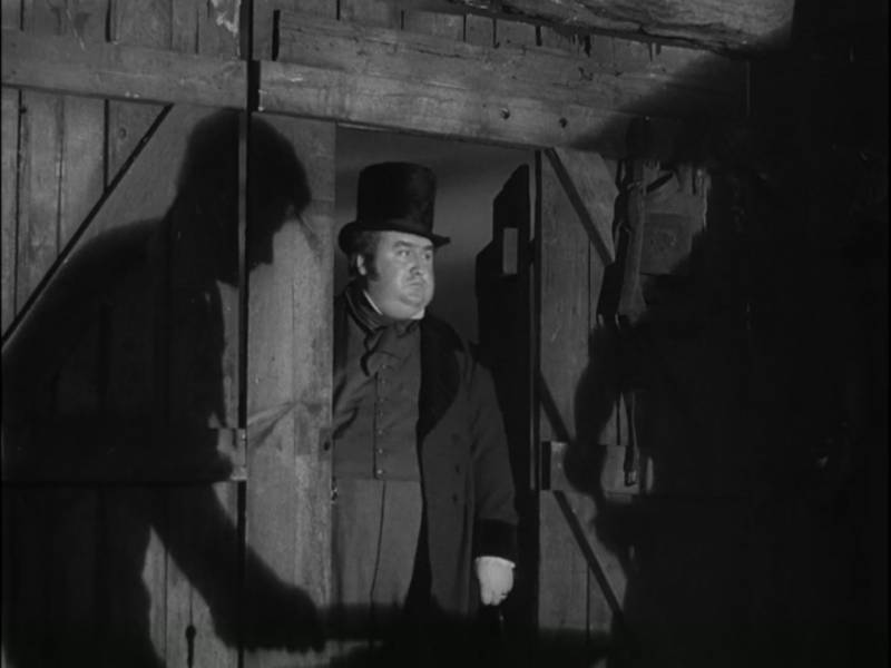
Speaking of shadows, here they’re used as a very visual device to underline who is important in this moment
Additionally, leading lines and in-frame frames are plentiful and extremely effective. There are many complex environments shot in wide angles which, through very careful placement of the camera, actors, and set dressings, come across clear and bold. In other words: great shape design!
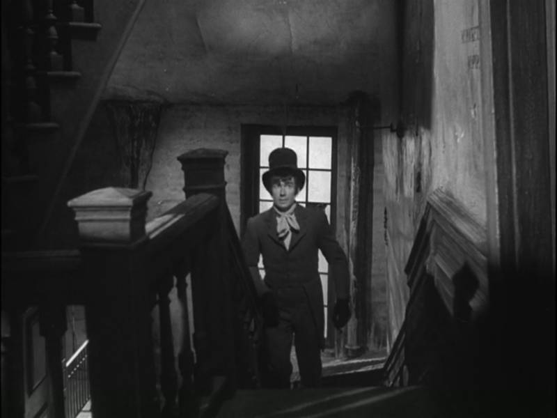
Just a man walking to a door, but look at all those frames and leading lines! You can very much feel his nervousness as the environment boxes him in
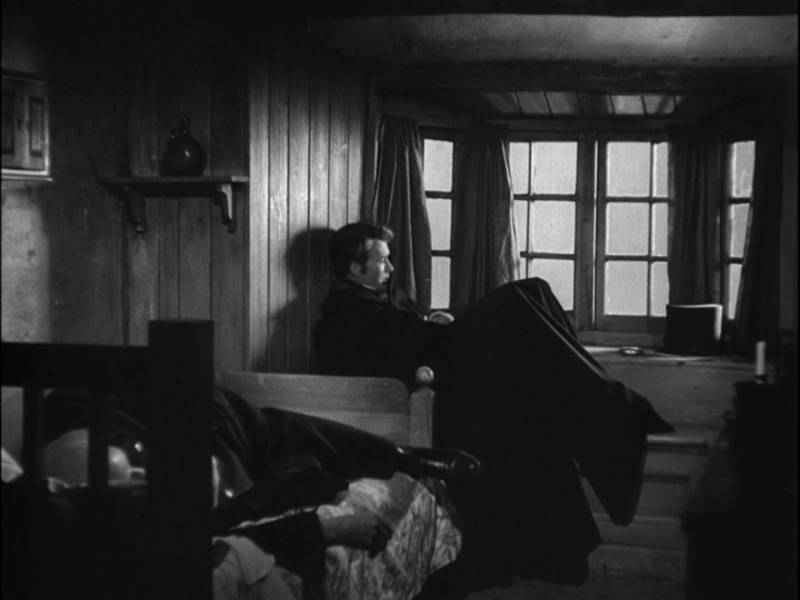
I adore the quiet beauty of this frame. The foreground figure sprawled on the bed almost goes unnoticed, but is such a rewarding detail. Dark on middle on dark on light, just beautiful!
Overlap:
Perhaps the composition tool which grabbed my attention most as I watched was the constant use of interesting foreground shapes. Except in intimate moments, there is often the indication of objects, figures, or environment features between the viewer and the focal area. It not only gives depth to so many scenes, but also adds to the voyeuristic feeling of watching as though from a window or doorway. To use these foreground shapes successfully means, once again, very disciplined control of values and scale so that they are effective but do not distract or clutter the scene.
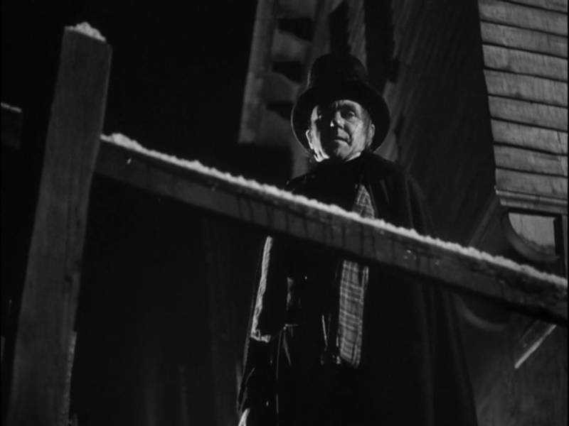
Menacing light, a menacing angle, but the railing that cuts through the frame and gives such a clear indication of his elevated (and hidden) vantage point is what really carries this shot
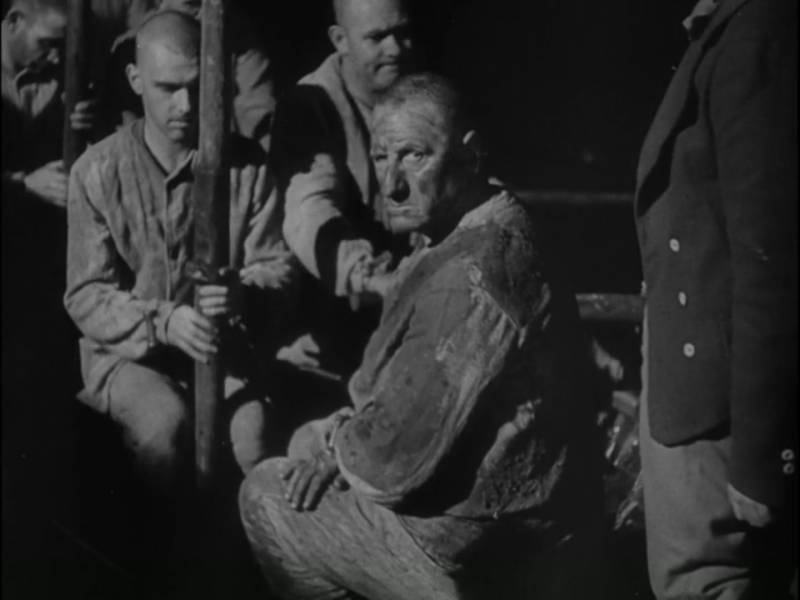
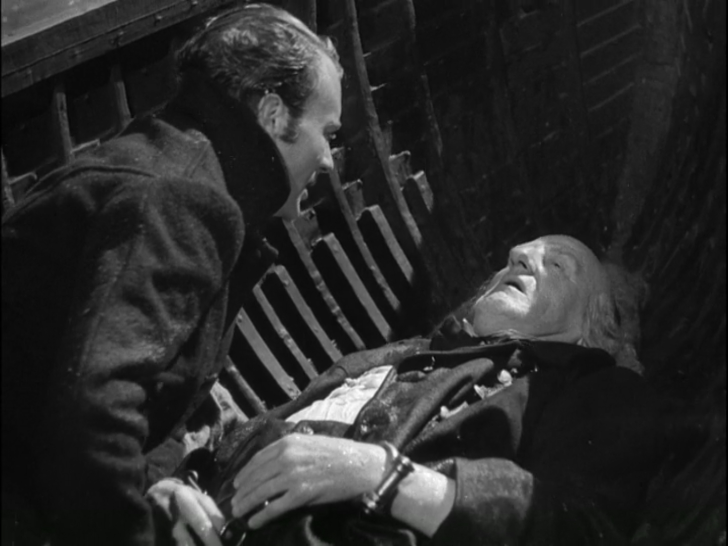
Stacked figures compressed in space, with a faceless guard blocking the right hand side, create a feeling of doom for a condemned man
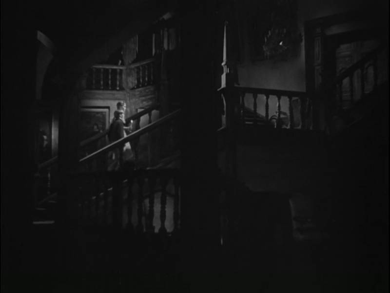
We have just enough light to see the layers of a vast and confusing space, with an unsettling and deeply mysterious result
Do you have any favorite visual movies? Please share some scenes that inspire you in the comments!






Excellent post, and beautiful choice of shots. I wonder how Guy Green (and David Lean) would have approached the film with color in their arsenal. Great read, thanks for posting.
Thanks so much! And I wonder the same thing. Something else which would likely change by the time color comes along and changes the lighting strategy for a movie like this, aspect ratios got wider as well. I love the wide scope of a 1:2.35 ratio, but these earlier boxier frames also lend themselves more to an illustrative look to me.
Great article on picturemaking. Thank you!!
One that I recently re-watched, that never ceases to amaze me, is Disney’s 20,000 Leagues Under the Sea (1954). I highly recommend looking into the “behind the scenes” material. They blew everyone, including themselves, away.
Great post!
One of my favorites is Barry Lyndon, the 1975 film directed by Stanley Kubrick. As a painter, I find all of Kubrick’s movies to be very inspiring from a composition and color/value point of view (Kubrick started his career as a magazine photographer) but Barry Lyndon is especially gorgeous to look at since it relies very much on natural lighting, particularly a lot of candle-lit scenes.