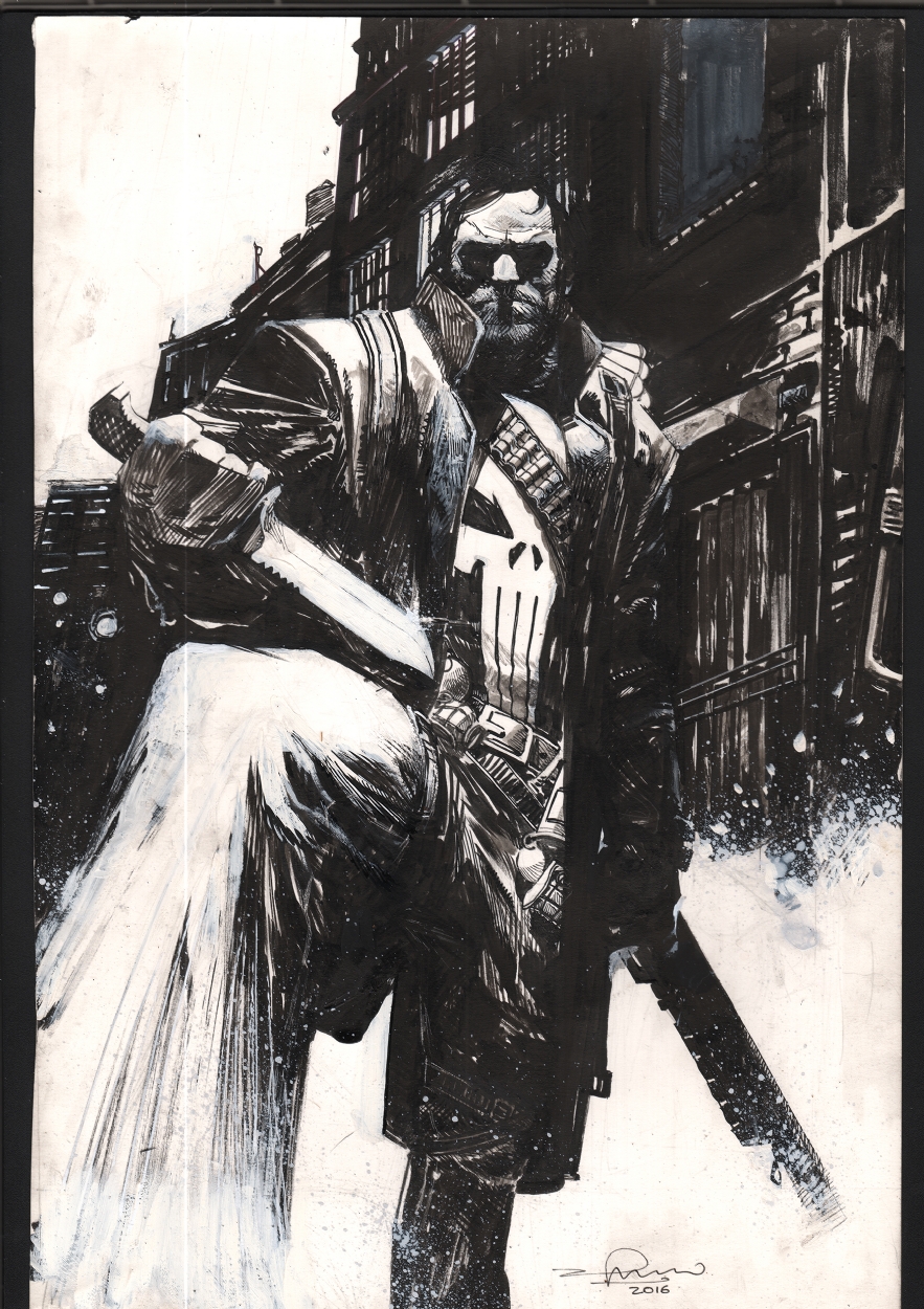
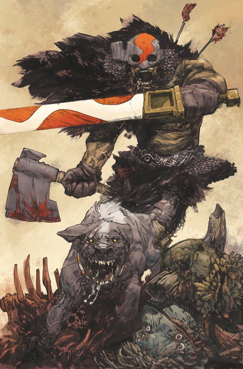
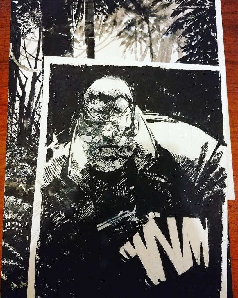
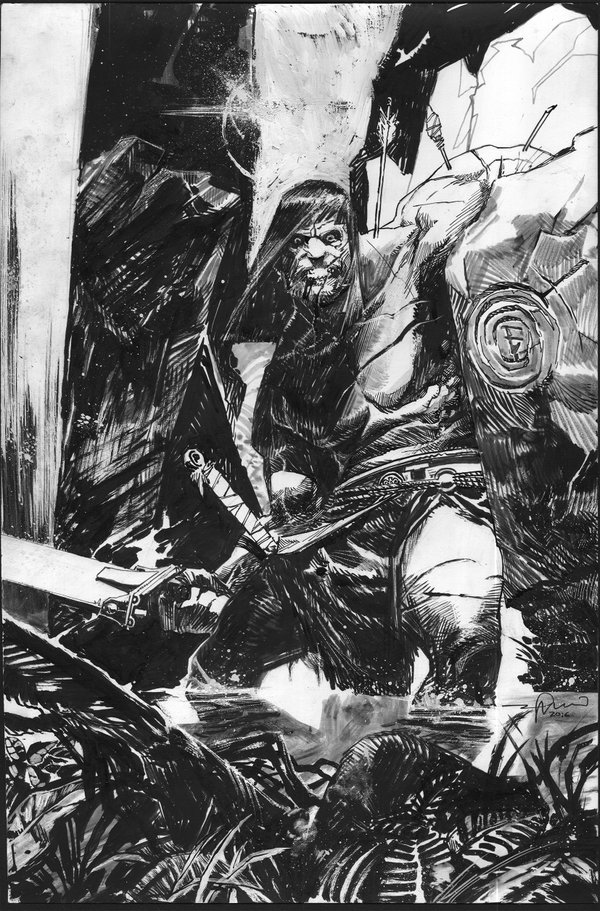
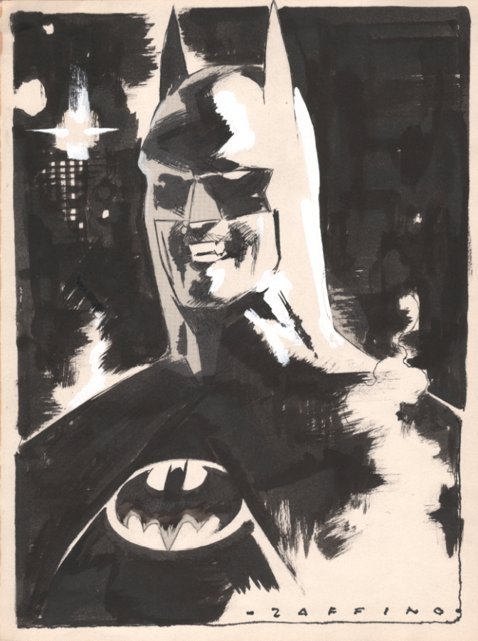
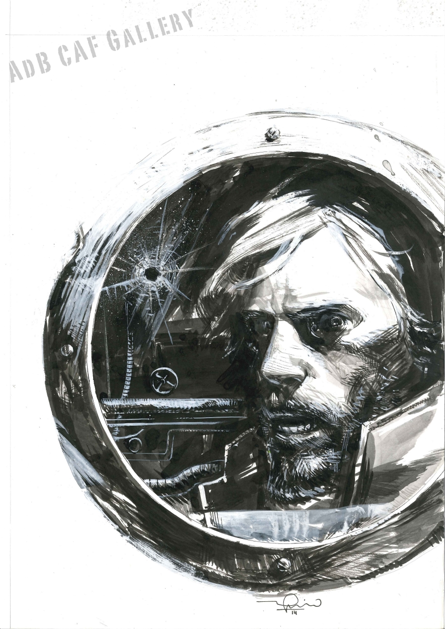
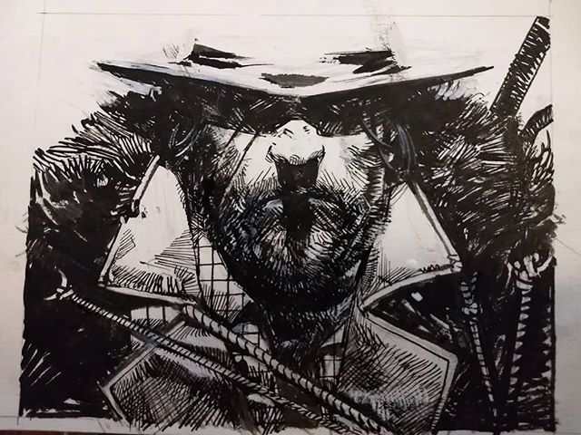
As I often do in my posts, I’d like to introduce the work of a fellow colleague from my city, and if you like powerful, rough inks, you’re going to love Gerardo’s work.
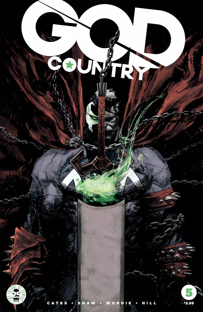
Many of you had probably heard of him already. In the past few years he’s been doing interiors for Marvel, in the “Karnak” series, and for Vertigo, in “Suiciders”, alongside many covers for different Image books such as God Country, Rumble! and Head Lopper.
About his process, Gerardo says: “I do very loose pencils. Lately, I’ve been trying digital pencils, which are basically blown up thumbnails. I take a bit more time when there’s some special lighting or with technical parts like buildings or structures, but other than that, I don’t even spot blacks, I do all that straight with inks. I don’t have a special technique. Sometimes I would start with brushes, other with nibs, but I always alternate between them. I also use white gouache and inks, white gel pens, and everything I can get my hands on to get different effects.”
When it comes to inks, I’m always curious to ask how do different artists handle the scan and preparation of the image, in the case of being colored later. The Bitmap mode used by most artists (in which the image is decoded in black and white pixels, only) can be very cruel in this sort of ink styles where there are so many textures and subtle grays.
“I always try to color my own work when doing covers, but when I don’t, or when doing interior art for someone else to color, I just tweak the levels to clean up the whites a bit and flatten the blacks. I try to keep as many variations in the middle as I can, but cleaning them up a bit.”
Ink is his weapon of choice, and most of his influences came from a few masters of the craft: “Obviously my dad was a great influence, especially in the way I try to play with volumes and lighting, Toth, Sienkiewicz, Mignola, Toppi, the list goes on and on…”, Gerardo explains.
In case you haven’t guessed yet when he says: “My dad”, he’s talking about Argentine artist Jorge Zaffino (1959-2002). An Artist’s artist.
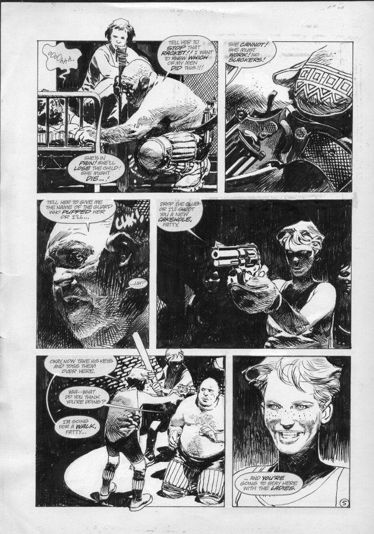
In 2015, Gerardo did a few covers for IDW Publishing’s series “Winter World: Frozen Fleet”, written by Chuck Dixon, who had created the series among his father a few decades ago.
“It was incredibly emotional, it was a book that, while one of my favorites, was almost forgotten, and suddenly it was back and I was working on covers. I really enjoyed working on the characters I grew up with.”
At the moment, Gerardo is “mostly working on covers, doing some character design work for a few projects I can’t talk about yet, and slowly working on my own creator-owned book, which I’m writing myself (a First for me)”
While he couldn’t tell me much about this creator-owned project (I tried to get him talk, I swear) he told me a bit about taking care of the writing as well as the art, which was a new role for him: “Writing is such a strong word, I’m new at this, and I’m mainly looking for excuses to draw what I love, so the story is very straightforward and visually driven. It’s kind of a post-apocalyptic western, with some horror elements, but mainly action-packed.”
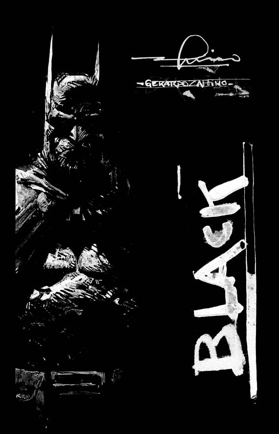
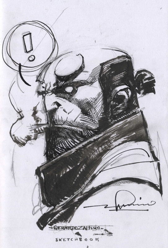
I prefer Gerardo’s work in black and white, and that’s why I was so happy to hear that he had recently released a sketchbook, “Black”, which compiles some of his work: “Black was supposed to be a “warm-ups book”, and it mostly consists of those. Sketches I do before getting to ink a page or a cover, to loosen the hand. Then I added some private commissions and covers that were only published in color. I’m very happy with how it turned out, and it has almost sold out its second printing, so we couldn’t be happier with it.”
You can get yours, here.




Nice works! He reminds me of Sergio Toppi
Powerful, visceral inks! Very cool!
Very powerful work! A great discovery, thanks!
One of the best!
Holy cow! Panel 3 on the Winter World page is pretty amazing! That bounce light.
Thanks
When it comes to inks, I’m always interested in finding out how different artists prepare their images for coloring after scanning them.
I always switch between brushes and nibs, though occasionally I start with brushes.