I was looking through Sotheby’s and came across some beautiful images of John Singer Sargent’s charcoal drawings. I have seen some before, both online but also in person. I have been on a Sargent binge lately, buying up the 9 volume series of books (soon to be 10 and the 10th will focus on his drawings) written by Richard Ormand. They are amazing books (here). I will be writing about them in a future post.
Something that has always stood out to me is how similarly Sargent handled both charcoal and paint. I know many artists, myself included, whose drawings don’t look much like their oil paintings, at least in approach. You can see how he would seek out the large shapes and forms and then accentuate them and create definition by adding in strong points of contrast and line. Much is known about his approach, and in his own words too. There are some excellent first hand accounts of his working methods. One is a book called John Sargent, by the Hon. Evan Charteris, K. C., published by Scribner’s & Sons in 1927. I stumbled across a PDF (originally here) that contains some excerpts from the book and some excellent diagrams and notes.
Including it here: Advice on Painting from John Singer Sargent
I found it interesting to read the comments and statements in the PDF and then take a fresh look at Sargent’s paintings and drawings. If interested, I recommend this exercise.
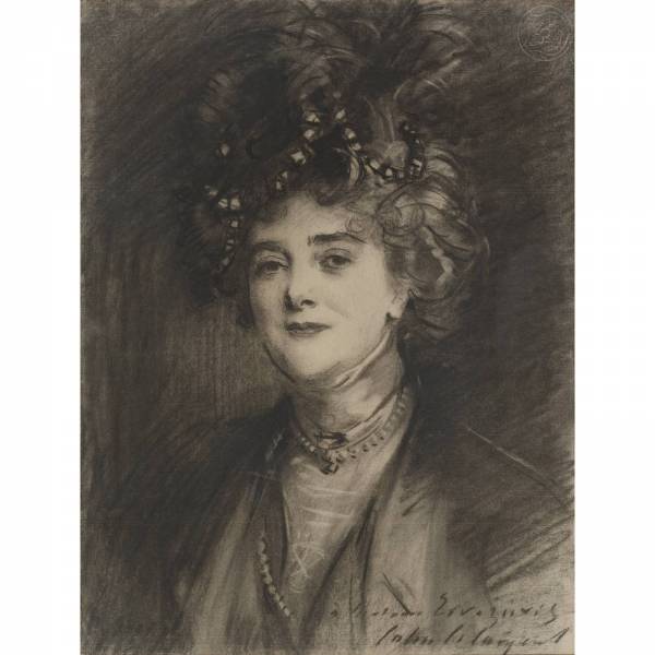
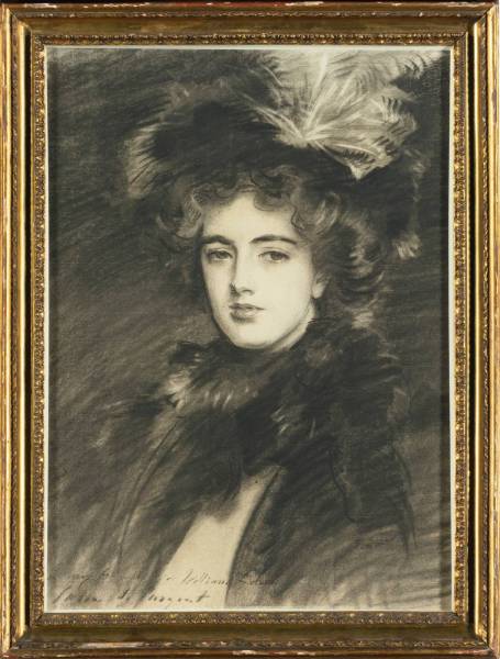
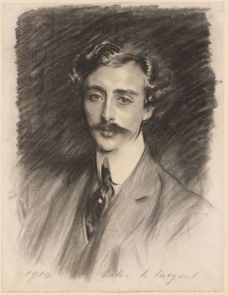
You can see in his charcoal drawings how he thinks about simplifying values and shapes, merging portions of the shadow into the background. Overlapping of values while laying in shapes and allowing the edges to dissolve into each other and then adding back in definition with a quick dark line or erasing back to the white of the paper. The image below really caught my eye. I can imagine approaching this drawing by keeping everything a soft impression of the subject, refraining from hard lines until the forms and values are clearly established. Only then allowing myself the chance to add details like eyes and add lines to accent divisions of space and form.
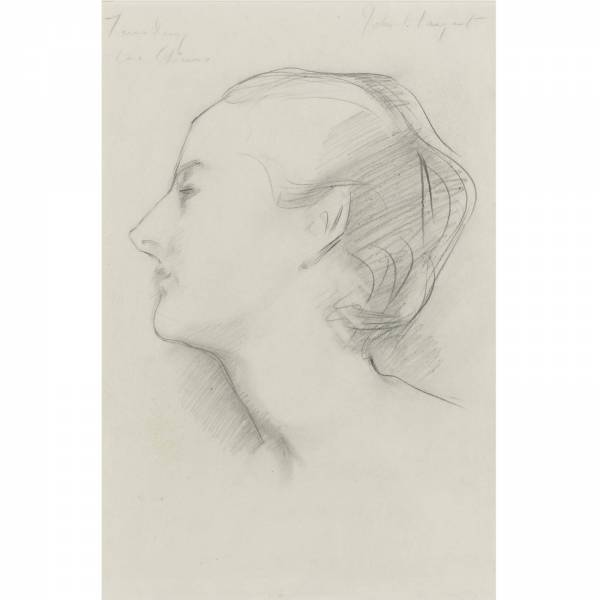
Look at this beautiful study of Virginie Gautreau.
In particular the shadow on the neck and how it runs into the background. You can almost imagine that he put down this shape or shadow mass and then drew a line across it to create her neck and allow the shadow to merge into the background. Same with the hair. I don’t know that this was the case (did the lines come first or the dark shapes?), but in reading through his approach to painting it certainly wouldn’t be out of line. Either way, it is a beautiful example of how he could use a few marks to convey so much.
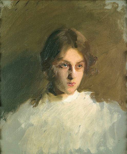
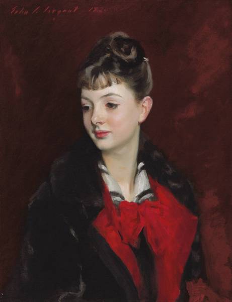
Looking at some of Sargent’s unfinished paintings give confirmation of his painting approach. You can see on the right hand side of this portrait how he has incorporated the value of the background into the mass of the hair and simplified the hair shape significantly.
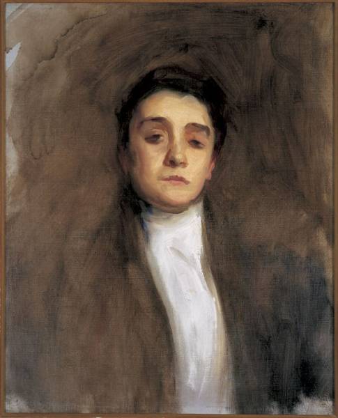
In the painting below you can imagine that it wouldn’t look much different in both execution and approach if it were a charcoal study.
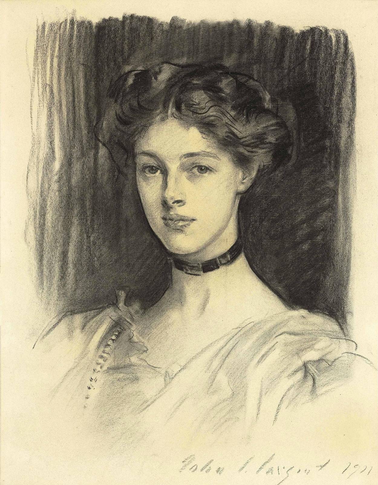
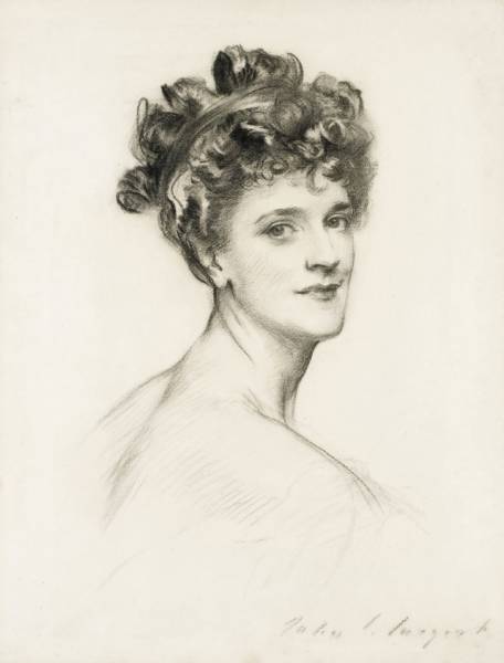
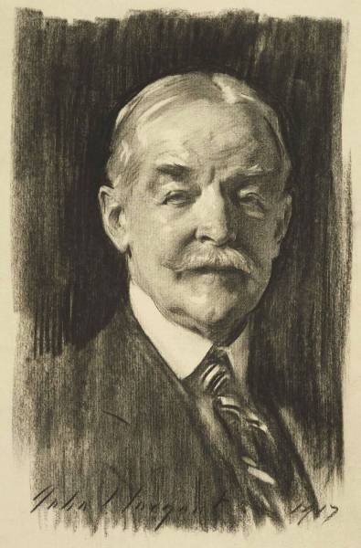
Here are a few more Sargent images:
This self portrait is so masterful. Sargent said the outline of the head was “where the light and shadow meet, not the place where the head meets the background.”
This less polished portrait is a great example of simplifying shape and value.
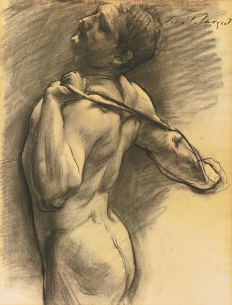
I love this figure study below. Look at all the variety of edges and lines and how he used them to push and pull forms. Note the neck and how it melds with the bg, contrasted with the buttocks and right deltoid and how that hard line defines the light side form and shape.
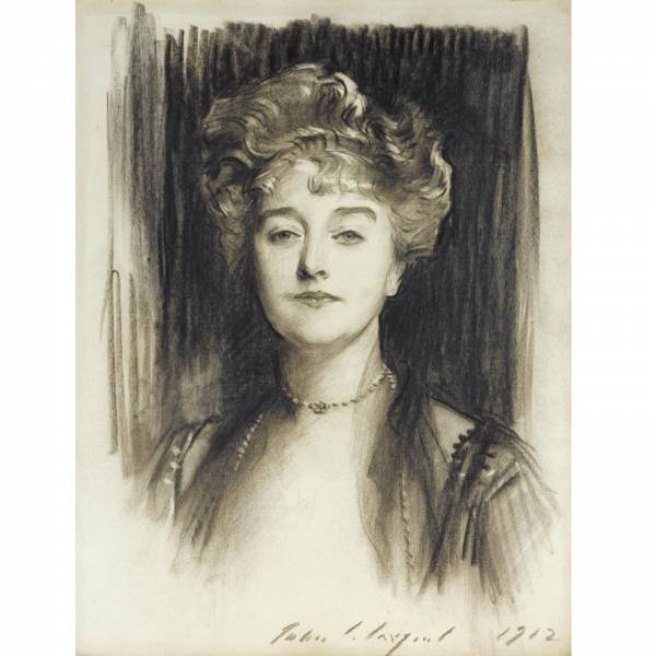
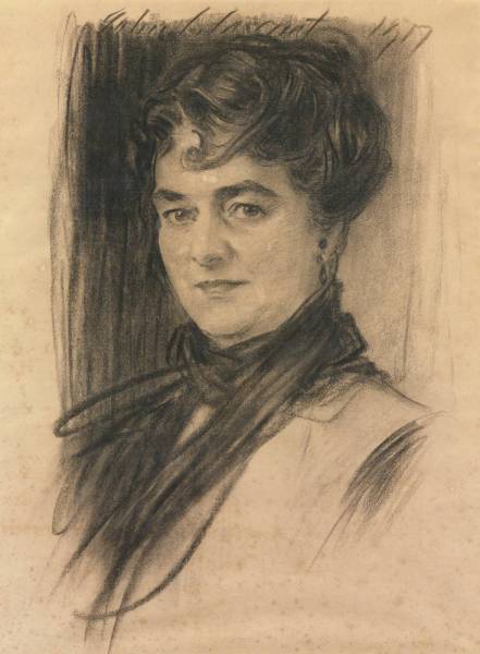
Look how he handled the chiffon or gauzy fabric across her shoulders and chest. Soft transitions of value and edge. Compare that to the way he dealt with the hair. Extracting highlights from the mass and then defining with dark crisp lines.
I’d love to draw one portrait in my life as beautiful as the one below.
Back to this beautiful drawing from the top of the post. Look at the left hand side of the hair. You can see how the background value was massed in, and then to create the hair he drew in the dark accents over the top and removed just a few spots with an eraser. The vertical lines of the background are clearly visible running through the shape of the hair. 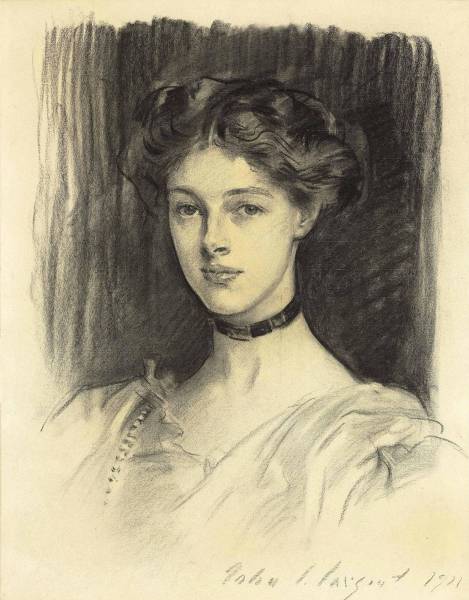
I hope this post was helpful. Look for more posts on Sargent in the future as I dig in!
Howard








These are fabulous.
He was amazing, wasn’t he?!
Thanks a lot, Howard.
Valerii – Thank you for giving the post a read!
Just wonderful, Howard!
Thank you, Arnie. It was great to see you at the Spectrum Awards, even if just for a moment. Looking forward to another time when we have more time to chat.
I feel like John Singer Sargent is everywhere! Both the Cincinnati art museum and the Richard H. Driehaus Museum in Chicago will have exhibits featuring Sargent’s artwork this year! I’m going to try to make both 😀 Thanks for the post!
Great Post- JSS drawing is painting!!!
Fantastic post, Howard! Thank you for the PDF link too, great stuff. Do you recommend a particular one of Richard Ormand’s books, or is it best to just buy them in order?
Another great post Howard- thank you! (also for the awesome PDF). Two other Sargent books I really like are “American Drawings and Watercolors in the Metropolitan Museum of Art John Singer Sargent” by W. Herdrich and H. Weinberg and “John SInger Sargent The Sensualist” by T. Fairbrother. They both have his quick studies and less polished work along with personal sketches.
great