This past year I’ve had the opportunity to tackle some of the most iconic and known quantities in my particular world view, but few have been so daunting as to take on a new approach to Stanley Kubrick’s masterpiece of cinema, 2001: A SPACE ODYSSEY. There are films that occupy a rarified station in the landscape of cinema as foundational, and there’s always some that simply don’t hold up under the test of time becoming more significant as a relic of a time, or a place in history than a film still alive and relevant. 2001 is not one of those. In seeing it again to study for imagery this last winter I came away at the end gob-smacked with how absolutely terrific it remains. I screened it her to also show my two boys each 15 and 12 years, assuming they would get bored, find it slow and start instatweeting their friends on snapface or whatever. They did not. We were all locked into the space this film creates right until the last insane trip into the Jupiter monolith and then the hard work began: what to do for an image?
There’s already been a terrific slew of posters and art created for this film, and while the honor of being tasked by Mondo with standing on the shoulders of those giants is beyond words, it is also totally terrifying and turned into what was for me, every human shaped emotional head-squirrel imaginable. I literally went from bold hubris, to timid self doubt, mechanical coping, denial, sobbing, joy, worry, and about two dozen other stages of madness in the process. The key I found in the end was to ignore everything I knew about what the film means, and stay laser-focused on the film itself. Keep it to the work and hug the insular reality that at the time, I could tell no one I was doing this project and thus did not have to also field outside questions that would only stir the pot if feral kittens my head was by asking how it was all going.
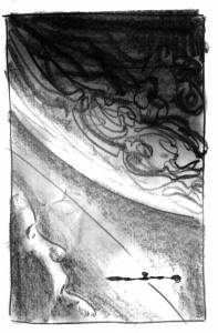
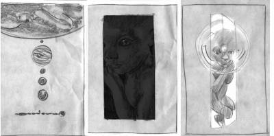
First up as usual was the bevy of thumbnail sketches and broad stroking the the concepts out to see what the field may show. I must have done at least 30 of these, some derivations of others, but largely encompassed by all separate and stand alone concepts. These were all of course for the primary, any variant image would have to be worried about later if not already executed. One mountain at a time, please.
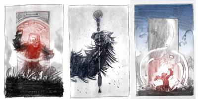
There were a ton of others as I first thought the best place to carve new ground was also some of my favorite scenes from the film where Dave Bowman is inside the Monolith and living out his life in a kind of hall of mirrors fast forward folding of time. SO I went to the Apes, because whenever you feel in doubt, go ape! I actually argued for a while heartily for the middle image of the Ape gripping the Discovery like the first weapon… but we found a better way):
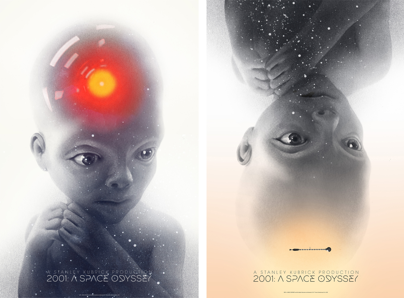
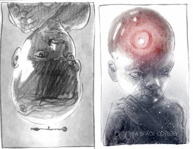
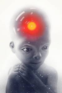
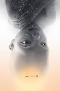
But as it turns out there were already too many good swipes at both ape and monolith-Bowman. This is why ignorance is bliss for a little while but as you plan to put something out into the world, a good idea is to see what’s out there already. No one since the 60’s had done one focusing in on the Star Child, and that seemed the singular place to be. It excluded everything else except for himself, but in and of himself encapsulated the whole film’s ethic entirely. It meant going to familiar ground in the area of portraiture and character. That seemed like interesting territory to me, and while I think there’s an old one-sheet lobby card that shows the Star Child, I thought it might be interesting to feature him in this way here as previously unseen. So the folks at Mondo gravitated to these two below and we were off to the races.
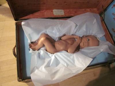
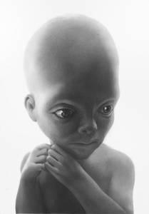
The trick of it was coming to realize that this isn’t just some baby, and in researching a bunch of baby images I found right away that the sculpture this was use in the movie was in no way a normal baby in either shape or character, and I needed to be true to the Star Child as a character in fact and reality. To do otherwise would be to draw Superman as a blonde with a buzzcut. So after a few tries I set out to make a large graphite drawing of him knowing this would be upscaled HUGELY and require a serious attention to detail, and ethereal sense of form and smoothness I hadn’t before tried to pull off. It took a few false starts before I managed to finally get this bit sorted out and lay down some landscape upon which to do the rest…
This as they say was the hard part. It took days and days of putting it down and coming back to it and putting it down and tedium and tedium again to get there, but having laid down the core image, the rest was just playground stuff. Getting the Discovery drawn to insert, HAL 9000’s all seeing eye, the sense of space…. the hardest thing about this stage and applying all the details was to resist the tendency to go too far, to overcrowd the image and final with too much. There’s SO MUCH that wants to be there from the sprawling visuals of Jupiter, the Earth Orbit space station, the Tycho Monolith, the sleeping travelers int heir pods, the weird white room as Bowman ages… coming to realize the ease at which this could be overpacked and my own personal growing dislike for head-cloud, and overly flooded complexity in these poster images helped keep most of it in check. With something like this it becomes about remembering what this is for, the large 24″ x 36″ scale at which it will be exhibited and how such an image as a presence int eh room would feel. At this size simple and quiet and airy take on a presence that means you don’t have to shout, no matter how much one might want to. That something quiet like the relationship between the hyper-evolved avatar that Dave Bowman becomes in the Star Child and his relationship with HAL can be impactful enough without screaming it out loud. That in the vast depth of space and the usual cold and hard world of Stanley Kubrick, there can be a place for the quiet-personal to blossom.
To get the prints that go on sale this very day, please go HERE: https://mondotees.com





Recent Comments