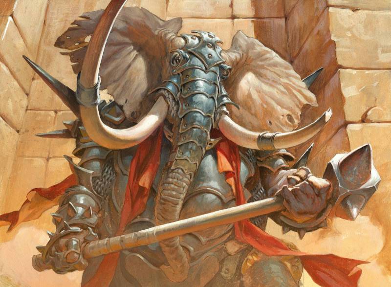
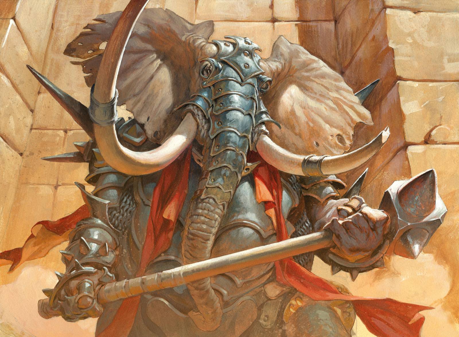
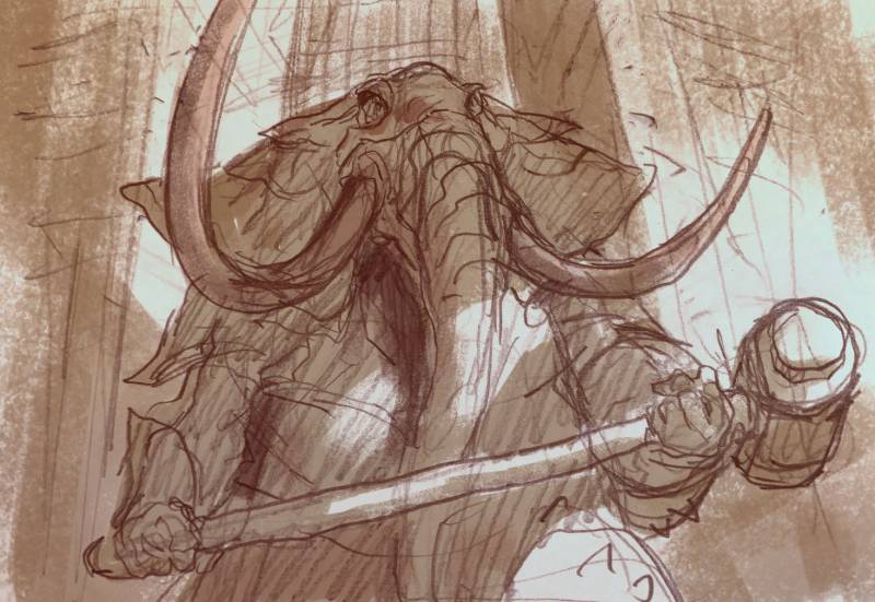
The Loxodon Line Breaker is a new illustration for Magic 19. The assignment was describing a big loxodon ( humaniod with elephant head ) in full armor wielding a huge weapon guarding a tower entrance. In my mind I saw a clean straight on point of view slightly from a low angle to make him more menacing and I sketched it out pretty easy and with no difficulty.
This is very rare for me, so please celebrate and cheer me on, because its about only one in 50 that comes out smoothly and doesn’t repulse me right away. But since I did not have the usual struggle and hair pulling agony of trying to get my inner vision out on solid papper, I thought that something might go wrong anyway. “This was too easy, Jesper. What’s wrong?” and I came to the conclusion that the image would end up being boring. So I started thinking of what I could do to make it more interesting at this point.
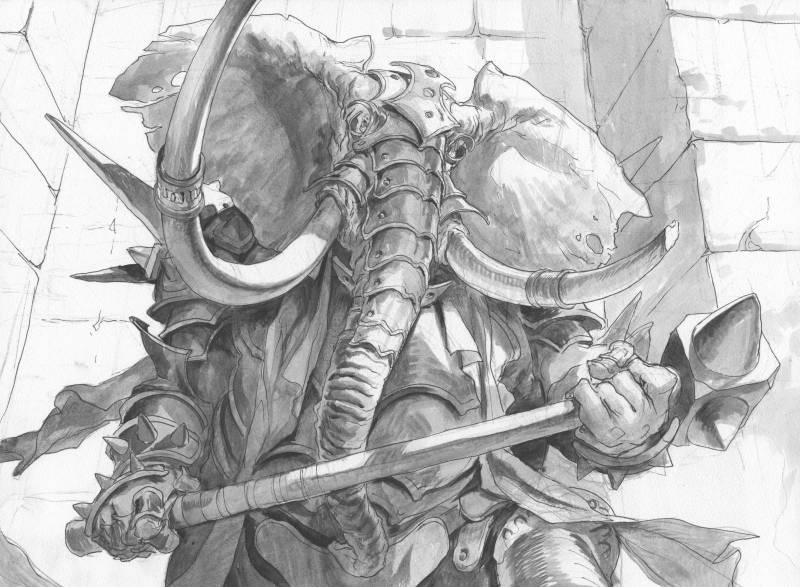
I had already transferred the sketch to a board and had the whole thing inked up and was more or less ready to start adding paint. Only thing left for me to decide was color and light. So I made up my mind to go all in on colors and make a painting that would explore the effect of bounce light on a very bright lit day. I looked at the image in a different way now. The Loxodon had all the usual traits that I aim at: A solid silhouette against a light background. Detailed armor and face against a minimal detailed background, heavy foreshortening in the tusk. All were elements that would still make the image clear almost no matter what colors I chose. But I wanted to keep it all brightly lit. A long long time ago I send a painting I did of Gandalf to one of my favorite artists Mark Zug. His only advice for me was that, when choosing light and shadows I should try to think of my characters as if they were standing outside on a super sunny bright day and then pull back from there. So with this Elephant man I did just that. When looking for references for bright sunny days and how it affects the light on characters I usually search for “babe” and “beach”. One: there is so many pictures on the internet of bikini girls and 2 because the beach sand makes the sun light reflect up into the shadows in a warm and easy to distinguish way.
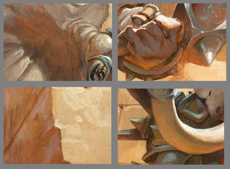
I found a photo of a model called Bianca-Kmiec. I used to have a H&M summer catalogue that I used for this, but it got torn and wrinkled form paint over the years. Well. Armed with a beach bikini model I started painting the elephant man. When I looked at the way light was acting on the woman’s skin I noticed right away how very orange the bounce light is. Often it seems too extravagance and aggressive to use so saturated and orange in a shadow area, but when you see it on a photo it looks alright. Another thing is that the skin tone on hand, thigh, chest and shoulders almost burn out and goes to white from the bright sun light. The only area where elements has its true or real color is the area between the direct light and the bounce light. I started with the tusks and painted the bright light in thick white and the rest in warm light brownish. I always establish one element or area and make it almost final and when I am happy with it I start spreading, what works there, all over the rest of the painting. I got the tusk working out nicely and went to the face and the armor. The further down towards the ground I started pumping up the orange but kept it in a value almost equal to the shadows.
The bounce light is a colorization of the shadow area not a light source in it self. If I go too light when doing bounce light the image ends up looking like a dude in a disco light. From looking at the bikini girl I just went through the painting and added orange to all the parts of the armor, ears cloth and so on, that was pointing downwards and that would catch reflected light from the ground. In the end I had to add a layer of dry brushing to the lower part of the figure to resemble dust. I did that to soften the contrast and make the bottom part seem less busy and catch less attention, so that the focus is on the top and face of the character. It is a matter of editing with small layers of acrylics to make certain areas less important. When painting digitally I use a Screen layer for this effect and just brush in a soft area of light color in a low percentage. I then erase the layer where I want it all to be clear and less “dusty”. With acrylic, I airbrush water on the painting, smear some paint on it and start brushing the paint around the wet surface almost like a wet-glazing. Before it dries I wipe away the wet paint where I do not want it to “dust” or kill the contrast. If I look back at earlier paintings where I did not care or even knew much on how to portrait bounce light I see a huge difference.
In the painting of the rampaging giant from over ten years ago you can see there is no bounce light. Only local color and rim light and what strikes me to be the biggest difference is that the are between the soft light of the local colors and the rim light goes to completely black. The light setting in the 2 images are the same, fully bright sunny day. But if you compare the giant painting and his skin tones to the bikini girl there is a strikingly huge difference in how the light acts. There is NO black in skin tones when the light is bright. The giant was painted at a time where, I was inspired mostly by comic book artists like Simon Bisley and Glen Fabry where the special effect seemed more interesting to me than capturing real light. I think that exploring bounce light is one of the most enriching part of the painting process for me these days. Every time I can find a reason to light up shadow areas with color of reflected light I get a kick out of it. Try it, less dark, more color. The shadows can be far lighter than you think. As long as the direct light is really light the shadows can be just a slightly bit darker and will still read as shadows.




I’ll have to remember this article the next time I’m asked why I’m looking at pictures of people in swimsuits 🙂
Beautiful piece and great insight on bounce light management, thanks for the post!
Great article and beautiful painting Jesper.