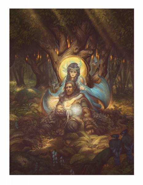
 This scene is from The Tale of Beren and Luthien by J.R.R. Tolkien and is one of my favorite scenes from the story. I went with the title, “Drawn Back to Life” but it could also be titled by one of the previous lines from the story, “Wandering upon the Dark Borders of Death.” Anyway, it’s one I have wanted to paint for a very long time and since no one was commissioning me for it I was forced to commission myself.
As you might expect, the pay was lousy, the hours miserable, my boss is clearly insane and the working conditions can only be described as medieval.
Graphite Drawing on heavyweight paper
But I loved working on it. The scene is from a moment near the end of the story where Beren has just lost a hand while trying to impress a giant wolf with magic tricks. By modern medical standards, Beren ought to be dead really, but Luthien’s power is such that she is able to just barely pull him back to life. Because of this dynamic, I had always seen the scene as something closer to classical iconography with a solid, formal composition, and story elements arranged within the scene. I didn’t go so far as to actually compartmentalize the scene or add type and gold leaf, but it was tempting and it would have fit well.
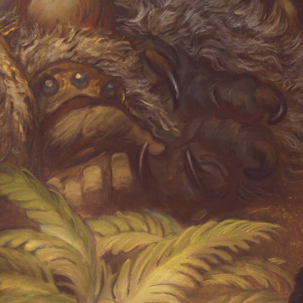
In the scene we can see elements like the poison creeping up Beren’s ruined arm, as well as their disguises (the wolf-hame of Draugluin and the bat-fell cloak Thuringwethil), and Luthien’s power’s of healing, which we have described visually as flowers and birds that whirl around her.
(And look I’m not saying that if I end up with a poisoned arm I want you to get me a surgeon who says ‘forget about modern science, I’ve got bird powers!‘ No I don’t want that. If they are an elf maybe, but still I will need to see some serious credentials proving they know how to use their bird magic. What I’m saying is that the birds and flowers here offer a good visual metaphor for healing, not that this should be construed in any way as actual medical advice.)
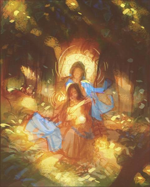
Digital Color Study


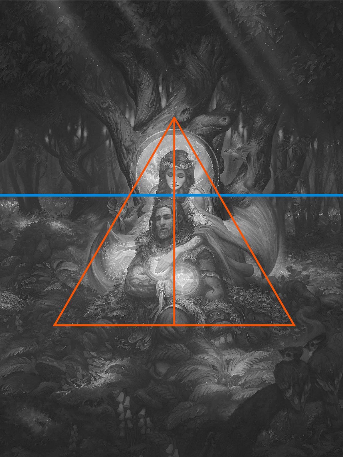
As mentioned above, I wanted a composition that was very formal and closer to iconography than my usual narrative illustration. Most of my compositions are like an elephant juggling dynamite while balancing on a bowling ball, and when that’s your subject, even with only 3 lines the composition tends to go pinwheeling around the scene. But here I wanted to keep it very centered and grounded and so I went with the pyramid. Initially there were a lot more roots at the base of the tree to really sell the triangle shape but I found I didn’t need them once the drapery and bat wings were in there. This geometric composition has the danger of being too restful and passive which can risk making the image feel boring. So you have to add a lot of movement in the characters. When you are worried about this, hands and folds in drapery are great devices for keeping things moving and pointing the viewer back onto the path you want them to follow. This keeps them engaged in the scene for longer and generally makes the image more pleasing to look at.
If you have any questions of a non-medical nature or if you have any requests for future posts let me know in the comments!





Looks great, you’ve been on a roll!
This is a lovely piece, that actually makes me want to read the story of Beren and Dr. Luthien. I’d say it was worth the medieval working conditions. And I hadn’t heard about the three major lines, but it’s something I’ll keep in mind for future work.
Thanks for sharing another insightful article! Turned out beautiful.
It was well that you took the job as it turned out beautifully!
Thank you for sharing Justin, it’s always a delight!
Justin, this piece is beautifully executed. It’s quite the challenge to distill all the elements of an elaborate story into one, concise image, but you’ve done it, and done it well! I was intrigued by what you wrote about dynamic vs static compositions. As I’m a naturally-static-composing artist, how would you advise pushing a composition to be more dynamic to the untrained eye? I have a hard time telling if a dynamically-drawn comp “looks right”, and so tend to play it safe with the centered comps instead. Thank you kindly for taking the time to read this, and for sharing your process!