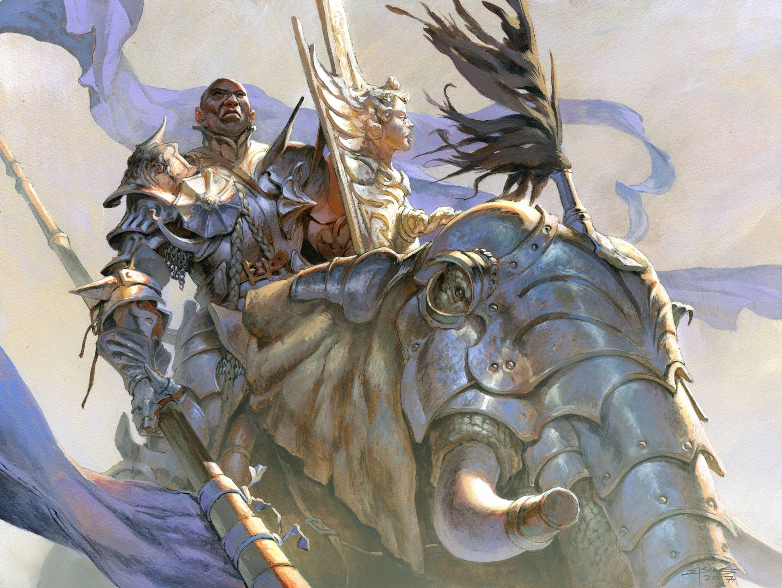
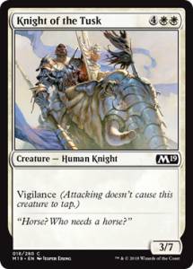
 The Magic the Gathering set Magic 2019 also called M19 is on the doorstep and I have one of my favorite illustrations featuring in that set. He is a white card, which means its a white knight card, but the assignment said he should be a black knight. I really liked the contradiction in it visually and thought a lot about how I could play up the differences in the dark skin against the light amor. Ohh, and one more thing: The art assignments said he was a mean looking intimidating guy riding an elephant instead of a horse.
My first image in my head was that we would be looking up at him from a lower position. He would be looking down or maybe over us and have a majestic aura. A lot of ideas came to my head and I tried sketching them all out. I did not keep all of the sketches since they all were searchings going away and around my first initial idea, but thats how it is. Often I have to go astray and away bit to find out that my first idea was right. Anyway; what felt right about my first sketch was that he was sitting still. If you are riding an elephant instead of a horse, by yourself into battle, you are not messing around. So the pose of him royal like looking over the horizont felt natural to me. In the sketch I therefore let him point the lance downwards to show how heavy it is and to have nice good element that would allow for good directional forshotning lines. all to give the impression of us looking up at him. 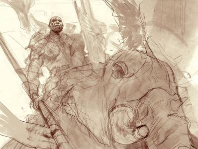
So after I ink up the drawing on the board – I need to ink it in order for everything to be visible when I start covering up lines with acrylic paint. Pencils disappear after a layer or 2 – I start thinking about the light source and the values. I knew that his face was gonna be the defining point of the illustration, and since it was very dark I also knew that I wanted a light background. So I thought to grab this chance to create a color theme that wasn’t pulled out of my usual back of tricks, which meant no purple no orange and no pink. I thought it should be a super light color piece with low values almost as if he was coming out of the battle mist. But in order to have the image less difficult to read I thought I would cover the most of him up in shadows to make him a dark clearly readable silhouette against the much lighter background. And the strong side light would fall on his face and cast a long shadow down over his body. So I washed in all the darker parts on the drawing with black acrylics and liked the effect it would create. The light only catched by the face and chest area would be a great focal point for the whole image.
I painted the panting in one sitting. The more I painted the more flat and grey and boring it became. So out of pure frustration I took an orange, mind you I promised myself this was not a color I would use in this one – and layed down a stroke right in the transition between the light and the dark areas of the amor. And “pang” the whole picture fell into place. That small effect made the difference between light and shadow seem bright and burning and alive. I added orange to the shadows of the face in the shield, I added orange to the arm holding the shield and it gave a perfect temperature contrast for all the Purple/light blue that had somehow sneaked its way into my painting while working the brushes.
When I was done painting I still needed part of the image to loose a bit of focus and I have a simple trick for that: I use an airbrush with water in it, I mist the surface of the board with water to make it moist and then I add a thin layer of background, in this case to the lower part of the figure. I then use a fan brus to brush out the paint, creating like a thin glase or wash if you like, in acrylics. What it does is it kills a lot of the contrast in the areas where the white paint gets glared over the image. And then before it dries I wiped away the glase on the tip of the elephant tusk, to make it seem like it was coming out towards us through a mist. Also I toned down tha banner in the background the same way, spraying with water and fanning light paint around. It is an analog version of adding a screen layer of color in photoshop to create an atmospheric effect. But in acrylics there is no turning back and you gotta work fast. To be honest I always keep a cloth ready and in case I mess it up I spray water all over and rubs it off before it dries.





Heck Jesper, everytime you post your work in progress, I learn something new! Now I’m gonna throw away my Wacom and start painting in acrylics, are you happy?
Hopelessly in love with your work, as always! That orange stroke was pure genius.
Great insight for how you glaze over an area with acrylics. Do you always use straight white or mix color into it?
Thank you again Jesper, always love reading about your process. I think you have the Painting Vigilance ability, you don’t have to tap to paint a image in a single session. Heh.