So you’re sitting in your living room having a rest from a long night out, and there is a guy in a metal suit out in the street waving a flag and yelling. He’s making a real racket out there. Now the neighbors are starting to look out of their windows. Soon they’ll be complaining to the HOA about you (again). And now the man in the metal suit is beating his chest with a pointy stick, like he’s about to lead a parade of bears or something. *sigh* All you wanted was a little rest! I mean, what would you do? (Particularly if you weigh 3 metric tons, can breathe fire, and eat men in metal suits every Tuesday for lunch.)
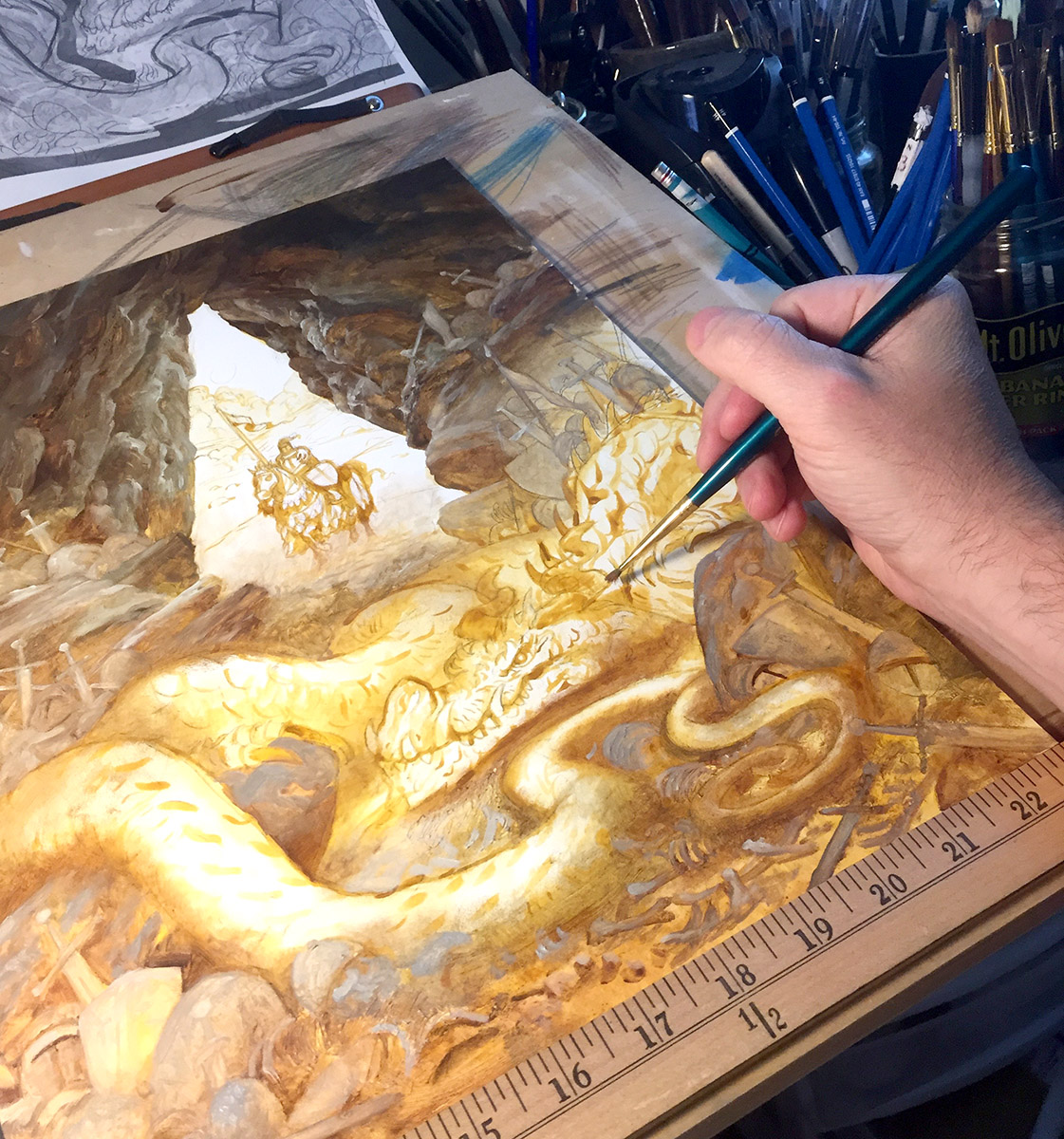
Today we’ll be having a look at a slightly different perspective on dragons. In Part 1 this 2-part article I will first be going through the drawing and design for “The Lair of the Firebreather” and in Part 2 we will go over the oil color phase.
STEP ONE : THUMBNAILING AND COMPOSITION
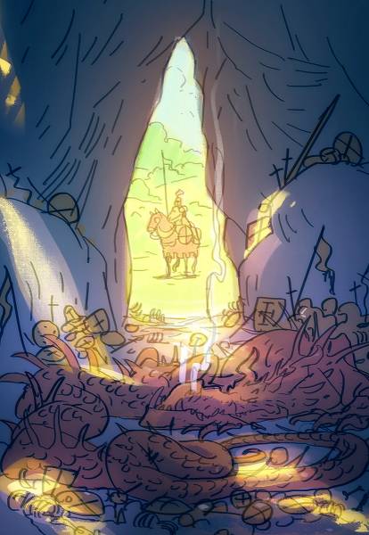
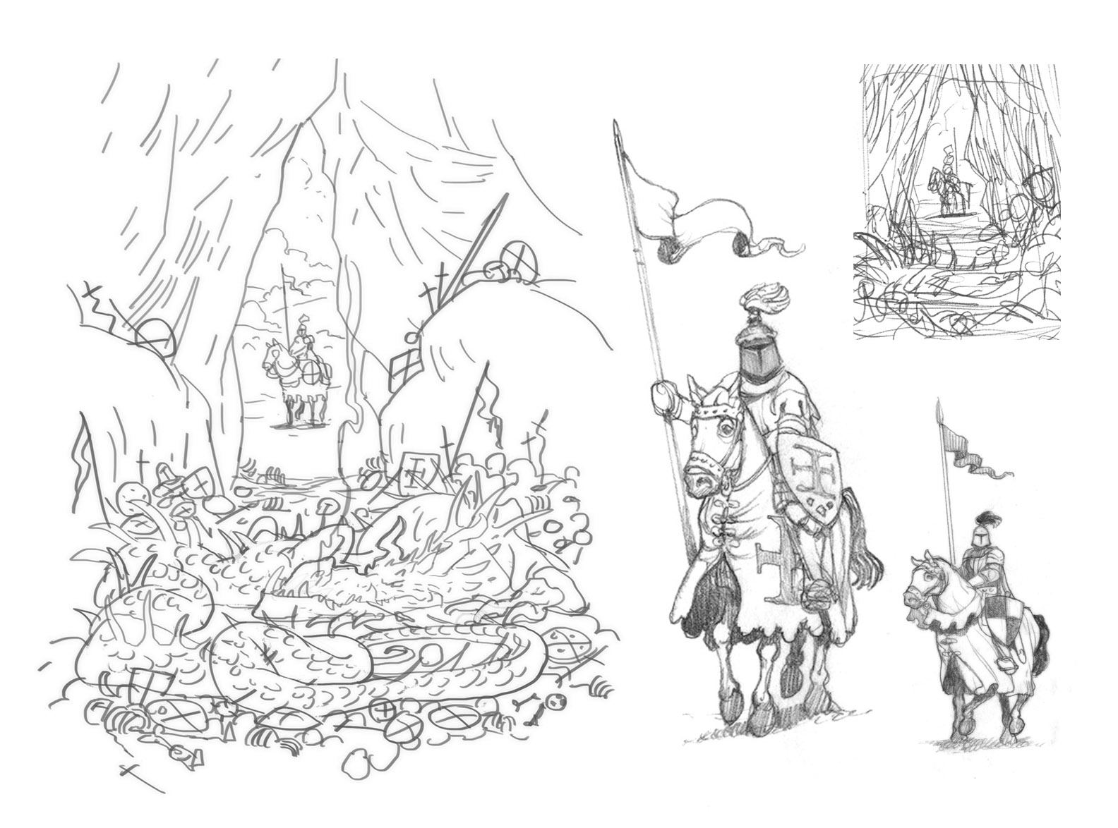
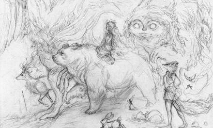
The most fun part of any painting for me is the thumbnail. It’s so dynamic! And there are so many possibilities to explore! Conversely, the most difficult and least fun part for me comes directly after the thumbnail, where you have to actually make sense of it all. Now that I have my idea I have to wrestle all those loose, scribbly-nonsense lines together into a functioning and proportionate composition with fully-realized characters. This is always the most tedious phase for me, but it is also the most important. Without it I am likely to have really committed myself to terrible compositional errors that are impossible to fix later on. (and you can only add so many trees and rocks to obscure those mistakes) So to get to the fun stuff of shading and detailing we must wrestle a solid line drawing out of our little thumbnail.
To achieve this I use photoshop to do a very boring, clean line drawing (see above left). No shading in this drawing, only lines. I dislike these little Photoshop drawings. They are frustrating little endeavors, made of pain and agony and bring me no joy to show. Yet I do them for almost every image I make. They are lifeless and generic, and you can’t hide any of your errors behind details and lighting tricks so they are never something I am proud to display. Nonetheless, I find them incredibly useful for generating complex scenes fast and for building a very reliable framework to do a tight pencil drawing over.
Working this way in Photoshop has the benefit of allowing you to push, pull, mirror and transform lines and objects after you draw them. You can of course do most of these tricks traditionally with tracing paper and pencil, (it will probably look better too) I just find this dirty digital drawing helps keep things moving so much faster for me. And honestly I just want to get through this stage as fast as possibly. I’m only here because if I don’t work out all of the math here, all the finest shading in the world won’t be able to save me later on.
After I do this I print this little comp out and do the rest of the sketching with traditional pencil and paper.
STEP TWO : SKETCHES
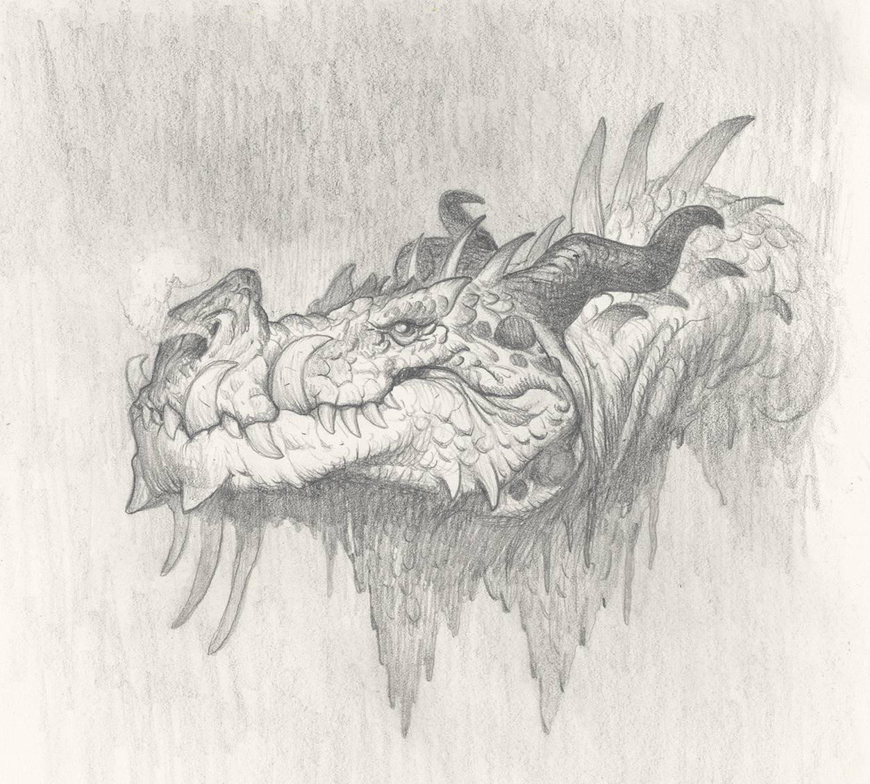
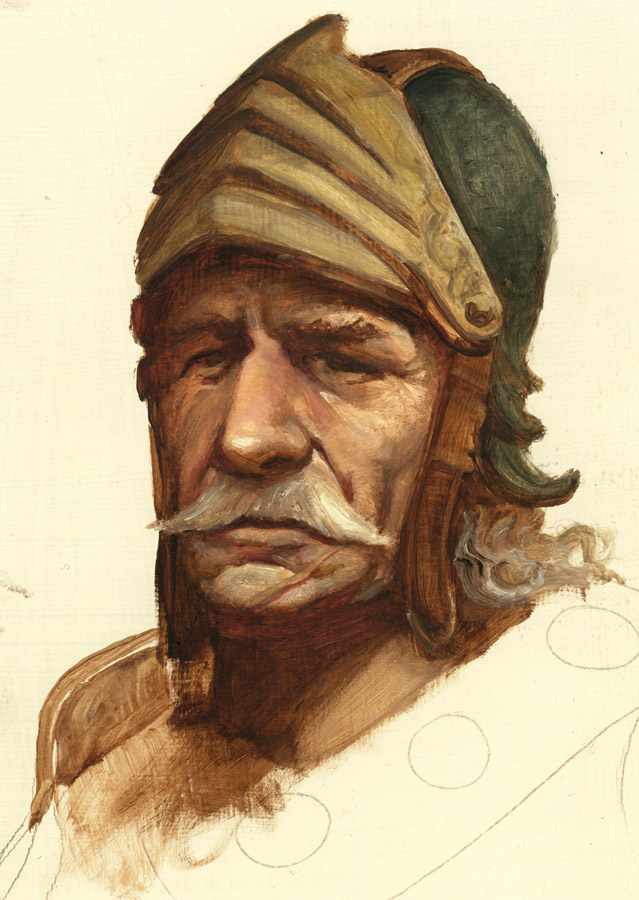
At this point I get to finally have some fun and do some real drawings! I know where I want my final image to go, now I just need to work out the fun details so my actors look like they belong in this film. When I do sketches I tend to only really work on main faces and characters. Most of the boring details can be worked out in the tight drawing (or even the underpainting) but the faces and hands really need to be explored and worked out here.
STEP THREE : REFERENCE STUDIES
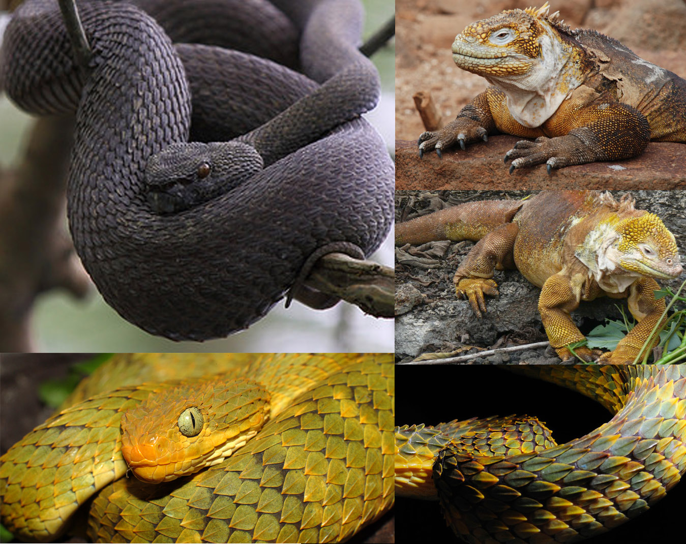
After I get the framework for the drawing down I do drawings from reference to make sure that I fully understand the figures in the scene. For this I did studies of mounted knights, and of a few choice snakes and lizards. Most of the time when I do this I try to do drawings of the actual reference, so as to better memorize the actual anatomy and mechanics of the subject. But sometimes it is just too tempting (as with the black viper below) and I will try to work my design into the reference.
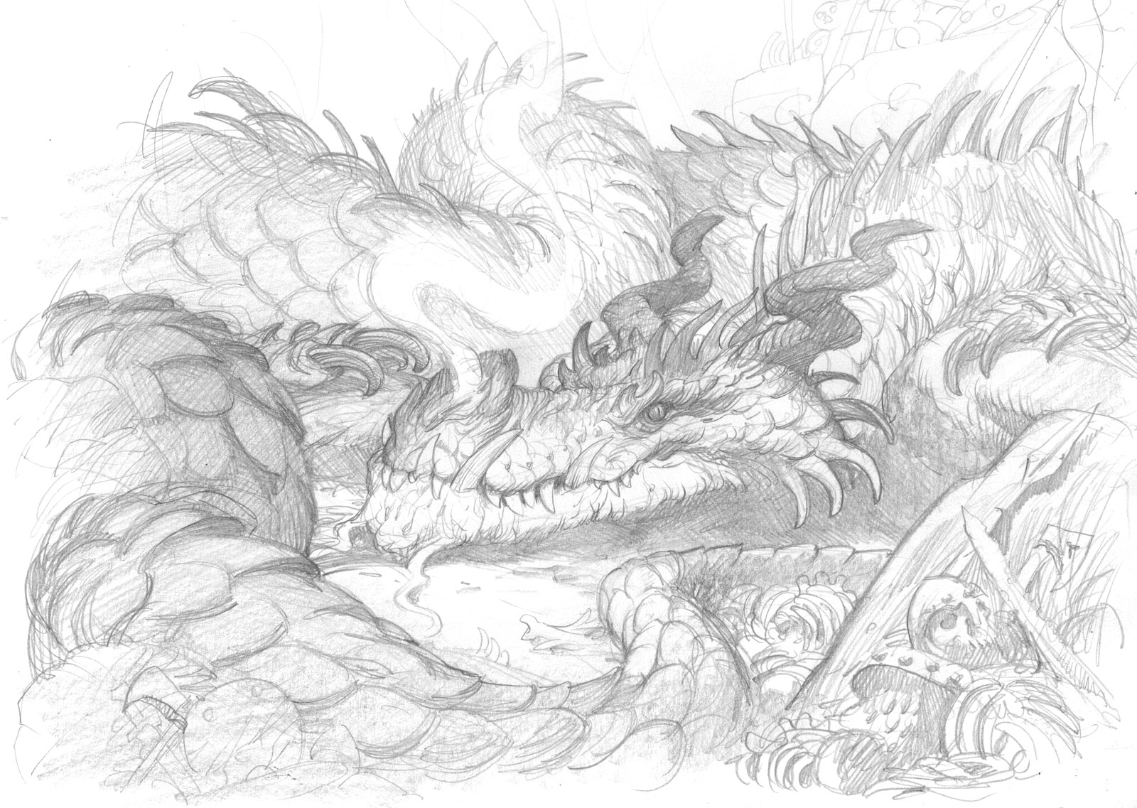
The drawing below was drawn while looking at the above reference as a guide. As you can see certain elements make their way in and inform the decision making in the scene.
But, as is usually the case when I work from reference too closely, I didn’t like this design as much as my original. It just didn’t work as well narratively as the first one. So as much as I loved the twisted coiling of the dragon here, I had to murder my darling and go back to what I had initially worked out.
The lesson for me: When working with reference, I think it is a better modus operandi to draw out your initial idea purely from memory and imagination, as it is in your head, and get it as close to right as possible, and only then go find reference that fills in any gaps you may have missed while constructing your subject. For me, this preserves so much of what makes the art a personal form of communication, and not simply a redundant facsimile of photograph.
STEP FOUR : TIGHT DRAWINGS
If all the other steps were done correctly, Step Four should now be simultaneously one of the most rewarding, and one of the most boring parts of the entire image-making process. You should essentially just be coloring in the lines now. (I like to turn on a good audiobook or podcast at this point) So you get all of the reward with very little of the struggle since you took care of all that in the previous steps.
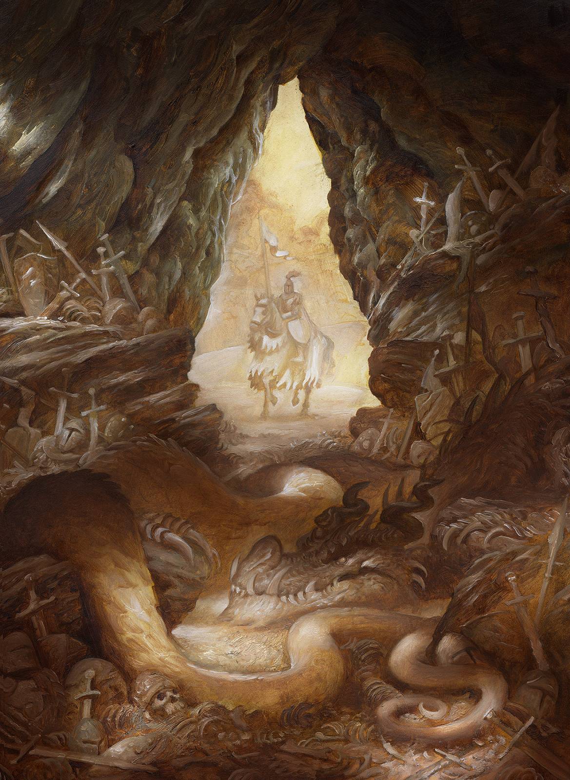
Once all of this is complete I feel much more confident to go into the oil painting and start carving away with light and shadow. In part 2 of this post we will go through some of the layering methods used to apply the final colors. Until then, I leave you with the finished underpainting below!






Amazing post, Justin! I see again and again in my own experience and with other artists that the hardest work always comes up front in the planning. Thanks for sharing this. Your work is such an inspiration.
Awesome! Lovely post, and … traditional, a nice bonus!
Can’t wait for the painting part.
Thanks for sharing!!!
Beautiful Justin. Love the lighting…..and glad to know we share the same Hell of scribbles to drawing.
I love this! I share your sketchbooks with my students every semester because they have such good visuals for the different phases of the creative process!
Fantastic post, Justin. I love reading about artists’ processes from thumbnails to finished work. Documenting the challenges is especially encouraging as it reminds me I’m not alone! That initial sketch you had of the dragon most resembling the snake reference was so GOOD, I totally get the pain of “murdering” a fantastic drawing for the well-being of the whole image. Such a struggle, but when done for the sake of fresh expression in the thumbnail, it makes sense overall. Keep up the good work, sir!