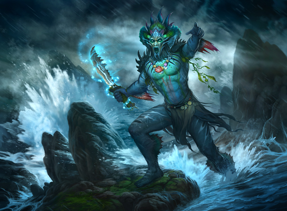
I think it has been quite a while since I have shared any of my illustration work. I will get caught up, starting with a painting I did for Magic: the Gathering. I did a promo version of True Name Nemesis for the online version of the game. Taylor Ingvarsson was the most excellent art director for this piece.
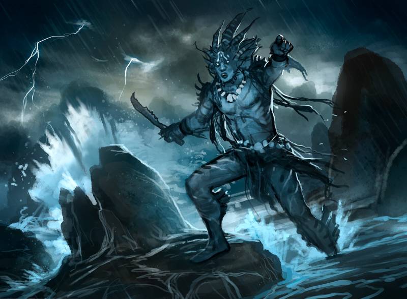
Here are some of the steps, starting with the sketch.
Once the sketch was approved, onto the painting! Here is a gif showing some of the progress:
And the final image alone and in card format:
One thing I love about illustration work is that it pushes me beyond my area of comfort, or even creativity. this isn’t something I would have come up with on my own, or even thought to paint had it not been the opportunity to paint for a rich and creative universe like Magic: the Gathering. It feed my imagination and makes my personal work that much stronger and unique.
Thanks for giving the post a read and feel free to ask questions in the comments. I’ll do my best to answer.
Thank you – Howard.






Beautiful work as always mr. Lyon! As a fan of your detailed figures its a treat to see you go in the realm of fantasy!
I absolutely adore the variety of edges you have even in the thumbnail stage, the background soft edges to the hard edges of the shoulder and back really help the figure pop to the foreground and the soft edges of the left hand and kneecap help it feel like hes in his environment and add a sense of movement. I’m impressed how you kept the overall shape of the original loose water splash, seeing in the gif how it turned from a few seemingly splashed strokes of color to a full on beautiful rendering is nothing but jaw droping, how you designed your background and kept the anatomy and gesture of the figure I know from experience is not an easy task. I like how you made the colors MORE vibrant as the image goes on rather than subdue them like a traditional acrylic painter adds glazes. Seeing your gif I’m amazed by how your process seems to be just small adjustments to the original thumbnail.
As a very limited skilled painter I always run into the problem of never being able to make an image look “finished” but with your painting, I could very easily see your first sketch be the final image. what advice would you give to someone who can’t escape the “rough sketch stage” look?