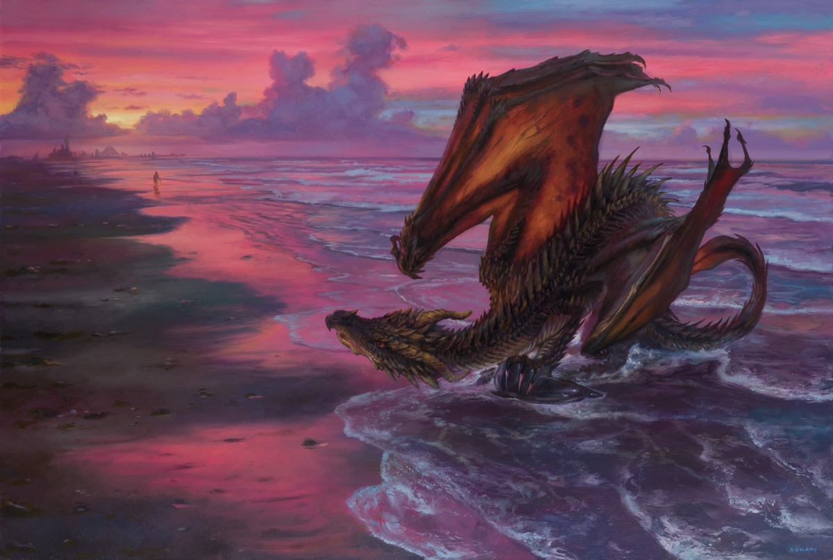
A recent bout of beautiful sunsets put me onto creating a new work centered around a landscape. Of course I couldn’t refrain from making the art only about the landscape and found the need to inject my love of story, narration and the fantastic. Thus what is presented here from a few inspirational pathways is a reflection of a unique convergence:
Drogon and Daenerys at Slaver’s Bay
20″ x 30″
Oil on Panel
A handful of detailed shots follow to illuminate a few of the choices undertaken to bring this image into a coherent whole.
I thought we could play a ‘guessing’ game today with these detail shots and see how things pan out for the absolutist lurking in every critic. For those hard-core fans out there of A Song of Ice and Fire, you know that Drogon is a black dragon with hints of red. How you interpret that is a gift to artists, nor does it exclude weaving in some other colors into the mix as well! So, on with our first question.
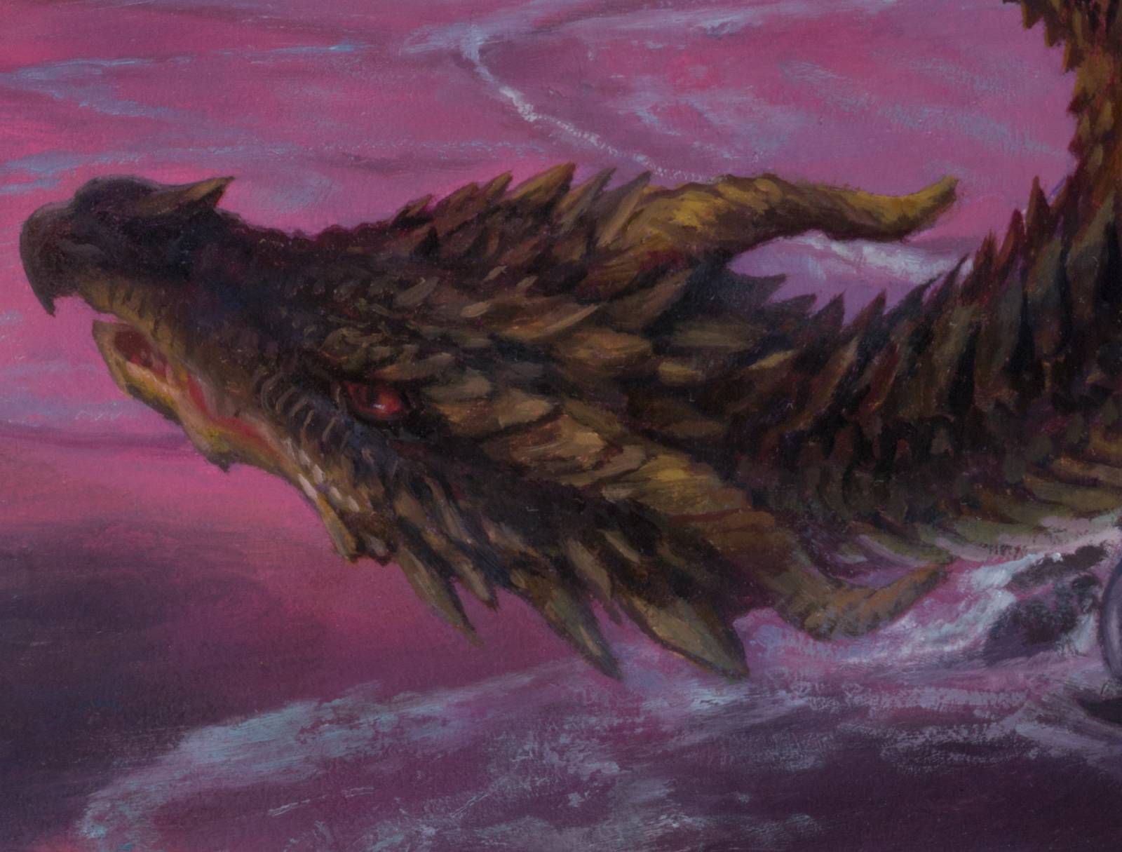
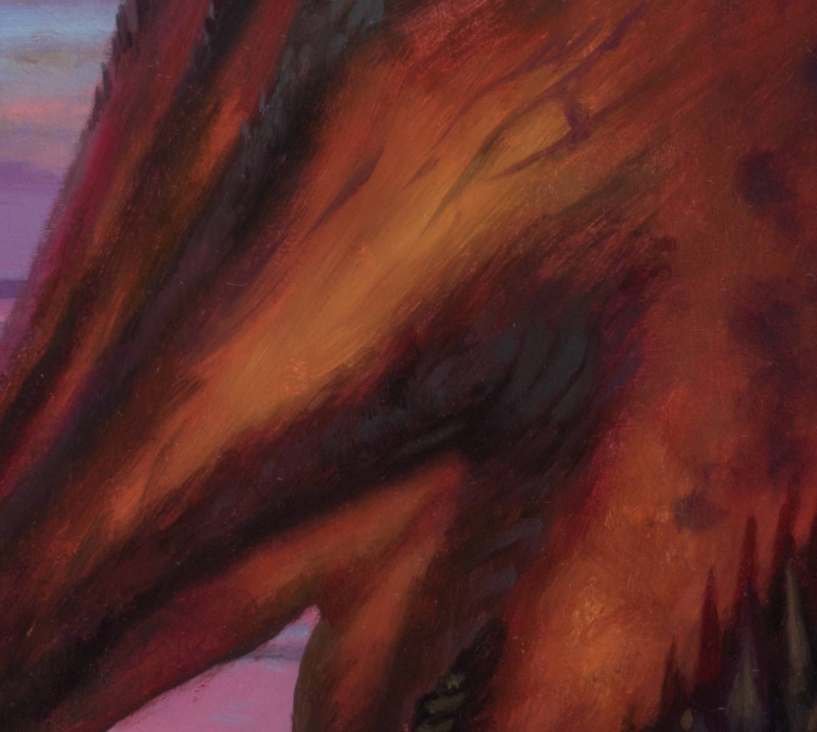
What color is the dragon head below?
If you guessed dull muddy umber-black with hints of pale yellow ocher, backed up by warm shadows pushing into dirty red/magentas, and finished off with cooler neutral grays as highlights, then you hit the nail on the head! Congratulations!
If you said black, yellow, or red, then you missed the mark and over generalized. Many times viewers cannot see the subtlety of color, because they likely have never painted nor looked closely enough to comparatively assess color in highly localized areas. While not incorrect to broadly label a color’s chroma, as artists we need to be much more specific when it comes to choices.
The colors we see are informed by those in their their immediate surroundings, thus the feeling of darkness, or black, may change pending on the comparative color/value you are establishing the basis of evaluation from. Here we have a modestly light background, thus making the head appear dark. But upon close inspection we can see there is nearly no real black used in its rendering. It is all subjective.
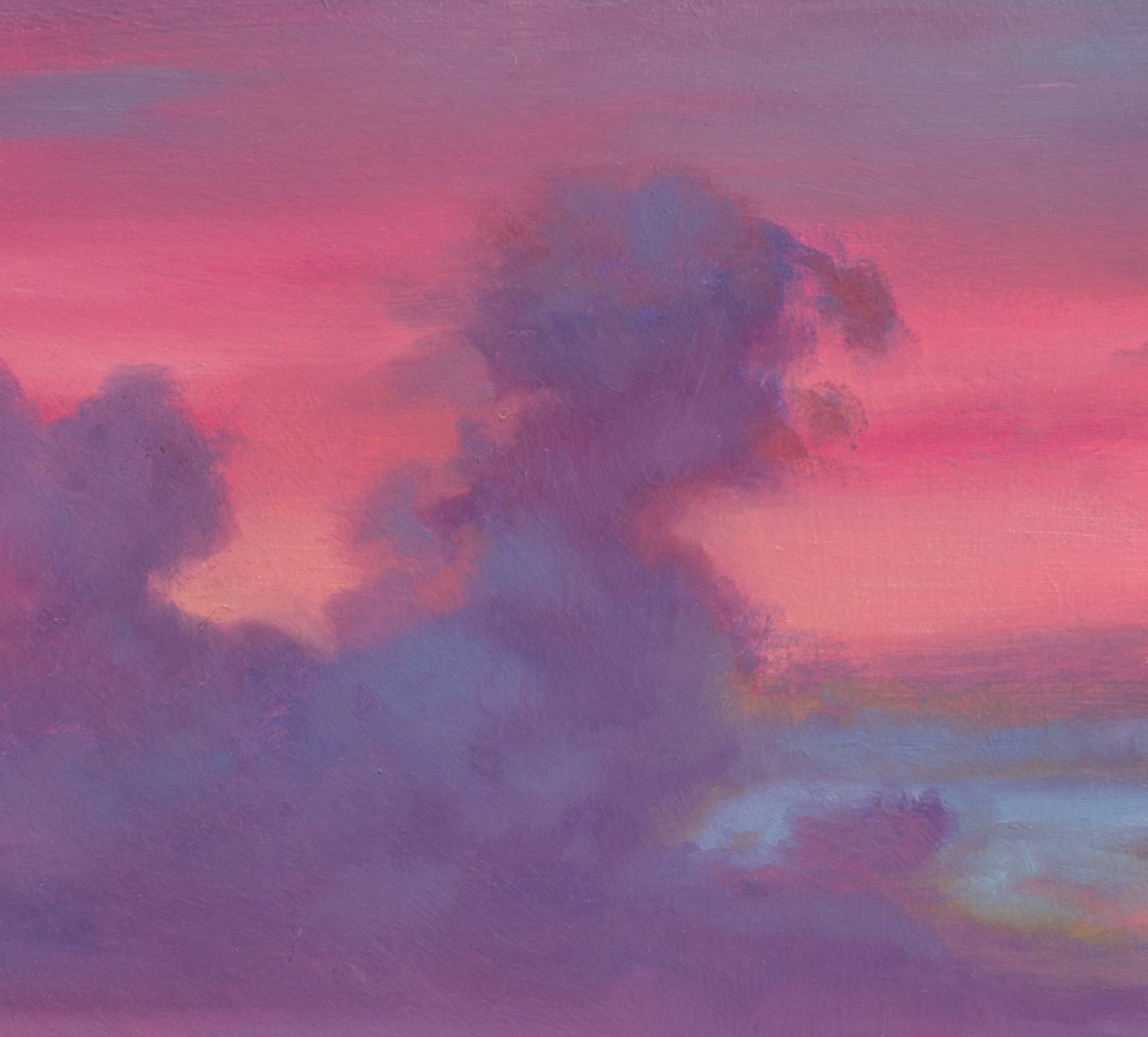
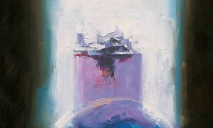
Next. What color are the clouds?
You better not have said white!!
Nor are they blue, purple, yellow, pink, green, magenta, orange, red, nor gray. They are all of them together. The question was a little misleading, as I did ask what ‘color’, not ‘colors’. But that is the challenge, to get us all to think about what we are seeing, and not jump to quick conclusions and cliches.
How the hell can we paint clouds the color of a rainbow anyway? I don’t know how really, it just works. Sometimes you have to take a leap of faith and try something outrageous and see if you can incorporate that new visual language into the evolving ‘truth’ inside the painting. Taking cues fro other artists works, nature, or photographs are a great way to jump start this experiment, but be careful not to be a ‘slave’ to your reference. Always remember that you are creating ‘art’ and not attempting to only ‘copy’ what your eyes are ‘seeing’. That is a whole other post (or 50 posts to really get into a discussion)
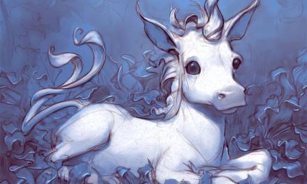
Here’s an easy question:
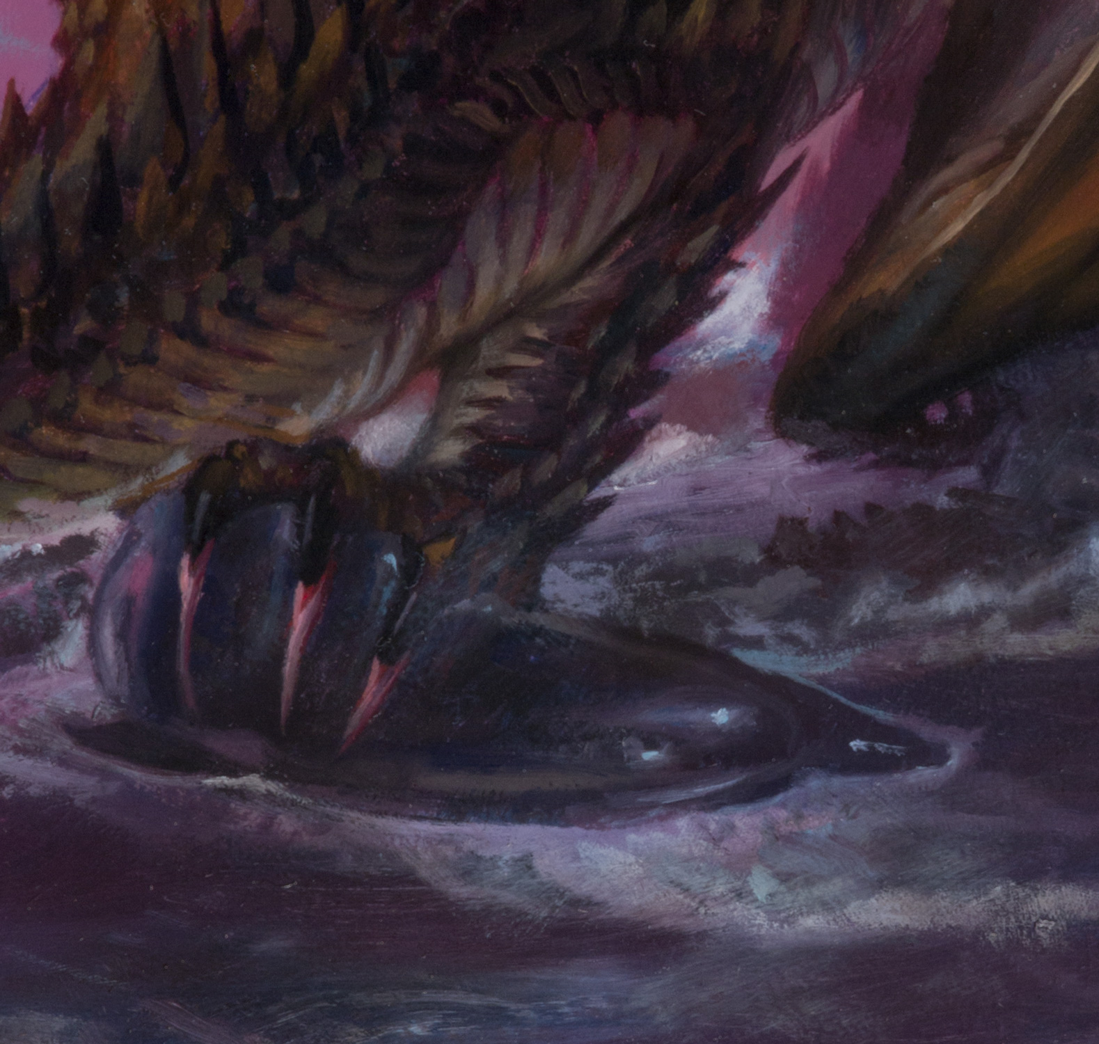
‘What have I got in my (pocket), hand?’
If you guessed ‘nice juicy fisshess’ then you win!! If it was ‘dolphin’ then that is a close second.
How do we know it is a dolphin though? Does it have a mouth, eyes, tail, and overall shape of a dolphin?
The challenge here was to leverage other aspects of the creature in order to convey its nature. First off we have the scale of the dragon to establish the relative size of the dolphin, and that is mostly set by the way the waves interact in and around the body of the dragon and the shoreline of the coast. Next there is the use of a few select highlights on a dark skin to suggest a smooth, glistening surface. Further is the rounded shape of the head, a slightly elongated snout, a blow hole (very key!) and lastly a hint of a dorsal fin along the back. The nature of the animal is further belied by the three slashes opening up the pink, contrasting flesh beneath. Poor dolphin.
All of these elements are brought into somewhat careful consideration and tweaked as I discovered just how much foaming I could use from the waves to place this element in the context of the scene and not obscure the reading as a dolphin beneath the claws of the dragon. Wouldn’t it have been easier to just hide the dragon’s foot in the water and splash some waves over it? Yes. But I like a challenge.
Last question.
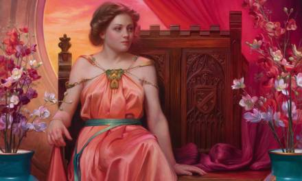
Where does the thin transparent skin of the wing end and the skeletal structures of the arm and digits of the wing begin?
Trick question! There is no terminal line.
The effect of glowing translucency of the wing is achieved, in part, through the use of highly defused, low contrast changes in the wing, both in color and value control. Certainly there are high contrast moments where the wing is defined against the background or other body parts of the dragon, but generally there is a soft, blurring of edges which enhances the diffusion of light through a semi-opaque form. Working wet into wet is a life saver when trying to pull off these effects.
In conclusion, I hope you enjoyed the Game Show today, and be sure to tune in next time for ‘Your Money or Your Life!’


Love the humor:) And another fantastic painting!!
I find it very helpfull to hear which colors you use, I often find it difficult to choose colors for a scene, because the left brain thinks it sees a certain color, and it takes effort and training to ignore that. Could be interesting to start a trend, here om muddycolors, of sharing palettes for each painting on future posts!
Thanks for sharing.
You are welcome Rasmus! I’ll try to remember to take shots of my palette for other paintings. One aspect of the way I work is to generate a large ‘puddle’ of varied colors that i then tap into for paint selection. Thus what you will see are large muddy and colorful blobs on my white palette. I like to use disposable white as opposed to gray/brown based because of the amount of glazing I do. White allows me to more clearly see my color choices for tinting.
Happy Painting!
Donato
How do you digitize a 20″ X 30″ panel painting? Giant scanner? Any adjusting needed once it is made digital for the computer??
Hello Todd, I use photography, not a scanner, for these large pieces. Basically the final image is a composite of 6-12 photos that are auto-stitched/merged in Photoshop. I then perform some simple warping to adjust for camera distortions and then small color/value adjustments pending how the shots came out. a bit of patience as well to remove ‘dust and scratches’ highlights. A bit of labor to get the digital file, but I do have a nice original oil painting that is a product of all this!!!
Curious if you have to put a varnish on the finished oil painting? (to even out the color/ bring out the darks) If so, does a varnish cause light bouncing on the painting when taking a photograph? ( a problem I encounter when photographing an oil painting) Scanning the painting seems to mitigate this problem, but then you end up doing only 8″ X 11″ panels that fit flat on a scanner window.
I very much appreciated your response to my previous question. Thank you.
Absolutely stunning painting Donato! I know this post is about colors but I wanted to ask do you have any advice for making realistic dragons like this? I’ve tried drawing upon animals but they often end up looking like bad mashups and finding reptile muscle anatomy to study is almost impossible online. Is there any exercises you could recommend for a budding dragon artist like myself?
Thanks for sharing! I was interested in reading that this dragon was black with hints of red, I haven’t seen the show, and it’s been a while since I read the books, so until I read the description, this dragon actually ‘reads’ more dark bronze to me. If you hadn’t said it was black with red, I wouldn’t have seen that as the overall color scheme. I do like seeing just how many different colors are in things, though– especially human skin tones. There’s green, blue, and purple, even though most of the time you would just say peach, or rosy, or beige with pink highlights on the cheeks, or some such. When you look extremely closely, you can see strokes of all these colors, and it might seem strange, but as you step back, those disparate colors form a cohesive whole.