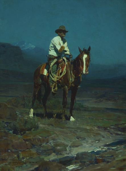
Frank Tenney Johnson was a fan of doing nocturnes, or night paintings. The conditions to capture a subject absorbed in moonlight depend on your ability to recognize subtle value and color. Specifically value.
Study the light in this Johnson painting. Besides the dense, solid black shadows under the horse and foliage, notice how subtle the mountain sits in the background while the cowboy’s shirt floats in the foreground plane of the piece, even though they’re both bright white. The subtle marks indicating the reflections of moonlight off the horse’s anatomy are perfectly captured in value. The color makes it feel like moonlight on brown skin.
Here’s another Johnson. This time the white of the mountain dominates the piece, but, based on value again, it sits behind the bright white of the horse’s white facial marking and the cowboy’s scarf. Compare this to the values between the pine trees and mountain shadows. Exquisite.
These are the kinds of subtle observations that drive composition. And composition drives concept.
Drawing in color. Euan Uglow’s elegantly drawn forms are perfected by the almost absent-minded sketch marks used to capture the figure’s proportions. Loose and practically thoughtless, undoubtedly from years of experience. Flat color turning form. The haphazard mess of strokes on her cheek is nicely balanced to give form and interest. The nostrils, perfect.
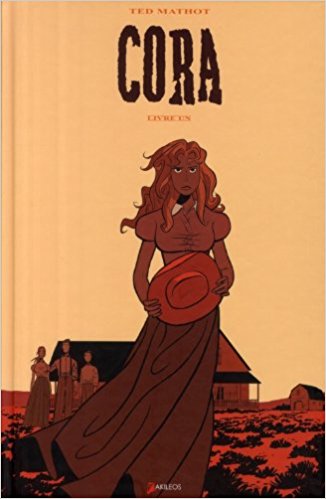
Ted Mathot nailed this deceptively simple cover for Cora. Four colors with a simple and direct composition. The dress blows just right, the horizon is just so, and the figures sit in the right space. Now, the viewer can study her character.
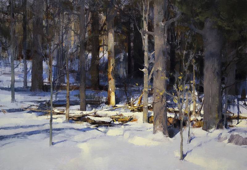
The painter, Boedges, has created one of the all-time best snow paintings. The color of the bark-less trunk pulls us right past the white of the snow. Quite an accomplishment. (All done with value and color, of course.) And then there’s the one lone tree in sunlight in the background, just left of center. Depth. The other part I love is the soft, blue shadow against the tree trunk on the far right.
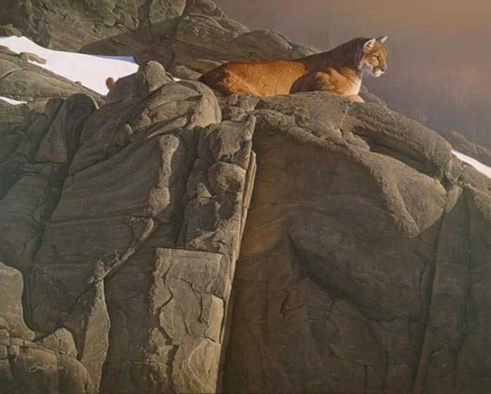
This cougar painting by Daniel Smith stops me every time. The phenomenal warm greys allow that cat’s coat to pop right off the piece, sitting in just the right space, by the way. The snow is flat, stark, and drives the diagonal to the lion. Oh, but that mountain lion color. Just dreamy.
I’ve studied this painting by Abbott Handerson Thayer for decades. It’s the hair shape for me. So round, so sketchy, so gentle. It’s not a globe. It’s hair, but entirely graphic. Shaped by the strokes of black at the base of her head. I know…the eyes are great, the nose excellent, the mouth pursed to show attitude. The brighter white of the right eye. But that hair…with just a hint of shadow against the wings, a few errant hair strands shadowed as well.
The other perfection is the shadow of the fold on the chest. This painting reminds me that subtlety reigns supreme, and a subject can command attention by not obviously commanding attention.



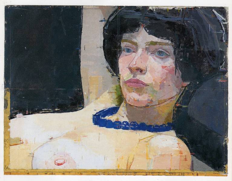

I’m glad you included Euan Uglow. I’ve never seen his work before which led to a google image search. I love his style.
The soft and lost edges in the background of the first nocturne… Beautiful.
Thayer is one of the most under-appreciated American artists.