Last month I posted a collage of some of my favorite covers for Moby Dick. Today, I am sharing my own spec cover for the novel!
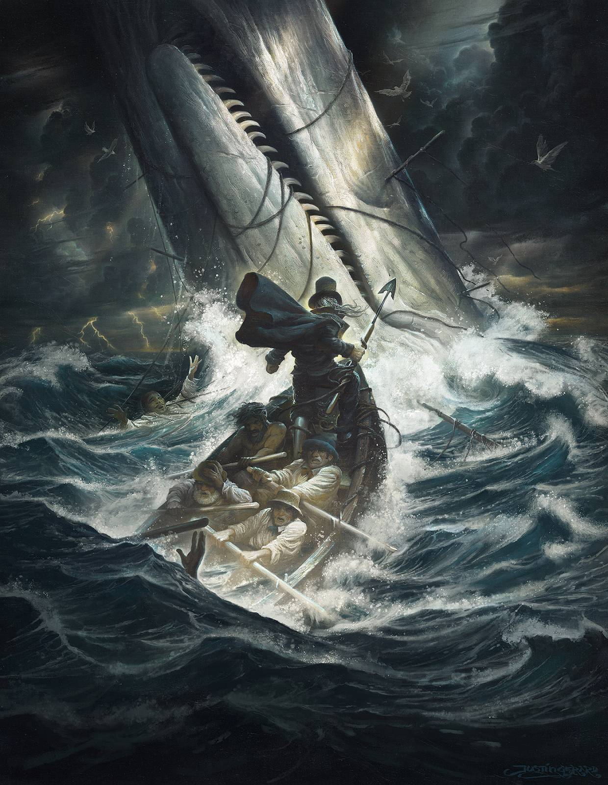
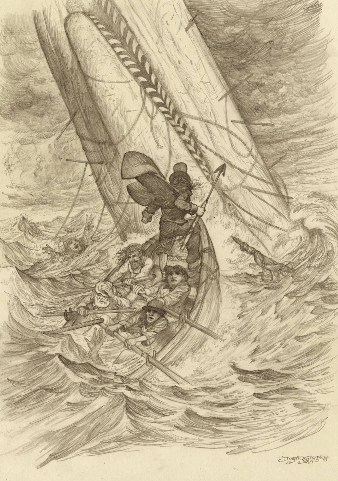
One of the great challenges of this piece was the amount of atmospheric effects I had laid out for myself in the sketch. The temptation with digital is of course to make a brush for every effect. (“Eureka! It will be simple as cake! I’ll just make a foam brush, a cloud brush, a wave brush; why… even a person brush! THE WORLD WILL BE MINE!”)
Yet, were I even able to do this, it would lead to disunity in the image. Cut-outs and shortcuts don’t work. They create a visual clutter that disrupts the flow and repetition viewers are used to seeing in painted images and more importantly, in real life. When you use a wide variety of trick brushes, elements within the image don’t seem to match up with one another. They don’t feel like they belong in the same world together and a keen observer, particularly those familiar enough with painting, will pick it out quickly, and it will be an annoying distraction that will take them out of the experience. The rest will feel a low grade disappointment with the piece as their subconscious tries to reconcile the disharmony. It just doesn’t look right.
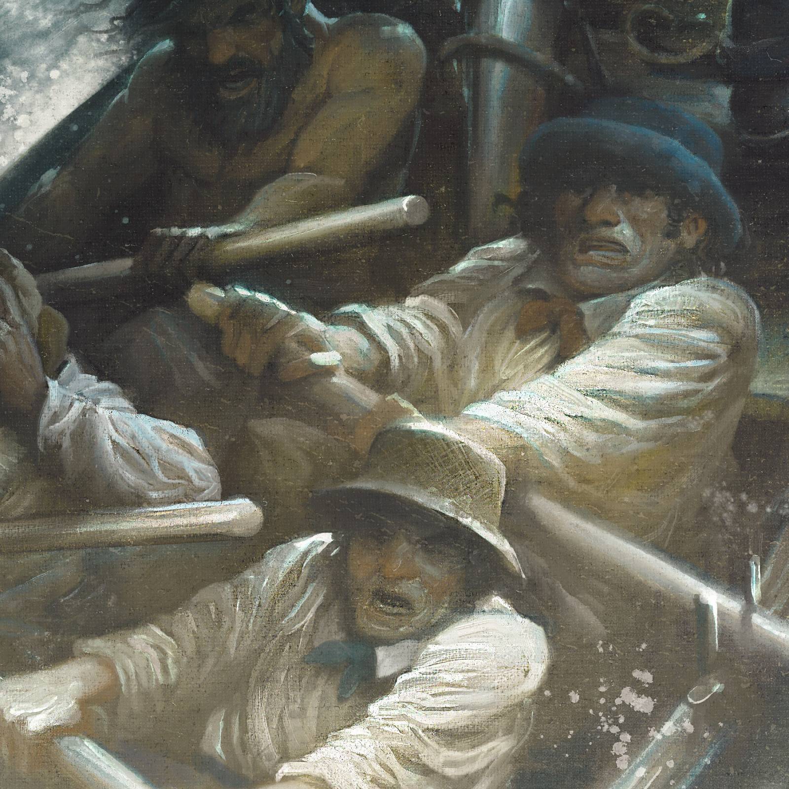
So a challenge for me in this piece was to use only 2 brushes to try and achieve all the effects: A splatter brush and a rough-edged brush. I made the rough-edged brush one that could blend well on low opacity, but also paint clean, solid shapes on high opacity. You will have to be the judge of the image’s success or failure on this 2 brush approach. (Hey Gerard, you aren’t fooling anybody! I can see clearly you used a whale brush to make that whale and you used the cloud filter, you snake-handling eel!) …Anyway, it was an interesting challenge and I really enjoyed working with a limited tool set for this one.
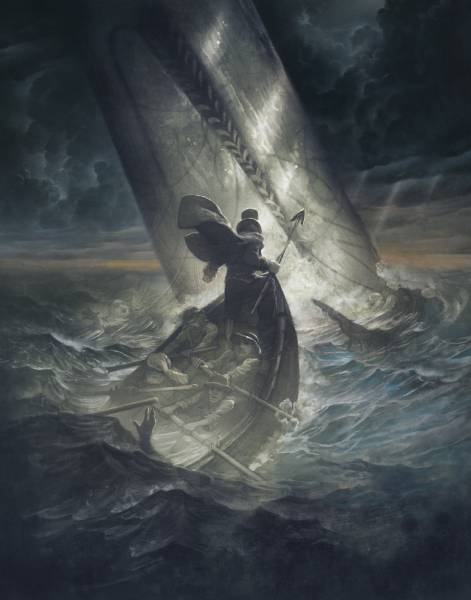
Tight Pencil Drawing. Graphite on heavyweight drawing stock.
“Towards thee I roll, thou all-destroying but unconquering whale;
to the last I grapple with thee;
from hell’s heart I stab at thee;
for hate’s sake I spit my last breath at thee.”




I can’t express how much I love this!
Thanks Arnie!
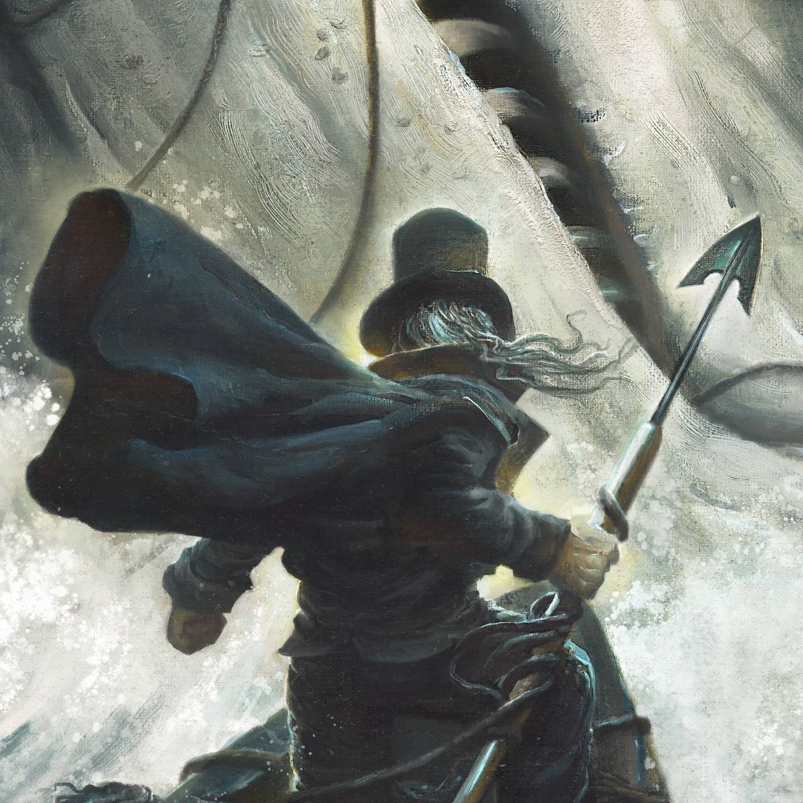
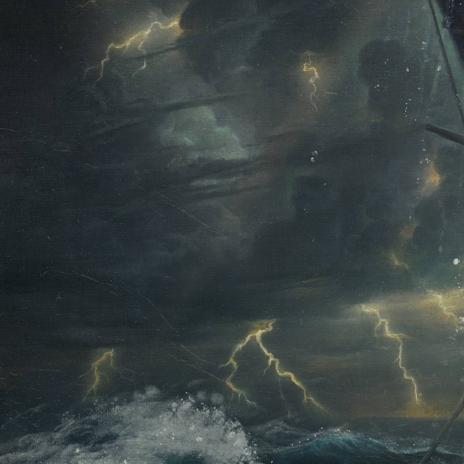
Wow!!! Those juicy impasto brushstrokes on the guys rowing look like they could have been done by Rembrandt! And there is a lot of other neat stuff going on … splatters, canvas texture, imperfections in the support … many secrets 😉
The final has a sense of chaos of light, wind and other elements that Turner would fall in love with. Outstanding work!!!
Thanks Nico! You are too kind! It was a ton of fun to work on 🙂
Wow! Fantastic!
Thanks Scott!
Yes!!
Thanks, Justin, for demonstrating digital doesn’t have to “look” digital because of certain shortcuts/approaches i.e. your brushes decisions, but if approached with the same technique can look like a “painting”… not a traditional or a digital painting, but a painting.
When I saw this in my FB feed (after saying “Rigth out of the Golden Age of Illustration!”) I has to ask myself if it was traditional or digital. So aside from just a really nice piece, if that was what you were going for, missions accomplished.
Thank you Darren!
Hey Justin
Thats a beautiful ground plane of the ocean that you have, with the upward reaching hand.
Im looking forward to your future posts.
Thanks Vic!
Wow! Ask and ye shall receive. Seems like this is just what I asked for in your previous post about Moby Dick. I love the way you have Ahab positioned here leaning forward as the whale draws him like a magnet, and also completely oblivious to the fact that the back of the boat is swamped. It’s a nice summation for the whole novel: how Ahab’s obsession makes him blind to the peril to his ship, his men, to everything. I’m not sure a sperm whale’s teeth are actually quite that curved but it makes your point. Ahab is hooked. And of course this foreshadows how he will drag all, “all save one”, down with him. Well done, Justin.
Thanks Aaron! Well said and well spotted! You are correct about the whale’s teeth. Originally, I had really liked the idea of the whale as some mythical predatory monster, and the standard sperm whale teeth just felt like they wouldn’t read as menacing enough. I even had a top row of matching teeth in the comp and drawing (which they don’t have) because I liked it being a little dragon-y. But in the end I realized it didn’t quite need all that to be powerful, so I took the top row out… but I just couldn’t let go of the bottom row being a little hooked and predatory… 🙂
Erika Taguchi contacted me to say “have you seen Justin’s newest piece”. Ever since I saw it I have been coming back to get that one more look.
As for the digital vs paint, I’ve always been on the sideline believing both can be done, but generally finding there’s something off with some digital work. That’s absolutely not the case with this one though.
The two brush approach sounds very logical and sure makes a great image.
Thanks for the post.
Thanks Christof! (And hi Erika!)
I absolutely love this! The dramatic lighting is gorgeous and I’m amazed at how non-digital it looks. Bravo!
Thanks Scott!