I’ve been painting Magic: The Gathering cards for more than ten years now. What was intriguing to me about working on cards was how to create something visually appealing with such small surface area; so many of my paintings involve layers of depth and detail, but a lot of that detail can get lost when it’s printed at 1.5” x 2”. At such small scale, I have to be much more strategic about composition so not to clutter the image once shrunk.
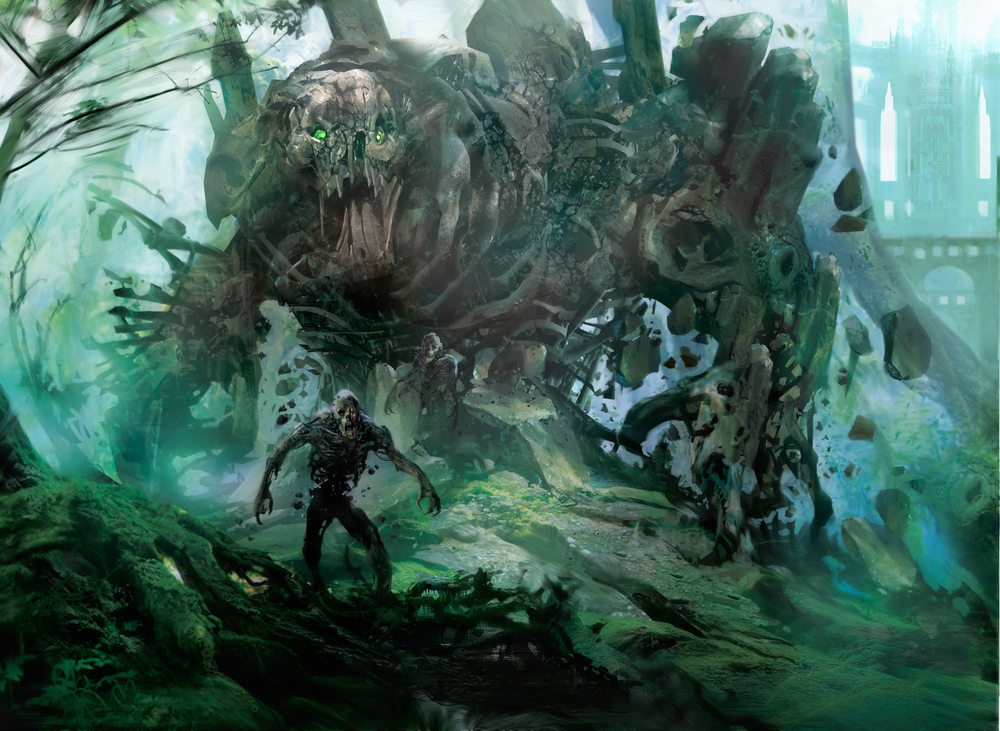
This particular piece is one of my favorite of the Magic pieces I’ve done, called Sepulchral Primordial for the Gatecrasher Expansion Pack. This was part of a series of 5 creatures I did for this pack, also including Sylvan Primordial, Diluvian Primordial, and Luminate Primordial. These were intended to mirror the lands I did for Return to Ravnica several years ago, but in a much doom-and-gloomier way. This one was connected to the Forest card, so I wanted to use some of similar background elements.
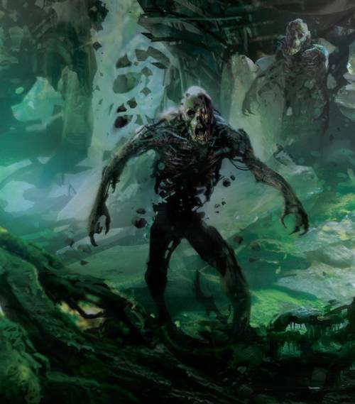
Before starting on this piece, I decided to look up the meaning of Sepulchral, and found that it comes from the latin sepulcrum, meaning a grave, burial place, or tomb. So it was only fitting to me that the creature should be made of decaying materials from the forest, an ancient creature reborn. And be surrounded by decaying skeletons brought back from the dead.
Because of the subject matter and the size, I wanted the creature as the focal point, and leave the background more suggestive with shapes, textures and colors, allowing me to work more from instinct than precision. I starting with layering reference images, and paints together to see what might emerge.
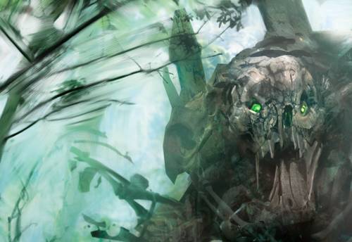
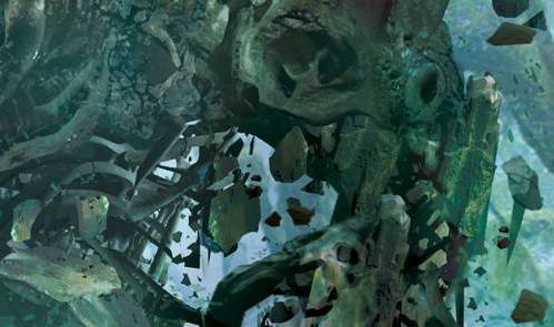
When I found some that I liked, I manipulated them to form the structure and armature of the creature. I then added more detail around the head, added dark contrast in the neck and torso, and added glowing green eyes as the only source of light, so that the creature could be read well, and quickly. Then, while keeping the rest of the image much more organic, I added subtle detail around the armature to create distinct, skeletal parts.
Magic cards force me to think much more strategically about how I paint, having to be efficient about the use of space. It encourages me to be much bolder with brush strokes and texture. It’s consistently an experiment in balancing a more organic and loose painting style, and detailed, textural elements to create an engaging experience for viewers at such a small scale.


I think it’s amazing to see all the detail that comes through in such a small area on the cards!! mtg artwork is so beautiful and some of my favorite media artwork. i love following so many wonderful mtg artists. what a great piece!
Thanks. Its also interesting how doing magic card for me forces me to think of the basic foundation especially composition and color. Its a great exersise
thx