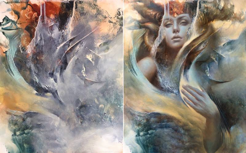
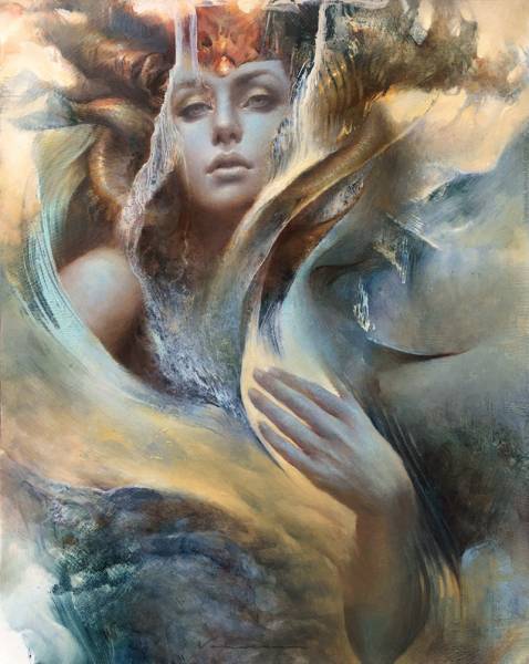
I thought I’d share a progression of images and some info about a recent painting, Keeper Of The Sentient Landscape. This one started with abstract marks, not unlike most of my paintings do. I had the abstract out where I could see it for a while in my studio after I’d painted it, so for this one, the underpainting was dry when I decided to paint onto it. Here’s the abstract start.
These are the tools I used to make the marks in the abstract start. I started the painting in oil on pre-gessoed masonite, using all sorts of tools, as well as the splattering and dripping of gamsol. I’ve posted several articles here previously where I show how I use these tools to make marks, but basically, there are some used for pick-out such as the spatulas, combs, kneaded eraser, sculpey, rubber stamps, and pieces of foam core; some used for putting paint onto the surface such as the cheap bristle brushes, which I also use for splattering; and some like the mops/fluffy brushes are used to soften areas with the brush dry and no paint added. I use varying degrees of pressure sensitivity, tilt control, and looseness or freedom in overall handling to get the different marks and texture. I also turn the surface in all directions in this stage, including laying it flat or having it upright – there is no right side up or upside down at this point.
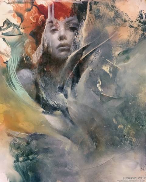
Having this one out in view in my studio while I worked on other things, I was able to see different things in it each day. I’d turn it different directions and what I saw would change, but I also was drawn to many areas of the abstract as they were. The idea of turning the areas into something more realistic wasn’t necessarily what I was going for, but to incorporate something into what was there while leaving much of the abstract as abstract was what I was hoping for. I eventually landed with this as the development of what was to be painted into it. I saw a face and painted simple forms there as a quick indication, and used the sweep of movement in the lower portion to determine how I’d include the hand, which I ghosted in with some burnt umber. The addition of the face and hand are basically like note-taking, reminding myself of what I saw and what my intentions would be for what will be next. What I saw in the abstract shapes – mainly, what later becomes the ‘headdress’ sort of area – is a big part of what was the impetus to move forward with that composition.
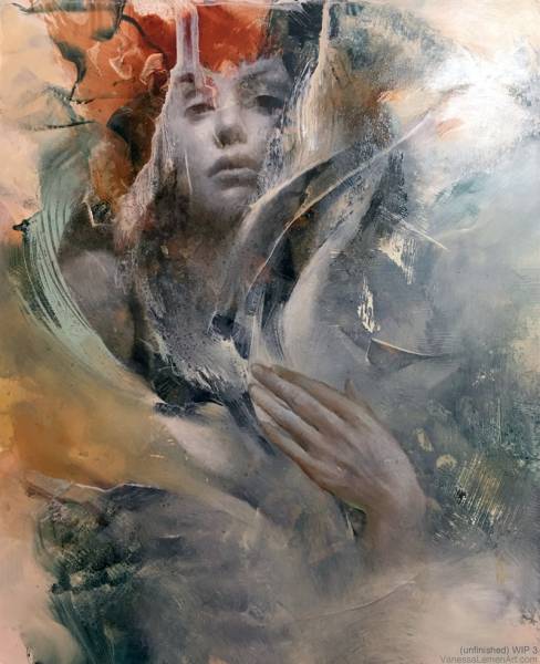
The most work here in this stage is the development of the hand. I pose my own hands for reference for a lot of my paintings, and I believe that’s what I used here, and exaggerated the length a bit (compared to my own hands) for the dynamic of the pose in the composition in keeping with the initial ghosted in shape. Also, in the upper portion of the painting, in both corners, I added an atmospheric sense by painting opaquely to lose some of the sharper edges that were there from the initial (dry) abstract underpainting.
As far as the abstract goes, I saw the broader picture as a landscape or environment, which is how I see most of my initial abstracts, and I wanted it to remain as this. Even as I developed areas of it, the development was not to change what was there, but to let it evolve while remaining true to the shapes. Much of what I’d do with the development of the face and hand would inform me as to how I’d develop the other areas. To give them a sense of form in some places so that they felt cohesive with the rest of the composition, but also so that they were the supporting areas to the figure and to one another. In a broad sense – in terms of technique as well as concept – you could say that, for me, in order for the entire composition to feel solid, I tend to work at maintaining an organized visual hierarchy of ambiguous to described. Just as a side note, but relevant – I don’t plan on describing the meaning behind the painting too much in this article.
These last few images show the stages of refining. I worked on the whole painting at once, not really sticking to one area for long, doing what was needed in different areas in order to bring up the whole composition to a finish. In the hand and face, I described a bit more of the anatomy. In the ‘headdress’ I defined edges, brought form to some of the abstract shapes. The intention was for those to remain similar to what was there already, guided by the abstract shapes, but with an added sensibility to the forms. I also added atmospheric edges to some background areas, as well as what defines her torso area as a fantastical landscape. To maintain the imaginative or fantastical quality as it’s describing a landscape, but to push edge work, color, value, and movement in such a way that it gives a hint to an indication of a figure. It’s painted as if to give the feeling that it would be surrounding her, that she is existing along with it, but also that it just is her.
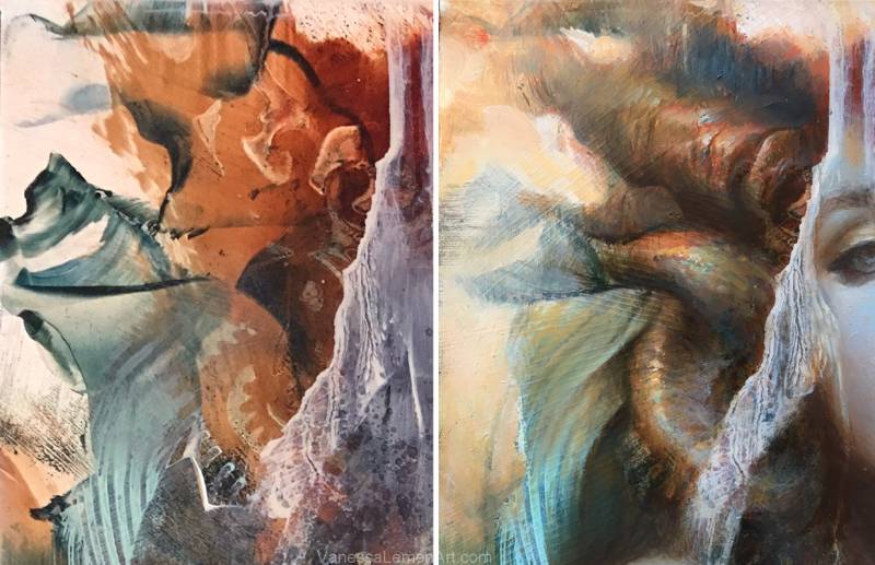
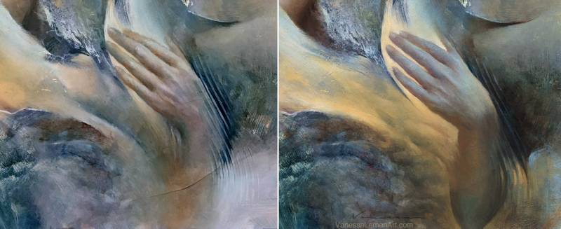
I’m including these details to show a close-up of this area and what’s happening here in terms of progress, of course, but this detail is basically an example of what’s happening in the rest of the painting too. The progression that’s happening isn’t only in the details, though. At this point, the process is a lot more about stepping back. Sure, there is a honing in to refine and connect areas of varying degrees of finish, as well as stepping back to check if it all reads as if it’s cohesive as a whole. Sometimes, I’ve heard it assumed that the abstract is a lot of loose happenstance type painting, but that really isn’t the case. There is a lot of refining even in the abstract. My biggest concern throughout is making sure that the piece flows in and out of the abstract and realism and feels balanced overall.
One more point about the abstract.. The forms that took shape do have a story to them, but how I choose to render them leaves room for interpretation a bit too. So, when I say abstract throughout this article, it’s mainly just so that I’m not telling anyone who reads this what to see in those areas. There are ways that I chose to define them, and it’s with intention (and sure, some unintended things most definitely happened too), but I’ve left them ambiguous enough so that there is room for discovery and interpretation. Those areas have as much importance in the picture as the figure or ‘recognizable’ forms – not only in terms of design or for balance in an aesthetic sort of way, but for story – for what those areas are describing also, using visual metaphor, shape, movement, color, texture, etc., but not in rendering out exactly what those are or mean.
Well, there’s a whole lot more I could write about in terms of the conceptual aspects of this painting, but I meant to keep this mainly about the progression and process.









Wonderful! A beautiful marriage of abstract and fleshed out realism, all done masterfully.
Besides the depth and soft/hard edges, there is always this almost iridescent quality in your work. It appears to come from placing complimentary colours next to each other … one stronger/more, the other in little dabs. Would this be a fitting description?
Really wonder if adding little flecks of gold/copper/silver leaf here and there would benefit your works or if it would distract. Probably best not to to.
Great insightful article, thanks very much for sharing!
hi Nico- Thank you! I have heard that before about the iridescent quality, and I’ve been asked before if I do use gold leaf. I have before, but not much and not recently. I think the iridescent quality comes from what your describe, yes, and also from the layering – especially the layering of opaque over transparent, so that the transparent underneath then seems to have an effect that seems like gold leaf or iridescence simply by being juxtaposed by the opaque quality of what’s next to/laid over it. I guess I could say that the layering in the opposite direction also might work to seem this way too (transparent over opaque), as long as there is still the juxtaposition/contrast of the two side-by-side as opposed to one completely covering the other. The opposite effect they have being aligned directly next to each other gives a depth that reads sometimes iridescent/gold or to have a perceived depth or sort of interference like a hologram might, in a way. Well, anyway, thank you again!
Really wonder if adding little flecks of gold/copper/silver leaf here and there would benefit your works or if it would distract. Probably best not to to. Well, anyway, thank you again!