A couple of years ago I was browsing through all the annual award nominees from Spectrum 24: The Best in Contemporary Fantastic Art here on MuddyColors (thanks Arnie Fenner for the post!. For those who may not have heard of this publication, it is a stunning collection representing a broad swath of imagery and talent from the genres of science fiction and fantasy, the juries do their best to select the inclusions each year, yet a massive helping of amazing art winds up on the cutting room floor through the jury process.
It is both humbling and depressing to be a judge (I have done it twice) to see what gets in, and left out. Yet even with these caveats, the book is a much anticipated addition into my shelves and into the hands of thousands of creatives across the globe, as it is filled with amazing artworks from old, new, known, and unknown voices. It truly is a wonderful cross section of contemporary fantastic art.
Back to the browsing of Spectrum. There was a ringing in my ears when I scrolled through all the nominations for awards that year and in an attempt to decipher the cause, I downloaded and collated the thumbnails of each image. The results were fascinating, and confirmed a trend I had seen and suspected, but never had data to back it up until now. ( If only climate science data were taken 1000 times more seriously than this data set…)
I present my evidence that you can now safely throw away your color palettes, pickers, and paints. Black & White and Mono-Toned Art now RULES! In a nutshell:
- 25% of the art is basically Black and White,
- 25% is B&W with one color,
- 25% is highly limited color palette/desaturated/two color complimentary,
- and the last 25% (maybe 20%?) falls into an approximate ‘full chromatic’ approach to image making, and even some of those are questionable.
Admittedly this is not exact science, but the overall desaturated palettes represented here is fairly clear. Humans are the cause of this data change! I would like to state that this is not a criticism of the art, these are all wonderful works representing the genre. Rather this is a look (and hard data) at a trend within our culture for an aesthetic preference, or awareness, of the graphic nature of imagery regardless of its color attributes. We have all likely noticed this within movies, tv series, mainstream advertising, etc. It is indeed fun and educational to analyze this data, for what does it mean that this is pervading our cultural preferences?
Opinions?
Again here is a link to the large jpgs if you wish to fully enjoy the art!


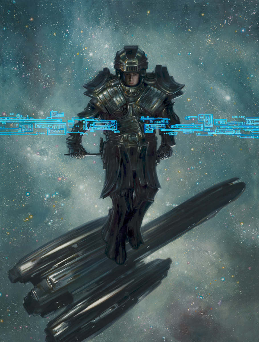

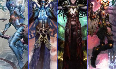
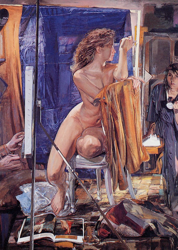

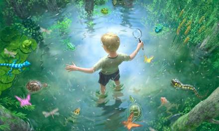
That is interesting! I never picked up on this before. Wonder if it’s new or part of some shift i’ve Not noticed.
Well Donato I gotta fess up and declare that I personally love this, as a black and white guy myownself. So I can only speak from my personal and admittedly tainted perspective. There may be a few things going on… b/w to me is more immediate and direct. It speaks without the imbued emotional veil of color and must execute itself emotionally through form and light and shadow. There’s a more direct artifice in this kind of art making- there’s no chance of the illusion of the real, or that window idea. It is inherently and firmly symbolic by design and must then achieve itself with fewer tools more nakedly and purely. I think this invites more of a conversation with the viewer, requiring the audience to imbue the art from his/her perspective. It becomes a dialogue of a different sort that way. Maybe it’s anti-didactic in that way, more intimate and quietly conversational. Harder to do but when it does it, supremely powerful.
Black and white is close to language too- for me in comics I think it reads more directly, used to black and white say, bold on paper as we are. The goal there is to connect more directly with the act of seeing past the scribbles and into its content. What is it saying versus what does it look like. Less about the thing unto itself but more towards what it indicates or points to.
So I celebrate and personally adore b/w work as a maker of it and a draftsman myself. There’s no blanket of technique or illusion to it. It can be studied and seen for what it is. A Saul Williams piece sung aloud in public versus a vast orchestral event from a symphony. That said, I confess I also come to it from a place of weakness as well- I don’t think in color as I do in b/w, tonalities. Color for me is a slow long crawl up a tall hill. It’s not a natural course, and as a result I tend not to assume color in a piece but am forced to consider it as a pulse and a choice over a staring point. Color to me, needs to justify itself, Ned’s to s value to t moms. Can be a spot like the blue in the eyes of a fremen’s portrait from Dune, or a symbolist yellow sun behind a swath of sumi brush strokes. That said, color for me is a labor, and a forced exercise versus my natural bent.the ability for folks like you or Manchess or Rebecca to spin these colors is a bafflement to me. Like a tone deaf person who can hear music but can’t sing along to it.
Hey Greg,
Thanks for the comments, for you are one of the masters riding on this new wave!
This post was more to spark a dialog than any real conclusions or criticism. I use a tremendous amount of B&W and tonal preparation in my work, with color generally more of a formal accent to how I polish off a piece rather than being interwoven from the very initial concept. Its fascinating for me to see that my intermediate phase of visual development is now closer to an accepted ‘finished’ state than ever before. Neither good nor bad.
What I wonder is if this bend towards more tonal acceptance and aesthetics is a result of too many images to consume on a daily basis – internet, media, iphones, etc – and we are ‘shutting down’ or filtering our decisions to manage all the incoming data. Or is this a massive wave of technical management as aesthetics bend towards greater ‘hyper’ realism in media and movies, with graphic approaches used to manage that integration of various photo-real sources?
One of the most color-filled experiences I’ve had this past year was the beautiful Spider-Man Into the Multiverse movie. So much color, and it was more ‘cartoony’ than photo-real.
No real answers, just more anecdotes and questions….
I don’t see it as a dumbing down or as a diminishment as a response to a flood of possibles, but a tonal aspect of our time… or hopefully a tearing down of the traditionalist idea that there’s a hierarchy of value to color work over black and white. I’ve been feeling the need to push harder and advocate more furiously for black and white work because those of us who work in that medium are often marginalized or the work is considered unfinished or some kind of prep for the “real” thing. Of course that’s a small minded way of thinking, but it is a pervasive attitude in almost every visual field, or at least has been for a long time.
Ultimately to me it’s not about advocating the dominance of one over the other- and if there’s going to be a swing away from full blown color as a compensatory response, then so be it. We’ve suffered enough for long enough that I’ll not shed too many tears for that in the interest of these walls coming down at last.
For the record, Spiderverse was AMAZING, and I adored it. I think we’re all big and visually sophisticated enough now to live in a world where a film like that can work and be regarded just as well as a a film like Dead-Man or November, and we can talk about them within their own context rather than from some archaic idea of preeminence of one a-roach over another. That to me makes this feel like progress. The debate is essential to getting there for sure. Appreciate throwing this down as a place to discuss!
I am a dingus!
I just realized I wrote a MC post about this very thing, if there’s a desire to fall further into the colorless rabbit hole https://www.muddycolors.com/2015/11/why-black-white/
I suspected something like this shift was happening, but chalked it up to trends. Re: A few very respected artists use black and white or limited colour palettes, and the artists they inevitably influence follow suit. For my part, I gravitated towards a desaturated palette by focusing more on drawing and shading than on painting. But then I see a post like this, and it makes me want to re-learn colour theory and really push its usage. I lack the know-how to incorporate more vivid colours in my work, but I always supposed that to be my own fault, because I would not take the trouble of practicing. Maybe this’ll do the trick.
I think it may also be a reflection of the resurgence of the academic approach (focusing on value for a long while before diving into color) but also a response to the formerly prevalent hyper saturated gaming notion of color. I love them both in their turn and all the degrees between though I tend to utilize monochromatic and very subdued tonal palettes if I use color at all.
I should also add that when I first began it was very difficult to get much attention doing value based work (especially in graphite) and I’m unsure that people are appreciating color less but that there are more appreciating value and monochromatic/tonal work.
Certainly there has been a historical bias that mono-chromatic works are less ‘finished’ than full colored approaches, but this was also a case with abstraction and realism. Artists had ALWAYS used abstract principles in creating their art, but it wasn’t until the 19th and 20th Centuries that this language was brought out into the forefront of visual depiction, and became one of the strongest movements in art in the past 100 years.
Greg hinted that a B&W value structure may speak with greater clarity as a ‘language’ and what we are once again seeing is the rise of the general public (and artists) engaging with this language more on the surface level.
Again, I am fascinated not from an evaluative reason what makes this or that ‘better’ (art cannot be judge in such ways anyway – subjectivity) but WHY is it happening!? Were there other moments in history where color also sublimated…Caravaggio? RIbera? and the Baroque realists?
I have obviously not made it to Spectrum (yet 😉 ), but the one piece I managed to get into IBA was the most monochromatic piece I submitted
It would be interesting to correlate this awards-based discussion with commercial sales, museum acquisitions, and commissions based on color vs. b&w. Is the preference of bw over c a reflection of the judges’ visual preferences?
Interesting question Lester, and I do have one anecdotal response. The one time I received an award from the jury from the Society of Illustrators annual show (and one of the few times my work has been included in the show these past decade) was for a portrait, which originally was ‘full color’, but I heavily desaturated the digital file for submission. Viola, Award! Color is likely now seen as Kitch.
Wow. So your desaturating the image was an informed choice, having observed the jury’s preferences. A similar process to not submitting a scifi space illustration to a bird art competition, or an abstract portrait to a flower awards show. Or, more realistically, people art to a company looking for animal artists. Important to know your audience. Great advice.
Yes, and it bears noting that if you look at what’s being presented in gaming, say on Artstation, explosive color abounds in what looks like 80 to 90 % of the featured work. I myself am a fan of the full spectrum (no pun intended) but I do notice when someone handles color in a way that I think may be called tonal realism (though I could be misusing the term) such as your piece on this page…the Empathic Robots…there is a great deal of color in that piece but it is beautifully subdued.
Hi Allen! Yes, my ‘throw away color’ comment is not really true when you examine the details and palettes of these pieces closely. Like you mentioned there are quite a lot of color choices, but the overall effect is one of mono-chromatic or limited palette. Certainly gaming art has been holding onto its colorful flourishes -World of Warcraft! – but screen shots of some in-gaming experiences also convey a desaturated movement.
I guess my comment should be ‘where have all the bright saturated local color fields gone?’ 🙂
I am nowhere near the level of work needed for Spectrum, but this gives me heart. Color is a stressful puzzle for me, one I can manage if I’m working directly from a reference (landscape, etc), but I love my grayscale, lines, and tonal work. Sharing it and putting it up anywhere has felt like cheating, because to me it’s done, but in the art world stuff like what I do is seen as unfinished and rough. Nice to know the trend is sort of easing/flipping towards more value based work being accepted as in.
I am a serious minded artist (got my black polo neck on right now) and a dark & serious low sat palette appeals to me, yet I also know and love colour. To work commercially I must hide my inner Goth and make colourful imagery, which only makes me more keen to use low sat palette in my personal work. How to do both? Answer- low sat image with one bold accent colour, nice. Maybe it’s an increasingly popular thought process for many?
I notice as a photographer that it seems many people prefer b&w photos as being more “artistic” or “timeless”, and thus more worthy of artistic regard than color. A shame in my opinion since I generally find I like color better, though I suppose my bodyscape work is largely monochromatic.
Maybe I should start desaturating more of my images too.
I am not a artist but this blog has good content.
I never venture into the the nuanced, minutus discussions regarding creativity, nor am I a member here, but I do sneak up on my long time friend Donato every now and then to see what he is up to, and I must throw my long retired blood-soaked brush into this interesting topic of discussion.
I have no political artistic affiliations and personally love to see well crafted work in color, b+w, marble,decoupage, or any medium. It is clear my buddy Donato, you are onto something grand. Something huge. Something beyond your artistic control. Something Einstein may have pointed to as ” human inability to face his own mortality, and most of all – reality. Example, you say? Here you go. Lets use two works of art as examples. One work anointed by the elite creative literati as the Holy Grail of painting – Picasso’s “Guernica,” and another painting by Goya, “The Third of May.” Both minimal in color. Guernica almost b+w. Mostly greys, blacks, and subtle blue/grey tones. Goya more color. Blacks. Browns, yellows, some brown orange tones – and pure blood red. I personally love both works, but I must admit, one is clearly more powerful in depicting similar atrocities – and that is the Goya. The painting screams, Death Awaits!” There is no escape. Blood has clearly already been spilled. Guns pointed. The Goya in it’s execution is clearly crafted in more reality than the linear based, and fantastical imagery of Guernica. Guernica is clearly animated in it’s craft. Void of color. Picasso clearly succeeds in depicting a sense of chaos, and a sense of compositional balance. Clearly there is some sort of horror going on – but what? Guernica makes no clear distinction in it’s visual presentation as to the atrocities of the Spanish Civil War, or Guernica itself. Guernica was once shown to a an actual survivor of the bombing of Guernica, and she just stared at the work dismayed, having no idea what it is about. How does this all relate to color, and why we are seeing lees and less color? It is because we are living in a Picasso modernist reality, which = less reality. Within the19th century there came about a new search for reality. The romantic poets and painters, turned their backs on religion and sought salvation through art. They believed in the genius of the artist, endowed with a special capacity to transcend the human condition in creative ways, breaking all the rules in order to achieve a new order of experience. Art became an avenue to the transcendental, the gateway to a higher kind of knowledge. Their pursuit was – life. It seems now the pursuit is fantasy. Non reality, especially in the creative arts, where it seems two separate tonal ideologies are being displayed in painting, and in cinema. Within painting, the pillage of color is mostly stripped, and when it is used, as for example in a Currin painting, it is minimal. Currin, in no way matches the genius and superior subtle manipulation of color, temperature, and opacity, as Rembrandt. Perhaps this points to Modernism and back to Picasso. In Guernica, “real life” is stripped away, and we are left with a fantasy, perhaps a watered down reality. We are not in Goya’s reality. In modern cinema, it seems the opposite is being implemented. Color is overdone. It has become so fantastical in it’s hypnotic infusion of hues, it has anesthetized the viewer to perhaps view real life, as simply dull. Black & White works may be easier to recognize. Easier to understand. This does not mean they are less valid, or weak, Perhaps it is all easier to understand in a world that is becoming less ‘real.” Picasso’s Guernica is perhaps, less “real” than Goya’s The Third of May. Guernica”lets us off the hook in viewing reality. The Horror. The atrocities and bloodshed of war. Guernica could hang in any corporate institution and not cause a fuss, or ruffle any feathers. Goya’s painting may not be accepted as a painting that would hang in the U.N, or on Citibank walls. The spilled red blood alone would make anyone shield their eyes. Besides, who would want to face the reality of their own mortality when attempting to close a multi billion dollar bank deal?
Limited color palettes have always been popular because more colorful art simply has more to object to. We all have favorite colors and colors we naturally dislike, and those vary from person to person. If we assume this to be true, then the more colors you use, the higher chance you hit a color someone doesn’t like, thus narrowing the market for a particular work. Remove color from a piece entirely and you remove that barrier altogether, which is why b/w, silver tone and sepia tone palettes appeal to such wide audiences.
That being said, I think there is an aspect of courage inherent in artists who use color liberally. In my opinion, artists who do explore color generally tend to have higher ceilings and a longer lasting influence on the art world as a whole. Think James Jean, Murakami, NC Wyeth, the impressionists etc.
Anyway, maybe we can edit the old saying “If a painting isn’t working paint it big. If its still not working, paint it red,” and add “And if its still not working, paint it sepia and call it a value study” 🙂
Donato, , very insightful observations, as always. Yes, whether pouring over Spectrum or Society of Illustrators’ annuals, there do seem to be trends in color use. Just look at the red/blue risography color palette craze in the Annual, but, narrowed palettes in fantasy art? Perhaps driven by color impact on the phone, the speed at which things need to be completed, the trendy artists who made contrast be king influencing so many others, and the POP that contrast provides for impact with BW and simple color. Hard to sell Orcs and trolls with prismatic colors? I am waiting for avocado and harvest gold to cycle back around, as they will, and shift the trend in another direction…..