As an artist for entertainment, your job is to communicate to an audience, which means that while you are making your art, your role is to play Set Director, Film Director, Actor(s), Grip, Gaffer, Camera Operator, Stylist all at once and create something rich that speaks to your audience, successfully connecting with them in an intimate way. Piece of Cake, eh?
As I mentioned in the last article, here, it is your responsibility to “act” in your art. This means that when you make art, consider that you are an entertainer attempting to captivate an audience and it is your job to do the best that you can in accomplishing this task. Every prop, every player, every color and line, brush stroke and canvas size is taken into consideration when conceiving the work, all part of the plan.
You can and should use the rules and tools you learned while training, but you must also distance yourself from the rules enough not to allow them to strangle your creativity. Distancing yourself from what you have learned, learning to react from it is where you will finally find a voice, a reaction, acting out the part, playing the role, finding the most convincing moment for us all to react to. And, something that is never mentioned, find a way to blend them all back together into obscurity, tools with no names or labels that will step in the way of a clear performance. Blend them all back into the innocent act of making art, find your role, find your voice without labels. When you do this you will find the honest you in your own personal performances (your art).
It is difficult to “let go” of the rules once we learn them and just “respond’ to the work. These rules that have been absorbed and memorized are sacred, they helped shape the ideas and techniques that have led to this moment, why would they be cast aside? Well, fact is, they are not being cast aside at all, they can’t be unless you all of a sudden suffer from amnesia. However, they cannot be what leads the process, they need to sit in the back of the mind and move forward with instinct as the guide. How you feel, how you react to how you feel will help you find that perfect moment to be recorded forever, and if your mind is filled with good tools and rules, chances are likely you will make fantastic decisions along the way, well informed reactions and artistic decisions that make impressionable imagery.
It is strange that with all this “letting go talk”, we find a new set of “rules or tools” that can help us let go…ah the irony…anyway -here is a small list of “tasks” or “exercises” to try when exercising out those blasted art rule demons from the sacred temple of your mind, your imagination.
Clarify Shapes By Clarifying Boundaries With Stronger Lines
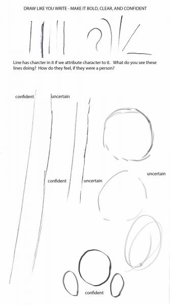
Lines poorly tended, or boundaries timidly sketched out often take away from the clarity of the basic shapes that can be used for so many different functions of measuring, or weaken the features that intend to express but lack the punch to do so in a powerful way.
Solid, confident lines can also lead to interesting feelings, emotions, etc. Practice confident line work, then adapt it to whatever line sensitivity you might naturally respond to. The goal is not to become something you are not, rather, to do things you would not normally do to help better emphasize particular traits or characteristics that might not be as easy to recognize or clarify in your own working ways. The hand becomes more sensitive when a broader range of pressure, length, arc, and angle are felt and understood.
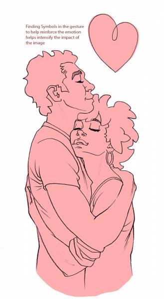
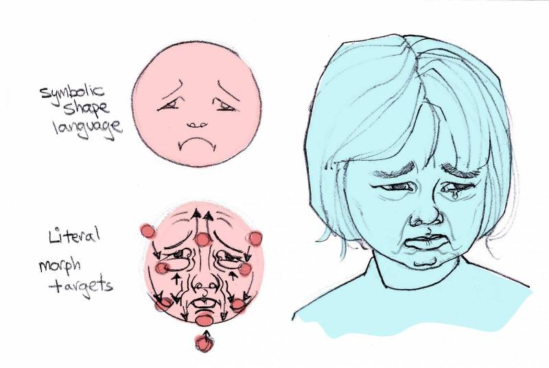
The shapes we draw are usually boundaries for physical objects, but they can also be made symbolic as well. In this example, the lines within the figures and the figures boundaries together form a shape resembling a heart, and I pushed it further into the design to make it visually clear and obvious, adding to the story content.
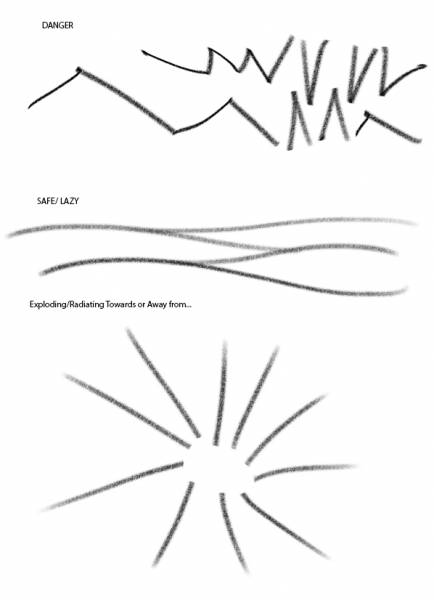
I don’t have the space to focus on just this one topic, but here are a few other examples of symbolic lines; jagged lines – danger, smooth rolling lines – safety, radiating lines – radiating energy expanding or contracting, etc.
Seeing Is One Thing – Overreacting Is Another
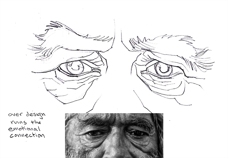
For those addicted to the Zoom-in for both the painting and the reference, and for the over analyzing types, when drawing anything, be careful not to over facet whatever you draw. Overdoing the facets is seeing too much and then sharing them by over designing them when most of what is observed is relatively subtle. The changes of surface that you perceive could very well be happening, but they have to be handled with the same subtlety as they are to begin with.
A few things to consider doing when making observations:
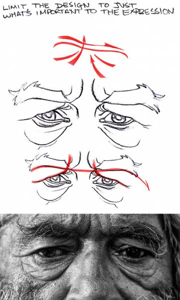
-Squint, and when you aren’t sure, squint some more. By squinting, the eyelashes are acting like a screen door and helping you blur the beyond out of focus enough just to see its raw design shape, color and maybe some of its form if it is round enough.
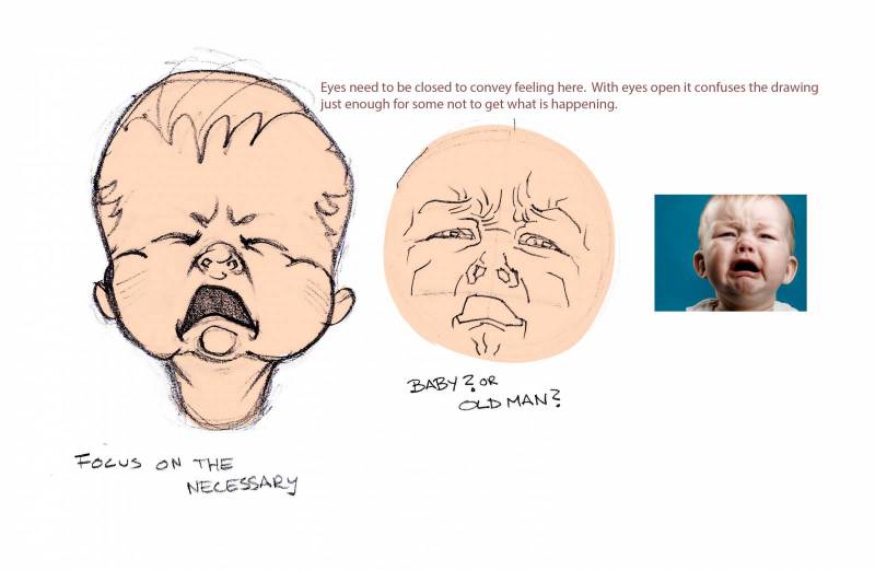
In this case, squinting helps one see the essence of the expression in design terms: Slant, slope, symmetry, angle, pattern, etc. What you see and can label is exactly, EXACTLY, what you want to be drawing. In the case of the baby face, over analyzing the face leads to OLD MAN-BABY syndrome that was a big hit back in the Pre-Renaissance.
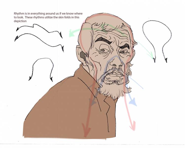
-Use rhythm to express both features through the center axis simultaneously (connect one side to the other). Do not favor one side then try to work into the other over time. This ensures that both sides will be built similarly and during the stage where measuring is most critical. Try and get both of the paired features to tie together using abstraction as the link. These abstractions, or rhythms exist in everything around us but they are deceptive until understood. They exist in the basic shapes, the complex anatomy, the surfaces, the textures, etc.
-Not just for the facial features, these abstractions are for everything, related to the figure and beyond. Tie pairing limbs together whenever possible. By finding the larger connection between the two sides it is easier to see the cause and effect, or action/reaction the body produces to maintain physical balance in space. This larger figurative abstraction is how animators find their action lines, their convincing contours, their figurative design. Squash and stretch, motion arcs, foreshortening all use abstraction as a root guide.
With an expression, over analyzing can lead to a flat or devoid expression. Facets are not the way to a better likeness or a closer resemblance to the expression, but it is something to consider when practicing to improve your “art-sight”, the way you see things as an artist.
Acting Is from Head to Toe
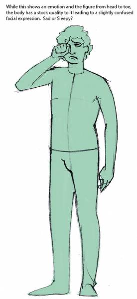
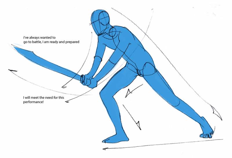
As kids, we often draw the TV person. Someone cut off below the chest of the belt line. TV is that powerful that it influences the way we draw our own pictures. It also leads to stunted performances or lack luster action just because we are not thinking about the pose from head to toe. The most powerful and dynamic emotions overwhelm our very essence and control every fiber of our body. It is hard to imagine a reaction or an action without envisioning the entire body and how all of it is reacting, from the ground up.
When I draw comic panels or storyboards, regardless of how tight the crop in on the figure, I find the entire pose from head to toe. I do not know how the performance will play out unless I can feel it entirely. This is usually done in a small thumbnail pose, but it is still the entire pose. I can’t imagine in parts and pieces, I reflect upon the whole and its surroundings. I can’t separate the actor from the performance just like I cannot separate the features from the rest of the face without it feeling incomplete.
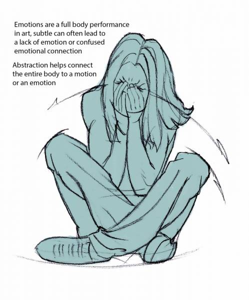
Emoting is a physical thing whether it is love, fear, anger, joy, whatever, it is a full body experience. Make sure to find it from the floor up in your own poses. In finding these figurative emotions, you are looking for the stronger silhouette, or the most fitting and “overly expressive” pose just right for a stage performance.
The concept of a strong silhouette in our art comes from stage performance, where a pose must be “A POSE” for everyone to see, all 250-500 in that 3-tier theater, or the several hundred the amphitheater could seat. Paintings, like a stage play, can cause immediate confusion if the work does not display quality design choices and clear, easy to read expressions. A weak performance can confuse or dumbfound the audience, just as a weak silhouette in a painting can confuse the viewer or possibly go unnoticed altogether.
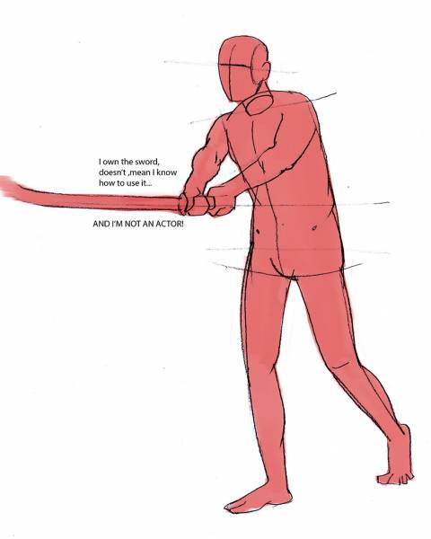
Understand that reference is only a starting point and that you must arrive at your visual statement intended, not with just what the reference provided. If you have lack luster performers the art can potentially portray their lack of understanding or nervous behaviors, never good for an action scene. Here I have two performers with swords. While both look like they are using it correctly, only one is really offering me a potentially exciting performance that I can use for my work. The other is the nervous neighbor who looked the part.
Converting the Lines to Tones
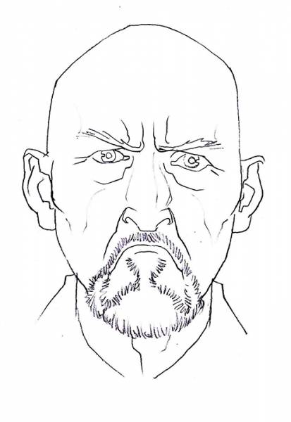
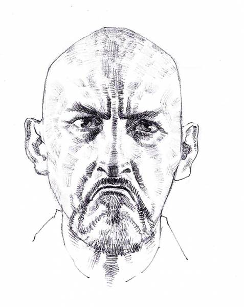
It is one thing to design the shapes with line, it is another to translate the lines into tones and finish the expression with paint, pixel, or polygon. Lines are a strong design tool; sometimes so strong we can’t see the art as painted at all. The key to remember about a line that it is either a boundary, or a center axis. If it is a boundary, it is drawn to show where one shape visually comes to an end and runs into open space or another shape. If it is a center-line it represents the peak or valley of an extreme volume, like a roll in a form, or a fold.
When shading, remember to enhance the simplicity of the expression and not confuse it. Use good judgement when deciding which way to hatch, crosshatch, or veil the lines together. And use the same discretion when deciding which planes to enhance and which values to push. Shading form can either enhance the quality of the form or take away from it as a form altogether. Paint isn’t “just” applied, it is designed on to the surface.
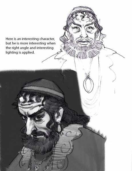
If the story involves internal conflict, it might be worth while to find the right angle, tilt, side that best depicts the character of the individual, whether that is their features, the collective whole, as a symbol. Lighting also plays a huge part in adding to the character of someone’s portrayal, and just the right lighting and angle is enough to make an impact.
I will talk more about this subject in the next installment.
Morphing the Entire Head to the Expressed Emotion
The entire face leads to clear expressions. If we only exaggerate the features themselves and not take note of their surroundings, the feature can get trapped or caught between several near expressions, like an actor unsure about their role, leading the audience to confusion. Follow the corners from the features out into the cheeks, the forehead, the chin, and look for the build up of mass either in the form of skin rolls or creases. The way the face contracts or expands around the primary features helps clarify or adds the convincing element to the emotion portrayed.
See you all again with part 3.




Ron you mad man!
You might just be the exception to the old “jack of all trades master of none” no kidding.
I will be going through thoroughly when I get home later.
Also, as someone that is extensively researching and learning about your Armature method, its always nice seeing it in use so effortlessly.
Thank for your all your efforts.