When I look back I think I have been a black and white artist all my life. Not talking about the colors black or white. More right or wrong, good or bad.
When you are doing an illustration there is tons of things that need to go right. I think of those things as questions that needs a right answer. Is the composition clear? is the figure seeming live enough? are the colors the right mood? everything down to: is this brushstroke showing the
form right or is this dot too bright. Actually every stroke or swipe of the pencil or stylus is a question that needs an answer. If there is no question, there is no deliberate answer and then its all random and doesn’t matter.
But my mind tend to work like this, with the questions and answers. Constantly. And I imagine that all of you out there feel the same. When a paintings goes sideways it usually feels like you chose the wrong bunch of answers at a certain point. But lately i have had the notion that it need not be this black and white. Instead of evaluation every stroke or line in either Good or bad I am trying to make myself think beyond the labels. And the reason is this: Bad equals wrong, good equals continue its okay. So if everything is not Good there is no decreasing value. its just all bad, down the drain, to hell: shit! I tend not to notice the good. Cos when its good I just continue merely until somethings goes bad. So with this mindset, paintings is a process of avoiding it all goes to hell. its a balance maneuver where you always fall. Because, lets face it: Nothing is ever perfect. Especially not paintings.
Also the thing is. if a stroke or a color or a hand is either only Good or Bad, what happens when you cannot change it from bad to good? You end up being a failure. in your own mind. I have been there plenty. loathing in self pity at how this is the moment I stall out and it is only downhill from here: And most of it just because I did a poorly chosen highlight on a spearhead.
Well; here is my solution: I try to change the words Good or Bad in my mind to comfort and discomfort. Mainly because those words raise questions. “Why is this shape making you uncomfortable, Jesper”? is just way better than: This is a shitty shape, Jesper. You are stupid for having made this to begin with, WHY ARE YOU NOT BETTER”?
The question of why some element is making you uncomfortable opens up for gentler questions. What should be changed for this to be more comfortable? to make it seem more in tune with what you are trying to achieve? And asking those gentler questions is super important. Actually; I find the constant questioning myself to be the most important aspect of growing as an artist and learning from your mistakes…I mean discomfort.
I want to end my argumentation your Honor, with an example.
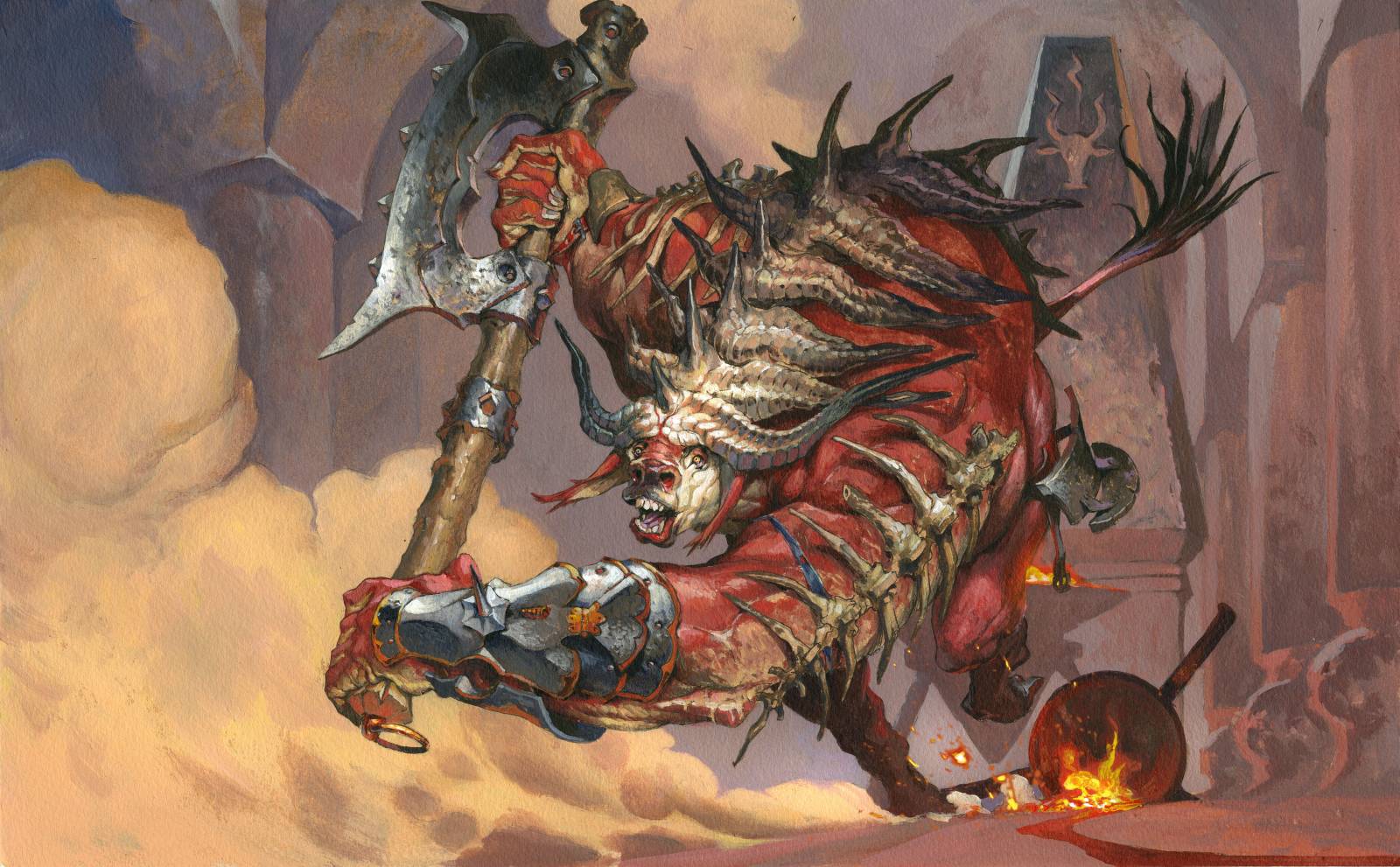
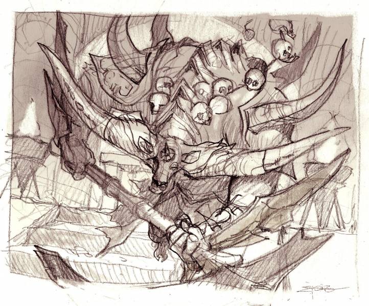
The recently spoiled image of “Spinehorn Minotaur” had a different sketch at first. The sketch was approved and i was in the process of transferring it to a watercolor paper to paint it, when my mind started acting up. “This is barely mediocre…its just a dude with an axe…no motion no expression no nothing”. I went home feeling like a fraud, because of this horrible conversation with myself. But next day I pulled myself together and sketched another and another and another until I ended at a new sketch.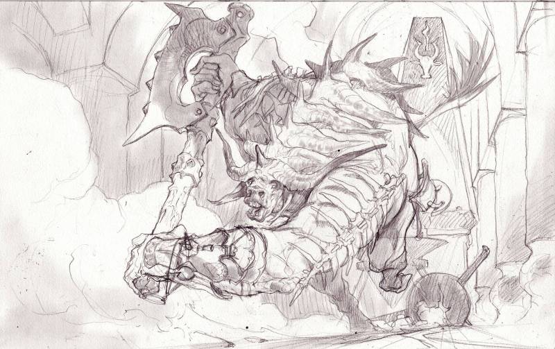
My new approach is painting towards comfort, and asking discomfort why it is there?


Hello, sorry for my bad english…
Since the article talks about questions, I would like to share with you my impressions and the relative questions I asked myself looking the illustration.
At first look I noted immediately the “strange” ratio between the vary volumes of the Minotaur.
Front and back hands are the same size. Even better, back hand and arm look bigger than the frontmost. Where is the prospective?
Also the head is very small. Maybe it’s wanted, but comparing it with the hands or the body it looks really too small.
Also the legs look strange because his left leg, that is moving forward, has the same size than the other one extended back.
And last. The tail seems attached in the middle of the back…
In conclusion, the new pose and shot is truly more dynamic than the original sketch, but maybe more questions were to be done.
I hope this not look as a simple criticism but as a constructive starting point to do even better works.
I respectfully disagree with Mark’s comments. I went back and looked at the passages he critiqued and just don’t see them the way he does. I feel like Mark is looking at the painting in a manner that is different than the way a lot of people view art. I hope that makes sense. Good work Jesper and thank you for writing this article.
I’d say Mark has some fair points. I was honestly surprised by the switch in sketches since the first one shown is much stronger compositionally and tonally. The figure looked far more imposing in the original while the ‘better’ one feels weak and looks a bit awkward to me. Worse yet, the character comes off looking goofy instead of dominant. The values in the new one are also very underwhelming compared to the original to the point of being inconsequential.
Unfortunately, I think this case is honestly less one of ‘honest self-criticism’ and more one of creating a worse piece out of self-doubt especially given some of Jesper’s comments:
“This is barely mediocre…its just a dude with an axe…no motion no expression no nothing”.
I went home feeling like a fraud, because of this horrible conversation with myself.
Not to be mean to Jesper, I’m sure nearly anybody here (myself included) would be thrilled to make anything close to the weaker option. But the original had a much better tone for the character, the overall composition was stronger and more balanced, and the value structure was very effectively used. So overall, I wouldn’t discount what Mark was saying although I think the issues unfortunately run far deeper than some distortion in perspective.
I think you guys miss the point that this is more a matter of thinking about you attitude towards your workflow than the actual painting.
I totally agree with lots of the points I feel the bottom half of the body is too weak. But I think you mid the point that it has to do with what I wanted to do rather than what looks best. Surely the first sketch could have been a great solid composition but it did not interest me or pushed at my boundaries. I wanted to do a dynamic piece I wanted him to look goofy and unintelligent. All of those things are done by choice because I liked them. And liking my own art is and pushing against my comfort zones is really important to me. That being said I still think the feet and hips could have been solved better.
Hi Jesper, thank you for your post. It actually makes a lot of sense to change the perspective from good /bad to a more learn-oriented (does this word exist?) one. I’ll be sure to approach my next painting with this mindset, I can already tell it’ll be very helpful.