I talk a lot about crosshatching. And one of the main things I try to accomplish is to use lines to create form and not just lines for the sake of lines. Or lines as value only. Like a sculptor you have an opportunity to build planes with those lines. Or in a make-up lingo, you can contour the hell out of that face.
Let me say first there is no ‘wrong’ way to draw. Drawing is an expression, and we should chase what we feel. My ‘no’ examples are only wrong in the sense that the shading is not building form. However there are great drawings done with those techniques. This is just one more tool for your toolbox.
So I wanted to make this ‘structure’ thing as clear as possible. And if you are trying to understand this, wanted to give you a worksheet to practice on.
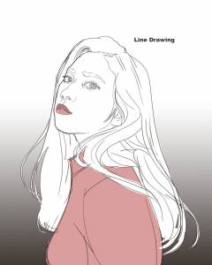
Here we have a baseline, purely linear drawing, without rendering. I feel like many of us can get to here. Then we break out in a cold sweat when it is time to render it, especially with line. I am also including the ref I used, which comes from the royalty free site https://www.pexels.com/.
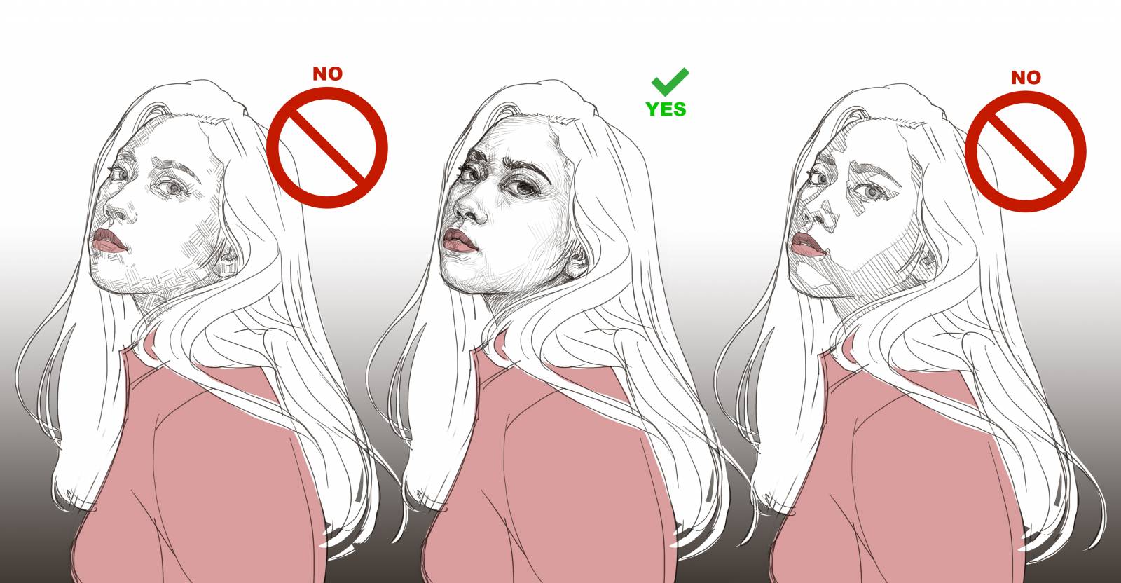
Example one: This first thing I see people do is outline the shadow shapes and just fill them with the same direction and weight of line. (Again a fine way to draw.) True, you are understanding the basic shadow forms of the image, but what you are doing by using the same line weight and direction everywhere, is flattening your image. I refer to this diagonal fill as ‘global’ shading. This can be ok in areas like the cast shadow from chin onto the neck. When I use this technique, I use it like I would a glaze or wash in a painting. I mostly tint with it. But it does not describe form. You can push your form way further if you don’t just fill the shadow shapes with the same thing. (Also outlining those shapes makes the shapes too interesting, amoeba-like, and that distracts from the form. Like a paisley scarf.)
Example two: The other thing I see folks do when they hear ‘cross hatching’ is fill the shadows in with little tiny intersecting lines. This is also not serving structure. Cause now you are filling the shadows in with pattern that isn’t describing anything at all, again, except the shadow overall shape. And nothing flattens like a pattern. (There are areas where this can be a really cool way to draw, if pattern is your desire. Areas where the value is flat overall and not an area you are trying to describe form within. I may use it in parts of a dark coat for instance even with the structure drawing on the face.)
Example three: When I am drawing with structure in mind, my intent is to let the shading describe that form. Show the contours. Check out this example of what I am talking about. Try to think about why I pulled the lines the direction I chose and what that did for the form of the face. How it chiseled it. How it informs us what is happening under the skin down the the structure of the head.
See what I mean? Now for the interactive part. Below is the same image but I blue-lined the the cross hatching. If you want a deeper understanding of this, download this image into your art program, or print it out- and go over the lines I threw down. Or go back up to the first line drawing with no shading and work on top of that. Look at the ref I provided and study how I interpreted it. There is no one way to lay those lines down, and if I did it again blindly, it would be a little different, but it would still describe form. I may have pulled the lines a different direction. Made them denser in an area. Spread the space between them out more. Who knows.
I am asking you to do some deep practice hear. Think about each passage of lines. Don’t just ‘surface-practice’ by simply duplicating what I did like a xerox with your brain off. Go deep. Look at other ref. Think about how you would contour the hell out of it even without a pencil or stylus in your hand. See the forms.










Thank you very much for this article, it has ben REALLY helpfull. I always had a very free way of render with hsthcings my drawings, kinda instinctively doing what you described as the “right way”. But when i was i was a bit older i started working in a landscape architecture company, and i was working doing pencil renders for their projects. So there they were telling me the right way to use hatching is to always draw them to the same side so the images feel cleaner and more presentative. Well, i ended up learning the wrong way. Now its being a challange for me to free myself from this and do what you are recommending in this article. Thank you very much for sharing this experience and helping me.
Good advice that we know (or should know) but always need a kick in the pants to reinforce doing. And my favorite part of the post is that killer photo of your’s. Haha. I think I need to draw you next (with contour lines.)
Jeez! Many Thanks for this
Nice! Thanks for this article!
Great job in providing eminently understandable explanations for your line of thought! It has made me reconsider the way I’ve been creating linework in different situations. The worksheet is a terrific “hands-on” way to experience exactly what you are referring to!