Here’s another piece done for Magic: the Gathering, called “Frilled Sea Serpent.” My assignment was simply to paint a sea serpent. Some ideas provided in the art description were possibly using a lion fish as inspiration for the serpent’s design and perhaps having the serpent wrapping itself around a sailing ship. Additionally, I was urged to keep the focus on the serpent itself and asked to show the creature both above and below the waterline.
Fortunately for me, I’d had to address part of the art description in the past—the bit about seeing the creature both above and below the waterline. While I could have tried to reinvent the wheel, I decided to (mostly) repeat my successes from that older work and concentrate more on the elements in which I was less confident.
The suggestion of using a lion fish as my primary source material was extremely helpful. Not only did that give me shape and color-cues, but it also gave me an excellent idea of the vibe my art director was hoping to see. Though the lion fish was just a suggestion, it was a suggestion that I found to be pretty irresistible because it wasn’t something I’d have landed on on my own, and that is always interesting to me. The only real challenge a lion fish-based design presented was that a lion fish’s head isn’t exactly the stuff of nightmares. In reality, take away the spines and the poison, and lion fish might be among the least intimidating looking fish in the natural world. To remedy this, I decided to inject some eel and piranha cues into the mix to give it a more threatening vibe.
That left one remaining problem to solve: exactly what was going on in the scene. Pretty early on, I decided against having the serpent wrapped around and crushing a sailing ship. If pressed, I would have offered up a version, but I had real concerns about the concept and my ability to deliver a satisfying version of it. Primarily, I was worried about how easy it would be to get bogged down (both as an artist and as a viewer) in the details of the ship and its crew instead of focusing on the sea serpent. Given that images for Magic cards have to read well when shrunk down to only a couple inches across, I’m always concerned with keeping focus where it belongs and pushing legibility and clarity above all else. Putting a ship in there threatened to make the image more about the action of crushing the ship rather than about the creature itself, and it also threatened to become a bit dense detail-wise. Other artists I know could and would have pulled it off, I’m sure. But I decided to take it another way.
Instead, I went with a small rowboat, which would literally take up less space within the composition and thus not compete with the primary subject (the serpent), still told a story in keeping with the ship/serpent interaction, and (at least to me) upped the level of tension and increased the immediate threat (all while providing a small bit of dark humor). Plus, the rowboat also allowed me to tip my hat in some small way to Winslow Homer, whose work I love and rarely get to reference.
Aside: Not all clients and assignments allow for such flexibility. Even with a consistent client like Magic and even working with the same art director, no two assignments are alike. It was clear both from the art direction and the language used in the art description that I had a lot of leeway in playing with the scene. Under different circumstances, however, I’d have slavishly adhered to the art order and spent an awful lot of time solving the boat/serpent interaction. Personally, however, I’ve found that the best client work I’ve ever done has always come with sufficient wiggle room to truly make the work my own. Either way, it’s important to know a client’s expectations and if there’s any uncertainty, to give them options.
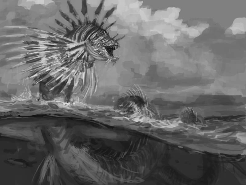
Anyway, decisions made and thumbnail drawings jotted, I went on to the sketch:
It wasn’t until pretty far in that I realized that the serpent needed to be more prominent within the piece. So, I cropped in on the thing and went back at it. Still, there was something that wasn’t quite working to me. So I showed it to fellow artist, Lars Grant-West, to get his two cents. I know several artists who hate it when fellow artists or art directors do “paint overs” while critiquing work. Me? I’m a huge fan since it expedites the transfer of information and is really clear. Lars, with his paint over, delivered in spades. His primary suggestions were minor tweaks to the head and a redesign of the the stiff, spine-filled fins on the side of the serpent into more fluid fins. While this took the serpent a step away from a lion fish, it insinuated motion that increased the tension and the stakes within the image. For me, it was an easy sell and I incorporated his edits into my piece almost verbatim.
Aside 2: Showing your work to other artists mid-process can leave one feeling vulnerable, but I’ve felt that it’s always been worth it—no matter how much it revealed of my inadequacies or weaknesses. I’d rather have flaws pointed out to me before a piece is too far gone. Here are two major rules I adhere to when showing my work to others: 1) if dealing with work that is covered by a non-disclosure agreement, I only show the work to other artists who have signed the same agreement for the same client in order to avoid leaks and because the artist will then have some sense of the context; 2) I stick with artists who understand my intentions and help me to communicate what I want to rather than trying to turn the piece into something they themselves would do. That second one requires that folks really know and understand me and my work, which makes them invaluable and worth keeping in the loop.
Tweaks made, the final sketch was this:
Fortunately, the fine folks at Wizards dug the image as is and let me go to paint, and so I did. Until I hit a snag or two, that is.
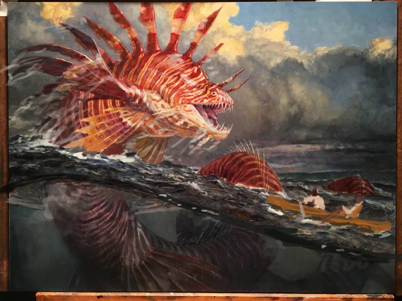
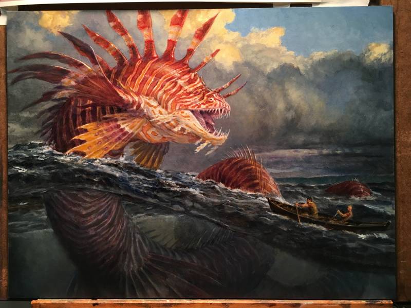
Sometimes, no matter how well prepared I am, no matter how much reference I have and how tight my sketch is, I get to a point in a piece where I’m not sure where to take it or how to solve a problem. So, I take a quick cell-phone photo, import it into Photoshop and digitally paint any changes or explorations I feel are necessary to get me going again. Usually, this is done either first thing in the morning before I start painting for the day or last thing before cleaning up, thus allowing for the following painting session to be dedicated to executing whatever I’ve figured out, and integrating it properly into the piece.
Now, there are some folks that feel that this step should be entirely unnecessary, that we should have our act together and have everything figured out before going to the final. I’m not that guy, and never will be. I’m always figuring something out while painting the finish, and there are always things that come up, happy accidents I want to capitalize on, and other options I’m curious to explore. That discovery built into the process is probably the thing I find most interesting about illustrating for a living, and it’ll likely always be there since I am uncomfortable and bored by a rigidly formulaic approach.
Anyway, as you can see below, I wasn’t entirely sure about the placement of the boat, the amount of splash and cascading water on the serpent.
Later, I second-guessed the exact placement of the water line.
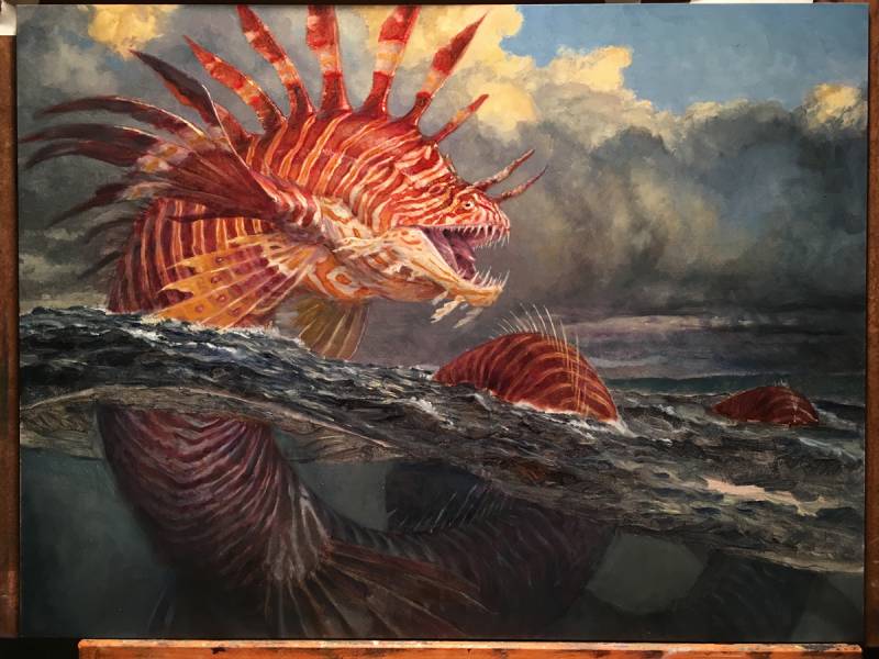
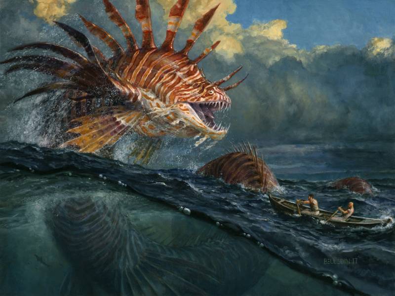
Anyway, the finished work looks like this:
The painting is oil on hardboard, is sixteen inches wide by twelve inches tall and was art directed by Cynthia Sheppard.
Looking at it now I wonder if I couldn’t have added flotsam and jetsam from a shipwreck both above and blow the water to insinuate the suggested ship, but then I’m not sure that the piece would either be better for it or be as easy a read when reduced to its printed size. Regardless, I enjoyed painting the piece more than most and I’m pretty content with where it landed. If nothing else, even with the uncertainty and the pauses to digitally check my gut, it was a piece that just kinda flew by. I wish they all could.




The end result is amazing. I don’t think floating wreckage would have improved it and might have been a distraction. Terrific work.
Great work! This picture looks like a shooting lens or a world inside the glass.
Love it. Great insight in your process.