I’m going to warn you now, this post is nerdy and I really don’t know yet if it is interesting or valuable… Or just mildly interesting at best. I find it fascinating, but we’ll see…
I had a great opportunity to have Greg Mortenson stay with me last week and teach a portrait painting workshop in my studio. I learned a ton from him. My favorite part of his stay was staying up late and geeking out over really technical art stuff. We chatted for hours about color and how different artists implemented palettes. Dry stuff, but it was really fun. Greg taught me more about Munsell’s color system. I had some familiarity but he showed me how it can aid in analyzing color. Something that we discovered while chatting and searching the web is that chroma is NOT the same as saturation. It is calculated differently. Different equation. If you want to read more on it, here is a link… and here.
It’s not that important EXCEPT if you think they are the same and are having a discussion with someone about whether chroma increases in the shadows of flesh or stays the same (this happened). Because chroma decreases with value while saturation can stay at 100 percent as a color darkens and decrease as you add white. A small, but important distinction.
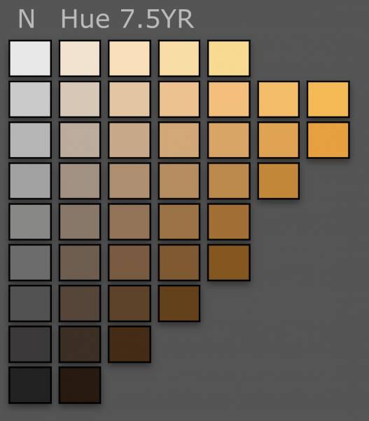
Greg and I were talking about chroma and whether it stayed the same or changed as you move from light to shadow. I thought it would be interesting to create some flesh colored spheres and implement a few approaches. I used colors from the 7.5 YR range on the Munsell chart. It comprises a basic range of flesh colors regardless of most ethnicities.
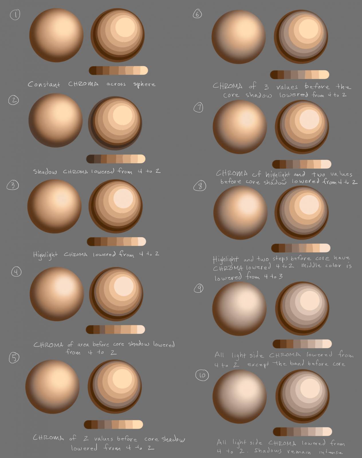
I made some circles using 8 value steps with the outermost being one value lighter than the core shadow as if there was some reflected light. Then I blurred the circle to make it look smooth. These diagrams don’t shift in hue like real skin does. I kept the hue consistent to reduce the variables and see what happened.
I made examples that reflect various ways I have seen skin painted.
1 keeps the chroma exactly the same. It makes the skin look like plastic.
2 drops the chroma of the shadow. I don’t love this but I see it done.
3 drops the chroma of the highlight and this helps but the skin still looks artificial.
4 starts to get interesting. The highlight and band before the core shadow are greyed down, the chroma going from a 4 to a 2. That subtle change is nice to my eye.
5 keeps the highlight at chroma 4 but drops the chroma of the two bands before the core shadow. This is nice too
6 is the same as 5 but with a larger grey area
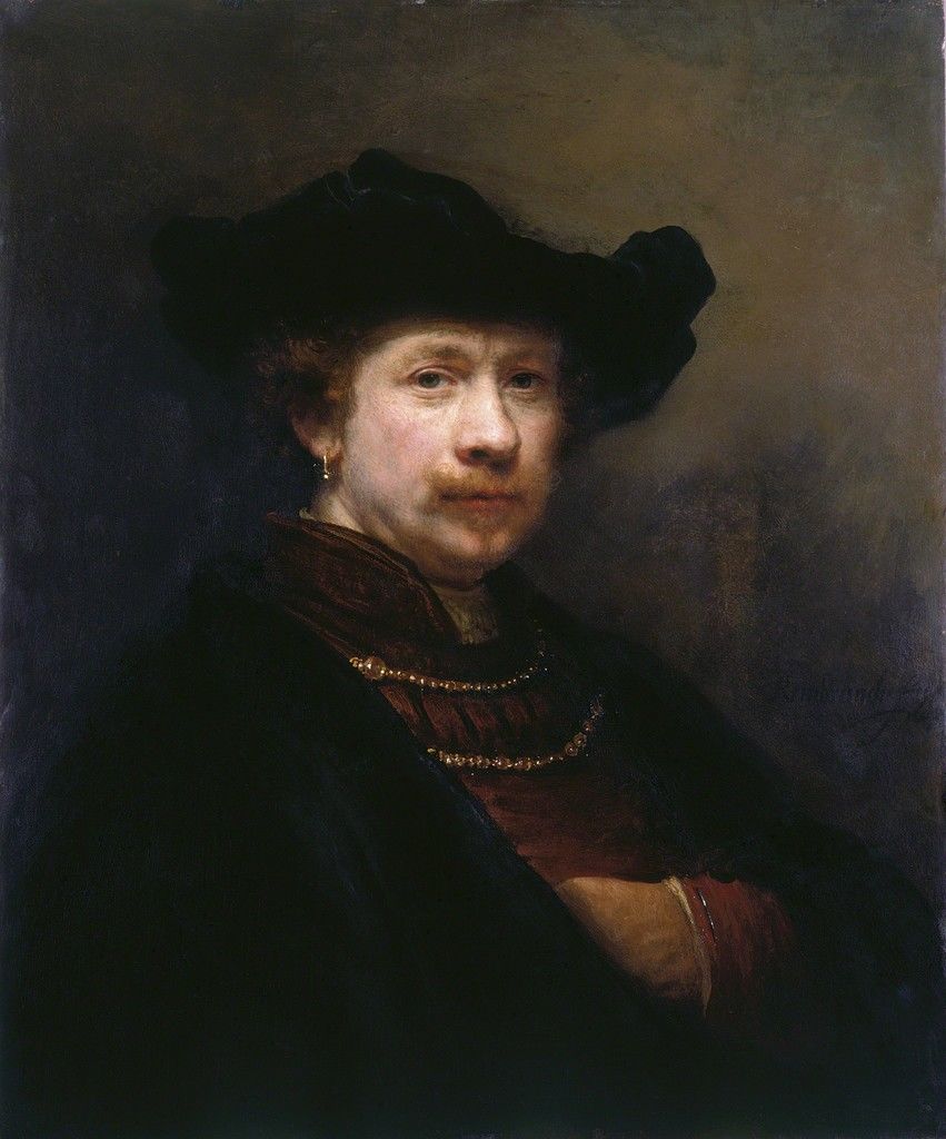
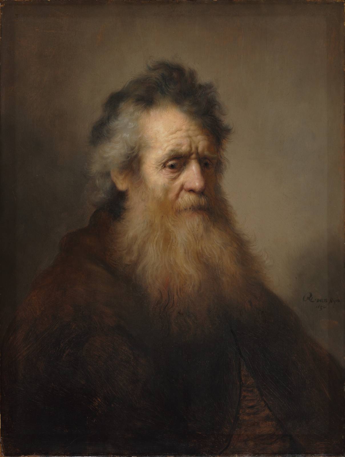
7 is closest to Rembrandt and Rubens in how they adjusted chroma as the form turns.
8 is similar to 7 with a larger grey area
9 and 10 are interesting. The light side chroma is dropped whole the shadows stay more chromatic. 9 keeps the band before the core more chromatic though. This is similar to Bougueureau’s flesh, but more Stark and not accounting for hue shifts.
What number do you find appealing for flesh? Do you see one that stands out as best or similar to your approach?
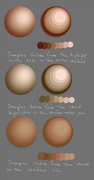
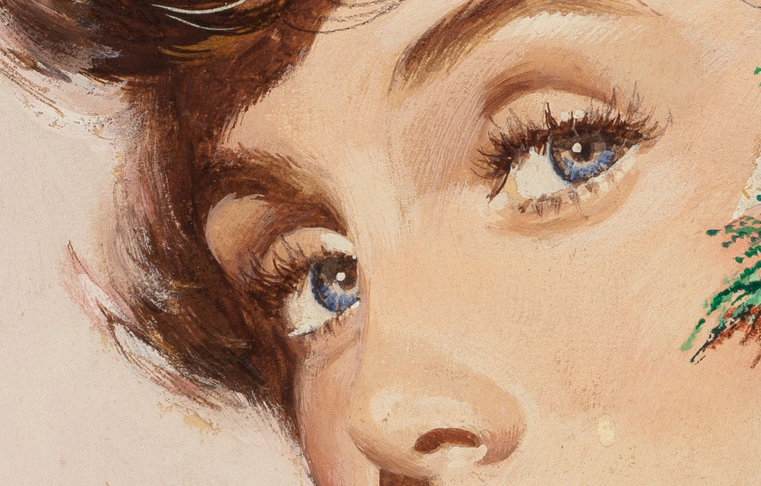
Here are some high quality scans. See if you can see changes in chromatic intensity as the form turns.

The top sample shows the form of the highlight on the ball of the nose to the nostrils
The middle one is the chest moving from the right side in the light to the shadow under the jaw
The bottom is the cheek in the shadow side.
It is interesting to see the shifts in hue and chroma. It’s not drastic but Bougueureau increased the chroma as he moved from light into shadow.
What is also interesting to consider is that while flesh is observable and quantifiable, artists can make personal aesthetic choices to distinguish their approach. From Guido Reni to Pompeo Batoni to Brom to Frazetta, artists have been making small and subtle changes to the narrow range of chroma and hues of flesh to create very diverse results.
Thanks for reading my post. I hope it was interesting today!
Howard





Feel welcome to get this nerdy in any post at any time! Very interesting.
There is just so much intrigue and interest to painting skin! I feel it’s one of the most interesting challenges we face as artists. If I paint skin every day for another 50 years, maybe I’ll come close to understanding it!
I was just thinking about this last night, wondering what would happen if I did high chroma in the lights and decreased in shadows or whether there was a better way. I’ll experiment!
::time passes::
I just read all the links and I think I’ve got this. Check my work.
Saturation is the purity of light wavelength, regardless of the amount of light being transmitted. So if you’ve got a pure red object that you’re lighting only with a very small, daylight balanced candle, you’re going to have high saturation and it’s still going to look brown because all the light your eye is seeing is red wavelengths but there aren’t that many of them.
Chroma, then, is a combination of saturation and volume of light. The candlelight example from the last paragraph is high saturation but low chroma. Whereas if I replaced the candle with a 1000 lumen daylight flood lamp, that would be high saturation and high chroma. But While it’s possible to have high saturation with low chroma, it is impossible to have high chroma with low saturation.
Have I got this right?
You’re on the right track but your example opens up another can of worms. Perception of object-colour attributes like chroma and lightness doesn’t depend just on the light reaching the eye, but on the light judged relative to the rest of the visual field. So in your first example the red object should still be seen as having high chroma in low light as long as it reflects a high *proportion* of the long wavelengths falling on it. A better example is that of two objects that reflect only long wavelengths, the first reflecting a small proportion of those and appearing dark ruby red and the second reflecting a very high proportion of those and appearing bright red like cadmium red. Both reflect light of high saturation, but the second object would be seen as having higher chroma.
Howard thanks for posting this. It helped to clear up a few things I was trying to wrap my head around at the workshop in Milwaukee. After looking at your 10 spheres, I was really torn between 7, and 8. After making a few more variations in Photoshop, I think I would probably go with 7. With that said, I would likely increase the chroma of the reflected light if the secondary light source was in the same color family as the local color of the sphere, or reduce it if it were not.
Thank you for this. I’ve been spending the past day trying to grasp saturation vs chroma. Chroma was something I had never gave a thought to, and I find this exciting. It reminds me of a moment in high school when my art teacher explained reflected color to me and suddenly I could see it everywhere. Thanks for geeking out!
Really interesting post Howard thanks very much. I’ll try the Rembrandt/Rubens way of painting flesh to see if something good happens in my painting.
If anyone want a full explanation on everything about chroma and colours I highly recommend you the website of David Briggs -> http://www.huevaluechroma.com/index.php
Simon
Howard this is EXACTLY the kind of content that should be written down. I think a lot of this incredible information is primarily conveyed through conversations between artists, but for the rest of us it can be incredibly hard to find well-written articles. Some of the greatest art tips I’ve received were from talking with a random convention table-mate or overhearing a lively painting chat in a studio setting, those concepts that make you go, “WOW, that changes everything”. There’s loads to digest from this, thanks for sharing!
Thanks very much Howard for citing my Munsell.com blog post and Wikipedia entry, and Simon for recommending my website! The relatively recent page on saturation may be of particular interest: http://www.huevaluechroma.com/017.php
Really great to see this sort of demonstration here. It would be interesting to distinguish between what is often called the “full light” (the brightest diffuse (flesh-colour) reflection, commonly represented with the highest-chroma paint, and the more localized “highlight” or specular reflection of the light source, which retains the (white) colour of the light. You can see the distinction very nicely in the Rembrandts and Bouguereau.
Can I ask who is Stark? Haven’t heard of such an artist.
“This is similar to Bougueureau’s flesh, but more Stark and not accounting for hue shifts.”
I think it is accidentally capitalized, but I may be wrong