As painters we see paintings very differently than other people; we respond not just to the subject matter but also to each nuance of technique, each flourish of skill. We’re craftspeople as much as we’re artists – and we spend an awful lot of time admiring and imitating one another’s craft. This isn’t to say we get “more” out of art. In fact, I think we all go through long periods where we largely miss the point, and value technique over message. This is the ubiquitous obsession with “brushwork,” and with “sumptuous edges.” When we value these things AS the message, we confuse sword-making for killing. Let me elaborate:
There are a lot of ways you can kill someone. You can spend several years learning to make a sword from the finest folded steel, producing a masterwork of technique which you then use to elegantly lop someone’s head off. But you can also just walk up to someone with a dirty shiv and stick them. Not pretty, but effective – and they’ll die just the same. Alternatively, you can carpet-bomb them, shoot them or set a tiger loose on them, and that’s all without being particularly creative. It doesn’t really matter to the dead how it happens, or – in the end – how pretty your weapon was. To be an effective killer, your singular aim must be killing, not crafting swords. Your sword is only a means to an end.*

Ashley Mackenzie. Would anyone in the Renaissance accept this as a “painting?” Does that matter when its power to affect us is so undeniable?
For all types of artists (hopefully uninterested in actual killing), our shared singular aim is to communicate a message; that’s it. While that’s easy to say, it’s difficult to achieve – and in the process of learning to do it we can forget that elegantly crafted swords (in this case, paintings) aren’t the only way to do it. They are a means to an end. So, too, are the components of painting. Brushwork is a means to an end; the distribution of edges is a means to an end; value is a means to an end. In order to know how you can best communicate (how YOU should be using edges, for example), you must know what you want to communicate. When you know the “why,” the “how” will follow much more easily – and a lack of preconceptions will help.
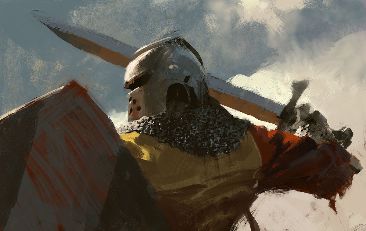
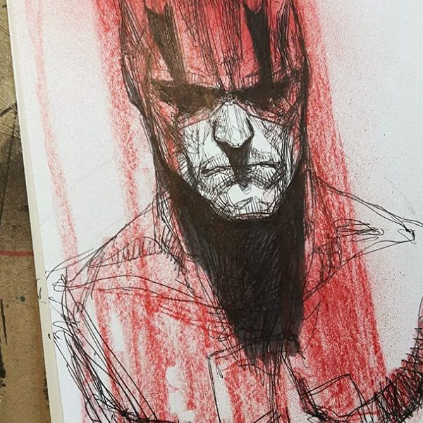
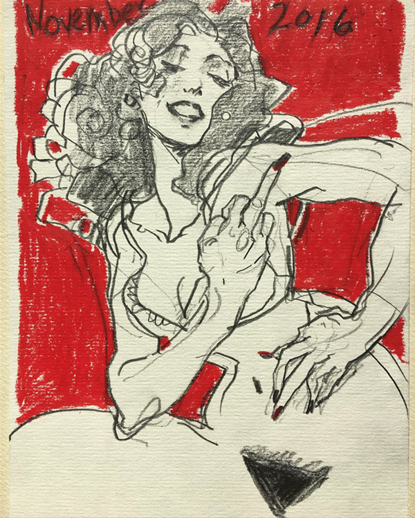
The fact is: a piece that effectively communicates is beautiful to us; there’s no way around it. Do you love a picture but can’t figure out why? Do you love a piece but think it’s “ugly?” Does that make you like it even more? The piece communicates with you; it slays you – job done. The thing to watch out for is that as an artist you’re also vulnerable to being slain by craftsmanship: you might keel over dead just from the sight of a beautiful sword. “Oh, the edges! The workmanship! I could die!” Keep your eye on the ball. Take a look at the pictures in this article again: these are pieces of art that break our rules and defy our logic; these are not, first and foremost, beautiful swords – they are confirmed kills.
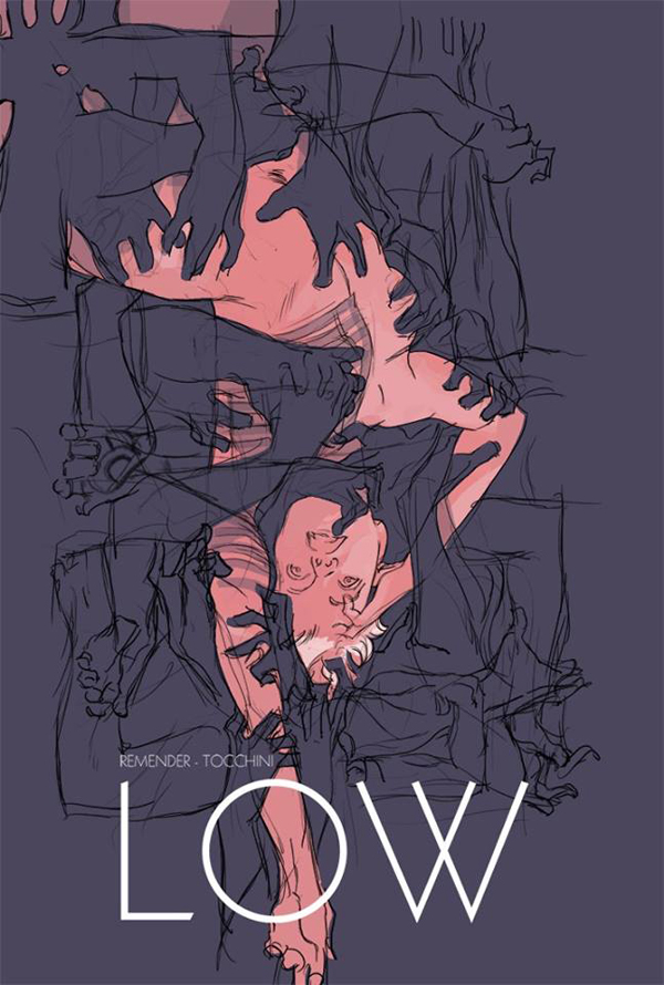
This Greg Tocchini sketch for the cover of LOW #11 kicks my teeth in. It didn’t need to go any further.
*For me, the originator of this crude but beautiful metaphor (which communicates excellently) is none other than my long-term teacher, Brian Stelfreeze.






This is a great post, especially for someone like myself who is learning and trying to go for “realistic,” whatever that means, and makes all other decisions (particularly color) subservient to that otherwise vague and nonspecific notion at the expense of other things.
Cheers for the post
Thank you for sharing all these beautiful pieces!! I am learning now that perfection is rarely the message we want to pass – there are so many stories that are far from ideal, and not aligned with the plan. Most of the time, life/stories are messy, so we need to be creative to try to express it with the technique too.
LOVE THIS!!!! Thank you
Yes. Thank you for this Tommy 🙂