I’m fond of pointing out that freelance illustration has provided me with many assignments that I’d never give to myself. Indeed this Food Token painting I did for Magic: the Gathering falls into that category.
For context, the assignment was to paint a medieval feast inspired by those done by classic Flemish painters. Central to the feast would be a large meat pie. The pie would perhaps be glowing from the inside or maybe have the outline of a hand pushing outward as though someone had been baked or magically trapped inside. Or, maybe the pie’s crust was shaped like a screaming face. Either way, it was meant to be a classic still life scene with a tinge of horror.
Considering my history of horror imagery painted throughout the years for Magic: the Gathering, you’d expect this to be right up my alley, and in some respects you’d be right. The problem is that my tastes have changed over the years. Overt horror is not something I’m as interested in depicting and I wanted to find a way to make both my client and myself happy. So I thought about it and started collecting my reference. The fine folks at Wizards of the Coast were kind enough to provide a couple images of Flemish still life paintings to get me started, but it wasn’t long before I was adding to that collection of images. My added reference consisted primarily of paintings, but I scoured images from every cookbooks in the house, too—some of which have some seriously sumptuous food photography therein. While going out and collecting the various items I’d be depicting and photographing them all seemed like a good idea, I knew that a lot of what I’d be procuring would likely go to waste, so the collected reference was the basis for everything.
As with many works, the central gag was where I started. While I toyed with the concepts they provided in my art description, none of them were where I wanted to take the piece. Obviously, the goal in illustration is to please the client, but I’ve been finding more and more that my sensibilities are increasingly at odds with my clients. The short version is that I prefer subtlety in imagery, and frankly that doesn’t always play well with my clients’ needs or with art that is reproduced at less than half the size of a playing card. So sometimes it ends up requiring quite a bit of effort to find something that still works for the assignment but remains unapologetically me.
To be clear, none of the ideas I was provided were bad ones. In fact, given to different artists, any one of them could be amazing. But I felt like I could solve the problem and make something that was more in line with what I like to do. The idea of the hand pressing out from inside the pie, while intriguing, proved shockingly hard to sell in practice and one that raised a lot of issues with scale—as in the scale of the meat pie in relation to everything else, and the scale of the person trapped inside. The glowing meat pie I felt was an easy sell and one I decided to follow through on as an alternate take to my own. The screaming face crust? Early on I dismissed it since I’ve painted more than a couple screaming victims and I wanted to do something that wasn’t that.
Of course, that’s kind of what I ended up doing anyway. The eureka moment came when flipping through my reference for inspiration. I found a photo of a meat pie where some of its juices had boiled up out of the crust while baking and coagulated in pools on top as it cooled. I thought it an interesting idea to turn those pooled juices into an abstract face bearing an expression of horror and misery. The solution was in keeping with the spirit of the assignment, but added a bit more of my desired subtlety into the mix. For good measure, I thought an interesting idea to have seeping juices at each side of the pie almost mimicking fingers in turned up hands. This ended up not working so well, but whatever.
“Why that’s not very subtle at all,” you might say. And maybe you’re right. But I stand by it as being more subtle than an unnatural glow or an hand pushing out of the pie.
In the end, once I’d done the hard part, the rest fell together quickly. I kind of just placed different things throughout the composition until I was happy with the general visual flow. The number and types of objects varied wildly as I experimented, and in the end I was forced to remove quite a number of things from the composition because they just didn’t work as well as I’d hoped. This included the pawpaw fruit (which most Americans and Canadian’s don’t eve know exists despite it being native to those two countries), a decorative silver and crystal condiment server that my wife’s family owns, and a cat’s head looking up from the bottom of the piece, as though ready to pull it all down (and boy do I wish I had gotten that last one to work).
Before long, I’ had a finished digital sketch and then as mentioned before, I created a second version which more explicitly fit into the concepts provided to me in the art description. Now, I don’t always hand in multiple sketches for things, but since I was pushing a bit outside of the assignment’s boundaries, I thought it prudent to give my art director options. Really, it’s ALWAYS good to give them options, but I don’t always do it.

This is pretty much how I tend to format my sketches when sending them in to my clients. It’s a pretty basic design grid with plenty of breathing room around each image, along with explanations of my intentions if they seem necessary. In all things, it’s super important to keep the labeling clear and consistent to make communication with my art directors simple. At top left is the art ID number, which Wizards of the Coast use to internally to keep track of each piece of art, as well as the temp title, which in this case became the final title minus the “A” signifier, of course.
While I was happy to paint either version, I was really hoping I’d get to paint my take. Fortunately, the fine folks at Wizards liked my version, and so I quickly made a digital color study before charging ahead in oil.
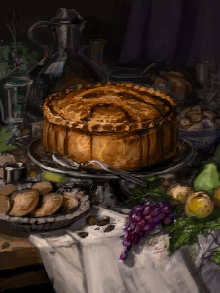
I don’t always do these color studies, but they’re almost always helpful. I adhered more closely than usual to this study as I painted and it guided my hand throughout as I was always referring back to it for color and value cues.
In this case (as in most cases), I projected the sketch using a mini digital projector onto my gessoed surface and traced it with a pencil. I used to print the sketch out and use either Saral Transfer Paper or a basic graphite rub to transfer the drawings, but the projector saved time, printer ink, and the stress of fighting with my printer. I then took the very basic sketched-out image that resulted and sealed it in with an underpainting of earth tones (underpaintings are generally part of my illustration process, but they vary in color and complexity depending on what I feel a given piece needs). My underpaintings are sometimes oil, sometimes acrylic. Again, this is determined mostly by what I feel works best for the piece. Then started painting things to completion, every once in a while going back and tweaking things that were “finished” in order to keep the whole feeling consistent. While I wish I could say I regularly work in a disciplined manner (painting background to foreground for example), I honestly have a hard time motivating myself and so I start with whatever I feel like painting and then expand from there. But in this case, I actually did paint background to foreground, though I did go back into the meat pie once I was through to tighten it up a bit, which was followed by a glaze to darken the background elements.
Alas I failed to take any photos of the piece in progress, but it was a really fast process and I had solved almost all of my problems up front, so it was pretty academic. Anyway, here’s how it came out:
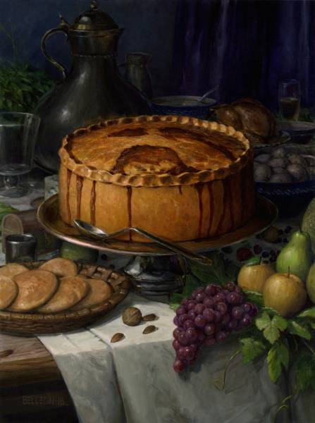
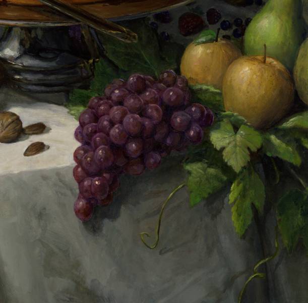
The grapes were probably my favorite thing to paint.They’re a pretty interesting mix of warm brownish reds and cool violets and blues.

I feel like I over-render and develop too much of my paintings at times and this was a rare instance where I felt comfortable letting things stay a little looser. Of course, it probably only looks loose because of how much I’ve zoomed in.

On the case of many of these background elements, I ended up rendering them much further than they needed to be since I eventually ended up glazing the background back several steps to help bring emphasis to the meat pie, and thus killing much of the detail. But really, the detail is still there and if nothing else, I think you can feel it.
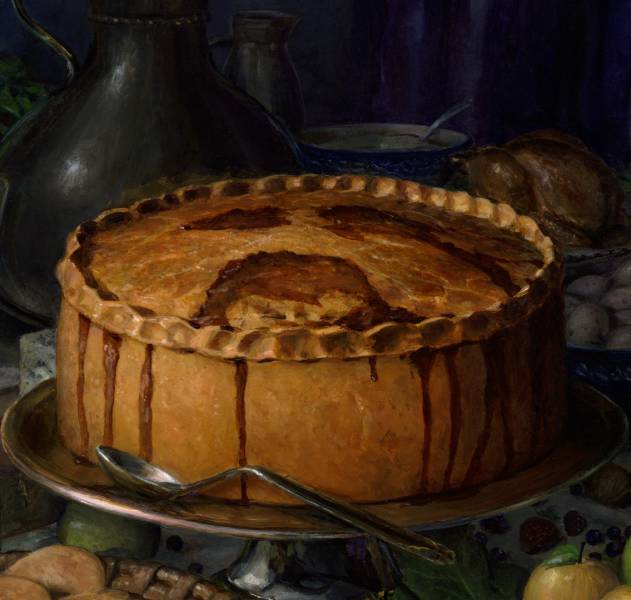
Fun Fact: the edges of the flakes of the meat pie’s flaky crust were created mostly by painting areas and then scraping down to the lighter underpainting with an X-ACTO knife. I popped some highlights in paint here and there to help sell the glistening doe with a 000 round detailing brush. Fun Fact 2: I know that the reflection of the meat pie in the ewer behind it is wrong and it bothers me. Now I’ve pointed it out so it can bother you too.

On the other hand, I really like how the top of the ewer came out. Also, I got away with murder on that plant. Honestly, I didn’t know what to put there and just felt a spot of green would be nice.
When I was assigned this piece it had been over twenty years since I’d done a still life of this nature. In that time I’ve been very fortunate to have seen some of the pieces I looked at for reference in person. I wouldn’t say that I dislike the genre, but it’s certainly not something I feel drawn to in any way. Honestly, I think painting still life paintings is more interesting than looking at them. But really, it’s awful nice to be pushed to do different things and revisit other genres—even if it takes another twenty years before I get around to revisiting them again.




I love this painting! You did an amazing job on it. The sense of flakiness in the pastry is amazing! So well done. You killed this one!
Thanks, Howard. I really appreciate it. I got lost in the piece while doing it and ended up having a lot of fun along the way.
Thanks for sharing Steve. I always enjoy when artist explain their thought process as well as you do.