I returned from a prolonged trip to Italy last week. My wife and I were fortunate to spend about a month in the country painting and leading a tour to some great art sites. While there I picked up some toned paper from Zecchi Color, a wonderful little art store in Florence and started doing some small little studies. I started with pencil, then a dark watercolor and a white or warm white to add the light. It’s nothing new, and lots of artists have taken advantage of toned paper to setup a quick means to render form. I am really enjoying this particular approach though and though I would share some results and thoughts.
The paper I am using specifically is Magnani 1404 Annigoni paper. It is 100% cotton and acid free and of middle weight at 120 lbs. It’s marketed as being good for drawing, charcoal, watercolor and acrylic. It has a nice warm sand color to it and the surface isn’t plate finish smooth, but it is quite smooth and the pulp holds together very well when wet and worked over. So far, I really love it.
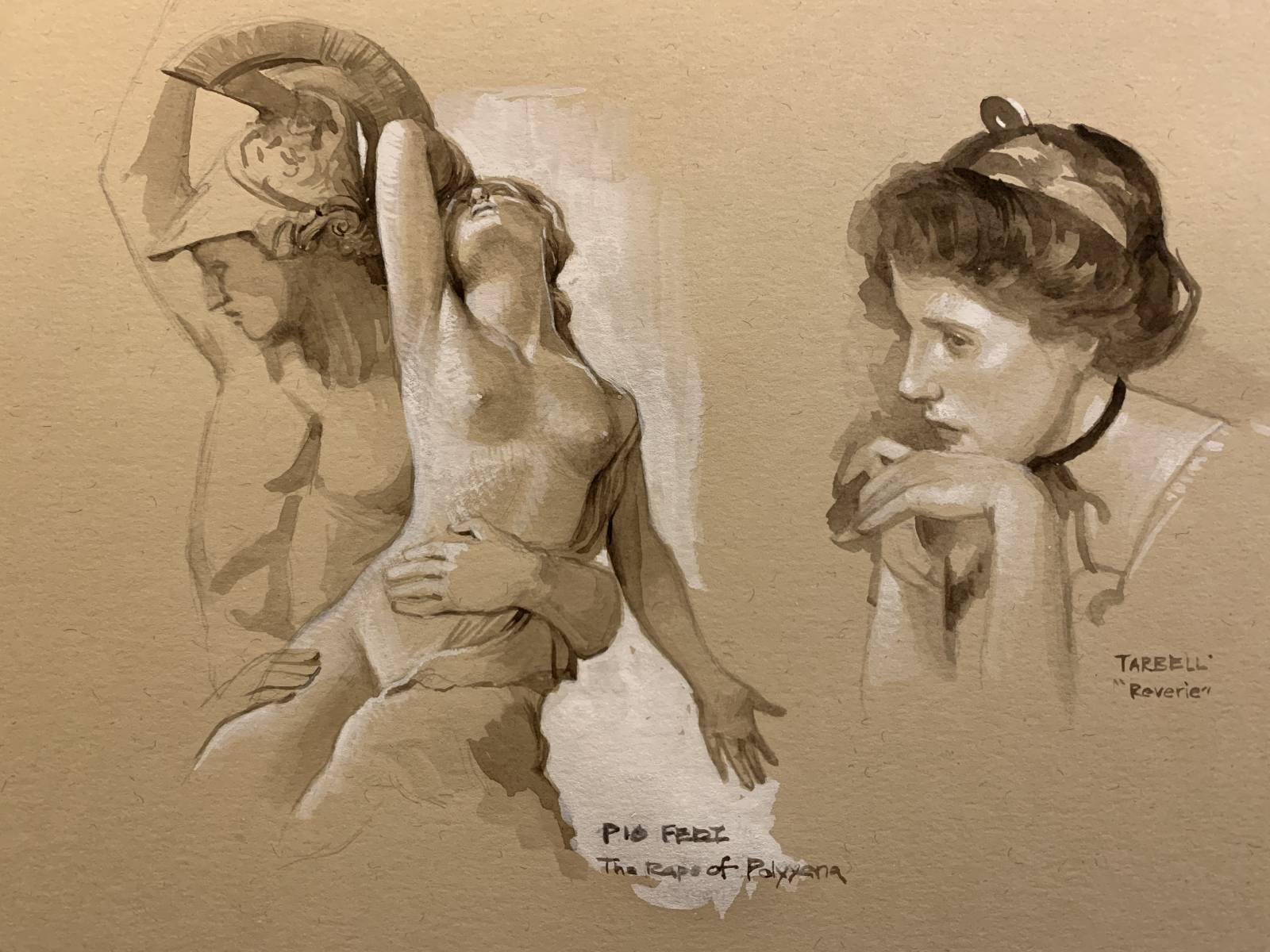
I started with a small study of Pio Fedi’s sculpture in the Loggia dei Lanza The Rape of Polyxena. It’s a remarkable sculpture placed among incredible works. I could spend weeks there studying!
All the studies posted are about 4 inches in height.
On the same page I did a small study of a head from an Edmund Tarbell painting. As I studied the Tarbell I admired the way he simplified the shapes and values, letting areas weld to others and playing with the edges and values to create variety and contrast. I realized that this approach lends itself very well to that. It is nice to start with three values, one of the being the paper as the middle value and only two paint colors. For both of the studies above I used raw umber watercolor and white gouache.
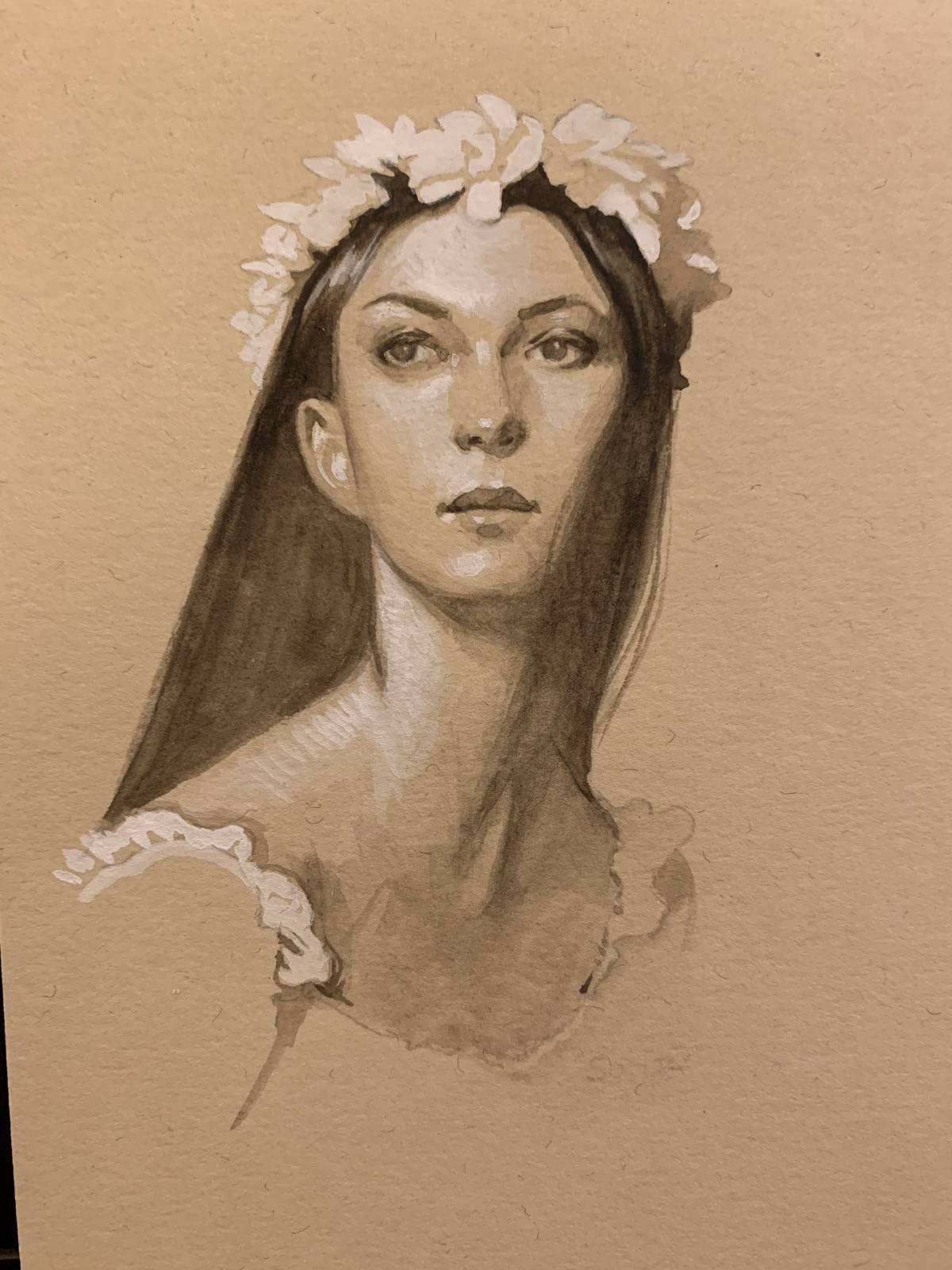
Here’s another attempt, this time from a photo that I took.
I think that it is a great exercise to try and simplify the value range you see. Especially at the beginning of a painting. I think that doing little studies like this could really help with that mental exercise.
I also think that it’s an inherently beautiful combination of materials.
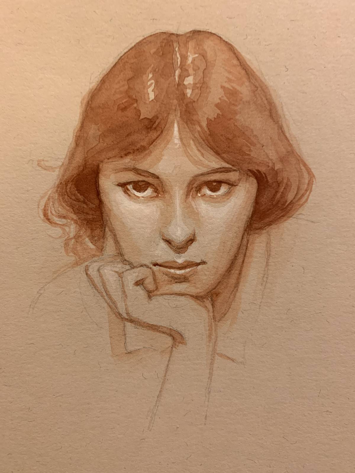
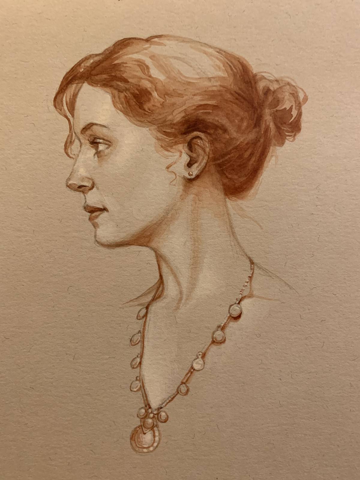
For the next images I switched to using a burnt sienna base and a warm white gouache.
Here’s the last of them for now (I plan on doing many more). Here I used a burnt sienna watercolor for the dark values and Holbein Ivory White for the highlights. It’s a good challenge to simplify, look for shapes and planes and then add a few transitions. I think that if you are struggling to see the primary values and shapes that this would be a good method to try. Force yourself to do very little blending or transparent washes and make your image use just three values. If you want to add more subtlety after that, then you can still do that since the media used are re-solulable.
For the image above I used one of the portraits of Evelyn Nesbit by Arnold Genthe. I love old vintage photos. They seem to have a great range of middle grays and less contrast than photography today. It’s as if the levels curve is biased towards the middle and it makes for beautiful skin tones, even in black and white.
I know that technique I am sharing isn’t new, but I think the observation of the value of working with the simple palette of values and how it pushes you to simplify is worth repeating. Give it a try if you haven’t and see if it proves beneficial.
Thanks for giving my post a read. I will be posting a bunch more of these, including some little landscape studies I have done on my Instagram account if you’d like to see more .
Howard




These are beautiful Howard! Thank you for writing about your process. Do you know of a toned paper that has good handling qualities for this type of practice, but isn’t quite so luxurious? I would not be able to bring myself to use that gorgeous paper for anything like a study, which of course defeats the purpose of doing this type of work. I’ve tried Strathmore, but it seemed not to accept the materials I used very well (charcoal, pencil and white “charcoal”). I’m glad you and your wife had a good trip. So many artists seem to be heading to Italy these days and I love to see the paintings and photos that result from their journeys.
Maestro, thanks for your posts… I’m just a hobbyist (retired chemist), but learn very much from your videos and comments on this page.
Gorgeous pieces! Glad you had an inspirational trip.
This selection of materials makes for beautiful results and one learns something along the way. Win win.
Then there are artists like Wylie Beckert who adopts and pushes these methods with great achievements.
Excelente ejercicio, Howard. Vamos a buscar ese papel, para intentar también algunos ejercicios de tonos monocromáticos.