While soliciting the Internet Hivemind for subjects to pontificate on, the following query arose:
Why are horses harder to draw than dragons?
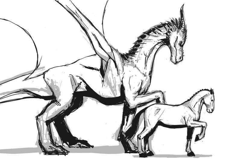
Here’s a quick and dirty horse and dragon I did. The gray bits are not shading. They’re the “dirty” part of the quick and dirty sketch. They’re the first pass that I thought I’d leave in to illustrate that I have trouble drawing both of these things. Heck—I have trouble drawing EVERYTHING.
Ahhh, horses. There are fewer things that have caused more frustration to artists than horses. As most reading this can attest, horses are very difficult to draw. Sure, there are some savants out there who can whip up a real nice and believable horse without much thought at all, but for folks like myself (and many, many others—seriously Google “why are horses hard to draw?”) they can present a huge challenge.
On the other hand, the question suggests that dragons are comparatively easy. Are they, though?
Kinda…
Not really.
But sort of.
But not really.
For arguments’ sake (not to mention the sake of this post), let’s just say that dragons are, in fact, easier to draw than horses*.
Okay, like I said, we’re assuming that horses are indeed more difficult to draw than dragons (again, not really). So why is that the case? Why is this creature that has lived along side much of humanity for millennia so bedeviling, while these other critters that have never existed—and thus should be harder to make believable—are comparatively easy to articulate?
The answer—at least in my opinion—starts with familiarity. As I said above, horses are something extremely familiar to most human cultures as people and horses have cohabitated for thousands and thousands of years. And even before they were domesticated (approximates six thousand years ago, if you’re curious), they were something upon which man was transfixed as any of a number of cave drawings can attest. That very familiarity gives us just enough knowledge to subconsciously parse what makes a horse a horse, and allows us to see when something is a bit off with any alleged horse.
But Steve, you might argue, I’ve never had much exposure to horses. Ah, but is that true? I mean, horses feature in a ton of films and television shows (not to mention video games), and seem to be omnipresent throughout most of art history. I’m betting you’ve seen a horse more than once. Did you study it? Did you pay attention? Maybe not. But all that horsy goodness is locked deep inside your brain.
Does that exposure make each of us an expert on horse anatomy and physiology? No. But I think each of us know enough to be dangerous. We might not know when a horse’s proportions are right, but I’m betting we know when they’re wrong. Just as there’s an uncanny valley for depicting humans, I believe there’s one for horses, as well (not to mention dogs and cats).
On top of us likely being better at knowing when a horse looks wrong than how to make one look right, is the fact that horses are just strange creatures anatomically. Their legs are thin and long, their bodies big and voluminous. They’re a weird juxtaposition of shapes and scale that can go wrong very easily. How quickly a horses’ head can become too small or too large. How easy it is to accidentally streamline a horse’s abdomen. And the legs? What a tangled mess of angles and joints that come to a truly curious hoofy end.
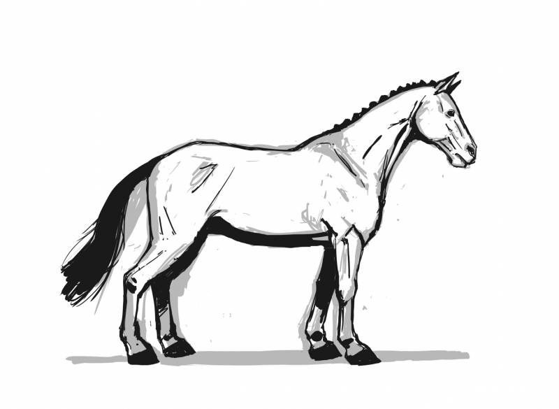
Here’s a hastily drawn horse to make fun of. Why are you like that horse? Why are you drawn so poorly? Why aren’t you easier to draw like rocks and sea urchins?
What’s even more curious is that—like cats and dogs—there are many breeds of horse that have very different proportions from one another and in come cases start to really mess with what one might think of as a stereotypical horse. So it’s no wonder that horses have been the subject of much consternation among artists for a very, very long time.
Meanwhile, you’ve got your dragon. It’s likely we can ask a hundred people to draw a dragon and get a hundred different dragons. There may be similarities, but I think we’ll get a pretty good variety. And why should they all be the same? It’s a creature that doesn’t exist. There are no authorities on dragon anatomy or physiology. It’s all made up. Because of that, an artist can get away with a lot. There are quantifiable things that allows us to say whether a drawing of a horse looks right or not (and honestly, there’s even a lot of wiggle room there because our tolerances vary). There just isn’t that resource for a dragon (unless you’re drawing a pre-existing dragon that’s already been designed, but I’m more talking about conjuring one from scratch).
Either way, horses exist and there are very specific rules that make a horse a horse. But a dragon? To some people they have four legs and a pair of wings, to others it’s two legs and winged arms like a bat. To some dragons have a mix of fur and scales, to others, it’s all scales and horns. Add to that the fact that the very idea of what a dragon even is can vary from culture to culture. A traditional Chinese dragon, for example, is quite different to those done in the European tradition.
While it’s likely that the believability of one dragon to another will vary, they’re not necessarily something that one can immediately point to and say, “that’s wrong,” because at the end of the day, they don’t exist and there’s nothing to compare your drawing to. There’s just a ton of leeway in their design.
*Now, here’s where the asterisk comes in.
A while back, I visited an art school. As with many art schools I’ve been to before, there was some incredible work there that made my college work look like complete garbage. The figurative work in particular at this place was superb, and so were the horses in every painting that depicted them. Looking through the work during my visit, I was truly impressed with the quality and level of realism. That is until I eventually came upon some work that attempted to blend the hyper realistic figurative work with imaginative realist elements. In one particular case, a painting contained a nude human figure and a dragon. As with all the other work I’d seen, the figure was incontrovertible. The dragon? Yeah, not so much. I mean, I guess you could say that it was well painted, but it wasn’t believable in the least. Why not? I mean, according to everything I just wrote about it should have been easy, right? Well, no.
See, dragons, though imaginary still have to have rules, they still kind of need to be based on something. The more believable dragons designs tend to start with another creature and build out. Maybe the design is based on dinosaur or lion, maybe it’s based on a bird of prey. Either way, there’s a foundation determining the shape and physicality of the thing that allows one to at least insinuate its anatomy.
In the case of the art school dragon in question, it seemed to be based purely on imagination without any understanding of its anatomy. Sure it had legs and wings and such, but those legs and wings weren’t built around bones. There was something amorphous about it all, and nothing for the brain to latch onto that was at least partly familiar. It was something that did not exist, for sure. But it was TOO alien for anyone to buy into it, and thus it did not feel like it lived in the same world as the figure next to it. A world with very specific rules.
Now, there was a lot that this painter got right. The lighting was beautiful as was the rendering and value structure. But the things they got right weirdly only made the dragon less believable because everything but the dragon was naturalistic and felt observable. Despite painting a horse quite well in a totally different painting, dragons were clearly a challenge.
So yeah, maybe dragons aren’t so easy after all.
What about style?
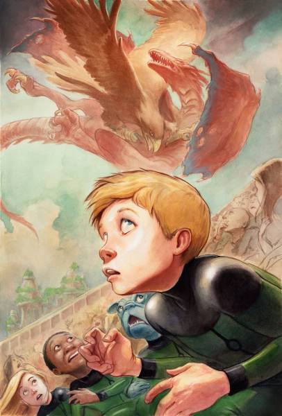
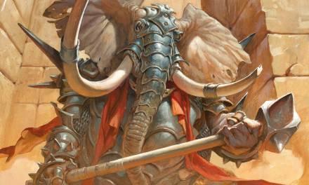
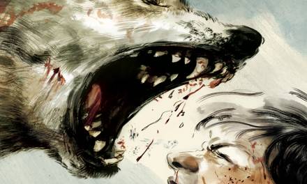
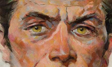
How—if at all—does stylization play into this? Rather than assuming a universal realistic take on things, I figured we could look at some examples of work from other artists who work in different aesthetics and who’ve addressed the subject matter at hand.
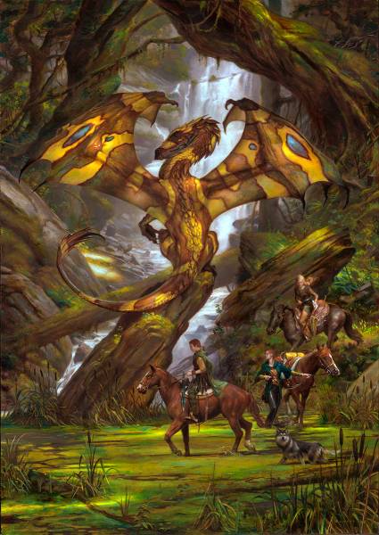
Above we have a piece by Donato, who claims that he has a hard time with horses like everyone else—he told me so himself—so putting three of them in this piece is no small task. They all feel believable though—especially that one that’s front and center, which was the most important to nail down since it’s clear and unobscured. I’m sure it wasn’t easy, and if he told me that he spent a disproportionate amount of time painting the horses on this piece, I’d believe him. More importantly, they feel quite at home alongside that dragon. Both subjects are informed to an equal degree. Anatomically, I’m not entirely sure what Donato’s using to build his dragon here, but it feels familiar enough to buy into.
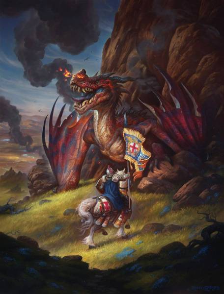
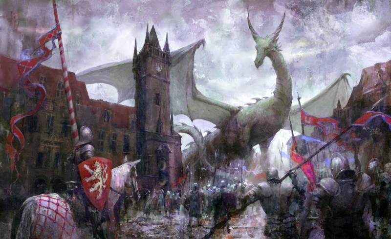
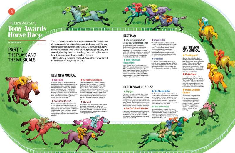
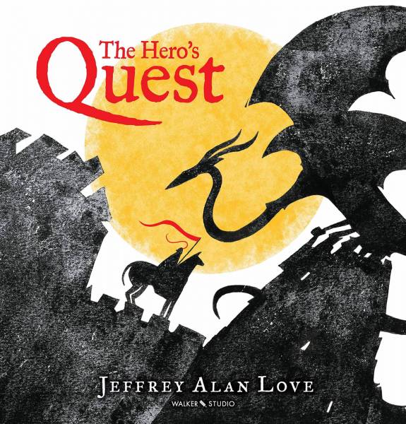
So what does this have to do with relative difficulty? I don’t know. A lot? Not at all? See, that’s the rub. The difficulty any one of the above artists had with designing and drawing a dragon vs. breathing life into their horses undoubtedly varies wildly. What matters is that in the case of their horses, they figured out what rules inherent to horses they needed to really nail down in order to make them believable within their given aesthetic. And in the case of the dragons, they figured out what rules they needed to create to do the same. Stylization allows for the paring down of information that needs to provided, but that can be a hard thing to figure out too, so someone who works in a more stylized fashion isn’t necessarily getting away with anything.
In short, each of our aesthetics (or styles, if you prefer) comes with its own set of rules (on top of the rules horses and dragons provide—lots of rules…so many rules), and one challenge we all face is to ensure that everything we depict follows those rules in a consistent way and to a consistent degree. Whether it’s a horse or dragon, it needs to be believable within the context of the world we put them in.
In conclusion…
Where does that leave us? Are dragons easier to draw than horses? Yes. Because reasons.
And also no. Because different reasons.
Where the difficulty in both overlaps is that both things need to be based upon anatomy—be it real or imagined—to the degree that makes sense within the context of your work.
And if you find that horses are hard to draw, you’re not alone in that. Like all things drawing, you can practice and get better at it. Dragons, meanwhile, provide their own challenges. It’s possible, though, that the exercises that would most help in drawing better dragons might just be drawing more horses.
Anyway, thanks for the half-dozen of you who read all that. Also, thanks a lot to Donato, Justin Gerard, Seb McKinnon, Scott Brundage, and Jeffrey Alan Love for letting me put nicer pictures than I could provide in this article. I highly encourage you to go check out their work if you’re unfamiliar and see what they’re up to.


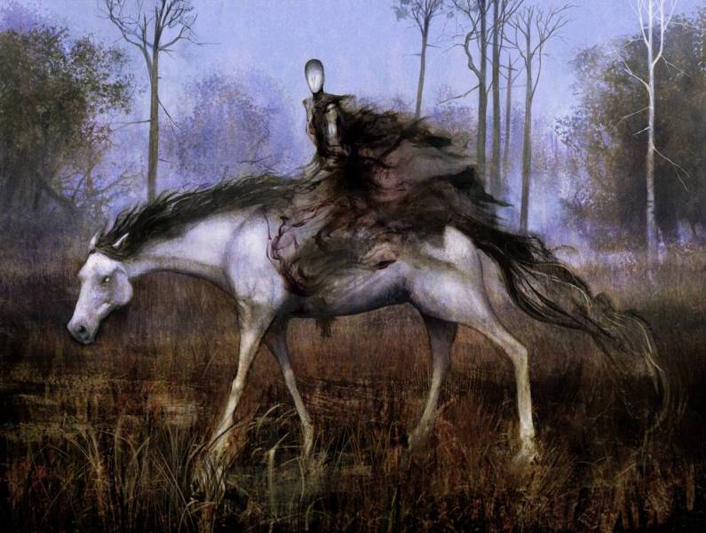

Recent Comments