Over the course of my career, some of the most challenging and inspiring painting commissions have sprung from the desire not only to satisfy my clients needs, but rather to execute a piece for my portfolio.
Deep motivations of personal taste, desire for emotional expressions, or pure technical challenges were drivers which help to flame the initiate spark from a commercial client into artistically satisfying visual conflagration. Making a piece for ‘my portfolio’ is not about abandoning my clients needs, rather it is about adding my artistic judgements to keep the work exciting, or pushing the envelop sometimes so hard and far that the original parameters become a minor aspect in the resolution process.
Either way, it required a restructuring my thoughts about the audience for the work and the caliber of quality I wish to place within it.
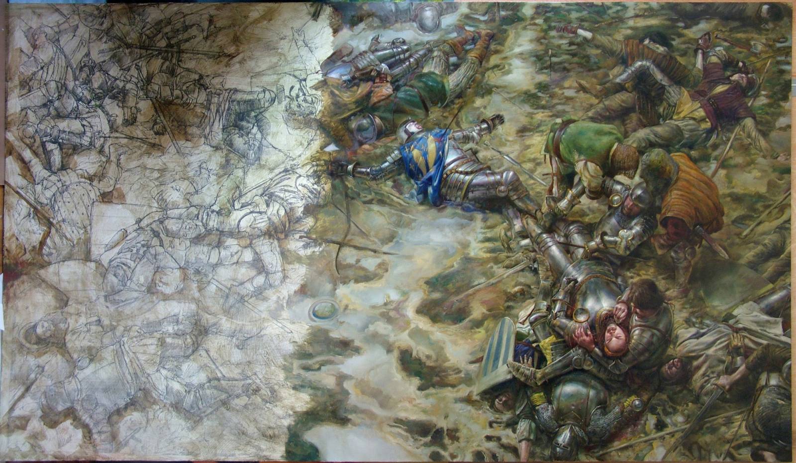
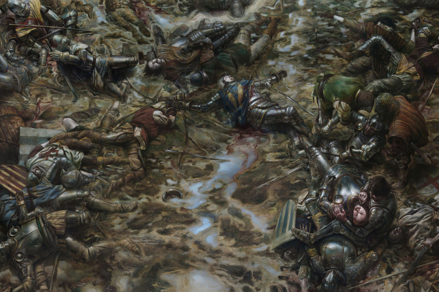
Below are a examples of commercial commissions which I took artistic liberties and ran with the concepts into new areas. Some are simple changes in format, while others are monumental conceptual undertakings as in The Battle of Agincourt: 1415.
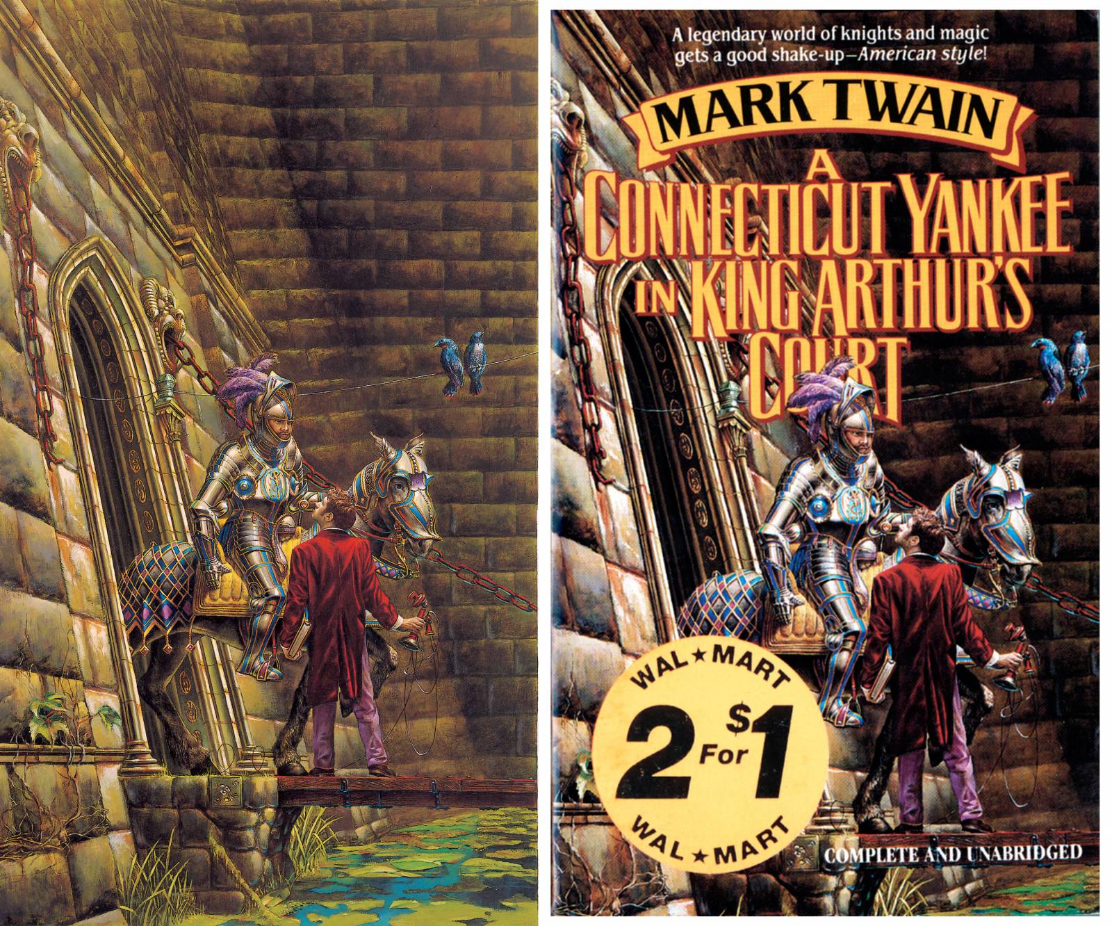
Much of the motivating factor around satisfying my personal needs as an oil painter over that of a published illustrator started with my very first professional commission as a cover artist, A Connecticut Yankee in King Arthur’s Court. After placing an enormous amount of labor and love into the painting, it was a bit dismaying to see the large type treatment and ‘sticker’ pasted onto the art. The kicker is that sticker wasn’t a sticker to peel off, it was printed as part of the cover design. I actually enjoyed the type design/style on the title, given its length the designer had to work with.
It was the sticker which darkened my soul to my client’s design needs, from which I never recovered from.
From that point forward I devoted my career as an illustrator to provide the best ‘paintings’ for my clients illustrative needs, not the best ‘cover’. my job was to provide the visual raw material for the narrative image, what the designer did to it to make it work for a cover was far out of my hands or aesthetic care – chop it up, color shift it, desaturate it, digitally recomposite it – it was all the designer’s and marketing department’s choice.
This lead to wonderful successes and a few horrendous flops. Yet overall, prioritizing the needs for my portfolio resulted in a great number of amazing successes for my clients, and it is still a policy I attempt to adhere to even to this day.

The Battle of Agincourt: 1415, final full triptych executed a year after cover commission, 48″ x 168″
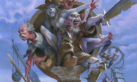
Where do you even put type on a cover which is packed full of action, contrasts, and details? Faramir at Osgiliath (below) was inspired by the congested, intimate group scenes Caravaggio or Guercino would put together, as well as the staccato rhythms of figure placement seen in Persian manuscript illumination.

Guercino, Samson Captured by the Philistines, 1619- Unknown illuminator, Selections from the Shahnameh by poet Ferdowsi, 1618 – Caravaggio, The Taking of Christ, 1602
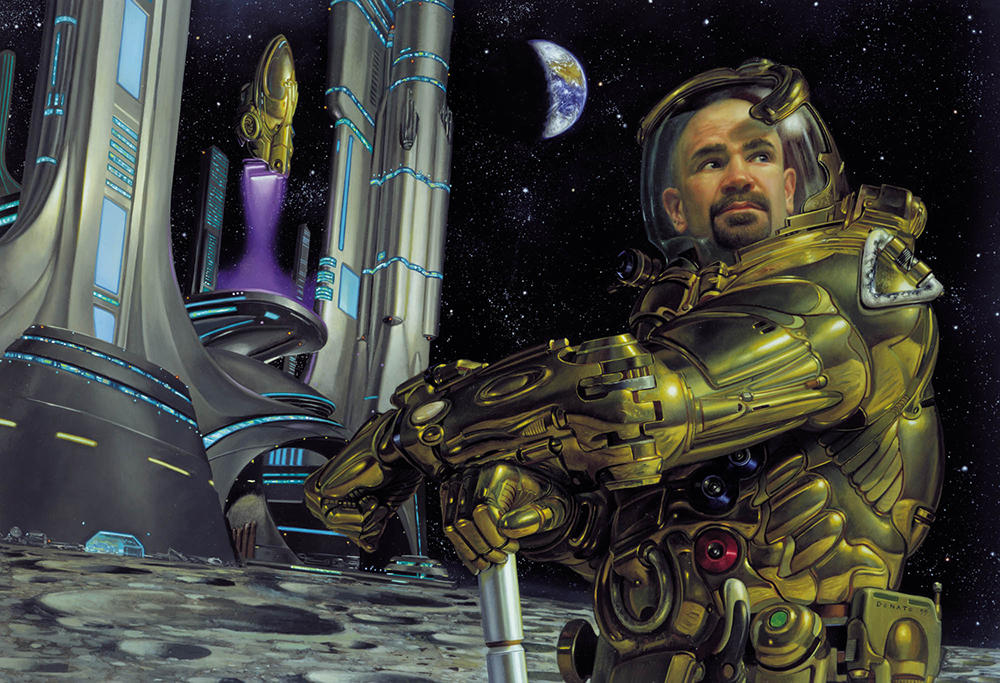
Early in my career, with newly developed technical skills, I really wanted to paint Iron Man with intent to capture that feeling of shiny metal so well you could ‘taste’ it. As a runner up to my desired theme, this was executed for Playboy Magazine back when artists were given cart blanche on what to create to go along with the story. Below is Cities on the Moon by Ray Bradbury.
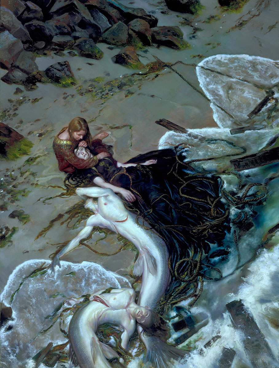
Sometimes creating a cover work which captures the essence of the protagonist means illustrating a scene which is not in the book. Artist like Michael Whelan have used this allegorical practice for decades. I made up this moment below to communicate the compassion the character (in red) felt for others around her, while capturing the fantastic nature of their natural world.




Yor work is So amazing, words can’t even descripe it…..
Man, seeing the final Connecticut Yankee cover really made me laugh! why on earth would a publisher want to destroy an artwork and actually make the cover ugly is beyond me. If I were in a bookstore I’d barely even notice this cover, yet alone be moved to buy it. The original artwork would’ve made it fantastic and stand out.
BTW, love your work and got a signed copy of your Middle Earth book.. simply breathtaking!
-AJ